Categories
By ChartExpo Content Team
In the realm of psychological and social sciences, the Likert Scale stands as a fundamental instrument for gauging attitudes and opinions.
We all have filled out a Likert scale survey at some point. You may have encountered it in your academic research, job interview, etc., Or even in your daily life without realizing it.
This guide will take you on a journey through the history and purpose of the Likert scale.
What makes the Likert scale so special?
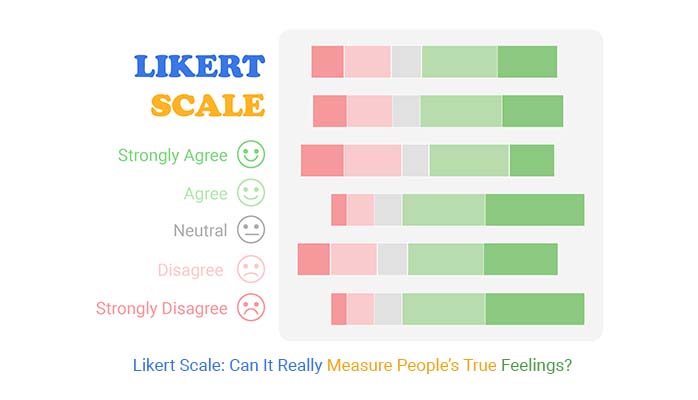
Likert scale is a simple survey tool that asks people to rate their opinions or feelings on a topic. It usually has 4 to 7 choices, ranging from one extreme, like “strongly agree,” to the other, such as “strongly disagree.”
Therefore, don’t be fooled by its simplicity – the Likert scale can reveal complex behavior and thought patterns.
Let’s find out. How?
Let’s start by defining the Likert Scale.
Definition: A Likert scale is a common tool used in surveys to measure people’s opinions, feelings, or attitudes. It typically provides a set of answer choices that range from one extreme to another, like “strongly agree” to “strongly disagree,” with some surveys including a neutral option. Most often, Likert scales have 4 to 7 points to give a clear sense of where someone stands on a topic.

Likert Scales offer a structured way to gather subjective data. Researchers assign numerical values to responses, facilitating quantitative analysis. However, interpretation requires caution, as responses may be influenced by various factors.
Despite limitations, Likert Scales remain popular due to their simplicity and versatility in capturing diverse viewpoints.
A Likert Scale provides a systematic approach to measure attitudes or opinions. Its straightforward design facilitates data collection and analysis, making it a valuable tool in research and survey methodology.
Understanding its principles and application can enhance the effectiveness of gathering and interpreting subjective data.
In 1932 Rensis Likert created the Likert Scale as a part of his Ph.D. thesis.
The problem he was trying to solve was the lack of a standardized method to measure opinions, attitudes, and perceptions in a quantifiable manner.
Prior to Likert’s scale, researchers often used ad hoc methods or dichotomous questions (yes/no questions), which didn’t allow for a nuanced understanding of respondents’ opinions.
Rensis Likert’s original scale typically had five response options, ranging from “Strongly Disagree” to “Strongly Agree.”
This five-point scale is the most common version of the Likert Scale and has been widely used in survey research since its development.
One significant enhancement is the addition of a midpoint, providing respondents with a neutral option. This midpoint allows participants to express ambivalence or neutrality towards a statement, which can lead to more accurate data collection.
Including a midpoint also prevents respondents from feeling forced to choose an option that doesn’t align with their true feelings, thus improving the reliability and validity of the responses.
Likert scale data is commonly visualized using a Likert Scale chart.
Survey participants’ responses should always have two extreme positions and an intermediate option that serves as the bridge.
The more items on the Likert Scale, the higher the reliability of insights produced.
Likert scales offer versatility, ease of interpretation, quantitative analysis capabilities, efficiency, and reliability, making them valuable tools for researchers and practitioners across various fields.
Whether used to assess customer satisfaction, public opinion, or in employee engagement survey results presentation, Likert scales provide valuable insights that can inform decision-making and drive positive outcomes.
One of the key benefits of Likert scales is the flexibility they offer in response options. Respondents can choose from a range of options, typically including choices such as “strongly agree,” “agree,” “neutral,” “disagree,” and “strongly disagree.”
This allows for nuanced responses and can provide valuable insights into respondents’ attitudes, opinions, and preferences.
Likert scales produce quantifiable data, making it easy to analyze and compare responses. Each response option is assigned a numerical value, allowing researchers to calculate mean scores, identify trends, and measure the strength of respondents’ attitudes or opinions.
This quantitative data can provide valuable insights for decision-making and can be easily visualized using charts or graphs to communicate findings effectively.
Likert scales offer a simple way to gather and interpret data. Respondents are presented with a series of statements or questions and asked to indicate their level of agreement or disagreement. This format makes it easy to quickly analyze responses and identify trends or patterns.
Likert scales are designed to minimize response bias by offering a balanced set of response options. By providing respondents with a range of choices, Likert scales encourage honest and thoughtful responses, reducing the likelihood of extreme or biased answers.
This helps ensure the accuracy and reliability of the data collected, providing researchers with confidence in their findings.
Likert scales are widely used in various research fields and can be applied to a wide range of topics and objectives. Whether you’re conducting academic research, market research, employee surveys, or customer feedback surveys, Likert scales can be adapted to suit your specific needs.
The Likert scale has been a game-changer in data collection and analysis. It provides a clear and concise way to measure attitudes and opinions. Let me show you why it’s the coolest thing since sliced bread (and maybe even cooler than that).
Likert scales are a widely used tool in survey research for measuring attitudes, opinions, and behaviors. However, like any measurement tool, they come with certain limitations.
Here are some limitations of the Likert scale:
Likert scales typically offer a fixed number of response options, often ranging from “strongly disagree” to “strongly agree” or similar variations. This limited range may not capture the full complexity of participants’ attitudes or opinions, leading to oversimplification of responses.
Responses on Likert scales can be subject to interpretation bias. Individuals may interpret the scale differently based on their own perceptions and experiences, leading to inconsistencies in responses across participants.
Likert scale items are usually brief and do not provide contextual information. This can result in respondents providing answers based on assumptions or an incomplete understanding of the question, leading to inaccurate responses.
Respondents may provide socially desirable responses rather than truthful ones to avoid judgment or present themselves in a favorable light, which is a clear example of social desirability bias. This can skew the data and lead to inaccurate conclusions if not properly addressed.
This bias can distort the validity of survey results, particularly when sensitive topics are being addressed.
Likert scales measure the direction of attitudes or opinions (e.g., agreement or disagreement) but may not capture the intensity or strength of those attitudes.
For example, two respondents may both indicate “strongly agree,” but one might feel much more strongly about the issue than the other.
Likert scales may not be sensitive enough to detect subtle changes in attitudes or opinions over time. This may happen when the scale lacks sufficient granularity or if respondents’ perceptions of the scale change between measurements.
Likert scales may not be universally applicable across different cultures or languages due to variations in interpretation of response options, cultural norms, or linguistic nuances.
Likert scales provide a versatile and effective means of gathering quantitative data on subjective opinions and attitudes to measure frequency, likelihood, and agreement.
So, When should you use a Likert scale creator? Whether in customer surveys, academic research, or healthcare assessments, the adaptability of Likert scales makes them indispensable tools for understanding human behavior and preferences.
A Likert scale questionnaire is a versatile tool that can be employed in various scenarios to gather valuable insights.
Likert scales can range from simple to complex and have vast applications in fields. They provide a reliable and valid way to measure subjective experiences, especially in the case of close-ended questions.
Here are some specific situations where using a Likert scale questionnaire can be particularly beneficial:
In customer satisfaction surveys, Likert satisfaction scales are often employed to measure levels of satisfaction with products or services. Responses range from “Very Dissatisfied” to “Very Satisfied.”
Overall, how satisfied are you with your recent purchase?
Likert scales are invaluable in gauging employee engagement and job satisfaction. A seven-point Likert scale might be used to assess agreement with statements like, “I feel valued in my role” or “I have opportunities for growth and development.”
I have opportunities for growth and development.
Market researchers often rely on Likert scales to gather data on consumer preferences and opinions.
By using a five-point Likert scale, researchers can assess consumer attitudes toward specific brands, products, or advertising campaigns.
Was the products was effective as advertised?
Here are some of the best market research survey examples to help you in creating your next survey.
Likert scales play a crucial role in assessing patient experiences and perceptions of healthcare services.
A five-point Likert scale might be utilized to measure agreement with statements regarding the quality of care received or satisfaction with medical staff.
How did you Find the Experience of Booking Appointments?


Patient satisfaction surveys can help you identify strategies for improving your medical practice.
Insights into the data gathered can easily translate into better care and happier patients.
The chart is straightforward to read and interpret. For instance, according to the chart above, the overall rating is 3 out of 5.
These questions assess the degree of website visitor satisfaction. They provide in-depth insight into how consumers perceive the website’s design, functionality, and content. This assists you in enhancing your website’s user experience.
How easy was it to navigate our website?
Feedback is a data-driven and reliable measure of success after hosting an event.
It can help you optimize your future events for increased attendance and more sign-up fees. Your events will start meeting deeply felt needs.

We recommend you use post-event survey questions if your goal is to learn:
Successful event organizers use post-event surveys to measure attendees’ satisfaction.
Keep reading to discover more examples.
Some of the options you can use in your Likert questions include:
Below are some of the options you can use to measure frequency using a five or 6-Point Likert Scale according to survey question:
Do you recommend our brand to your friends and family members?
In this example, we are using 4-Point Likert Scale to investigate quality of product/services:
Here are some of the types of Likert Scale based on the response.
There are two major types of Likert Scale that further have 5 categories each, which are as follows
When creating surveys or questionnaires, one important decision is whether to use an odd or even Likert scale options. This guide will explain the differences and help you decide which one is best suited for your needs.
First, let’s learn when to use odd Likert scales.
Researchers use even Likert scales to collect extreme feedback without providing a neutral option.
The 2-point Likert Scale type is one of the simplest scales you can work with. It’s made up of questions with two choices.

A 4-point Likert Scale is made of questions providing respondents with 4 choices. You’re likely to get 4 varying opinions of the same question.

A 6-point Likert Scale is made of questions providing respondents with 6 choices, as shown above. You’re likely to get 6 varying opinions of the same question.
This Likert Scale type displays extreme options for respondents. Besides, it comes without a neutral choice.

A 10-point Likert Scale is made of questions providing respondents with 10 choices, as shown above. Besides, it displays extreme options for the underlying question.

This scale chart has extreme ends and a neutral option (a gray area). It provides respondents with 3 options in a single question.

A 5-point Likert Scale is made of questions providing respondents with 5 choices, as shown above. Besides, it has a neutral option (a gray area).

The 7-point Likert Scale is an upgrade to the 5-point Scale. It offers 7 options in a single question. Also, it has a neutral option.

This Likert Scale type is an upgrade to the 7-Point Scale. It offers 9 options in a single question. Also, it has a neutral option.

When creating a Likert scale, you have various options from 2 to 10-point scales. The scale you choose should suit the complexity of your survey questions and the depth of information you wish to gather.
For instance, a 3-point scale might be suitable for simple agree-disagree questions, while a 10-point scale could offer more nuanced responses. Keep these characteristics of Likert scales in mind while choosing the right scale.
Ensure that your Likert scale is balanced and offers a neutral midpoint. This allows respondents to accurately express their opinions without feeling pressured to lean towards one extreme or the other.
For instance, a 5-Point Performance Rating Scale might include options such as “Strongly Disagree,” “Disagree,” “Neither Agree nor Disagree,” “Agree,” and “Strongly Agree.”
Choose a scale that will allow you to analyze the data effectively. Ensure that the responses can be easily quantified and analyzed using statistical methods relevant to your research objectives.
Consider the number of response options you want to offer. Common scales include:
The number of response options can impact the precision of your data and the ease of analysis.
Think about the characteristics of your respondents. Are they experts in the field, general consumers, or a specific demographic group? Choose a scale that is appropriate for their level of understanding and comfort.

The role of a midpoint in Likert scales has its own pros and cons according to survey type.
Different rating scales, similar to the Likert scale rating, are used to measure attitudes directly. Each type of scale has its own strengths and weaknesses.
Select the right type of rating scale questions for your business. You should choose the most appropriate scale based on the specific research question, the nature of the attitudes being measured, and the preferences of the respondents.
5 rating scales examples of attitudes measured directly:
The semantic differential scale measures the connotative meaning of objects, events, or concepts by asking respondents to rate them on a series of bipolar adjectives.
Example: Please rate your experience with the product:
The adjectives are typically opposite in meaning and are placed on a scale, allowing respondents to indicate where their perception lies between the two extremes.
The Thurstone scale presents respondents with a list of statements related to the attitude being measured.
Judges rate each statement based on its relevance and assign scores to them. These scores are then used to create a scale with items ordered from least to most favorable.
Example: Please indicate your agreement with the following statements about recycling:
Respondents indicate their level of agreement with each statement, and their scores are calculated based on the assigned values.
The Bogardus Social Distance Scale measures attitudes towards various social groups by asking respondents to indicate their willingness to interact with members of these groups.
Example: How willing would you be to have a close friend from the following groups?
Respondents rate each group on a scale ranging from “Definitely willing” to “Definitely unwilling” to interact with them socially.
The Guttman scale consists of a series of statements arranged in a hierarchical order of difficulty or intensity.
Example: Please indicate whether you agree or disagree with the following statements:
Respondents are asked to indicate whether they agree or disagree with each statement. If they agree with a particular statement, it implies that they also agree with all preceding statements on the scale.
The Visual Analog Scale is a continuous rating scale that measures attitudes or perceptions by asking respondents to mark a point on a line that represents their position on a particular dimension.
The line typically has endpoints labeled with opposite attributes.
Example: “Please mark on the line below how satisfied you are with the product:
Respondents mark a point between these endpoints to indicate their opinion or attitude.
Honestly, getting people to commit to a decision is like pulling teeth. But with a Likert scale, you can make your survey enticing and easy to respond to.
How?
Follow these best practices for using the Likert scale:
When crafting Likert scale questions, clarity is key. Use simple language that is easy for respondents to understand. Keep the question brief and to the point, avoiding any unnecessary jargon or complex terminology.
For example, instead of asking, “To what extent do you agree or disagree with the statement provided?”, opt for a more straightforward approach like, “Please indicate how much you agree with the following statement.”
Double-barreled questions can confuse respondents and lead to inaccurate data. These questions address more than one issue but only allow for a single response. To avoid this, focus on one specific topic per question.
For example, instead of asking, “Do you find the website easy to navigate and visually appealing?” separate it into two questions: “Do you find the website easy to navigate?” and “Do you find the website visually appealing?”
Before administering your survey, pilot test your Likert scale questions with a small group of individuals to identify any potential issues or areas for improvement.
Pay attention to how respondents interpret and respond to the questions, and make adjustments as necessary to ensure clarity and accuracy.
Remember to pretest the survey with a small sample of respondents to identify any issues with wording, clarity, or comprehensibility.
Let’s say you want to do a customer satisfaction survey consisting of the following questions:
You want your customers to respond to each question using the scale below.
How do you create an effective survey?
Use Google Forms for surveys.
Google Forms is free, and you can access it from anywhere with an internet connection. Furthermore, it provides real-time responses and data analysis.
To create a survey with Google Forms:


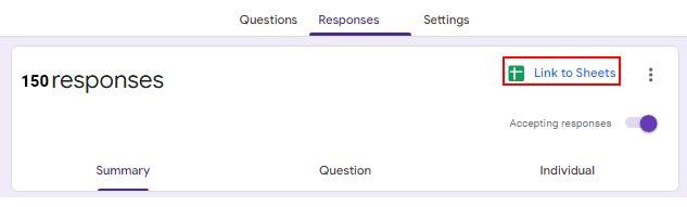

In the next section, you will learn how to analyze Likert scale data in Excel.
Are you struggling to make sense of your Likert Scale data?
Worry no more – The Likert Scale Chart is here to simplify your data analysis.
How?
With Likert Scale Chart, you can turn your Likert scale data into a visualization that unveils patterns, trends, and correlations.
Freemium data visualization tools, such as Excel, Google Sheets, or Power BI lack ready-made and insightful Likert Scale Charts. So, they’re not a reliable Likert Scale generator.
This is where a ChartExpo, a Likert Scale creator comes in.
It turns out you don’t have to ditch Excel, Google Sheets, or Power BI in favor of other costly tools in the market.
You can create Likert Scale Chart in your favorite spreadsheet. Follow the steps below to create a Likert Scale Chart.
Steps to make Likert Scale Chart in Microsoft Excel:
The following video will help you to create a Likert Scale Chart in Microsoft Excel.
Steps to make Likert Scale Chart in Google Sheets:
The following video will help you to create a Likert Scale Chart in Google Sheets.
Steps to make Likert Scale Chart in Power BI:
The following video will help you to create a Likert Scale Chart in Microsoft Power BI.
A Likert Scale is a psychometric scale commonly used in research that uses questionnaires.
And it’s the most widely used approach to scaling responses in survey research. Also, it is often used interchangeably with rating scales, although there are other types. The scale is named after its inventor, psychologist Rensis Likert.
Respondents are presented with statements or questions and are asked to indicate their level of agreement or disagreement. Each option is assigned a numerical value, which can then be analyzed to understand people’s perspectives on the topic.
Likert scales vary in the number of response options they offer, such as 3-point, 5-point, 7-point, or even 10-point scales. The choice of scale depends on the complexity of the topic and the level of detail needed in the responses.
Sure! Here are examples of Likert scales with different numbers of response options:
To create a Likert scale, start by defining the statements or questions you want to ask. Then, determine the number of response options and their labels. Ensure that the scale is balanced and captures the full range of opinions.
Likert scale labels are the descriptors associated with each response option, such as “Strongly Disagree” or “Strongly Agree.” These labels help respondents understand the meaning of each option.
Likert scale surveys are used in various fields, including psychology, market research, and customer satisfaction studies. They provide valuable insights into people’s attitudes, preferences, and behaviors.
The Likert Scale gives you a simple way to understand complex opinions. It turns feelings into numbers we can study. With options from “Strongly Agree” to “Strongly Disagree,” it shows us the shades of human thought.
Likert Scales are everywhere. They help in business, health, and even personal growth. They make the silent voices loud and clear. When we ask the right questions, we discover truths that guide us forward.
But it’s not just about asking. It’s about listening. Every tick on a scale tells a story. It’s our job to piece these stories together. To find patterns. To see beyond the numbers.
How much did you enjoy this article?


Learn how the 5-Point Performance Rating Scale improves employee evaluations with clear, consistent, and fair performance reviews across teams.

Fun Survey Questions can raise response rates, reveal patterns, and guide survey planning across teams, classrooms, and customer research. Read on!

Learn how to create, collect, and analyze data using a 4-point Likert scale. A complete guide with definition, examples, advantages, and practical applications.