Categories
Tracking opinions, feedback, and customer sentiment is essential for making better decisions. But when surveys include a neutral option, responses often become unclear and harder to interpret.
That’s where a 4-point Likert scale becomes useful.
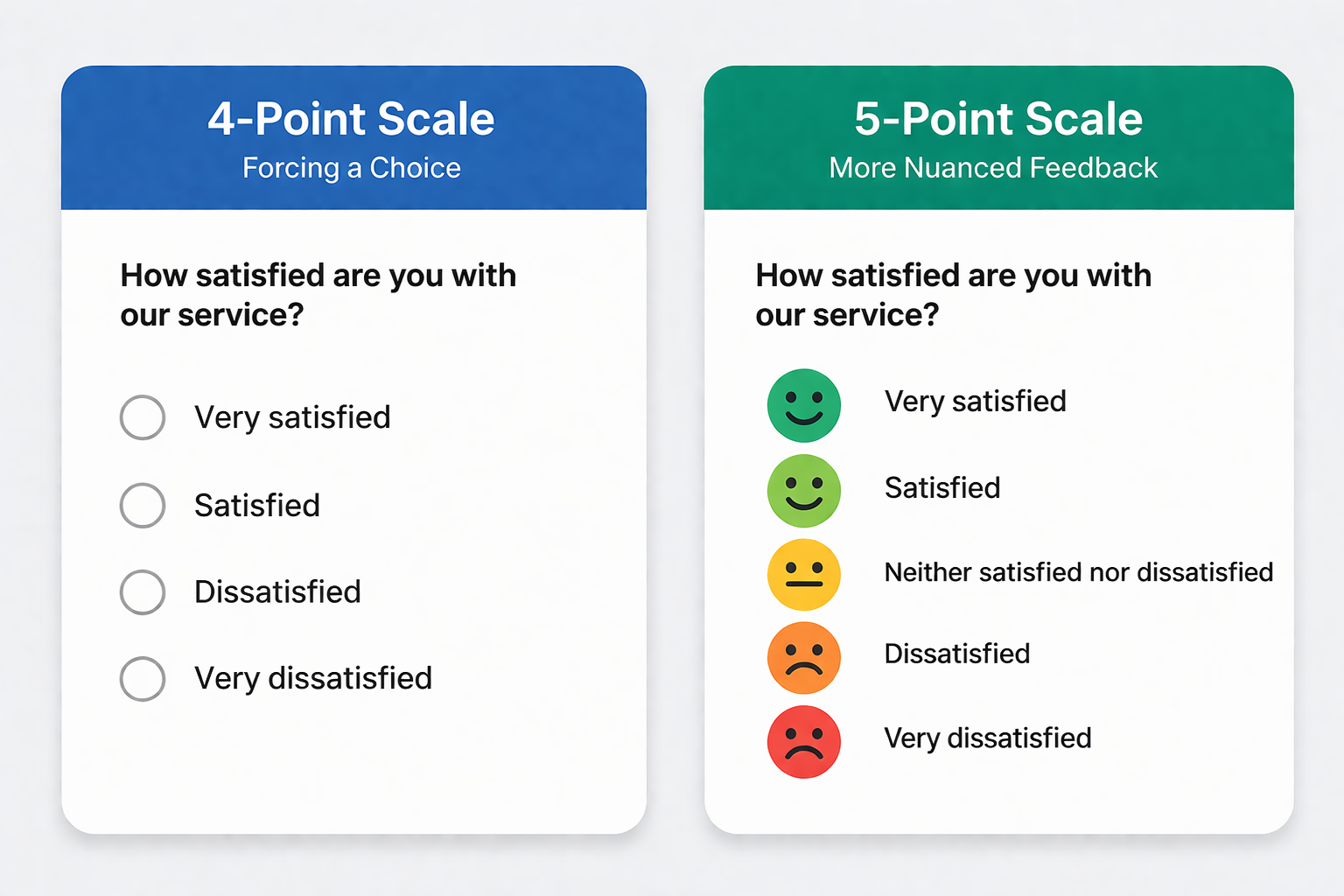
A 4-point Likert scale removes the neutral choice and encourages respondents to take a clear position. This makes the data more decisive, easier to analyze, and more valuable for identifying real trends.
However, while collecting responses is straightforward, presenting this data clearly and meaningfully can be challenging, especially in Excel.
In this guide, you’ll learn how it works and how to create and visualize it effectively.
Definition: A 4-point Likert Scale is a survey tool used to measure attitudes, opinions, or perceptions. It provides respondents with four response options, forcing them to indicate a preference without a neutral choice.

This scale helps gauge the intensity of opinions while simplifying analysis. Unlike longer Likert scales, it lacks a neutral midpoint, making it a forced-choice scale that encourages respondents to take a clear stance.
The 4-level opinion scale is widely used in psychology, market research, and social studies for its brevity, ease of interpretation, and ability to collect actionable data. Removing a neutral option helps researchers obtain more decisive responses.
Here is a brief comparison:
Below are practical examples used in different survey scenarios. Each example removes the neutral option to encourage clear and actionable responses.
How satisfied are you with our customer service?
How would you rate the quality of our product?
How would you rate the speed of service you received?
How comfortable is your current work environment?
How effective was the training session?
How easy is it to navigate our website?
To calculate a four-point Likert Scale, assign numerical values to each response option:
Next, calculate the mean score using the formula:
Mean = (Sum of all responses) ÷ (Total number of responses)
This average helps determine the overall sentiment of respondents.
You can also analyze the distribution of responses by calculating:
Finally, identify the mode, which is the most frequently selected response, to understand the dominant opinion.
Scores closer to 4 indicate positive sentiment, while scores closer to 1 reflect negative sentiment.
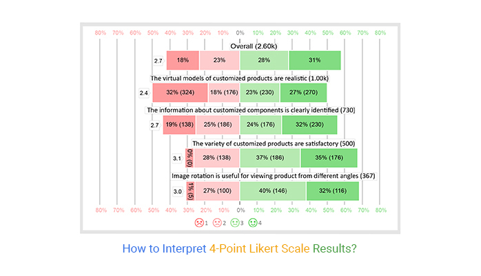
Interpreting a 4-option scale involves analyzing the mean score and response distribution to understand overall sentiment.
Visualizing survey results with a Likert scale is easy using a survey chart. Tools like ChartExpo can help make this process faster and produce cleaner, more readable charts.

Yes, a 4-point Likert scale can be reliable for capturing clear opinions and trends, especially when you want definitive responses. However, it may be less precise than 5- or 7-point scales when measuring the strength of attitudes, and it can frustrate genuinely neutral respondents.
A 4-Point Likert Scale is a one-dimensional scale you can use to collect the attitudes and opinions of your target market.
It uses an ordinal scale to help you understand the views and perspectives of the market towards your brand. Besides, it has different variants to help your business personalize its communication.
The difference between 5- and 4-point Likert scales lies in the neutral option. A 5-point scale includes a middle “neutral” choice, allowing respondents to stay undecided, while a 4-point scale removes the neutral option, forcing respondents to take a clear positive or negative stance. This makes 4-point scales better for capturing decisive opinions.
Visualizing survey data is one of the most effective ways to make your insights persuasive and easy to understand.
Our brains are naturally wired to recognize patterns and ranks in visual content. Using ranking-based data visualization charts, such as survey charts, helps create compelling narratives for your audience.
Why does this work?
Ranking charts display insights in a clear order—either bottom-up or top-down—making it easier to identify trends, strengths, and areas that need attention.
One of the most effective designs for survey data is the four-point survey scale.
A four-point survey scale is a “forced” scale, meaning respondents must form an opinion since there is no neutral option. This helps capture decisive responses and avoids indecision that can dilute insights.
While Excel does not natively provide a 4-point Likert scale, third-party charting tools and add-ins can simplify the process, offering ready-to-use Likert scale charts that are easy to create, interpret, and visually appealing.
Using visualizations like these ensures your survey data tells a clear, actionable story for better decision-making and reporting.
Related Article:
7 Point Likert Scale
How much did you enjoy this article?


Google Forms to Google Sheets keeps your data organized and current with every submission. Learn the steps, methods, and tips now!

Product survey questions reveal what customers truly think. Learn how to ask the right ones and act on the survey results. Read on!

Learn how the 5-Point Performance Rating Scale improves employee evaluations with clear, consistent, and fair performance reviews across teams.