Categories
As human beings, we are busybodies who want to accomplish our objectives by the end of the day. It depends on the approach you use to perform your tasks.


One of the tasks we carry out is associated with surveys. The survey is integral to the growth of every business. Business people will always find a way to how their customers perceive their products and services. Data analysis that is associated with a survey is essential because one collects views from other people.
The survey has become the backbone of statistical analysis. The big question is, how do we analyze such data?
This blog will help you understand how to analyze Likert scale data in Excel. By the end of the day, you will wear a happy face since you will learn about new concepts.
Buckle up as we get this journey started.
Definition: A Likert Scale is a psychometric scale with two opposing poles.
This sounds remarkable, right?
The bottom line is you can use the Likert scale chart to determine other people’s opinions. Their feelings and attitudes about a particular product and service come in handy.
In this case, you will be analyzing Likert scale data of how others agree or disagree with a topic.
As a business owner, you would be interested to know how your customers feel about your business. And for that, you will need to know how to analyze Likert Scale data in Excel.
Television shows can also benefit from such analysis because they want to know how their audience feels. The tricky part of this task is to collect data from your interviewees.
If you are lucky to be a marketer, psychologist, or sociologist, the Likert scale is meant for you. This is because your career involves interacting with other individuals.
Through such interaction, you can collect views from different people. It is part of analyzing Likert scale data.
Here is an interesting fact about the Likert Scale.
The chart assumes that opinions, attitudes, and feelings are always in linear form.
Let’s explain this fact. The path from an agreement to a disagreement is usually one way.
With that in mind, let us understand how to analyze Likert Scale data in excel using practical examples.
The best way to analyze Likert Scale Data in Excel is by creating and analyzing Likert Scale Chart on it.
However, here comes the news.
Your Excel worksheet does not have a Likert scale chart in its charts library.
Here comes the good news.
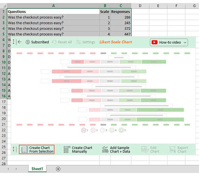
ChartExpo saves the day. It is an Excel add-in with numerous charts and graphs in Excel. When you use this add-in, you can create a Likert Scale Chart in a few clicks. ChartExpo has many built-in survey charts for you to use in your survey analysis.
With it, you can conduct a Likert scale analysis in Excel by using different types of charts suited for survey data.
I hope you are following along so far.
Now, let’s get down to business and walk through the steps of how to analyze Likert scale data in Excel with the help of ChartExpo.
We’ll use a practical Likert scale analysis example involving an individual who sells software products.
This example will broaden our understanding of conducting a Likert scale analysis in Excel using the right types of charts for clear insights.
You are the owner of a software product company. From the interaction with your customers, you want to know how customers feel about your products and services.
Your goal is to obtain meaningful insights into the general attitude of your customers. At this point, your only hope is to analyze your customers’ opinions with a Likert Scale.
You drafted some of the questions you would ask customers:
The questions are vital in your Likert scale analysis in Excel.
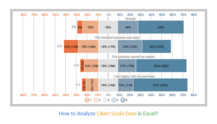
After your customers answered the survey questions, you tabulated that data in an Excel table, as shown below.
| Questions | Scale | Responses |
| The checkout process was easy. | 1 | 138 |
| The checkout process was easy. | 2 | 186 |
| The checkout process was easy. | 3 | 176 |
| The checkout process was easy. | 4 | 230 |
| The checkout process was easy. | 5 | 270 |
| The software solved my needs. | 1 | 0 |
| The software solved my needs. | 2 | 138 |
| The software solved my needs. | 3 | 186 |
| The software solved my needs. | 4 | 176 |
| The software solved my needs. | 5 | 500 |
| I am happy with my purchase. | 1 | 5 |
| I am happy with my purchase. | 2 | 100 |
| I am happy with my purchase. | 3 | 146 |
| I am happy with my purchase. | 4 | 116 |
| I am happy with my purchase. | 5 | 420 |
To get started with ChartExpo in Excel, follow the steps below:


From this Likert Scale Chart, Chris could identify how his customers viewed his products and services.
This chart could help you develop such insights to know where to improve.
In the following video, you will learn How to Analyze Likert Scale Data in Excel.
This Likert scale analysis example shows that most customers were satisfied with the software. You know where you stand as a business and can develop long-term goals to ensure more success.
Let’s proceed to how we can interpret Likert Scale data.
The whole process of interpreting Likert Scale data is straightforward and transparent.
Keep in mind that the following factors are essential when you want to know how to analyze and interpret Likert Scale data in Excel.
Your Likert scale in Excel’s items and questions should be compatible. It is advisable to select a scale that corresponds to your inquiries
Identifying and clarifying your goal before you begin data analysis is advisable.
It is also beneficial to understand the purpose of your survey. Making one-way questions will assist direct your survey inquiries.
Your audience will give irrelevant answers if your scale does not correspond to your queries.
To ensure that your scale quality is accurate, you should rate your Likert items. Have a professional team assess your items when you create the scale items.
You can rank the relevance of your products to the focus point as favorable or unfavorable. Remove any undesirable elements you discover.
It can be challenging to analyze the choices when the respondents’ choices vary.
To make your analysis easier, try organizing the choices into relevant groups.
If you find positive opinions, group them as one. You can also group the opposing views as one to ease the analysis.
In learning how to analyze Likert Scale data in Excel, a few components are necessary for your survey analysis to succeed. Find out what they are now.
Choosing the scale type for your Likert scale chart in Excel is crucial.
Your choice of scale type should be compatible with your questions. These scales include scales for agreement and quality among others.
There are many different types of Likert scales that you can use to gather and analyze your survey data. Some of them are as follows:
Your scale would go from “no feeling” to “optimum feeling” if it were unipolar. With numerals, the progression would be from 1 to 5.
A bipolar scale, on the other hand, would go from -5 to +5; therefore, it can only go from highly negative to extremely positive.
One advantage of a bipolar scale is that it gives respondents a wide option scale to express their feelings towards a subject.
Respondents can identify that every pole is utterly opposite to its counterpart.
You’ll discover that specific scales include an even number of alternatives, denying respondents the opportunity to make a neutral choice.
Because we believe that all respondents are courteous, neutrality is essential. Some respondents may feel that their responses were impolite.
Therefore, having a neutral response option is essential to keeping you from getting factual information.
Some respondents will be forced to answer your queries incorrectly if the neutral option is removed.
One drawback of providing a neutral option is that some questions may not receive a complete response from respondents.
A larger scale offers more options for your respondents to choose from. The outcomes presented will provide a valuable dataset.
A broader sample size will make it easier for respondents to locate responses in the poll that reflect their emotions.
A vast scale has the drawback that responders will find it tiresome to respond to several inquiries.
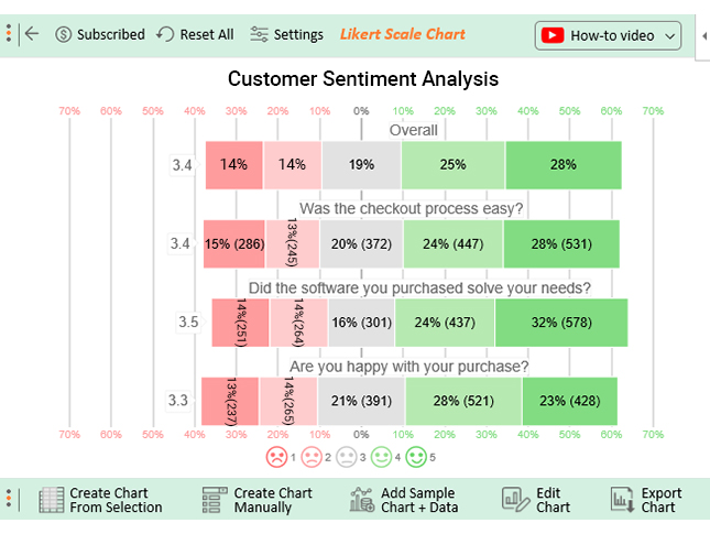
To present Likert Scale findings you need a visualization that can visualize the survey data perfectly, and that visualization is a Likert Scale Chart.
Since Excel does not have a Likert Scale chart, you can use the ChartExpo add-in to create a Likert Scale Chart in Excel to present your findings.
Code the responses from 1 to 5. Then count the number of responses against each value from 1 to 5. Then create a Likert Scale Chart to analyze the results.
To accurately analyze your respondents’ opinions using a 5-point Likert scale, choose a visualization tool such as ChartExpo.
We understand that data analysis is not for the timid. For the majority of people, we can make it seem simple.
If you have the proper knowledge and tools, using better data visualization tools can put you one step ahead of the competition.
One of the tools you may use in your Excel spreadsheet to show survey results with a Likert Scale is the ChartExpo add-in for Excel Mac.
This blog has shown us how to analyze Likert Scale data in Excel.
You must adhere to the procedures and instructions we have given you to analyze survey questions correctly.
With the information from this blog, you can become familiar with how to present Likert scale data in Excel.
Your Likert Scale data can be analyzed using charts with ChartExpo.
It can be easy for you too. Start a 7-day free trial today using ChartExpo to obtain the Likert scale chart.
Start now, and do not be left out by giving your audience an incredible data story.
How much did you enjoy this article?


Learn how to use sparklines in Excel to quickly visualize trends inside cells. Discover types, creation steps, customization, use cases, benefits, and best practices.

Learn what a confidence interval graph is, how to create it in Excel, and how to interpret results to make more reliable, data-driven decisions.

A correlation matrix in Excel helps identify relationships between variables. Learn how to create, read, and use it for effective data analysis.


