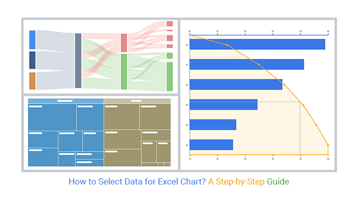
Categories
Data for Excel Charts plays a pivotal role in creating meaningful visualizations that convey insights effectively. Excel charts – the perfect way to turn rows of boring data into a colorful masterpiece.


With Excel’s powerful charting tools, you can turn even the most mind-numbing spreadsheets into appealing, insightful visualizations.
But where to begin, you ask?
Don’t fret if you’re a chart-making newbie. I’m here to guide you through the labyrinth of creating data for Excel charts. From selecting the right chart type to customizing it to perfection. I’ll lead the way through each step with ease.
Whether you want to create a simple pie chart or a complex line graph, we’ve got you covered.
And if you’re already an Excel charting pro, stick around. I’ll share some tips and tricks to take your charting to the next level.
The contribution of charts to data analysis and decision-making cannot be overstated. Whether you want to compare data or show trends, Excel charts can help you achieve your goal. Understanding how to effectively manage and present your data for Excel charts, such as a Box and Whisker graph, is crucial in maximizing their impact. Let’s see some ideal situations where you can use a chart in Excel.
Charts are an effective way to compare data visually and identify trends and patterns. For instance, you could create a Side-By-Side Bar Chart for data to compare sales data for different products across various regions. This approach allows you to see the sales figures for each product in each region side by side.
Consequently, you can identify which products are selling well in which regions and which products need improvement
When you want to show trends over time, a chart is an effective way to visualize the data. The best chart type for this purpose is a Line Chart. It can display changes in data over a specific time frame.
Furthermore, adding a trendline to a Line Chart can help highlight the trend’s direction and degree.
One of the most common ways to present distribution analysis is through a chart, such as a Tornado chart. A chart is useful in visually representing the distribution of data by showing the following:
Histograms, box plots, and Scatter plots are some of the Excel chart types used for distribution analysis.
Do you need inspiration on how to create data for Excel charts? Look at these data visualization techniques.
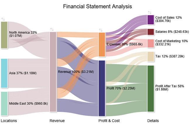
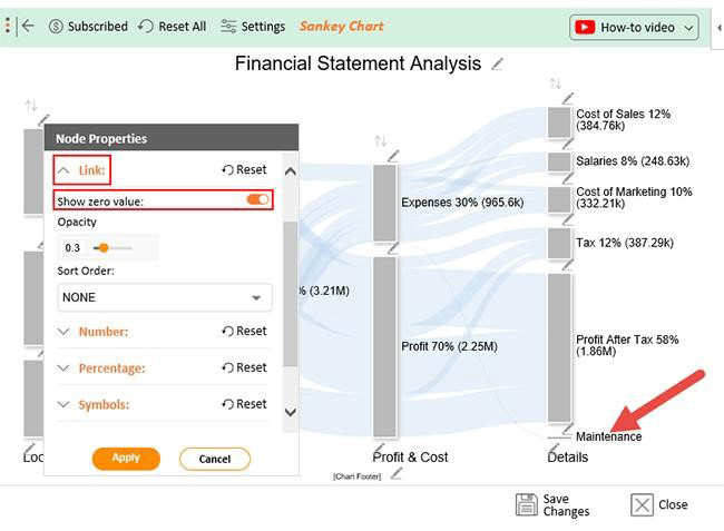
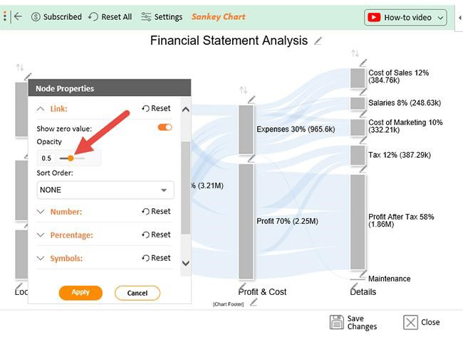
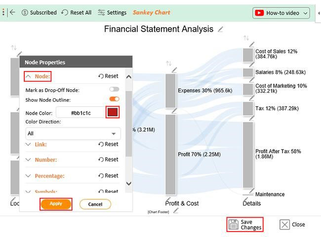
A Sankey Diagram is a flow diagram representing data movement between nodes. It is useful for visualizing the flow of resources, such as energy, money, or people. To create a Sankey Chart, you need to have the following data:
The source node represents the starting point of the flow, while the target node represents the endpoint.
The flow value represents the data that moves from the source node to the target node.
This structure also aligns well with a ranking chart maker, which helps organize and prioritize values when comparing flows or contributions across different categories.
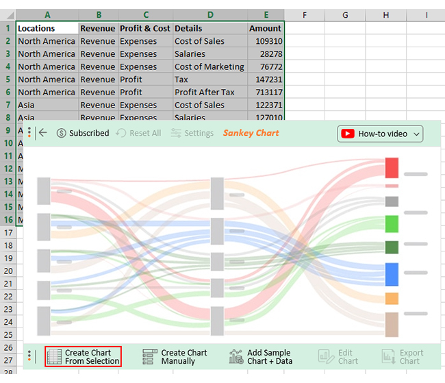
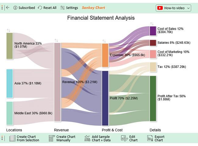
Let’s say you want to glean insights from the data below.
| Locations | Revenue | Profit & Cost | Details | Amount |
| North America | Revenue | Expenses | Cost of Sales | 109310 |
| North America | Revenue | Expenses | Salaries | 28278 |
| North America | Revenue | Expenses | Cost of Marketing | 76772 |
| North America | Revenue | Profit | Tax | 147231 |
| North America | Revenue | Profit | Profit After Tax | 713117 |
| Asia | Revenue | Expenses | Cost of Sales | 122371 |
| Asia | Revenue | Expenses | Salaries | 127010 |
| Asia | Revenue | Expenses | Cost of Marketing | 72919 |
| Asia | Revenue | Profit | Tax | 161953 |
| Asia | Revenue | Profit | Profit After Tax | 692948 |
| Middle East | Revenue | Expenses | Cost of Sales | 153080 |
| Middle East | Revenue | Expenses | Salaries | 93339 |
| Middle East | Revenue | Expenses | Cost of Marketing | 182517 |
| Middle East | Revenue | Profit | Tax | 78101 |
| Middle East | Revenue | Profit | Profit After Tax | 453762 |
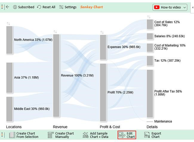
You can map it on a Sankey Chart, as shown below, to glean all insights at a glance.
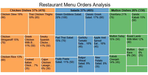
A Treemap is a hierarchical chart that represents data proportions across different categories. It helps to visualize data distribution, such as market share or budget allocation. Additionally, a Treemap is useful in displaying large numbers of items in a compact space.
To create a Treemap in Excel, you need to have the following data:
Let’s say you have the restaurant order data below.
| Food Items | Category of Items | No. of Orders |
| Salads | Classic Greek Salad | 80 |
| Salads | Pad Thai Salad | 70 |
| Salads | Green Goddess Salad | 100 |
| Salads | Fruity Pasta Salad | 50 |
| Salads | Bulgur Wheat Salad | 40 |
| Salads | New Potato Salad | 35 |
| Salads | Garlicky Tomato Salad | 45 |
| Salads | Apple and Sprout Salad | 45 |
| Chicken Dishes | Greek Chicken with beans | 50 |
| Chicken Dishes | Cooked Italian Chicken | 35 |
| Chicken Dishes | Chicken Stroganoff | 70 |
| Chicken Dishes | Chicken Rice | 60 |
| Chicken Dishes | Thai Chicken Thighs | 85 |
| Chicken Dishes | Cajun Chicken Lasagna | 30 |
| Chicken Dishes | Chicken Stew | 90 |
| Chicken Dishes | Smoky Spanish Chicken | 50 |
| Mutton Dishes | Kabab Chenjeh | 45 |
| Mutton Dishes | Mutton Rara | 30 |
| Mutton Dishes | Dande Kabab | 50 |
| Mutton Dishes | Quzi | 25 |
| Mutton Dishes | Roast Lamb with Mint | 40 |
| Mutton Dishes | Chanfana | 70 |
| Mutton Dishes | Baranina | 20 |
| Mutton Dishes | Mutton Satay | 50 |
You can map this data on a Treemap to make gleaning of insights effortless.
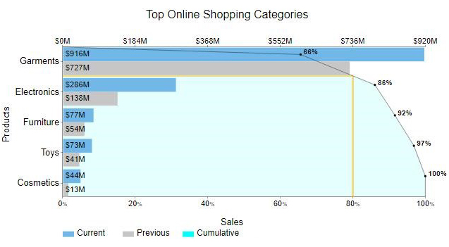
A Pareto Chart harmoniously fuses the visual elements of a Bar Chart and a Line Chart. As a result, displays the distribution of data across various categories and the cumulative percentage.
This tool proves advantageous in pinpointing the most pivotal factors contributing to a problem.
To create a Pareto chart in Excel, you need to have the following data:
The data below shows sales for the current and previous year’s products.
| Products | Current | Previous |
| Garments | 916 | 727 |
| Electronics | 286 | 138 |
| Cosmetics | 44 | 13 |
| Toys | 73 | 41 |
| Furniture | 77 | 54 |
Below is the Pareto Chart visualization of this data.
A picture is worth a thousand words. And when it comes to data, a chart or graph can speak volumes, like Funnel charts.
But let’s be honest, creating an Excel chart can be tedious.
That’s where ChartExpo comes in.
This Excel add-in can turn your data into insightful charts and graphs, including dynamic Radar Charts, with just a few clicks. No coding is required, just pure magic.
Let’s learn how to install ChartExpo in Excel.
ChartExpo charts, including Scatter plot in Excel with 3-variables, are available in both Google Sheets and Microsoft Excel. Use the following CTAs to install the tool of your choice and create beautiful visualizations in just a few clicks in your favorite tool.


Let’s say you have your company’s financial statement data displayed using a Sankey Diagram in Excel below.
| Locations | Revenue | Profit & Cost | Details | Amount |
| North America | Revenue | Expenses | Cost of Sales | 109310 |
| North America | Revenue | Expenses | Salaries | 28278 |
| North America | Revenue | Expenses | Cost of Marketing | 76772 |
| North America | Revenue | Profit | Tax | 147231 |
| North America | Revenue | Profit | Profit After Tax | 713117 |
| Asia | Revenue | Expenses | Cost of Sales | 122371 |
| Asia | Revenue | Expenses | Salaries | 127010 |
| Asia | Revenue | Expenses | Cost of Marketing | 72919 |
| Asia | Revenue | Profit | Tax | 161953 |
| Asia | Revenue | Profit | Profit After Tax | 692948 |
| Middle East | Revenue | Expenses | Cost of Sales | 153080 |
| Middle East | Revenue | Expenses | Salaries | 93339 |
| Middle East | Revenue | Expenses | Cost of Marketing | 182517 |
| Middle East | Revenue | Profit | Tax | 78101 |
| Middle East | Revenue | Profit | Profit After Tax | 453762 |
| Middle East | Revenue | Expenses | Maintenance |
This table contains example data. Expect many responses and questions in real life.


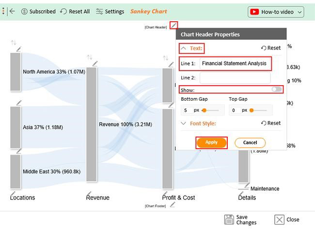
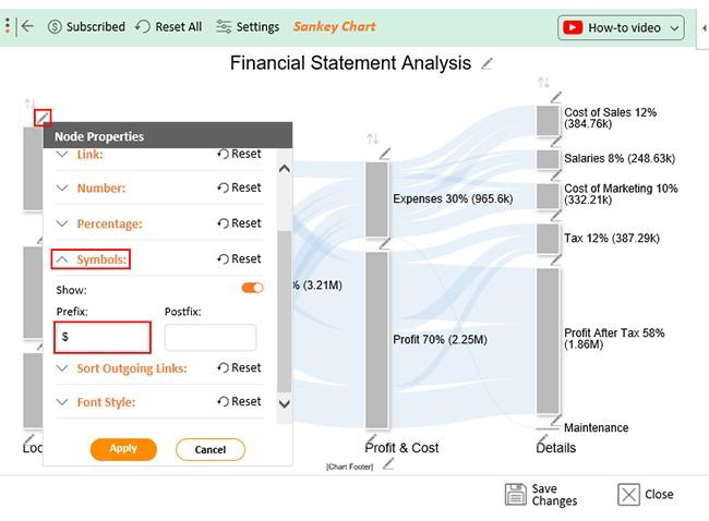


Here’s a video tutorial showing the perfect way to select data for an Excel chart:
The revenue report is divided into four levels;
Charts and graphs might seem like a bunch of colorful lines to some. But to data enthusiasts, they are the superheroes that save the day by concisely visualizing data for Excel charts. Let’s look at some reasons why Excel charts and graphs are important.
A dataset in a chart refers to a row or column of numbers entered in a worksheet and plotted in the chart. For example, a list of quarterly business profits. It contains the measurements for the categories or series columns/rows in the chart.
Charts are commonly used to condense large amounts of data into an easy-to-understand format. A chart can convey a table with rows of numbers in a picture. The choice of chart type depends on the metrics, features, variables, and audience.
You can import data from external sources, such as a database or a CSV file, into Excel charts. Power Query in Excel provides a convenient solution for importing data from diverse external sources.
Only a few clicks and keystrokes are required to create a chart in Excel. Pick the right chart type and provide the necessary information. Then customize the chart to suit your needs. Voila! You have your data for Excel charts represented visually in a way that is easy to understand.
It does not matter whether you are working with nominal data or numerical data. There is a chart type that can effectively convey your message.
Additionally, customizing chart elements such as titles, legends, and gridlines can enhance your charts further.
By utilizing data visualization techniques, individuals across various industries can communicate complex information effectively. With the right tools and techniques, you can create insightful charts and graphs, such as a slope chart, that convey a clear message. This, as a result, aids in the decision-making process.
How do you analyze your data for an Excel chart?
Use ChartExpo. With a few clicks, you can create insightful charts from your data in Excel, no coding skills are required.
Do not hesitate. Get started with ChartExpo today.
How much did you enjoy this article?


Learn how to use sparklines in Excel to quickly visualize trends inside cells. Discover types, creation steps, customization, use cases, benefits, and best practices.

Learn what a confidence interval graph is, how to create it in Excel, and how to interpret results to make more reliable, data-driven decisions.

A correlation matrix in Excel helps identify relationships between variables. Learn how to create, read, and use it for effective data analysis.


