Categories
Financial data tells a story, but only when examined through the right framework. Vertical analysis and horizontal analysis are two structured evaluation methods that convert raw numbers into actionable patterns.
Analysts use them to assess performance, track movement across time periods, and understand how a company allocates its financial resources.
Finance teams, accountants, and business managers apply these techniques across budgeting cycles, forecasting models, and strategic planning reviews.
Each method targets a different dimension of financial insight. Together, they provide a complete view of how a company grows over time and what its internal financial composition reveals at any given point.
Definition: In vertical analysis and horizontal analysis work, horizontal analysis measures how line items change across two or more consecutive reporting periods.
Using a base year as a reference, analysts calculate both the absolute change and the percentage shift for key metrics such as revenue, expenses, and net income.
The primary purpose is to detect directional trends over time, enabling teams to determine whether financial results are improving or weakening.
Organizations apply this technique for trend analysis in Excel when reviewing multi-year performance across income statements, balance sheets, or cash flow reports.
Vertical analysis and horizontal analysis each follow a defined process. The steps below demonstrate how to apply horizontal analysis by comparing financial data across reporting periods to reveal performance changes over time.
Collect financial statements for two or more consecutive periods, such as income statements or balance sheets. Arrange the data in columns by year so values can be compared easily. This organized structure also improves data analysis in Excel.
Select a base year for comparison. Then calculate:
These calculations show both the size and rate of financial changes.
Review the results to detect patterns. Rising revenue with controlled expenses may indicate efficiency, while increasing costs may signal potential issues. Visualization tools and the best Excel add-ins for data analysis can further simplify trend identification.
The table below uses three years of income statement data to show how horizontal analysis, one component of vertical analysis and horizontal analysis, quantifies revenue and expense changes through both absolute values and percentages.
| Year | Revenue | Expenses | Net Income |
| 2022 | 100,000 | 70,000 | 30,000 |
| 2023 | 120,000 | 80,000 | 40,000 |
| 2024 | 150,000 | 95,000 | 55,000 |
Absolute change compares each year with the base year (2022).
Revenue change (2023) = 120,000 – 100,000 = 20,000
Percentage change helps measure growth rate.
Revenue percentage change (2023) = (20,000 ÷ 100,000) × 100 = 20%
Revenue grew at a consistent rate while net income increased at a faster pace between 2022 and 2024, a result frequently examined in reports on financial analysis prepared for management audiences.
Definition: Where vertical analysis and horizontal analysis differ most is in scope. Vertical analysis examines the internal proportions of a single period statement, expressing every line item as a percentage of a base figure rather than comparing results across different years.
For income statements, total revenue is the standard base value. For balance sheets, total assets typically serve that role. This common-size format reveals cost ratios, profit margins, and how resources are distributed within a business, making it a strong complement to the temporal view that horizontal analysis provides.
The steps below explain how to convert a financial statement into a percentage-based format, making it easier to compare cost structures and profit proportions both internally and against peer organizations.
Organize financial data clearly, listing items such as revenue, cost of goods sold, operating expenses, and net income. Analysts often start with income statement data when conducting a financial performance analysis.
Convert each value into a percentage of the base figure using the formula:
Line Item Percentage = (Line Item Value ÷ Base Figure) × 100
For income statements, total revenue usually serves as the base value.
Interpret the percentages to understand the financial structure. Higher cost percentages may indicate inefficiency, while stronger profit margins suggest better performance. These insights are useful when learning how to prepare financial statement analysis for strategic decisions.
Applied together, vertical analysis and horizontal analysis reveal both structure and trend. This example converts income statement figures into percentages of total revenue, showing the proportional weight of costs and income within a single period.
Consider the following simplified income statement:
| Item | Amount |
| Revenue | 200,000 |
| Cost of Goods Sold | 120,000 |
| Operating Expenses | 40,000 |
| Net Income | 40,000 |
Cost of Goods Sold = (120,000 ÷ 200,000) × 100 = 60%
Operating Expenses = (40,000 ÷ 200,000) × 100 = 20%
Net Income = (40,000 ÷ 200,000) × 100 = 20%
| Item | Percentage of Revenue |
| Cost of Goods Sold | 60% |
| Operating Expenses | 20% |
| Net Income | 20% |
Where vertical analysis and horizontal analysis differ: with 60% of revenue in production costs, 20% remains as profit, a proportion relevant to 3-statement financial modeling frameworks.
Though both are essential analytical tools, vertical analysis and horizontal analysis serve distinct purposes. One focuses on proportion within a single period; the other tracks performance movement across multiple periods.
|
Feature |
Horizontal Analysis |
Vertical Analysis |
| Primary Objective | Identifies trends over time | Shows structural composition |
| Direction | Across multiple periods | Within a single period |
| Base Figure | Base year value | Total revenue or total assets |
| Decision Focus | Growth trends and performance change | Cost and revenue distribution |
| Common Use | Year-over-year comparisons | Common-size financial statements |
Used in combination, they give analysts both the structural picture and the historical trajectory, supporting stronger planning for long-term financial goals, examples, and more complete performance evaluations.
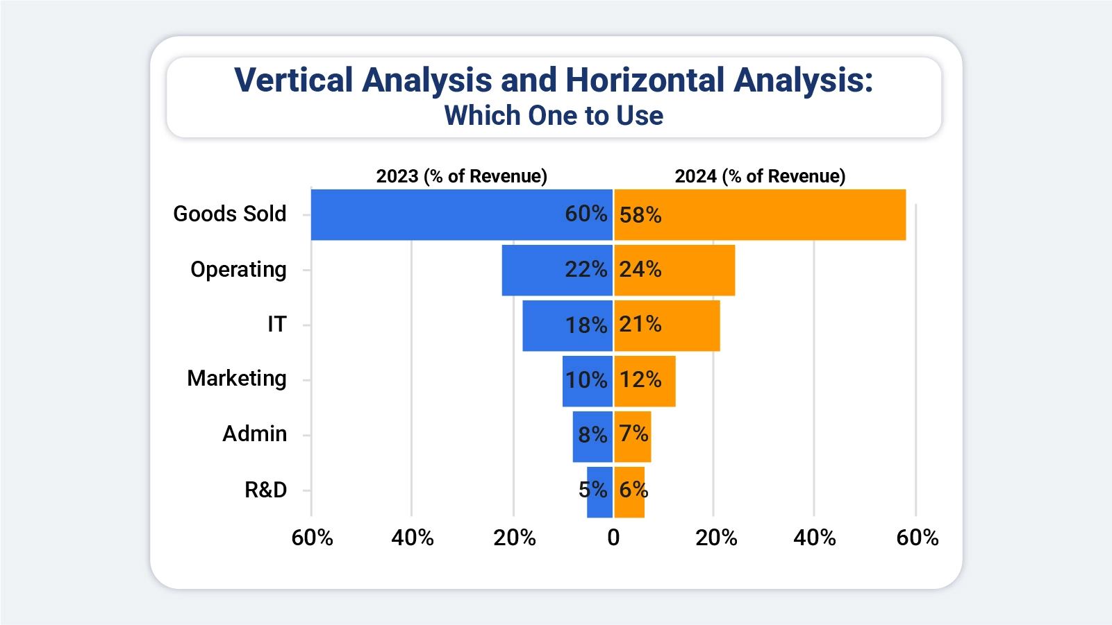
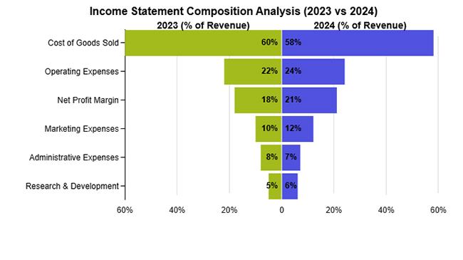
This example shows how the percentage contribution of key income categories to total revenue shifted between the two years under review.

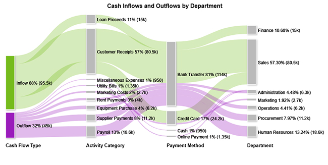
This example maps how cash inflows and outflows are distributed across business activities, payment methods, and organizational departments throughout a given period.
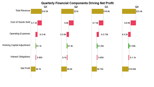
This example breaks down how revenue, production costs, and operating expenses each contributed to net profit results across individual quarters of the year.
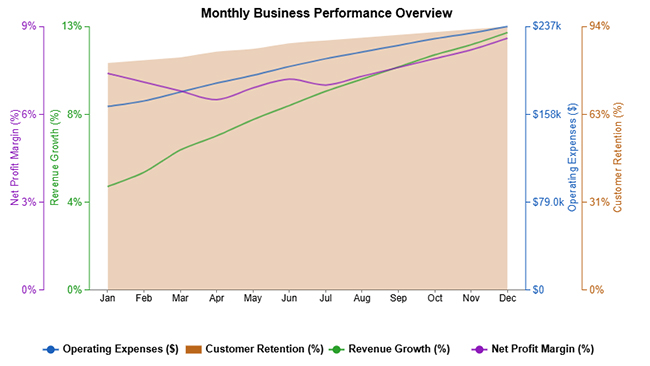
This example tracks key performance indicators, including revenue growth, operating expenses, customer retention, and net profit margin, across each month of the year.
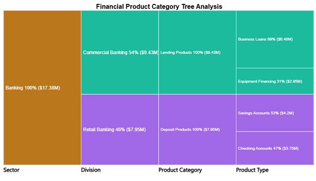
This example shows how various banking service lines each contribute proportionally to the institution’s total revenue.
Performing vertical and horizontal analysis in Excel helps you evaluate financial performance by comparing line items over time and understanding their proportion within a statement. Follow these steps to conduct an accurate analysis:
Begin by arranging your financial statements in Excel. Place different periods (e.g., years) in columns and list all line items like revenue, expenses, and profit in rows.
Calculate each line item as a percentage of a base figure, typically total revenue. Use formulas to divide each value by total revenue and multiply by 100. This helps you understand how each component contributes to overall performance.
Compare financial data across periods by calculating the percentage change from one period to another. Subtract the previous value from the current value, divide by the previous value, and multiply by 100 to identify growth or decline trends.
Use formulas like percentage calculations, growth rates, and difference formulas to automate your analysis. This ensures consistency and saves time when working with large datasets.
Use charts such as comparison bars or column charts to present your analysis clearly. For more advanced and visually engaging charts, you can use ChartExpo to simplify complex financial visualizations.
Analyze the results to identify key trends, cost structures, and performance changes over time. Focus on areas with significant increases or decreases to support better decision-making.
Include a final visualization, such as a tornado chart that highlights changes in financial components across periods.
This helps clearly present vertical proportions and horizontal trends, making it easier to compare performance and communicate insights effectively.
How much did you enjoy this article?


Calculate accounts receivable turnover ratio to measure credit collection speed, improve cash flow, and strengthen your financial strategy. Read on!

Change Management KPIs are the key to tracking adoption, performance, and ROI during transitions. Find out which metrics matter. Read on!

Data collection methods and techniques determine the quality of every insight you act on. Explore key approaches for gathering reliable data. Read on!


