Categories
Data doesn’t sit still. Businesses grow. Customers move. Job roles shift. Behind every change is a story. But if your system can’t remember what came before, that story vanishes. That’s where slowly changing dimensions come in.


In the data warehouse, these changes matter. A small update—like a job promotion or address change—could hold big meaning down the road. But if you overwrite the past, your analysis loses its depth. Slowly changing dimensions keep that history alive.
This guide explains how slowly changing dimensions work. We’ll break down each type, show you real examples, and walk through how to use them in Power BI.
You’ll learn how to structure your tables, build smart visualizations, and keep your historical data accurate and useful. You don’t need to be an engineer. You just need a plan.
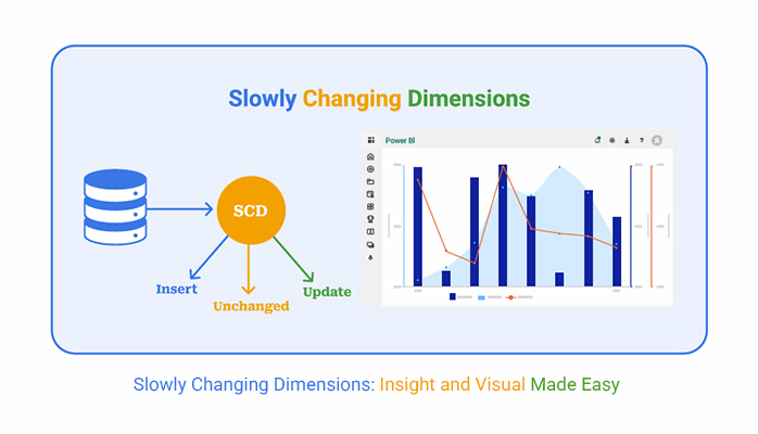
Definition: Slowly changing dimensions are fields in a dimension table that change over time but not often. Think of customer addresses, employee roles, or product categories. These details shift slowly, but when they do, the history matters.
In a data warehouse, this structure usually includes a fact table vs a dimension table setup. Facts hold the numbers—sales, transactions, or quantities. Dimensions give context—names, locations, dates.
Let’s say Sarah moves from Austin to Houston. You can’t just update her record. That change has value. Maybe her purchases increased after the move. That’s insight you lose if the system forgets her Austin days. Slowly changing dimensions solve that. They give you a clean, organized way to track updates.
Without history, data is empty. That’s why slowly changing dimensions are critical.
They let you keep a timeline. You can see where customers started, what changed, and when. That’s essential for analysis. Whether you’re comparing current performance or spotting trends, knowing what came before gives you the edge.
They also help with data accuracy. You don’t overwrite valuable changes. Instead, you build on them. This structure supports data analysis with layers of meaning—past, present, and future all in one place.
And if you need to prove something for an audit or backtrack on a decision, that history is right there. You’re not guessing—you’re reporting with confidence.
There are five slow-changing dimension types, each offering a way to manage history.
Type 0: Retain Original
Type 1: Overwrite Changes
Type 2: Add New Row
Type 3: Add New Column
Type 4: Historical Table
Each type serves a purpose. Pick the one that fits your tracking goals and system limits.
Examples make these types real.
Type 0:
Type 1:
Type 2:
| ID | Emp_Name | Role | Start_Date | End_Date | Is_Current |
| 101 | Sarah | Analyst | 2023-01-01 | 2024-06-01 | FALSE |
| 102 | Sarah | Manager | 2024-06-01 | NULL | TRUE |
Type 3:
| Cust_ID | Cust_Name | Current_City | Previous_City |
| 501 | Sarah | Houston | Austin |
Type 4:
Main Table (Customer):
| Cust_ID | Name | City |
| 501 | Sarah | Houston |
History Table (Customer_History):
| Cust_ID | Name | City | Effective_Date |
| 501 | Sarah | Houston | 2022-01-01 |
| 501 | Sarah | Austin | 2023-03-01 |
| 501 | Sarah | San Diego | 2024-06-01 |
SCD tables are how you track change without losing your base. You build them with a few smart choices.
Find Dimension Attributes That May Vary With Time
Insert SCD Type 2 Metadata Columns
ETL Workflow Design
Load To the Data Warehouse
Done right, this setup keeps your timeline sharp.
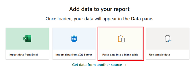
Power BI supports slowly changing dimensions through built-in tools.
Use Power Query to detect changes in data.
Use DAX to build calculations that respond to time shifts.
Use Dataflows to automate the update process across tables.
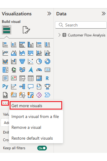
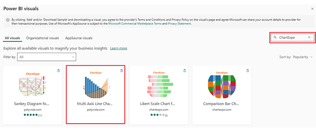
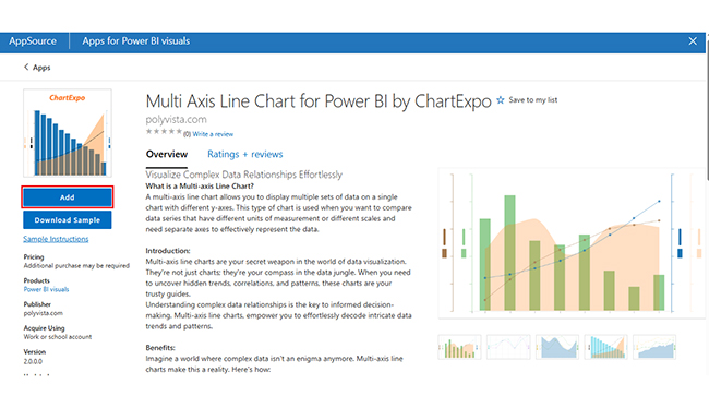
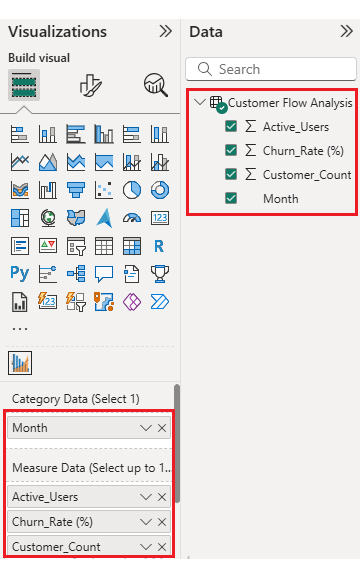
Want better visuals? Pair Power BI with ChartExpo. It works with no code. Connect your SCD table, choose a chart, and get a clean picture of the data.
You can even create a measure in Power BI to flag active rows—just filter where is_current = TRUE. That gives you clear, up-to-date reporting while keeping the full history available in the background.
Why use ChartExpo?
ChartExpo turns data visualization into something anyone can use. No code. No headaches.
It works as a chart maker that connects right into Power BI. Once your slowly changing dimensions are loaded, you choose from a set of charts designed for tracking change over time—multi-axis lines, stacked bars, radar charts, scatter charts, and more.
ChartExpo helps you tell the story of your data clearly. Trends, spikes, shifts—all visible in seconds. It’s fast, flexible, and built for teams who want real answers.
And yes, you can try it free for 7 days.
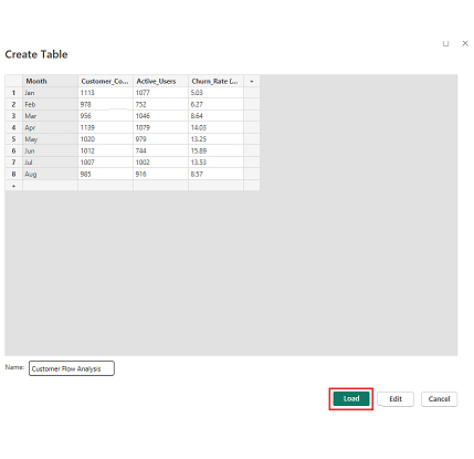
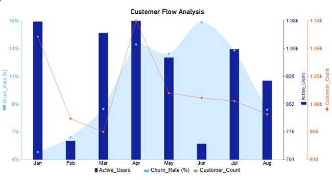
Here’s a Dataset
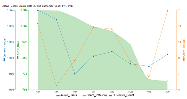
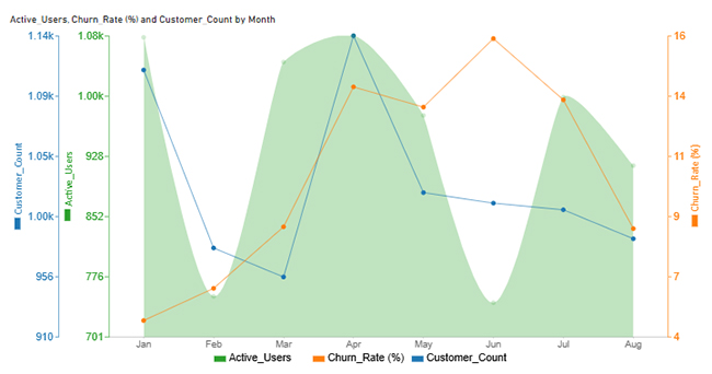
Before diving into visualization, let’s break down the data. This table tracks monthly user trends across Customer Count, Active Users, and Churn Rate. Why does it matter? Each shift tells a story.
April’s spike suggests a major campaign or product change. June’s dip might reflect disengagement. Tracking these metrics month-by-month gives a window into behavior and retention. Slowly changing dimensions don’t just capture values—they expose patterns over time.
| Month | Customer_Count | Active_Users | Churn_Rate (%) |
| Jan | 1113 | 1077 | 5.03 |
| Feb | 978 | 752 | 6.27 |
| Mar | 956 | 1046 | 8.64 |
| Apr | 1139 | 1079 | 14.03 |
| May | 1020 | 979 | 13.25 |
| Jun | 1012 | 744 | 15.89 |
| Jul | 1007 | 1002 | 13.53 |
| Aug | 985 | 916 | 8.57 |
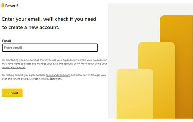
Power BI Login:

You need smart methods to manage change.
These small changes make a big difference in clarity and consistency.
Slowly changing dimension type 2 is popular for a reason.
It records the full history without overwriting anything.
It supports detailed data analytics, tracking trends, user journeys, and behavior shifts.
It works well with visual analytics, especially in tools like Power BI.
You get better filters. Use is_current or date ranges to split past and present.
It scales for large datasets, making it ideal for enterprise use.
Apply SCD Type 2 only where history matters. Not every field needs it.
Use dimensionality reduction if your table gets too wide.
Combine with ChartExpo to get clear visual comparisons.
Validate your pipelines often. Could you not assume they’re still accurate?
Track across environments using the Power BI deployment pipeline.
No method is perfect.
Slowly changing dimensions increase storage, especially Type 2.
ETL logic gets more detailed. That takes time and planning.
Large SCD tables may slow down performance, especially in visuals.
It can be hard to see change without a tool like ChartExpo.
Type 3 only keeps one previous value, limiting insight.
Sometimes the trade-off is worth it. Sometimes it’s not.
Power BI dashboard vs report differences also affect how the data loads and performs.
Type 1 overwrites old values. Type 2 adds new rows for each change. Type 3 uses new columns to store past values.
Type 1 forgets the past. Type 2 keeps every version, giving you a full timeline for analysis.
Slowly changing dimensions don’t just store values. They store time, truth, and transformation. Every record holds a story—when it changed, how often, and what came before.
This guide showed you how to set that up. From SCD types to Power BI visuals, you now know how to track change with purpose. The data isn’t flat anymore—it’s alive.
Use it. Build trust in your reports. Let your numbers speak clearly. And above all, never let valuable history go unrecorded.
The future makes more sense when the past is remembered. That’s the power of slowly changing dimensions.
How much did you enjoy this article?


Calculate accounts receivable turnover ratio to measure credit collection speed, improve cash flow, and strengthen your financial strategy. Read on!

Change Management KPIs are the key to tracking adoption, performance, and ROI during transitions. Find out which metrics matter. Read on!

Data collection methods and techniques determine the quality of every insight you act on. Explore key approaches for gathering reliable data. Read on!


