• Home
  • Tools dropdown img
    • Spreadsheet Charts

      • ChartExpo for Google Sheets
      • ChartExpo for Microsoft Excel
    • Power BI Charts

      • Power BI Custom Visuals by ChartExpo
    • Word Cloud

  • Charts dropdown img
    • Chart Category

      • Bar Charts
      • Circle Graphs
      • Column Charts
      • Combo Charts
      • Comparison Charts
      • Line Graphs
      • PPC Charts
      • Sentiment Analysis Charts
      • Survey Charts
    • Chart Type

      • Box and Whisker Plot
      • Clustered Bar Chart
      • Clustered Column Chart
      • Comparison Bar Chart
      • Control Chart
      • CSAT Survey Bar Chart
      • CSAT Survey Chart
      • Dot Plot Chart
      • Double Bar Graph
      • Funnel Chart
      • Gauge Chart
      • Likert Scale Chart
      • Matrix Chart
      • Multi Axis Line Chart
      • Overlapping Bar Chart
      • Pareto Chart
      • Radar Chart
      • Radial Bar Chart
      • Sankey Diagram
      • Scatter Plot Chart
      • Slope Chart
      • Sunburst Chart
      • Tornado Chart
      • Waterfall Chart
      • Word Cloud
    • Google Sheets
      Microsoft Excel
  • Services
  • Pricing
  • Contact us
  • Blog
  • Support dropdown img
      • Gallery
      • Videos
      • Contact us
      • FAQs
      • Resources
    • Please feel free to contact us

      atsupport@chartexpo.com

Categories
All Data Visualizations Data Analytics Surveys
Add-ons/
  • Google Sheets
  • Microsoft Excel
  • Power BI
All Data Visualizations Data Analytics Surveys
Add-ons
  • Google Sheets
  • Microsoft Excel
  • Power BI

We use cookies

This website uses cookies to provide better user experience and user's session management.
By continuing visiting this website you consent the use of these cookies.

Ok

ChartExpo Survey


Home > Blog > Power BI

Power BI Data Flows: Practical Use Cases for Businesses

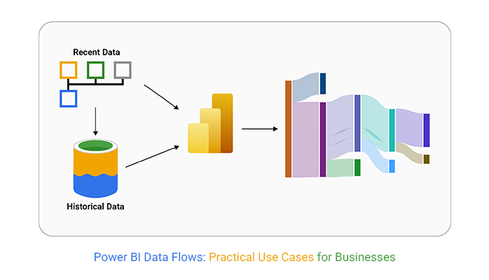
Power BI data flows allow users to automate data transformation and disintegration from multiple sources. This way, the user will be able to create reusable data models for consistent analysis. It helps streamline data preparation and enhance reporting efficiency.

Power BI data flows

In this guide, you’ll discover what data flows in Power BI are, why data flows in Power BI are important, and how Power BI data flows work. You’ll also discover how to create a data flow in Power BI, and how to utilize data flows in specific scenarios in Power BI.

Table of Contents:

  1. What are Data flows in Power BI?
  2. Why are Data Flows in Power BI so Important?
  3. How Power BI Data Flows Work?
  4. How to Create a Dataflow in Power BI?
  5. Power BI Data Flows Practical Use Case
  6. Advantages of Data flows in Power BI
  7. Power BI Data flows Limitations
  8. Best Practices for Microsoft Power BI Data flows
  9. FAQs
  10. Wrap Up

What are Data flows in Power BI?

Definition: Data flows in Power BI are data preparation features that allow users to extract, transform, and load (ETL) data from multiple sources into Power BI.

It helps automate data transformation processes and create reusable, standardized data models.
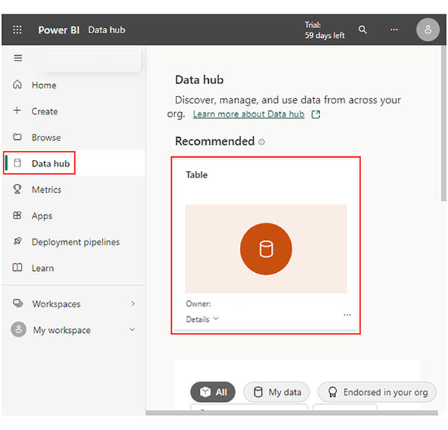
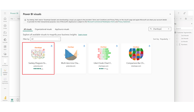
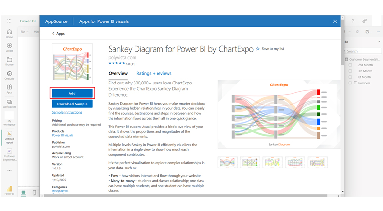
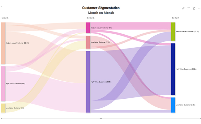
Why are Data Flows in Power BI so Important?

  • Streamlined Data Preparation: Data flows in Power BI automate the extraction, transformation, and loading (ETL) of data from multiple sources. The automation reduces manual effort and minimizes errors and inconsistencies in the data preparation process.
  • Improved Performance: Data flows lower computational load on Power BI reports. That’s done by handling data transformations outside of the report layer. This will, in turn, lead to faster report generation and better efficient data processing.
  • Single Source of Truth: Data flows ensure that all users are working with up-to-date, accurate data by maintaining a single source of truth. It enhances decision-making and ensures that analytics are based on consistent and trustworthy information.
  • Reusable and Consistent Data Models: Data flows give users the room to create centralized, reusable models that can be applied across multiple dashboards and reports. It ascertains consistency in data usage across the organization.

How Power BI Data Flows Work?

  1. Connect to Data Sources: Dataflow gives users the room to connect to multiple data sources like cloud services, files, and databases.
  2. Data Extraction: Data is extracted from these sources into the Power BI for more processing.
  3. Data Transformation: The Power Query helps users clean, filter, and transform data without writing code.
  4. Centralized Storage: The transformed data is stored in centralized dataflow storage within the Power BI service.
  5. Automated Refresh: Data flows can be scheduled for automatic refreshes to ascertain up-to-date data.
  6. Reusable Data: The processed data can be reused in multiple Power BI dashboards and reports.
  7. Simplified ETL: The process automates the ETL (Extract, Transform, Load) workflow, and reduces manual work and errors.

How to Create a Dataflow in Power BI?

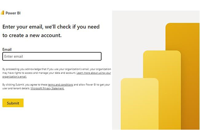
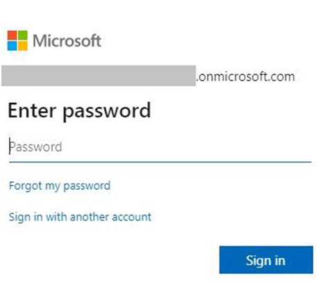
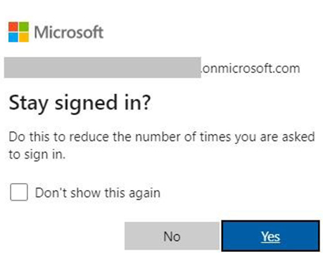
Step 1: Log into Power BI Service (app.powerbi.com).

Step 2: Navigate to the preferred workspace where you want to create the data flow.

Step 3: In the workspace, click on the “Create” button and select “Dataflow.”

Step 4: Click “Add new tables” and choose the data sources you want to connect to. It could be databases, cloud services, or files.

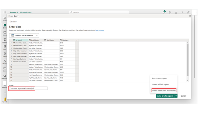
Step 5: Use the Power Query Editor to clean, filter, and transform the data. Apply the right transformations like merging tables, adding calculated columns, or removing duplicates.

Step 6: After the transformations, click “Save & Close” to save the data flow. After that, load the data into Power BI.

Step 7: To keep the data up-to-date automatically, set up a refresh schedule.

Power BI Data Flows Practical Use Case

Lets say you have integrated your data using Power BI data flows and now you wants to visualize it. This section shows you some Power BI design ideas. It also shows you how to use a compelling Power BI dashboard vs report to represent your Power BI datasets.

  • Stage 1: Log into Power BI, enter your email, and click the “Submit” button.
Power BI data flows
  • You’ll be redirected to a Microsoft account. After that, enter your password, and click “Sign in.”
Power BI data flows
  • You can opt to stay signed in.
Power BI data flows
Power BI data flows
  • Stage 2: Create a Data Set and Select the Data Set to Use in the Sankey Chart.
  • Navigate to the left-side menu, and click on the “Create” option. You’ll have to select “Paste or manually enter data.”
Power BI data flows
  • The Customer Segmentation data below will be used for this illustration.
Power BI data flows
Power BI data flows
  • Paste the data table above into the “Power Query” window. After that, select the third “Create” option.
Power BI data flows
  • Navigate to the left-side menu, and click on the “Data Hub” option. Power BI populates the data set list. If no data set has been created, you’ll get an error message.
Power BI data flows
  • Click on the “Create report” dropdown.
Power BI data flows
  • To add the Power BI Sankey Diagram Extension by ChartExpo, you’ll have to use an add-in or Power BI visual from AppSource. Navigate to the right side of the Power BI dashboard. After that, open the Power BI Visualizations panel. Click the ellipsis symbol (…) to import the Power BI Sankey Diagram extension by ChartExpo.
  • In the menu that opens, select the “Get more visuals” option.
Power BI data flows
  • Enter “ChartExpo” in the highlighted search box. You’ll see the “Sankey Diagram for Power BI by ChartExpo.”
Power BI data flows
  • After that, click on the Sankey Diagram and also click the highlighted “Add” button.
Power BI data flows
  • Power BI will add the “Sankey Diagram for Power BI by ChartExpo” icon in the visualization panel.
Power BI data flows
  • To draw a Sankey Diagram with ChartExpo’s Power BI extension, select the “Sankey Diagram for Power BI by ChartExpo” icon in the visualization panel. You’ll have to select the fields to use in the Sankey chart. After that, provide your email address or a ChartExpo license key. Add the key under the Visual section. At this point, you’ll see the Sankey Chart.
Power BI data flows
  • You can add the top header text in the chart under the General section.
Power BI data flows
  • After that, click on General and add the top header text.
Power BI data flows
  • There’s the option to disable the percentage value.
Power BI data flows
  • You can set the Level Labels on the top position.
Power BI data flows
  • You can change the Nodes color by following the steps below:
Power BI data flows
  • Here’s the final look at the Sankey Chart.
Power BI data flows

The strategy used for this Power BI data model can be applied when performing other similar data analytics and data visualizations like self-service analytics, healthcare analytics, and visual analytics.

Insights

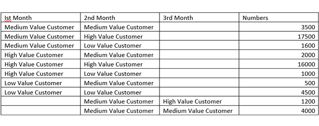
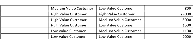
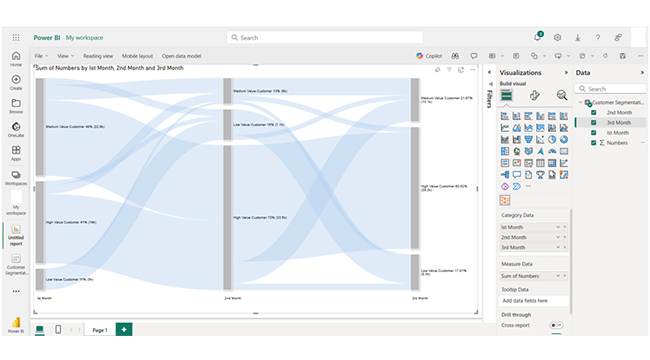
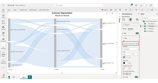
This chart tracks customer transitions across value categories over three months. High-value customers dominate revenue, and the retention is consistent with some downgrades.

Medium-value customers shift between higher and lower tiers, and that reflects volatility. Low-value customers usually remain in their category but occasionally upgrade — that shows potential growth opportunities in targeted engagement.

Advantages of Data flows in Power BI

  1. Centralized Data Management: Data flows enable centralized management of data transformations, and reduce redundancy. It also ensures consistency across multiple dashboards and reports.
  2. Reusability: Transformed data models can be reused in multiple Power BI reports, and that eliminates the need to repeat the same transformations and ensures consistency in data analysis.
  3. Automation: Data flows automate the ETL (Extract, Transform, Load) process. It reduces manual effort and minimizes errors.
  4. Improved Performance: Offloading data transformations to the dataflow layer helps in optimizing report performance. It also gives room for faster loading and processing of large datasets.

Power BI Data flows Limitations

  1. Performance Bottlenecks: Handling large datasets (or complex transformations) may lead to slower processing and refresh times.
  2. No Direct Live Connections: Data flows only support import mode. They do not allow direct live connections to underlying data sources.
  3. Limited Debugging Tools: Troubleshooting complex data flows is challenging — that’s due to limited error-reporting and debugging capabilities.
  4. Storage Constraints: Data flows are subject to storage limits, and that can restrict the size of datasets that can be processed.

Best Practices for Microsoft Power BI Data flows

Whether you’re a newbie or a Power BI advanced user, here are some Power BI best practices to help you get the most from your data interpretation process.

  • Plan Data flows Strategically: You have to design data flows to centralize reusable data transformations and reduce duplication across reports.
  • Avoid Overloading Data flows: You have to keep data flows focused on specific tasks. This will help prevent performance bottlenecks and complexity.
  • Leverage Linked Entities: Use linked entities to reference existing data flows. That promotes modularity and consistency in data usage.
  • Optimize Transformations: Always avoid unnecessary steps that could slow processing when performing data transformations in Power Query.

FAQs

What is the difference between data flow and dataset in Power BI?

A dataflow is a reusable ETL tool for centralizing and transforming data. A dataset, on the other hand, is a structured collection of data ready for visualization and analysis in Power BI.

How do you create a new data flow in Power BI?

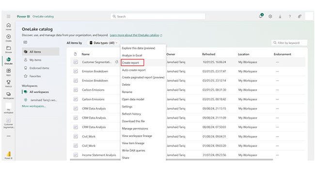
Navigate to a workspace, and select “Create” > “Dataflow,” connect to data sources, transform data in Power Query, and save it.

How do you enable data flow in Power BI?

You have to ensure you have a workspace, access Power BI Service, and create a data flow. To create a dataflow, select “Create” > “Dataflow” from the workspace options.

Wrap Up

Power BI data flows are ETL tools used for extracting, transforming, and loading data from multiple sources. This way, users can create reusable and centralized data models for analysis.

Data flows automate data preparation, ensure consistency, centralize data management, and improve performance. It also enables scalable, efficient, and reliable analytics across an organization.

To get the most out of the Microsoft Power BI data flows, you have to plan data flows strategically. You also have to regularly monitor performance. Periodically review and optimize data flows to ascertain they meet your business needs.

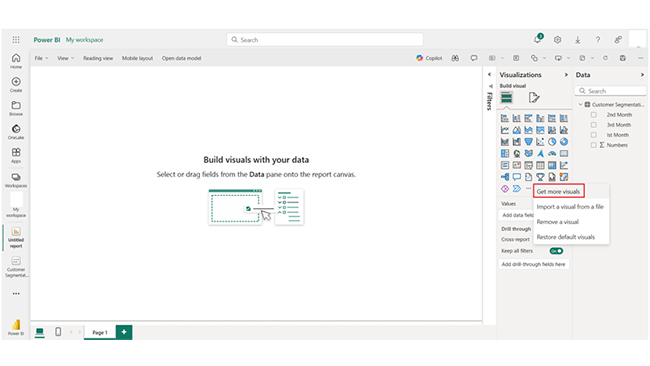
By following the steps in this guide, you’ll be able to use the workspace in Power BI, and also create visualizations like the Sankey chart.

Now you know what the Power BI dataflow is, how will you incorporate it into your data analysis process?

How much did you enjoy this article?

PBIAd1
Start Free Trial!
148169

Related articles

next previous
Power BI12 min read

Power BI Group By Guide for Effective Data Insights

Learn how Power BI Group By helps you aggregate data, clarify trends, and create reports by grouping values to make large datasets manageable & insightful.

Power BI12 min read

How to Create Sankey Diagram in Microsoft Power BI?

Learn How to Create Sankey Diagram in Microsoft Power BI using Desktop & Web Service. What they are and how to use them effectively.

Power BI8 min read

Power BI Artificial Intelligence: Insights Using Visuals

Discover all there is to know about the Power BI artificial intelligence. You'll also discover how AI is used in Power BI, and how to use it for analysis and more.

Power BI9 min read

Budgeting in Healthcare: Use Visuals to Spot Budget Gaps

This guide helps you discover what budgeting in healthcare is. You'll also discover the factors that affect hospital budgets and types of budgeting in healthcare.

Power BI9 min read

Predictive Analytics in Power BI for Making Insightful Visuals

This guide shows you everything you need to know about Predictive Analytics in Power BI. It also shows you how it works, and how to interpret the results.

ChartExpo logo

Turn Data into Visual
Stories

CHARTEXPO

  • Home
  • Gallery
  • Videos
  • Services
  • Pricing
  • Contact us
  • FAQs
  • Privacy policy
  • Terms of Service
  • Sitemap

TOOLS

  • ChartExpo for Google Sheets
  • ChartExpo for Microsoft Excel
  • Power BI Custom Visuals by ChartExpo
  • Word Cloud

CATEGORIES

  • Bar Charts
  • Circle Graphs
  • Column Charts
  • Combo Charts
  • Comparison Charts
  • Line Graphs
  • PPC Charts
  • Sentiment Analysis Charts
  • Survey Charts

TOP CHARTS

  • Sankey Diagram
  • Likert Scale Chart
  • Comparison Bar Chart
  • Pareto Chart
  • Funnel Chart
  • Gauge Chart
  • Radar Chart
  • Radial Bar Chart
  • Sunburst Chart
  • see more
  • Scatter Plot Chart
  • CSAT Survey Bar Chart
  • CSAT Survey Chart
  • Dot Plot Chart
  • Double Bar Graph
  • Matrix Chart
  • Multi Axis Line Chart
  • Overlapping Bar Chart
  • Control Chart
  • Slope Chart
  • Clustered Bar Chart
  • Clustered Column Chart
  • Box and Whisker Plot
  • Tornado Chart
  • Waterfall Chart
  • Word Cloud
  • see less

RESOURCES

  • Blog
  • Resources
  • YouTube
SIGN UP FOR UPDATES

We wouldn't dream of spamming you or selling your info.

© 2025 ChartExpo, all rights reserved.