• Home
  • Tools dropdown img
    • Spreadsheet Charts

      • ChartExpo for Google Sheets
      • ChartExpo for Microsoft Excel
    • Power BI Charts

      • Power BI Custom Visuals by ChartExpo
    • Word Cloud

  • Charts dropdown img
    • Chart Category

      • Bar Charts
      • Circle Graphs
      • Column Charts
      • Combo Charts
      • Comparison Charts
      • Line Graphs
      • PPC Charts
      • Sentiment Analysis Charts
      • Survey Charts
    • Chart Type

      • Box and Whisker Plot
      • Clustered Bar Chart
      • Clustered Column Chart
      • Comparison Bar Chart
      • Control Chart
      • CSAT Survey Bar Chart
      • CSAT Survey Chart
      • Dot Plot Chart
      • Double Bar Graph
      • Funnel Chart
      • Gauge Chart
      • Likert Scale Chart
      • Matrix Chart
      • Multi Axis Line Chart
      • Overlapping Bar Chart
      • Pareto Chart
      • Radar Chart
      • Radial Bar Chart
      • Sankey Diagram
      • Scatter Plot Chart
      • Slope Chart
      • Sunburst Chart
      • Tornado Chart
      • Waterfall Chart
      • Word Cloud
    • Google Sheets
      Microsoft Excel
  • Services
  • Pricing
  • Contact us
  • Blog
  • Support dropdown img
      • Gallery
      • Videos
      • Contact us
      • FAQs
      • Resources
    • Please feel free to contact us

      atsupport@chartexpo.com

Categories
All Data Visualizations Data Analytics Surveys
Add-ons/
  • Google Sheets
  • Microsoft Excel
  • Power BI
All Data Visualizations Data Analytics Surveys
Add-ons
  • Google Sheets
  • Microsoft Excel
  • Power BI

We use cookies

This website uses cookies to provide better user experience and user's session management.
By continuing visiting this website you consent the use of these cookies.

Ok

ChartExpo Survey


Home > Blog > Data Analytics

Fact Table vs. Dimension Table: What’s the Difference?

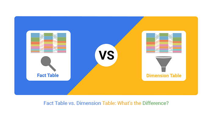
Fact table vs. dimension table: the heart and soul of any data warehouse.

Fact Table vs Dimension Table

Imagine a bustling city. The fact table is akin to the city’s pulsating intersections, where the action happens in sales, transactions, and events. It’s where the raw numbers and measurements that track performance are stored, brimming with quantitative data.

Now, picture the dimension table as the city’s street signs and landmarks. It provides context to the bustling intersections with descriptive attributes like dates, product details, and customer information.

In the world of data, these two types of tables are fundamental. The fact table vs. dimension table debate is not about competition. Rather, it’s about understanding their unique roles in data analysis. Fact tables are numeric workhorses, often massive, containing records like prices, quantities, and counts. They’re the backbone of business intelligence, offering the cold, hard stats that companies rely on to make informed decisions.

On the other side, dimension tables are the storytellers. They might not have the hefty numbers. But they hold the keys to categorical and descriptive information that breathes life into those numbers. Without dimension tables, fact tables are like a spreadsheet full of figures with no headings confusing and meaningless.

The synergy between the fact table vs. dimension table is undeniable. They complement each other, with fact tables answering the “how much” and “how many” questions. On the other hand, dimension tables provide the “who,” “what,” “where,” and “when.”

In the grand scheme of data warehousing, one cannot function without the other.

So, let’s demystify the fact table vs. the dimension table.

Table of Contents:

  1. What is the Fact Table vs. the Dimension Table?
  2. Fact Table vs. Dimension Table: Key Differences
  3. What are the Types of Fact vs. Dimension Table?
  4. How to Choose the Right Program Table vs. Dimension Table?
  5. How to Visualize Your Data in Power BI?
  6. What are the Benefits of the Fact Table vs. the Dimension Table?
  7. What are the Limitations of Fact Table and Dimension Table?
  8. Wrap Up

First…

What is the Fact Table vs. the Dimension Table?

In the context of data warehousing and business intelligence, fact tables and dimension tables are fundamental components of a star schema or snowflake schema. Here’s a detailed explanation of each:

What is a Fact Table?

Definition: A fact table is a fundamental component of a data warehouse. It contains quantitative data about a business process or event, such as sales transactions or customer interactions. Fact tables typically consist of numerical values known as measures, along with foreign keys that link to dimension tables.

Fact tables facilitate analytical queries and reporting. How? By enabling users to analyze and gain insights into business performance and behavior based on various dimensions and measures.

What is a Dimension Table?

Definition: A dimension table is a core element of a data warehouse structure. It contains descriptive analytics that provides context to the quantitative data stored in fact tables. Dimension tables often represent entities such as customers, products, time, or geography.

Dimension tables help organize and structure data meaningfully, facilitating effective analysis and reporting. They serve as reference points for querying and filtering data in conjunction with fact tables. This enables users to gain insights into various business performance and behavior aspects.

Fact Table vs. Dimension Table: Key Differences

In a data warehouse, the fact table and dimension table play crucial roles in organizing and analyzing data. Understanding the difference between these two types of tables is essential for effective data management and analysis.

Here are the differences between the fact table vs. dimension table.

Aspect Fact Table Dimension Table
Definition Contains quantitative data related to business processes Contains descriptive attributes providing context to data
Primary Content Measures or numerical data Descriptive attributes
Usage Used for analyzing and aggregating data Used for filtering and categorizing data
Relationship Typically has foreign keys linking to dimension tables Often linked to fact tables via foreign key relationships
Granularity Granular, with many records for each business transaction Coarser granularity, with fewer unique records
Example Sales transactions, inventory levels, financial metrics Customer details, product attributes, time dimensions

What are the Types of Fact Table vs. Dimension Table?

Here are some types of fact tables and dimension tables:

Types of Fact Tables:

  • Transactional Fact Table: Transactional fact tables store detailed, atomic-level data representing individual business transactions. These tables typically contain a large number of records and capture various events or activities as they occur. Examples include sales transactions, order placements, or service requests.
  • Periodic Snapshot Fact Table: Periodic snapshot fact tables capture data at regular intervals, such as daily, weekly, or monthly. Examples include daily sales summaries, weekly inventory levels, or monthly customer activity reports.
  • Accumulating Snapshot Fact Table: Accumulating snapshot fact tables track the progress or lifecycle of a process or workflow. They capture key milestones or events as they occur and maintain a record of the status or progress. Examples include order fulfillment workflows, project management timelines, or customer onboarding processes.

Types of Dimension Tables:

  • Conformed Dimension Table: Shared dimension tables that are consistent and standardized across multiple data marts or data warehouses within an organization.
  • Junk Dimension Table: This table consolidates low-cardinality attributes or flags that do not fit well in other dimension tables. It reduces the number of joins and simplifies queries.
Junk Dimension Table for Fact Table vs Dimension Table
  • Role-Playing Dimension Table: Dimension table that serves multiple roles in a single fact table. These tables often represent different perspectives or contexts within the same analytical scenario.
  • Degenerate Dimension Table: Dimension table derived from fact table attributes. Typically, degenerate dimension tables contain transactional details or identifiers not associated with any other dimension.
Degenerate Dimension Table for Fact Table vs Dimension Table

How to Choose the Right Program Table vs. Dimension Table?

Are you looking to select the appropriate program for fact and dimension tables? Consider the following factors to ensure they meet your organization’s needs effectively.

For Fact Tables:

  • Understand data requirements: Seek clarity on the data types to be stored in the fact table and its purpose in analysis.
  • Consider granularity: Determine the level of detail needed in the data and how it aligns with reporting and analysis objectives.
  • Assess performance needs: Evaluate the expected volume of data and the system’s capability to handle it efficiently.
  • Evaluate reporting requirements: Understand the reporting tools and techniques used to access and analyze data stored in the fact table.

For Dimension Tables:

  • Identify dimension attributes: Define the key attributes that characterize the data and will be used for analysis and reporting.
  • Consider data reusability: Assess whether dimension attributes can be reused across different analyses and reports to enhance consistency.
  • Evaluate data complexity: Analyze the complexity of dimension data and ensure it can be effectively organized and managed.
  • Account for dimension usage: Understand how dimensions will be used with fact tables to support various analytical queries and reporting needs.

How to Visualize Your Data in Power BI?

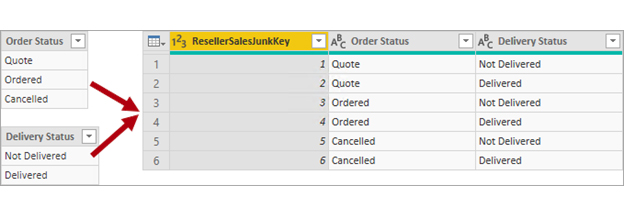
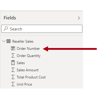
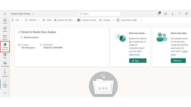
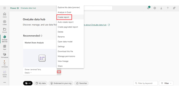
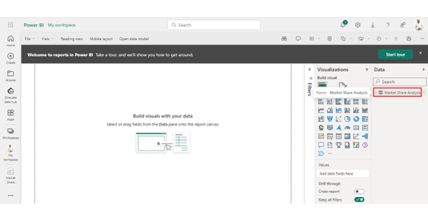
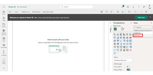
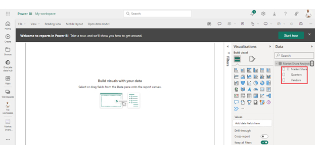
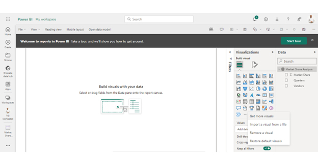
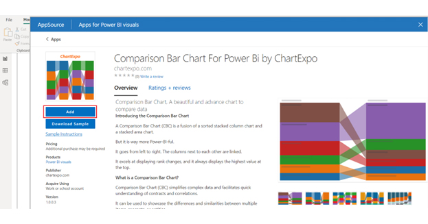
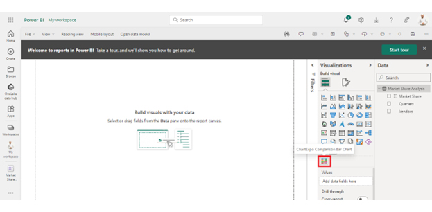
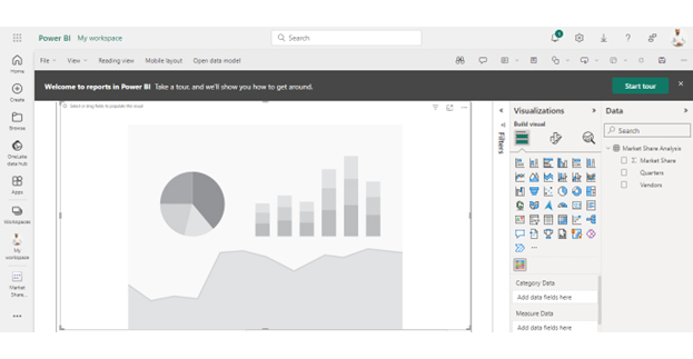
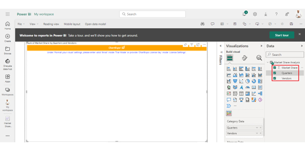
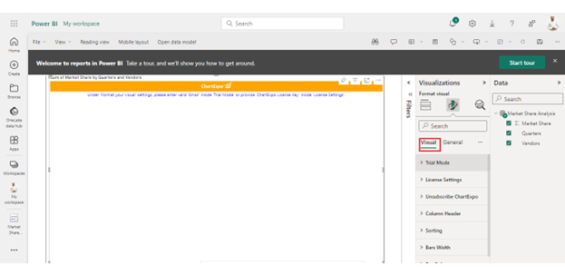
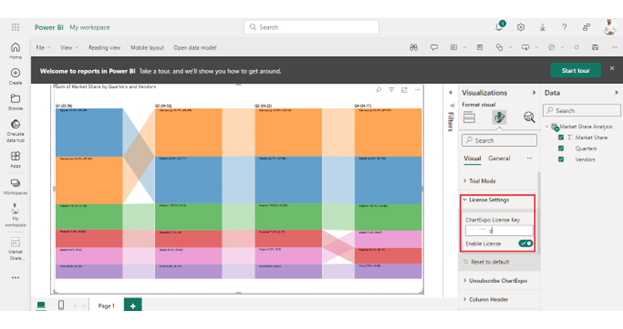
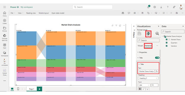
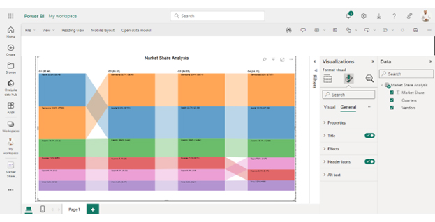
Follow these steps to visualize data in Power BI.

Stage 1: Logging in to Power BI

  • Log in to Power BI.
  • Enter your email address and click the “Submit” button.
Enter email to login to Power BI
  • You are redirected to your Microsoft account.
  • Enter your password and click “Sign in“.
Enter Password to login to Power BI
  • You can choose whether to stay signed in.
Click on stay signed in
  • Once done, the Power BI home screen will open.

Stage 2: Creating a Data Set and Selecting the Data Set to Use in Your Chart

    • Go to the left-side menu and click the “Create” button.
    • Select “Paste or manually enter data“.
select Paste or manually enter data in Power BI ce487
  • We’ll use the sample data below for this example.
Quarters Vendors Market Share
Q1 Samsung 27.69
Q1 Apple 28.45
Q1 Xiaomi 11.8
Q1 Huawei 6.53
Q1 Oppo 5.3
Q1 Vivo 4.19
Q2 Samsung 28.14
Q2 Apple 27.58
Q2 Xiaomi 12.62
Q2 Huawei 6.17
Q2 Oppo 5.5
Q2 Vivo 4.21
Q3 Samsung 28.45
Q3 Apple 27.71
Q3 Xiaomi 12.9
Q3 Huawei 6
Q3 Oppo 5.29
Q3 Vivo 4.17
Q4 Samsung 27.97
Q4 Apple 27.62
Q4 Xiaomi 12.68
Q4 Huawei 5.17
Q4 Oppo 6.07
Q4 Vivo 4.66
  • Paste the above data table in the Power Query Window.
  • Select the “Create a dataset only” option.
Create Dataset Only After Learning Fact Table vs Dimension Table
  • On the left-side menu, click “Data Hub“.
  • Power BI populates the data set list. (If you have not created a data set, refer to the Error! Reference source not found section).
Data Hub Only After Learning Fact Table vs Dimension Table
  • Click on the “Create a report” dropdown.
Create a Report After Learning Fact Table vs Dimension Table
  • Click on Market Share Analysis:
Click Market Share Analysis After Learning Fact Table vs Dimension Table
  • Click the “Expand All” button.
Click Expand All After Learning Fact Table vs Dimension Table
  • You can see your chart metrics:
Chart Metrics After Learning Fact Table vs Dimension Table
  • Click on “Get more visuals“.
Get More Visuals After Learning Fact Table vs Dimension Table
  • Search for ChartExpo and select the Comparison Bar Chart:
Click Comparison Bar Chart Icon After Learning Fact Table vs Dimension Table
  • Click the “Add” button.
Click Add Button After Learning Fact Table vs Dimension Table
  • You can now see the Comparison Bar Chart in the visualizations list.
See Visualizations List After Learning Fact Table vs Dimension Table
  • Expand your chart space.
Expand Chart Space After Learning Fact Table vs Dimension Table
  • Select the metrics of your data:
Select Metrices After Learning Fact Table vs Dimension Table
  • Click the second icon of Format Visuals and click on Visual:
Click Format Visuals After Learning Fact Table vs Dimension Table
  • In Visual, click License Settings, add the key, and enable the license.
  • After adding the key, you can see the comparison bar chart.
Add License Key After Learning Fact Table vs Dimension Table
  • Click the General tab to add the header text.
Add Header Text After Learning Fact Table vs Dimension Table
  • The final Comparison Bar Chart in Power BI will appear as below.
Final Fact Table vs Dimension Table

Insights

  • Samsung and Apple are the two leading vendors in market share, with Samsung in the lead.
  • Xiaomi is increasing its market share, while Huawei is decreasing its market share.
  • Oppo and Vivo have maintained a consistent market share.
  • There was a shift between Huawei and Oppo in the last quarter.

What are the Benefits of a Fact Table vs. a Dimension Table?

Understanding the benefits of fact table vs. dimension table helps to optimize data storage and analysis for better decision-making.

Benefits of Fact Tables:

  • Quantitative analysis: Fact tables facilitate in-depth quantitative analysis by storing detailed numerical data on business transactions or events.
  • Performance: Fact tables’ optimized design offers faster query performance, enabling efficient data retrieval for analytical processing.
  • Granularity: Fact tables allow data to be stored at a granular level, capturing fine-grained details that support detailed analysis and reporting.
  • Decision-making: By providing comprehensive and accurate data, fact tables empower decision-makers with insights for informed decision-making processes.

Benefits of Dimension Tables:

  • Contextual information: Dimension tables provide contextual information about the data stored in fact tables, enhancing the understanding of analytical results.
  • Data exploration: Dimension tables enable users to explore data from different perspectives, facilitating deeper insights and exploration of relationships.
  • Consistency: Dimension tables ensure consistency in data attributes across various analytical queries and reports, enhancing data integrity and reliability.
  • Reporting flexibility: You can create customized reports tailored to specific business requirements and user preferences.

What are the Limitations of the Fact Table vs. the Dimension Table?

While fact tables vs. dimension tables offer numerous benefits, they also have limitations. Consider the limitations below when designing your data models and analytics processes.

Limitations of Fact Tables:

  • Limited context: Fact tables primarily store numerical data related to transactions or events. They lack contextual information that may be crucial for analysis.
  • Data redundancy: In certain scenarios, fact tables may lead to data redundancy due to repetitive storage of dimensional keys and measures.
  • Query complexity: Complex queries involving multiple joins with dimension tables can lead to performance issues and increased query execution time.
  • Granularity challenges: Fact tables may struggle to maintain the right level of granularity. This leads to either overly detailed or insufficient data for analysis.

Limitations of Dimension Tables:

  • Limited scalability: Dimension tables may face scalability issues when dealing with a large number of attributes or rapidly changing data.
  • Data maintenance: Dimension tables require regular updates and maintenance to accommodate changes in dimension attributes, which can be time-consuming.
  • Inflexibility in hierarchy: Dimension tables may struggle to represent hierarchical relationships effectively, limiting the flexibility in analyzing data across different levels.
  • Storage overhead: Storing redundant attributes or maintaining multiple versions of dimension tables can increase storage overhead and complexity.

FAQs

What is the purpose of a dimension table in Power BI?

A dimension table in Power BI provides descriptive information or context to the data stored in fact tables. It helps categorize and organize data attributes such as time, geography, products, or customers, facilitating meaningful analysis and visualization.

Can a table be both fact and dimension?

Yes, a table can serve as both a fact and a dimension in a data model. This scenario is known as a factless fact table. It occurs when a table contains only keys or relationships to other dimension tables without numerical measures.

What is the relationship between dimension and fact table?

The relationship between dimension and fact tables is established through primary and foreign key relationships. Dimension tables provide context and descriptive attributes, while fact tables store numerical measures associated with business transactions or events.

Wrap Up

Understanding the distinction between fact and dimension tables is crucial for effective data modeling and analysis. Fact tables primarily contain quantitative measures or metrics associated with business transactions. Dimension tables provide descriptive context to these measures.

While fact tables store numerical data, dimension tables store descriptive attributes such as time, geography, products, or customers. This categorization allows for a structured organization of data. It facilitates meaningful analysis and visualization in business intelligence tools like Power BI.

Each table type has its unique benefits and limitations. Fact tables enable quantitative analysis, support performance optimization, and offer granularity in data. Dimension tables provide contextual information, aid in data exploration, and ensure consistency in reporting.

However, it’s important to note that a single table can sometimes serve as both a fact and dimension. This occurs in the case of factless fact tables. These tables bridge relationships between dimensions without containing numerical measures, adding complexity and flexibility to the data model.

In practice, selecting the appropriate table type depends on the specific data requirements, granularity, performance considerations, and reporting needs. Careful consideration ensures the creation of a robust and efficient data model that supports accurate analysis and decision-making.

How much did you enjoy this article?

GSAd1
Start Free Trial!
135424

Related articles

next previous
Data Analytics31 min read

Data Analysis Without Nonsense: Fix the Right Problem, Fast

Data analysis can mislead when metrics look right but outcomes fail. Learn how to spot red flags, fix failures, and make better decisions. Read on!

Data Analytics29 min read

Variance Analysis Isn’t a Math Problem, It’s a Trust Problem

Variance analysis helps identify what went wrong, who owns it, and what to do next. Use it to drive decisions, not just reports. Learn more!

Data Analytics10 min read

Supplier Comparison Template: Download It Now

A supplier comparison template streamlines vendor evaluation by comparing cost and quality. Click here to learn its benefits and how to analyze them.

Data Analytics32 min read

Ecommerce Analytics: How to Fix What It Often Gets Wrong

Ecommerce analytics often lead to mixed signals and costly misreads. Fix attribution gaps, align teams, and act on the right data. Get started now!

Data Analytics30 min read

When Sales Funnel Breaks: Failures, Fixes, & Funnel Debt

Is your sales funnel hiding costly gaps? Learn how pipeline stalls, false metrics, and handoff chaos could be draining revenue. Get started now!

ChartExpo logo

Turn Data into Visual
Stories

CHARTEXPO

  • Home
  • Gallery
  • Videos
  • Services
  • Pricing
  • Contact us
  • FAQs
  • Privacy policy
  • Terms of Service
  • Sitemap

TOOLS

  • ChartExpo for Google Sheets
  • ChartExpo for Microsoft Excel
  • Power BI Custom Visuals by ChartExpo
  • Word Cloud

CATEGORIES

  • Bar Charts
  • Circle Graphs
  • Column Charts
  • Combo Charts
  • Comparison Charts
  • Line Graphs
  • PPC Charts
  • Sentiment Analysis Charts
  • Survey Charts

TOP CHARTS

  • Sankey Diagram
  • Likert Scale Chart
  • Comparison Bar Chart
  • Pareto Chart
  • Funnel Chart
  • Gauge Chart
  • Radar Chart
  • Radial Bar Chart
  • Sunburst Chart
  • see more
  • Scatter Plot Chart
  • CSAT Survey Bar Chart
  • CSAT Survey Chart
  • Dot Plot Chart
  • Double Bar Graph
  • Matrix Chart
  • Multi Axis Line Chart
  • Overlapping Bar Chart
  • Control Chart
  • Slope Chart
  • Clustered Bar Chart
  • Clustered Column Chart
  • Box and Whisker Plot
  • Tornado Chart
  • Waterfall Chart
  • Word Cloud
  • see less

RESOURCES

  • Blog
  • Resources
  • YouTube
SIGN UP FOR UPDATES

We wouldn't dream of spamming you or selling your info.

© 2025 ChartExpo, all rights reserved.