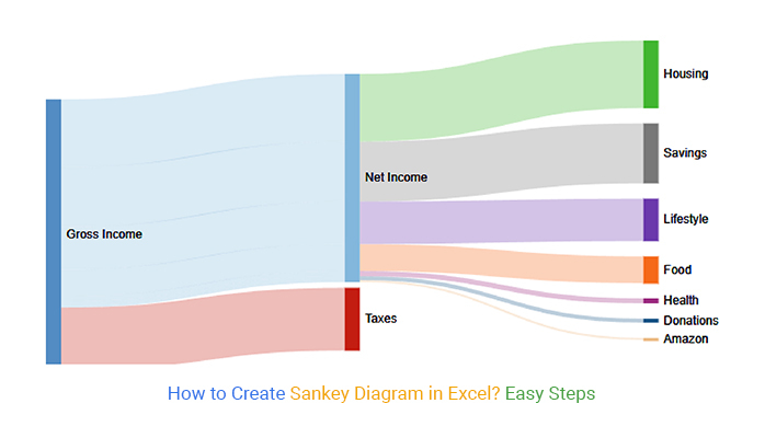
Sankey chart examples are versatile and can be applied to various fields to represent flows and connections. Some specific Sankey diagram examples include energy flow, material flow, budget allocation, transportation flow, and financial flow.
Visualizing information with flow-like characteristics, like expense breakdowns, is overwhelming and time-intensive. Why?
Because such kind of data is complex and bulky. What’s more, it can undoubtedly overwhelm you, particularly if you don’t have a solid visualization strategy.
If you use ill-suited and irregular charts and graphs to display survey insights into this data type, you’re unlikely to get reliable answers.
Indeed, there is a graph called Sankey visualization that handles this data type proficiently, thereby saving you time hugely. Additionally, the diagram is amazingly simple to peruse and decipher.
To access actionable insights into data with flow-like attributes on a miniature level, you want this Diagram.
This blog will walk you through:
Before jumping right into the blog’s core, we’ll address the following question: what are Sankey Diagram Examples?
There any plenty of visualizations that can be used to represent the flow of resources or information between multiple entities. These are particularly useful for illustrating the distribution, allocation, or transition of quantities such as energy, materials, costs, or other resources.
Here are some common examples of Sankey diagrams:
This graph helps you to notice the massive flows, the biggest consumers, and different bits of knowledge. Additionally, it uses connections and nodes to reveal hidden insights into connections between key metrics.
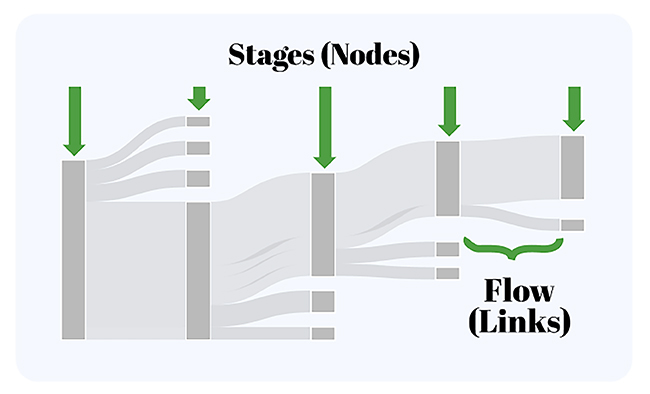
The size of a node is straightforwardly proportionate to the key metrics of interest.
A flow that is two times as wide signifies double the worth of the measurement. You can use this chart to present information with flow-like characteristics, like material, energy, cost, and so forth. This graph helps you to notice the gigantic flows from one node to another.
Also, it gives you an overall perspective on your data, regardless of its complexity and volume. Furthermore, it achieves (the abovementioned) by changing complicated, raw data into actionable insights for your data stories.
Use the Sankey Plot to distinguish the regions that need serious and pressing improvement in your business, like consumer loyalty.
These Diagrams were at first used to visualize energy flows, yet they’re really remarkable in portraying the flow of cash, time, and assets.
Directional flows between the nodes in the chart show the flows in the processes. Besides, it permits you to outwardly show complex cycles, zeroing in on a solitary perspective that you need to feature or emphasize.
Likewise, it offers the additional advantage of supporting various levels. Your audience can get a detailed view, see information related to a particular thing, or develop actionable perspectives.
A Sankey visualization makes dominant nodes prominent. Thus, your audience can easily find actionable insights by focusing on critical areas.
You can use this extraordinary graph to display a more extensive scope of data types generated by enterprises, for example,
Let’s look at the top 5 Sankey Diagram examples. Then we will guide you on how you can create one for yourself.
Now we will discuss some of the most used examples of Sankey Diagram, which are as follows:
Recruiting is one of the undertakings that can produce monstrous data. As a human resource professional, you’ve got to track requests for employment until the onboarding stage.
The data produced en route can help in informing future decision-making processes. This is where this chart becomes very important. The chart can assist you with refining recruiting data into significant insights by visualizing the whole data flow of the Job Application Tracker system.
What’s more, this can save lots of hours, which you can use to unwind or execute different assignments.
The visualization above tracks the job application flow from the recruitment phase to onboarding.
You can use the chart to track the sentiments of a particular niche market towards a brand or its offerings.
The Sankey Diagram Example above tracks market sentiments toward a fast-food brand.
You can use this Diagram to track and analyze the cash flow from cash sources to the final recipients.
The Sankey Diagram example above tracks the packages from dispatch to the intended consumers. The final recipients are segmented based on their country of residence.
The chart can also be used to track online store orders to prevent problems, such as loss of packages along the way. Also, you can use the Sankey Diagram example to track products sold based on their respective brands.
In the coming section, we’ll take you through how to analyze different examples of Sankey Diagram.
Google Sheets is a trusted data visualization tool since it’s natural to many.
However, the application lacks an instant and ready-to-use Sankey Plot. We comprehend changing tools is certainly not a simple task.
In this way, we’re not encouraging you to ditch Google Sheets for other costly data visualization instruments. There’s a simple to-utilize tool that comes as an add-on you can easily install to create the best Sankey diagram examples.
The tool is called ChartExpo.
So, what is ChartExpo?
ChartExpo is an incredibly intuitive add-on you can easily install in your Google Sheets without watching hours of YouTube tutorials.
In the coming section, we’ll take you through how to visualize different Sankey Diagram Examples by using ChartExpo.
You don’t want to miss this!
This section will use the Sankey chart examples to visualize the tabular data below.
You don’t want to miss this.
Store | Category | Items | Brand | Unit Sole |
Online Store | Electronics | Mobile | Samsung | 39 |
Online Store | Electronics | Tablet | Samsung | 73 |
Online Store | Electronics | Laptop | Dell | 156 |
Online Store | Garments | Jeans | Levi’s | 46 |
Online Store | Garments | T-Shirt | H&M | 104 |
Online Store | Garments | Jackets | Puma | 41 |
Online Store | Furniture | Sofa | IKEA | 73 |
Online Store | furniture | Chair | Kartell | 46 |
Online Store | furniture | Desk | Stickley | 43 |
Once you have installed the ChartExpo add-on for Google Sheets follow the easy steps below:
In the coming section, we’ll address the following question: what types of data can be visualized using Sankey Diagrams examples?
Many people seem to get worried about identifying the specific type of data mainly used by Sankey Diagram examples.
This is a question that needs a lot of interpretation to eliminate confusion. The reality is that Sankey Diagram examples are mainly used to identify weighted networks such as flows.
In other words, your data should have flow-like attributes.
The diagram’s nodes are depicted in two or more categories that represent various data stages. Once you’ve outlined your data properly, it becomes easier to analyze it and generate essential insights.
These diagrams are magnificent, especially in communicating flow systems. They can assist with uncovering examples and help in investigating, tracking down bottlenecks, or showing clients how cycles flow.
Plus, they prove to be useful, particularly in addressing large volumes of data.
The flow of data through a system, a process, or even a decision process can undoubtedly be examined for in-depth insights.
While investigating what is happening, it’s frequently challenging to get to the base of a problem. A Sankey Diagram example can show where the issue exists and what it might mean for the general framework.
So, when should you not use this diagram?
The main issue with using Sankey Diagram examples is that they will not always be accurate.
Also, the key role of this chart is to illustrate the flow of data in a system. So, it won’t depict the overall user experience.
For example, let’s assume you intend to determine the number of people placed on a waitlist for an upcoming flight. And besides, you’ve added the number of passengers and their seating preferences. The extraneous data is likely to skew the diagram and make it less accurate.
Sankey diagrams examples are commonly used in energy management to visualize the flow of energy within a system. An example of a Sankey Diagram could illustrate the distribution of energy sources, losses in transmission, and final energy consumption in a building or industrial process.
Visualizing information with flow-like characteristics, like expense breakdowns, is overwhelming and time-intensive.
Why?
Because such kind of data is complex and bulky. What’s more, it can undoubtedly overwhelm you, particularly if you don’t have a solid visualization strategy.
If you use ill-suited and irregular charts and graphs to display survey insights into this data type, you’re unlikely to get reliable answers.
Indeed, there’s a graph called Sankey that handles this data type proficiently, thereby saving you time hugely. Additionally, the diagram is amazingly simple to peruse and decipher.
To access actionable insights into data with flow-like attributes on a miniature level, you want a Sankey visualization.
We recommend you install ChartExpo, to access ready-to-use Sankey Diagram examples.
ChartExpo is an add-on for Google Sheets & Excel that is stacked with an astute and all-set Sankey visualization. You needn’t bother with programming or coding abilities to utilize ChartExpo.
Sign up for a 7-day free trial today to access a ready-made Sankey visualization that is easy to interpret and visually appealing to your target audience.