Categories
By ChartExpo Content Team
Ever found yourself tangled in data, feeling like you’re deciphering an ancient script?
Welcome to the club!
But fear not, because today we’re slicing through the complexity with the superhero of data visualization: the Radar Chart.
Imagine having the power to compare the incomparable, to see beyond numbers, and to bring data to life, all while sipping your morning coffee.
Intrigued?
Let’s dive into the world of Radar Charts, where data isn’t just numbers; it’s a story waiting to be told.
Whether you’re a data nerd or a newbie, by the end of this journey, you’ll be wielding Radar Charts like a pro, ready to unveil the hidden stories in your data. So, buckle up, and let’s embark on this data adventure together!
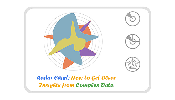
Definition: A Radar Chart, also known as a spider chart, is a type of data visualization that depicts multiple variables and categories along a circular axis, instead of a linear one.
The unique shape of the Radar plot allows you to draw accurate comparisons between multiple items in your data and assess the presence of any outliers.
Radar Charts are also excellent tools when mapping data that follows a cyclic path, such as over some time or through a repeating process.
It is a versatile and easy-to-use chart type to engage with your data in new ways.
Before you can effectively use a Radar Chart with your data, it is helpful to understand what exactly it is. This understanding not only showcases the best ways to use this visualization but also highlights the types of insights it can reveal, particularly in the realm of descriptive analytics.
The Radar Chart has an interesting history. There is some dispute regarding its exact origins.
Some sources report that German economist Georg von Mayr used the Radar Chart for data visualization in 1877.
However, Florence Nightingale, founder of modern nursing and a renowned statistician, was already using a form of the Polar Chart in 1856, twenty years before von Mayr.
Polar Chart is one of the best early examples of data visualization and amply demonstrates Nightingale’s expertise as a statistician. In some circles, a Polar Area Diagram is referred to as a Nightingale Rose diagram because of the flower-like appearance of her diagram.
Other chart examples show that Andre-Michael Guerry developed something resembling a Radar Chart as early as 1829.
Much of the confusion regarding the origin of Radar Charts has to do with its many names and iterations. These names include:
Picture this: you’re at your favorite cafe, menu in hand, decision time.
Espresso, latte, cappuccino, or that fancy new blend?
Here’s where the magic of Radar Charts comes into play, much like choosing the perfect coffee blend.
What if we could compare these coffees on attributes like 1) strength, 2) bitterness, 3) acidity, 4) aroma, and 5) body on a single graph?
Imagine plotting our coffees on a radar plot, with each point representing an attribute score from 1 to 10, similar to an IELTS band score.
The espresso might score high on strength but lower on the body, creating a unique shape that distinctly stands out from a latte, which could score higher on the body due to its milk content.
Each coffee’s flavor profile forms a pattern on the chart, revealing at a glance which brew wakes you up and which soothes you.
Ever wondered how your favorite ice cream flavors stack up against each other?
Imagine stepping into a sweet, frosty arena where vanilla, chocolate, strawberry, mint chocolate chip, and cookie dough battle it out, not with spoons, but on a radar chart.
Picture this: At the center of our chart, there’s a dot. This dot is the starting point for our ice cream attributes. Moving outward, each concentric circle represents an increase in intensity or quantity. Each ice cream flavor then stretches out along these axes to show how it scores in each category.
Let’s dip our spoons into this data delicacy:
By observing how each flavor extends along these axes, we can start to see a pattern – or a lack thereof. Where does each flavor excel, and where does it fall short? Is there a well-rounded champion, or does each flavor have its moment to shine?
In this chilly competition, there’s no single winner. Instead, each flavor boasts its strengths, from the creamy richness of chocolate to the refreshing zest of mint chocolate chip.
The radar chart reveals the diverse appeal of these frozen treats, each catering to different tastes and preferences.
So, next time you find yourself in the ice cream aisle, paralyzed by choice, remember the radar chart. Each flavor is a champion in its own right, ready to win over your taste buds in its unique way.
By dissecting the qualities of our contenders on such a chart, we not only make sense of complex data but also appreciate the nuances that make each option special.
So, grab a spoon and dig into the data – your taste buds (and your inner data analyst) will thank you.
Ever tried to juggle too much info at once?
Radar Charts are your best pals here.
Imagine you’ve got a ton of variables for a project, and you’re scratching your head on how to make sense of it all. Enter Multivariate Analysis with Radar Charts. They let you throw all these variables onto a single chart.
Now, you’re not just looking at numbers; you’re seeing a shape that tells the story. This shape helps you quickly grasp how your project is doing across different areas. It’s like seeing the big picture without losing the plot.
Patterns and trends can be sneaky.
But with Radar Charts, you’ve got a secret weapon.
These charts make spotting trends and patterns a breeze. You can see how different aspects of your project or business measure up against each other over time. It’s like having a map that shows you where you’ve been and where you’re heading.
This insight is gold when you’re trying to navigate the twists and turns of your project’s journey.
Let’s face it, data can be as confusing as a plot in a complex thriller.
But Radar Charts? They’re like the narrator who helps make sense of it all.
They take complex data and present it in a way that’s not just easy to understand but also hard to ignore. Whether you’re presenting to your team, stakeholders, or clients, Radar Charts help you communicate complex information succinctly. It’s like translating a foreign language into something everyone can grasp and appreciate.
Imagine lining up your favorite superheroes to see who’s the strongest, fastest, or has the best superpowers.
That’s what comparative analysis with Radar Charts feels like.
You can compare multiple projects, teams, or products across various attributes all at once. It’s a face-off that not only highlights who’s leading in what area but also where there might be room for team-ups or improvements.
Radar Charts make these comparisons not just possible but visually compelling, turning data analysis into an exciting showdown.
Radar Charts don’t just blend everything into a sea of data; they’re excellent at pointing out the outliers.
These are the superstars or the underperformers that might otherwise get lost in the mix. By visually emphasizing these outliers, Radar Charts ensure that you don’t overlook critical insights. They’re like the spotlight that shines on the most important parts of your data, ensuring that you notice and can act on these pivotal points.
Whether it’s capitalizing on a strength or addressing a weakness, Radar Charts make sure it catches your eye.
Ever stared at a spider web glistening in the morning dew and marveled at its intricacy? That’s what diving into a standard Radar Chart feels like.
Imagine plotting your skills against Spider-Man’s – daunting, isn’t it?
Yet, that’s the beauty. A standard Radar Chart, or spider chart as some aficionados call it, lays bare the strengths and weaknesses in a glance. It’s like looking in a mirror and seeing not just your reflection but your superhero alter-ego.
Perfect for individual assessments or comparing a singular entity across various metrics, it turns data visualization into an art form.
Now, imagine a spider convention, where each web tells a story of a different arachnid.
That’s the realm of multiple Radar Charts. It’s where you pit Spider-Man against the Black Widow, visually dissecting their prowess across various dimensions. Ideal for juxtaposing multiple entities, this chart turns a jumble of data into a coherent narrative of comparison and contrast.
It’s not just a chart; it’s a battleground of metrics where only the data-savvy emerge victorious.
What if Spider-Man and the Black Widow decided to team up?
Enter the composite Radar Chart, a fusion of powers showcasing a collective force.
This variant combines the attributes of multiple entities to present a unified front. It’s the Avengers assemble moment for data, where collective strengths are highlighted, and weaknesses are strategically obscured.
A tool for synergy analysis, it reminds us that sometimes, the whole can indeed be greater than the sum of its parts.
Imagine a spider web filled with morning dew, each droplet capturing the essence of the web’s design.
That’s a filled Radar Chart for you. It’s not just about the outlines but the fill that matters, highlighting the magnitude of variables with color gradients.
This chart doesn’t whisper; it shouts, making sure the impact of each variable is felt visually. Ideal for emphasizing volume and density, it turns data visualization into a visual feast.
Picture a multi-layered web, where each layer tells a different story of the night’s catch.
That’s the stacked Radar Chart, a sophisticated twist on the Radar Chart where multiple data sets are stacked over one another. It’s the visual equivalent of a seven-course meal, where each layer adds a new flavor to the palate.
Perfect for trend analysis over time, it invites the viewer to delve deeper, discovering the nuances hidden in layers of data.
Stepping away from our arachnid analogy, imagine the polar lights captured in a chart.
The polar area diagram, with its radiant design, illuminates differences in magnitude among categories on a circular scale. It’s like watching the aurora borealis of data, where each beam of light tells a story of variance and similarity. Ideal for showcasing cyclical patterns, it turns data into a celestial spectacle.
Lastly, imagine a bicycle wheel where each spoke represents a different data point, converging at the center to create a unified whole.
The spoke chart, akin to the Radar Chart but with a minimalist twist, strips down the visual complexity to focus on the core metrics. It’s the essence of data visualization, where simplicity speaks volumes, and every speech points to a conclusion.
When diving into the world of Radar Charts choosing the right data is your first big win.
Think of a Radar Chart as your data’s best storyteller. It can make your competitors’ strengths and weaknesses as clear as day or show where your project shines. But, pick too much or the wrong kind, and you’re telling a story no one gets.
Stick to the main characters ”“ the variables that matter.
Imagine trying to compare apples to, well, whales.
Doesn’t work, right?
That’s where data normalization steps in. Before you plot those points on your radar diagram, make sure they’re speaking the same language.
This way, when you’re looking to make a spider web chart that sings, you’re comparing apples to apples, making your insights not just accurate but actionable.
Ever seen a Radar Chart so busy it looks like a toddler’s art project?
That’s a no-go.
Radar Charts are ace for comparing a handful of variables ”“ think five to nine max. Go overboard, and your radar plot becomes a tangled web (pun intended).
So, when you’re plotting your next big project or doing a competitor analysis, remember: that simplicity isn’t just beauty; it’s clarity.
The scale of your Radar Chart is like the foundation of your house – get it wrong, and everything else falls apart.
Whether you’re crafting a spider chart for a presentation or plotting data for internal analysis, picking a scale that reflects the true nature of your data is crucial. Too broad, and you miss the nuances. Too narrow, and everything looks exaggerated.
Strike a balance, and your Radar Chart will communicate effectively, making your data’s story both compelling and truthful.
Ever tried reading a book where the chapters are all mixed up?
Frustrating, isn’t it?
That’s what happens when the axes on your Radar Chart are out of order. Whether you’re creating a Radar Chart for assessing skills, using skills matrix templates Excel, or evaluating project risks, arranging the axes logically makes your chart intuitive.
Group similar variables together, and suddenly, your chart isn’t just a tool – it’s a navigator through the complexities of your data.
Colors can make or break your radar diagram.
They’re not just for show; they guide the eye and highlight what matters. But misuse them, and your chart becomes a psychedelic nightmare. Use color to differentiate between datasets or to highlight specific areas of interest, but always keep in mind the story you’re trying to tell. Is your aim to compare, contrast, or highlight growth?
Let your color choices reflect that, making your Radar Chart not just visually appealing but informatively rich.
A Radar Chart without context is like a map without legends ”“ pretty but pointless.
Whether you’re using a Radar Chart generator or drawing it by hand, always provide the backstory.
Why does this data matter?
What’s the big picture?
This context transforms your radar from a mere visualization into a tool for strategic decision-making, giving insights that drive action.
When lines on your Radar Chart overlap, it’s easy to lose track of what’s what.
It’s tempting to cram as much data as possible onto your radar plot but remember: the goal is insight, not confusion.
Use transparency, different line styles, or even interactive elements if you’re presenting digitally. This way, when lines cross or datasets are similar, your audience can still follow along, making each data point count.
Lastly, never underestimate the power of a well-placed label or a clear legend. They’re the Rosetta Stone for your Radar Chart, translating complex data into understandable insights.
Whether it’s a spider web diagram showing team skills or a radar plot for market analysis, labels, and legends ensure that your audience can follow your data’s story without getting lost in translation. Remember, a Radar Chart is only as good as its ability to communicate.
Make every element count, and you’ll turn data into decisions, and insights into actions.
You can create a Radar Chart in your favorite spreadsheet. Follow the steps below to create a Radar Chart.
The following video will help you to create a Radar Chart in Microsoft Excel.
The following video will help you to create a Radar Chart in Google Sheets.


Do you think Radar Charts are just pretty faces?
Think again.
These charts are the detectives of data analysis. They lay out multivariate data like an open book. You can spot who’s performing and who’s just there for the snacks.
From employee evaluations to comparing smartphones, Radar Charts cut through the noise, spotlighting strengths and weaknesses at a glance.
Worried about juggling too many variables?
Radar Charts have got your back.
They compress complex information into a neat, circular package. Imagine capturing the essence of a superhero team in one glance ”“ that’s your project team through the lens of a Radar Chart.
Each axis is a unique skill, and the chart reveals who’s the Hulk and who’s more of a Hawkeye.
Ever tried to explain the flavor of a dish by only talking about its salt content?
That’s what it’s like trying to visualize complex data with just bar or line charts.
Enter Radar Charts, with their ability to showcase multivariate data on a neat, circular graph, they’re your go-to when you need to show how various flavors blend to create the full picture.
One of Radar Charts’ superpowers is its holistic overview. They don’t just show you the trees; they show you the forest, the neighboring meadow, and the mountain in the distance.
Whether you’re assessing a product’s features or a competitor’s strategy, Radar Charts encapsulate the big picture without losing sight of the details. It’s like having a bird’s-eye view and a worm’s-eye view simultaneously.
Dive into the world of Radar Charts, and you’re donning your detective hat. These charts excel at highlighting the odd ones out and tracing the path of emerging trends.
Spotting an outlier is as straightforward as noticing a penguin in a flock of flamingos. And trends? They emerge like trails on a treasure map. This isn’t just about spotting anomalies; it’s about uncovering stories hidden within your data. It’s the difference between guessing and knowing, between hunches and insights.
Ever felt stuck in a cycle, data-wise?
Radar Charts shine here, making sense of cyclical patterns like seasons in retail or stages in product development.
They wrap the cycle in a visually intuitive format, turning the cyclical journey into an insightful adventure. It’s like watching the seasons change from a mountaintop; you see everything unfold in a continuous loop, capturing the ebb and flow of trends and activities.
This isn’t just about seeing the cycle; it’s about understanding its rhythm.
At first glance, Radar Charts appear as a data analyst’s dream. With their web-like structure, they promise a comprehensive view of multiple variables at a glance, showcasing exactly what a data analyst does in simplifying complex data for better insights.
Yet, like a spider’s web, they can entangle more than enlighten.
The complexity of these charts can swiftly turn them from a tool of clarity into a maze of confusion. When variables multiply, so does the complexity, making the Radar Chart a less-than-ideal choice for the faint-hearted or the time-pressed.
Radar Charts suggest a seamless comparison across different variables, but here lies the rub. Despite their design, comparing variables across different axes proves to be a Herculean task.
Unlike their more straightforward counterparts – let’s say, bar charts where comparison is as simple as glancing up and down a singular axis – Radar Charts require a more circular approach, quite literally.
This can obscure rather than illuminate key differences, especially when you’re juggling more than a handful of variables.
Radar Charts, with their spider-web allure, hold a special place in the visual representation of multidimensional data.
They offer a compact and visually engaging way to display how different entities score across various categories.
Yet, this visual charm masks an inherent flaw – the limitation in handling a multitude of variables effectively. This singular disadvantage, the restriction on the number of variables, subtly undermines the Radar Chart’s utility, transforming it from a tool of clarity to one of compromise.
A fundamental flaw with Radar Charts lies in their scale sensitivity and data order.
Different scales on each axis can distort perceptions, leading us down a path of misunderstanding rather than clear insight.
Moreover, the order in which data is presented can dramatically alter the shape of the web, leading to potential misinterpretations.
While Radar Charts aim to clarify, they are often complicated, requiring a level of detail and consideration that might not be practical for quick analysis or decision-making.
Venturing further into the Radar Chart’s intricacies, we encounter the vexing issue of visual clutter.
As the number of variables increases, so does the density of the web, transforming our chart into a thicket rather than a tool of insight. This visual clutters not only the eyes but also the mind, as deciphering the overlapping lines becomes an exercise in frustration rather than analysis.
It’s akin to trying to find a path through an overgrown forest without a map; the potential for insight is there, but obscured by the complexity of the presentation.
Ever wondered how to showcase data with multiple variables in a neat package?
Enter the Radar Chart, perfect for spotting patterns and outliers at a glance.
Unlike the parallel coordinates plot, where data points string along parallel lines like beads on a necklace, Radar Charts wrap your data around a central point, making comparisons feel like a breeze.
Great for team assessments or feature evaluations, Radar Charts transform complex data into spider web-like visuals that are not only informative but also intriguing to explore.
So, when you’re aiming to compare individual performances or product features, let the Radar Chart spin its web of insights!
When you’re juggling dimensions like a circus performer, Radar Charts step in to save the day, offering a clear view of multivariate data without the clutter.
Unlike bubble charts, where the size and position of bubbles convey value, Radar Charts lay it all out on a single plane, each axis representing a different variable.
This makes Radar Charts particularly handy for evaluating entities across several dimensions – think analyzing athlete performance or a product’s feature set.
So, if you’re looking to compare complex profiles at a glance, the Radar Chart is your go-to, turning data analysis into a less daunting task.
Stacked bar charts are great for showing how individual segments contribute to the whole.
But when it comes to comparing multiple entities across various attributes, Radar Charts steal the spotlight.
With their ability to highlight strengths, weaknesses, and patterns through a simple, circular layout, Radar Charts excel in situations where relationships and differences among data points are key.
Ideal for strategic analysis like competitor or SWOT analysis, they provide a comprehensive view that stacked bars can’t, making your data comparisons not just detailed, but also decidedly more digestible.
Treemaps shine when you’re exploring hierarchical data or visualizing part-to-whole relationships, turning a forest of information into a neatly organized garden.
But when it’s time to compare multiple, complex entities against diverse criteria, Radar Charts sweep in with their spider-web elegance.
Whether you’re mapping out the skill sets of your dream team or comparing product portfolios, Radar Charts offer a panoramic view of multivariate data, making it easy to spot outliers and patterns at a glance.
So, when your data story spans multiple dimensions, let the Radar Chart be your guide through the intricate landscape of insights.
Heatmaps are fantastic for spotting trends and densities in data, painting a picture where colors denote values, and turning data into a thermal vision of insights.
Yet, when you need to compare entities across multiple axes or dimensions, Radar Charts come into their own.
With their ability to simultaneously display various attributes of a single subject or compare different subjects on the same set of attributes, Radar Charts provide a distinct advantage.
Radar Charts are perfect for assessing team skills, product features, or market research variables. They help identify hot spots of performance or areas needing improvement, making complex comparisons not just possible but visually compelling.
When you’re dealing with a complex set of data points, Radar Charts are your go-to. They let you put various variables under the microscope, side by side.
Picture this: You’re assessing a car based on its speed, fuel efficiency, comfort, and price. A Radar Chart lays it all out in one view, making it a breeze to see how each car stacks up across these different aspects. For a more detailed analysis, you could even use a price comparison template Excel to break down costs alongside other performance metrics, giving you a complete overview at a glance.
It’s like having a multi-lens camera to capture every angle of comparison, ensuring you don’t miss the forest for the trees.
Radar Charts excel at spotlighting what’s working and what’s not.
Imagine you’re a coach analyzing your team’s performance. By mapping out aspects like speed, agility, and teamwork on a Radar Chart, it’s crystal clear where your team is shining and where there’s room for improvement.
This is akin to a health check-up, pinpointing areas of strength and those requiring a bit of TLC.
Patterns and trends stand out in a Radar Chart.
For educators tracking student progress across subjects, a Radar Chart can highlight learning patterns or areas needing attention.
It’s like connecting the dots in a constellation, using a dot plot example to reveal the bigger picture of a student’s performance landscape.
Radar Charts excel at handling multivariate data. They’re perfect for scenarios where you need to juggle numerous data points simultaneously, such as evaluating software based on features like user-friendliness, customization, and support.
A Radar Chart brings this diverse data together in a harmonious symphony, allowing for an integrated view that’s hard to achieve with linear graphs.
Finally, when it comes to performance comparison, Radar Charts are unparalleled.
They’re ideal for benchmarking products, services, or individuals against a set of criteria.
For instance, if you’re weighing different smartphones, a Radar Chart can help you compare them across various features like battery life, camera quality, and processing power, providing a comprehensive at-a-glance comparison.
Radar Charts cut through the noise, offering clarity and insight. Whether you’re making strategic decisions, comparing products, or analyzing market research, these charts help spin the complex web of data into actionable intelligence.
Imagine a spider web chart that shows you at a glance who’s a rising star and who might need a bit more coaching in your team. By plotting skills like teamwork, creativity, and leadership, a Radar Chart lays out strengths and areas for growth, fostering a culture of transparency and continuous improvement.
Before launching your next big thing, you probably want to know how it stacks up against the competition. A Radar Chart lets you compare products across various features like battery life, user-friendliness, and price. It’s like having X-ray vision, seeing through the clutter to focus on what matters.
Understanding your audience’s preferences can feel like deciphering Morse code. Enter the Radar Chart, which can showcase consumer preferences across different demographics. It’s the compass that guides your marketing strategy, ensuring you’re always on target.
When plotting your company’s next big move, a Radar Chart can help visualize strategic priorities such as market growth, innovation, and customer satisfaction. It’s your business strategy, wrapped up in a single, compelling diagram that says, “Here’s where we’re going, and here’s how we’ll get there.”
Maintaining top-notch quality can feel like walking a tightrope. Radar Charts can plot various quality metrics over time, helping you identify trends, anticipate issues, and maintain the balance between excellence and efficiency.
The true power of Radar Charts lies in their ability to make the invisible, visible.
As we gear up for a future where data becomes even more intertwined with our daily decisions, the Radar Chart’s role becomes increasingly critical.
From enhancing sports analytics to refining user experience designs, these charts allow us to spot patterns, strengths, and weaknesses at a glance.
So, as we march forward, let’s not underestimate the humble Radar Chart. It might just be the key to unlocking insights that have been hiding in plain sight, weaving a clearer picture of our complex world of data.
Radar Charts shine in comparing multiple variables for several entities, offering a clear snapshot of strengths and weaknesses. They’re particularly adept at showcasing performance across various domains, making them invaluable for team assessments or product comparisons.
The visual distribution of data points allows for immediate identification of outliers and patterns, facilitating insightful analyses at a glance.
To the untrained eye, a Radar Chart might look like a meteorologist’s dream or a spider’s masterpiece. However, once you know the ropes, interpreting them becomes straightforward. Each axis represents a variable, with data points plotted according to their value.
The key is to look for the shape formed by connecting these points. A larger area indicates higher values across variables, making it easier to spot which entity excels or needs improvement.
Radar Charts, while visually appealing, tread carefully in the realm of statistical analysis. They’re not typically used for deep statistical analysis due to their qualitative nature. The challenge lies in comparing values across different axes and interpreting complex overlays of data.
Hence, while useful for initial assessments and comparisons, they may not be the best tool for intricate statistical investigations.
Yes, Radar Charts can be misleading, especially when not designed with care. The order of variables around the chart significantly impacts the shape of the data representation, potentially skewing perceptions.
Furthermore, when too many variables or data sets are included, the chart can become cluttered, confusing the intended message.
Radar Charts are primarily designed for positive values. Representing negative values can be challenging, as the radial nature of the chart doesn’t naturally accommodate below-zero data.
In cases where negative values are crucial to the analysis, alternative chart types might be a safer harbor.
While Radar Charts are versatile, they have limitations. Overcrowding with too many variables or data sets can render the chart unreadable. Additionally, their circular layout can make direct comparisons between non-adjacent variables more challenging than linear formats like bar or line charts.
It’s essential to use Radar Charts when their unique strengths – comparing a manageable number of entities across several variables – can be fully leveraged.
To ensure Radar Charts are as effective as they are captivating, stick to comparing a few entities to avoid visual clutter. Use consistent scales across axes for accurate comparisons, and consider applying transparency to overlapping areas for better visibility.
Most importantly, match the chart type to the story you’re trying to tell – Radar Charts are most effective when the relational dynamics between variables are central to your narrative.
No, Radar Charts are not suitable for all data types. They excel in situations where comparing the relative performance of multiple entities across a range of variables is the goal. For datasets that don’t fit this criterion, other types of charts might spin a clearer story.
Radar Charts are predominantly used for performance evaluation, competitive analysis, skill assessments, and any scenario where a comprehensive comparison across various dimensions is needed.
Their ability to visually depict the balance or imbalance among different variables makes them particularly useful for highlighting areas of strength and opportunities for improvement.
Radar Charts can handle missing data to a certain extent, but gaps in the data may lead to broken or incomplete shapes, potentially misrepresenting the analysis. It’s crucial to address missing data before plotting or to choose a visualization method that can accommodate or indicate these gaps.
Radar Charts have that unique knack for showing you the full story at a glance – strengths, weaknesses, and everything in between. They turn the mundane into the meaningful, transforming rows of data into a visual feast that speaks volumes. Whether you’re comparing coffees or competitors, these charts do the heavy lifting, so your insights can shine.
But remember, the power of Radar Charts doesn’t just lie in their ability to organize complexity. It’s in how they invite us to see data differently, to question, to explore. They challenge us to look beyond the numbers and see the stories they’re aching to tell.
Here’s to your next insight, may it be as revealing and impactful as a well-crafted Radar Chart. Happy charting!
How much did you enjoy this article?


Master Power BI GroupBy to streamline your reporting, aggregate data effectively, and gain actionable insights for improved analysis & visualization outcomes.
Master Power BI cumulative sum with DAX formulas and visualizations. This guide helps analysts explore running totals, financial trends, & actionable insights.
Make sense of complex data with dimensionality reduction. Simplify datasets, enhance visual clarity, and uncover key insights faster. Learn more!