Categories

Learn how to use sparklines in Excel to quickly visualize trends inside cells. Discover types, creation steps, customization, use cases, benefits, and best practices.

Learn how to create a clustered column chart in Excel with real use cases, step-by-step guide, tips, and common mistakes.
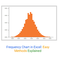
Learn how to create and use frequency charts in Excel to simplify data analysis, visualize distributions, and make better business decisions with clear insights.