• Home
  • Tools dropdown img
    • Spreadsheet Charts

      • ChartExpo for Google Sheets
      • ChartExpo for Microsoft Excel
    • Power BI Charts

      • Power BI Custom Visuals by ChartExpo
    • Word Cloud

  • Charts dropdown img
    • Chart Category

      • Bar Charts
      • Circle Graphs
      • Column Charts
      • Combo Charts
      • Comparison Charts
      • Line Graphs
      • PPC Charts
      • Sentiment Analysis Charts
      • Survey Charts
    • Chart Type

      • Box and Whisker Plot
      • Clustered Bar Chart
      • Clustered Column Chart
      • Comparison Bar Chart
      • Control Chart
      • CSAT Survey Bar Chart
      • CSAT Survey Chart
      • Dot Plot Chart
      • Double Bar Graph
      • Funnel Chart
      • Gauge Chart
      • Likert Scale Chart
      • Matrix Chart
      • Multi Axis Line Chart
      • Overlapping Bar Chart
      • Pareto Chart
      • Radar Chart
      • Radial Bar Chart
      • Sankey Diagram
      • Scatter Plot Chart
      • Slope Chart
      • Sunburst Chart
      • Tornado Chart
      • Waterfall Chart
      • Word Cloud
    • Google Sheets
      Microsoft Excel
  • Services
  • Pricing
  • Contact us
  • Blog
  • Support dropdown img
      • Gallery
      • Videos
      • Contact us
      • FAQs
      • Resources
    • Please feel free to contact us

      atsupport@chartexpo.com

Categories
All Data Visualizations Data Analytics Surveys
Add-ons/
  • Google Sheets
  • Microsoft Excel
  • Power BI
All Data Visualizations Data Analytics Surveys
Add-ons
  • Google Sheets
  • Microsoft Excel
  • Power BI

We use cookies

This website uses cookies to provide better user experience and user's session management.
By continuing visiting this website you consent the use of these cookies.

Ok

Google Sheets

Google Sheets10 min read

Forecasting in Google Sheets: A Complete Walkthrough

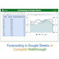
Forecasting in Google Sheets helps you predict trends using past data. Click here for simple steps, tools, and charts to improve planning and decision-making.

Google Sheets10 min read

Project Tracking in Google Sheets: A Visual Walkthrough

Project tracking in Google Sheets helps manage tasks and deadlines in one place. This guide shows how to build, use, and improve trackers with smart visuals.

Google Sheets8 min read

Google Sheets Add-Ons for Modern Spreadsheet Users

Google Sheets add-ons make your spreadsheets more powerful. This guide covers the top add-ons, the best for data analysis, and how to install and use them.

Google Sheets7 min read

How to Create a Clustered Bar Chart in Google Sheets?

Discover how to create and use Clustered Bar Charts in Google Sheets to visualize data clearly. Compare multiple series side by side and gain quick insights for decisions.

Google Sheets10 min read

Grouping Rows in Google Sheets: Get More Insights

Discover what Google Spreadsheet Group Rows is and how it streamlines data organization. Learn step-by-step grouping, analysis tips, and key benefits.

Google Sheets14 min read

How to Create a Dashboard in Google Sheets?

Learn how to Create a Dashboard in Google Sheets to simplify your data analysis and keep your performance insights organized.

Google Sheets11 min read

How to Use a Job Application Tracker Template in Google Sheets?

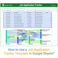
Click to learn how the Job Application Tracker Template in Google Sheets can simplify your job search and keep your applications organized.

Google Sheets10 min read

Survey in Google Sheets: A Complete Guide

Discover what a survey in Google Sheets is and why it's great for data collection. Learn to create, analyze, and visualize survey data with quick chart tips.

Google Sheets9 min read

Payroll Template in Google Sheets for Insightful Reports

A payroll spreadsheet template simplifies pay tracking in Google Sheets. Learn how to create, use, and analyze it with easy steps and insightful visuals.

ChartExpo logo

Turn Data into Visual
Stories

CHARTEXPO

  • Home
  • Gallery
  • Videos
  • Services
  • Pricing
  • Contact us
  • FAQs
  • Privacy policy
  • Terms of Service
  • Sitemap

TOOLS

  • ChartExpo for Google Sheets
  • ChartExpo for Microsoft Excel
  • Power BI Custom Visuals by ChartExpo
  • Word Cloud

CATEGORIES

  • Bar Charts
  • Circle Graphs
  • Column Charts
  • Combo Charts
  • Comparison Charts
  • Line Graphs
  • PPC Charts
  • Sentiment Analysis Charts
  • Survey Charts

TOP CHARTS

  • Sankey Diagram
  • Likert Scale Chart
  • Comparison Bar Chart
  • Pareto Chart
  • Funnel Chart
  • Gauge Chart
  • Radar Chart
  • Radial Bar Chart
  • Sunburst Chart
  • see more
  • Scatter Plot Chart
  • CSAT Survey Bar Chart
  • CSAT Survey Chart
  • Dot Plot Chart
  • Double Bar Graph
  • Matrix Chart
  • Multi Axis Line Chart
  • Overlapping Bar Chart
  • Control Chart
  • Slope Chart
  • Clustered Bar Chart
  • Clustered Column Chart
  • Box and Whisker Plot
  • Tornado Chart
  • Waterfall Chart
  • Word Cloud
  • see less

RESOURCES

  • Blog
  • Resources
  • YouTube
SIGN UP FOR UPDATES

We wouldn't dream of spamming you or selling your info.

© 2025 ChartExpo, all rights reserved.