Categories
The Power BI Summarize DAX function is a tool designed for data analysis and aggregation. Users can use the tool to create summaries, group data, and calculate totals based on specified columns.


In this guide, you’ll discover what the Power BI summarize function is, why the summarize function in Power BI is important, and what is the use of summarize Power BI function.
First…
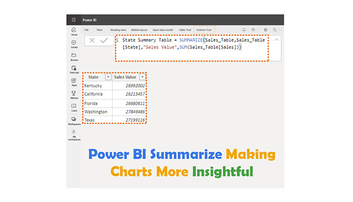
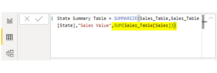
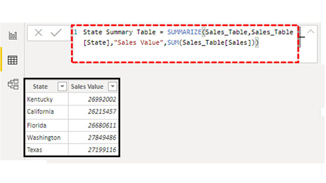
The Power BI SUMMARIZE DAX function enables users to create summary tables from existing data tables. If the columns to group the data by is defined, users can generate aggregated values and calculate subtotal and total values based on the grouped columns. The result is usually a more concise and organized representation of the data, making analyzing and interpreting data easier and more efficient. This streamlined approach enhances clarity and decision-making.
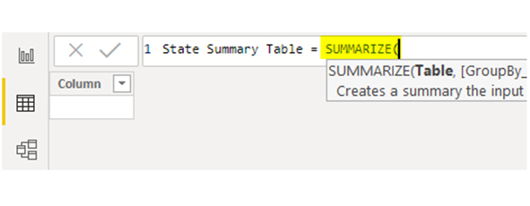
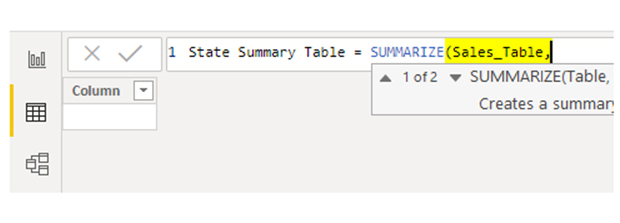
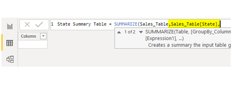
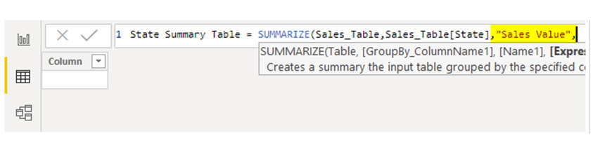
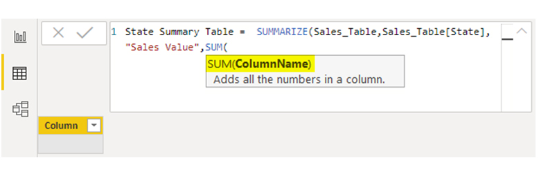
To effectively use the SUMMARIZE DAX function, you have to understand its syntax. The function takes two main arguments: the table name and a list of column expressions.
The table name shows the data table from which you want to summarize the data, while the column expressions show the grouping columns and any additional expressions (or calculations) you want to include in the summary table.
The column expressions list could include calculated columns, simple column references, or measures. If you combine these expressions with appropriate grouping columns, you’ll create flexible and powerful summary tables that meet your specific analysis requirements.
Here’s the basic syntax of the SUMMARIZE function in Power BI:
<table>,
<grouping_column1>, [<grouping_column2>, …],
“<new_column1>”, <expression1>,
“<new_column2>”, <ex[ression2>,
…
)
You should remember that the “SUMMARIZE” function groups the data in a new table. You can apply the SUMMARIZE function only when you create a new table. This way, it cannot be used as a “NEW COLUMN” or “NEW MEASURE.”
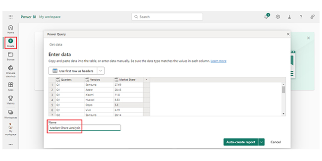
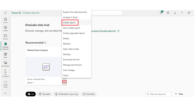
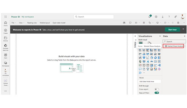
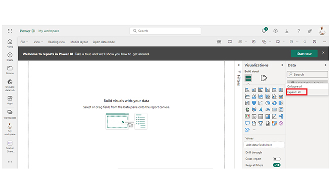
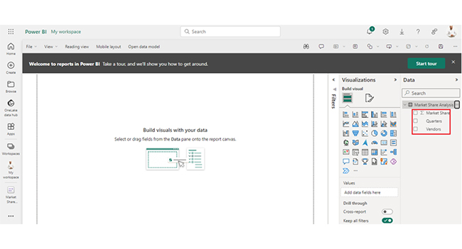
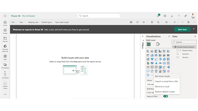
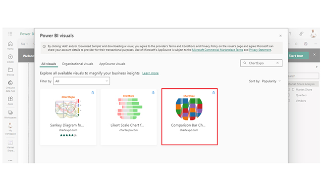
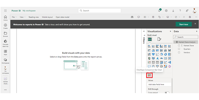
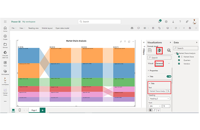
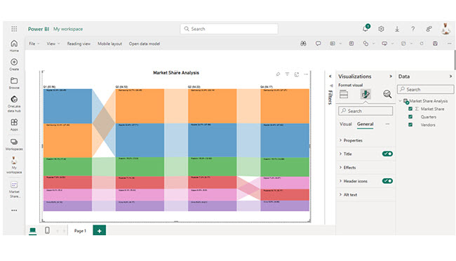
You can summarize data in Power BI by using Power BI charts to group, compare, and visualize key metrics, making trends and insights easy to understand at a glance.


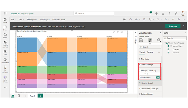
| Quarters | Vendors | Market Share |
| Q1 | Samsung | 27.69 |
| Q1 | Apple | 28.45 |
| Q1 | Xiaomi | 11.8 |
| Q1 | Huawei | 6.53 |
| Q1 | Oppo | 5.3 |
| Q1 | Vivo | 4.19 |
| Q2 | Samsung | 28.14 |
| Q2 | Apple | 27.58 |
| Q2 | Xiaomi | 12.62 |
| Q2 | Huawei | 6.17 |
| Q2 | Oppo | 5.5 |
| Q2 | Vivo | 4.21 |
| Q3 | Samsung | 28.45 |
| Q3 | Apple | 27.71 |
| Q3 | Xiaomi | 12.9 |
| Q3 | Huawei | 6 |
| Q3 | Oppo | 5.29 |
| Q3 | Vivo | 4.17 |
| Q4 | Samsung | 27.97 |
| Q4 | Apple | 27.62 |
| Q4 | Xiaomi | 12.68 |
| Q4 | Huawei | 5.17 |
| Q4 | Oppo | 6.07 |
| Q4 | Vivo | 4.66 |
Insights:
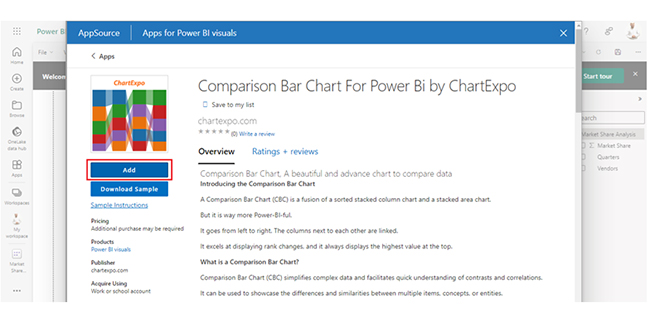
The following video will help you create a Comparison Bar Chart in Microsoft Power BI.
SUMMARIZE in DAX groups and aggregates data from a table, and that creates a summary table with specified grouping columns and calculated expressions for reporting and analysis.
An alternative to SUMMERIZE in DAX is the GROUPBY function. The GROUPBY function aggregates and groups data from a table, and it offers similar functionalities for analysis and summarization.
No, SUMMARIZE cannot be used directly in DAX measures. It is usually used to create calculated columns or tables, or within calculated table expressions (not measures).
The Power BI SUMMARIZE function aggregates and groups data. It also helps in creating summary tables for analysis. The SUMMARIZE function is a good fit for users who are looking to efficiently organize and analyze large datasets, and also generate insights for decision-making.
The SUMMARIZE is a major function in Data Analysis Expressions (DAX), and the formula language is used in Power BI for creating measures, calculated tables, and calculated columns. With SUMMARIZE, users will be able to build sophisticated data models that support complex analytical requirements.
When it comes to creating summary tables, the function makes it easier to understand and visualize patterns, trends, and outliers in the data. SUMMARIZE helps in optimizing query performance, and that comes in handy for users who will be handling large datasets.
Now you know what the Power BI SUMMARIZE function is, how will you integrate it into your data analysis process?
How much did you enjoy this article?


Discover diverse and high-quality Power BI report examples for inspiration and insights. Elevate your reporting with strategic visualization techniques.

A Customer Relationship Management Dashboard centralizes data, tracks key metrics, and drives smarter business decisions. Discover now!

Explore Healthcare Dashboard Examples and learn how to turn complex healthcare data into clear, actionable insights for better decision-making.


