• Home
  • Tools dropdown img
    • Spreadsheet Charts

      • ChartExpo for Google Sheets
      • ChartExpo for Microsoft Excel
    • Power BI Charts

      • Power BI Custom Visuals by ChartExpo
    • Word Cloud

  • Charts dropdown img
    • Chart Category

      • Bar Charts
      • Circle Graphs
      • Column Charts
      • Combo Charts
      • Comparison Charts
      • Line Graphs
      • PPC Charts
      • Sentiment Analysis Charts
      • Survey Charts
    • Chart Type

      • Box and Whisker Plot
      • Clustered Bar Chart
      • Clustered Column Chart
      • Comparison Bar Chart
      • Control Chart
      • CSAT Survey Bar Chart
      • CSAT Survey Chart
      • Dot Plot Chart
      • Double Bar Graph
      • Funnel Chart
      • Gauge Chart
      • Likert Scale Chart
      • Matrix Chart
      • Multi Axis Line Chart
      • Overlapping Bar Chart
      • Pareto Chart
      • Radar Chart
      • Radial Bar Chart
      • Sankey Diagram
      • Scatter Plot Chart
      • Slope Chart
      • Sunburst Chart
      • Tornado Chart
      • Waterfall Chart
      • Word Cloud
    • Google Sheets
      Microsoft Excel
  • Services
  • Pricing
  • Contact us
  • Blog
  • Support dropdown img
      • Gallery
      • Videos
      • Contact us
      • FAQs
      • Resources
    • Please feel free to contact us

      atsupport@chartexpo.com

Categories
All Data Visualizations Data Analytics Surveys
Add-ons/
  • Google Sheets
  • Microsoft Excel
  • Power BI
All Data Visualizations Data Analytics Surveys
Add-ons
  • Google Sheets
  • Microsoft Excel
  • Power BI

We use cookies

This website uses cookies to provide better user experience and user's session management.
By continuing visiting this website you consent the use of these cookies.

Ok

ChartExpo Survey


Home > Blog > Power BI

Enhancing Business Insights with Power BI Metrics

Are you tired of navigating the labyrinth of business decisions armed with nothing but guesswork?

No more shooting in the dark; Power BI Metrics is here to rescue you from the depths of data despair.

Power BI Metrics take your raw numbers and massage them into a symphony of sense. Suddenly, trends pop like confetti, outliers wave red flags, and correlations sashay out of hiding.

Power BI Metrics

And let’s not forget about the wit. Power BI Metrics has a knack for injecting humor into your data analysis. It knows that sometimes a clever visualization can make all the difference in capturing your audience’s attention. As a result, this does magic in driving the message home.

Don’t settle for stale visualizations; embrace dynamic dashboards that make data feel alive.

Power BI Metrics whips up visuals that could make Da Vinci weep with envy. Stunning graphs, sleek dashboards – it’s like infographics had a sizzling affair with spreadsheets.

Table of Content:

  1. Power BI Metrics
  2. Why Usage of BI Metrics are Important?
  3. Key functionalities of Microsoft Power BI Metrics
  4. What is the Power BI Usage Metrics Report Template?
  5. Power BI Metrics Dashboard Example
  6. Create A Power BI Metrics Dashboard
  7. Wrap Up

Power BI Metrics

Power BI Metrics is a dynamic BI Tool from Microsoft. It transforms raw data into interactive visualizations, like charts and dashboards. These visualizations make complex business metrics easy to understand. Consequently, empowering informed decision-making.

BI Metrics essentially turns data into a compelling story that helps businesses thrive.

Why Usage of BI Metrics are Important?

BI Metrics isn’t just important ”“ it’s the secret sauce that turns businesses into tantalizing tales of triumph.

Why?

  • Data-driven decision-making: PBI Metrics transforms raw data into meaningful insights that guide informed choices. You can base your decisions on concrete evidence instead of gut feelings or assumptions. This results in better strategies, optimized resource allocation, and improved outcomes.
  • Real-time monitoring: Power BI Metrics provides up-to-the-minute data visualizations, allowing you to monitor critical metrics as they happen. This agility empowers proactive responses to emerging trends, issues, or opportunities, preventing costly delays.
  • Performance tracking: Power BI Metrics enables tracking key performance indicators (KPIs) across various departments and functions. Moreover, the dashboard presents trends, anomalies, and improvement areas.
  • Visual communication: Numbers alone might not resonate with everyone. BI Metrics leverages visualizations – from interactive charts to compelling graphs – making complex data understandable. These visuals transcend language barriers, facilitating effective communication across diverse teams.
  • Efficiency enhancement: Streamlining processes and resources hinges on understanding inefficiencies. BI Metrics exposes bottlenecks and inefficiencies through visual representation. This helps identify areas that require optimization, leading to enhanced productivity and reduced operational costs.

Key functionalities of Microsoft BI Metrics

  1. Data Connectivity: Connects seamlessly to various sources.
  2. Data Transformation: Allows cleaning and shaping data.
  3. Data Visualization: Creates compelling charts, graphs, and maps.
  4. Dashboards: Power BI Report Builder constructs interactive and dynamic dashboards seamlessly
  5. Real-time Analytics: Supports monitoring of live data streams.
  6. Natural Language Query: Enables querying in plain language.
  7. Sharing and Collaboration: Facilitates easy sharing of reports and dashboards.
  8. Mobile Accessibility: Provides on-the-go access to insights.
  9. AI-powered Insights: Utilizes AI for data analytics to enable automated trend analysis.
  10. Security and Governance: Ensures robust data security and governance.

What is the Power BI Usage Metrics Report Template?

The Power BI usage metrics report template is a pre-designed framework within Power BI. It tracks and presents usage data for Power BI reports and dashboards. This template offers insights into user interaction, popular content, and engagement patterns. It simplifies the analysis of user behavior, helping you optimize Power BI deployments. Consequently, it enhances the overall data-driven decision-making process.

Visuals in the Power BI usage metrics report template can include the following:

  • Usage Overview: A concise summary of total views, interactions, and unique users.
  • Top Reports/Dashboards: A summary of the most frequently accessed reports or dashboards can be effortlessly obtained through the Power BI deployment pipeline.
  • User Engagement: Metrics on user interactions per session, report dwell time, and frequently used features.
  • User Activity: Insights into who viewed specific reports and their viewing times.
  • Popular Visualizations: Information on the visualizations within reports that receive the most interactions.

Power BI Metrics Dashboard Example

Here are some jaw-dropping Power BI metrics dashboard examples to inspire your inner analyst.

  • Sales Dashboard

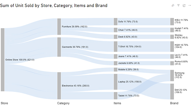
Imagine you’re a sales manager overseeing a team of sales representatives. The sales dashboard powered by PBI Metrics becomes your command center. It aggregates data from various sources, including CRM analytics systems and transaction records. Then transforms them into visually appealing insights.

Example

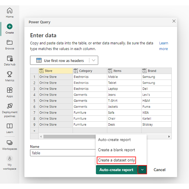
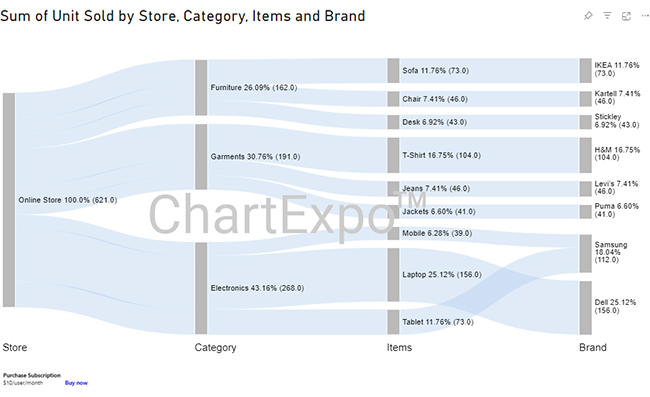
Let’s say you have sales delivery data below.

Store Category Items Brand Units Sold
Online Store Electronics Mobile Samsung 39
Online Store Electronics Tablet Samsung 73
Online Store Electronics Laptop Dell 156
Online Store Garments Jeans Levi’s 46
Online Store Garments T-Shirt H&M 104
Online Store Garments Jackets Puma 41
Online Store Furniture Sofa IKEA 73
Online Store furniture Chair Kartell 46
Online Store furniture Desk Stickley 43

You can appreciate how the sales dashboard below has represented this information.

Sales Dashboard Power BI Metrics
  • Financial Dashboard

The financial dashboard in Power BI becomes indispensable for making sense of complex financial data. It consolidates data from accounting systems, budgeting software, and other financial sources, translating them into visually impactful insights.

Example

Let’s say you have the financial data below.

Locations Revenue Profit & Cost Details Amount
North America Revenue Expenses Cost of Sales 132000
North America Revenue Expenses Salaries 159000
North America Revenue Expenses Cost of Marketing 170000
North America Revenue Profit Tax 182000
North America Revenue Profit Profit After Tax 834000
International Revenue Expenses Cost of Sales 162000
International Revenue Expenses Salaries 158000
International Revenue Expenses Cost of Marketing 145000
International Revenue Profit Tax 171000
International Revenue Profit Profit After Tax 753000
Middle East Revenue Expenses Cost of Sales 155000
Middle East Revenue Expenses Salaries 166000
Middle East Revenue Expenses Cost of Marketing 199000
Middle East Revenue Profit Tax 151000
Middle East Revenue Profit Profit After Tax 685000

You can create a dashboard using this data to make gleaning insights easy.

Financial Dashboard Power BI Metrics

Create A Power BI Metrics Dashboard

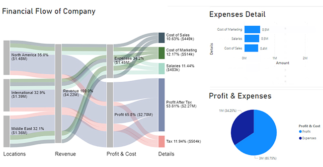
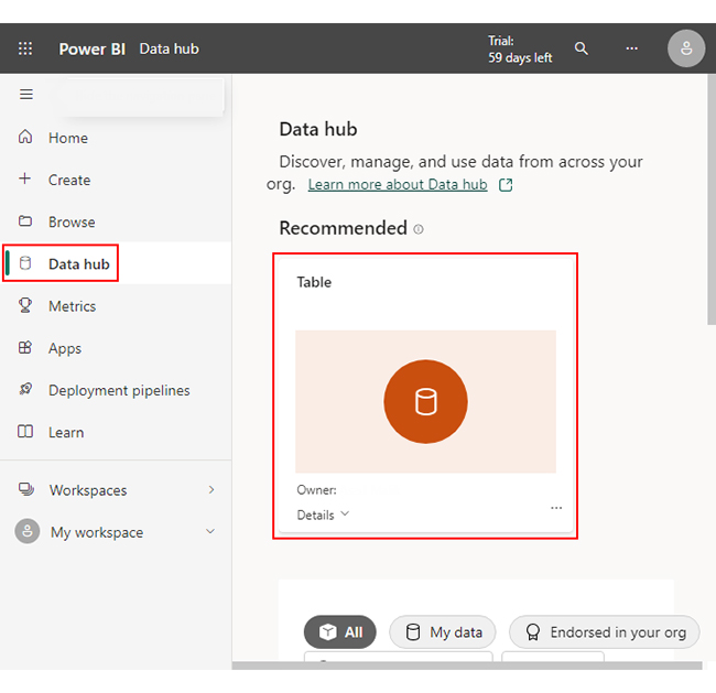
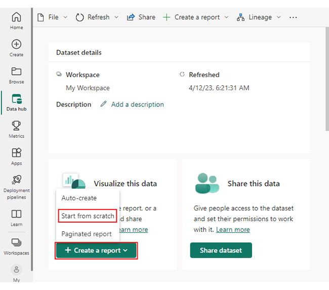
We’ll break down the process into 5 stages. Sankey Diagram in Power BI is the best option for the perfect dashboard.

Stage 1: Logging in to Power BI

  • Log in to Power BI.
  • Enter your email. Click the “Submit” button.
Enter email to login to Power BI
  • You are redirected to your Microsoft account.
  • Enter your password and click “Sign in”.
Enter Password to login to Power BI
  • Choose whether to stay signed in.
Click on stay signed in
  • Once done, the Power BI home screen will open.

Stage 2: Creating a Data Set and Selecting the Data Set to Use in Your Sankey Chart

  • Click on the “Create” option on the left-side menu.
  • Select ”Paste or manually enter data“.
select Paste or manually enter data in Power BI
  • We’ll use the sales data below for this example.
Store Category Items Brand Unit Sold
Online Store Electronics Mobile Samsung 39
Online Store Electronics Tablet Samsung 73
Online Store Electronics Laptop Dell 156
Online Store Garments Jeans Levi’s 46
Online Store Garments T-Shirt H&M 104
Online Store Garments Jackets Puma 41
Online Store Furniture Sofa IKEA 73
Online Store Furniture Chair Kartell 46
Online Store Furniture Desk Stickley 43
  • Paste the above data table into the “Power Query” window.
  • Select the “Create a dataset only” option.
Create Dataset in Power BI ce417
  • Click on the “Data Hub” option on the left-side menu.
  • Power BI populates the data set list. (If you have not created a data set, refer to the Error! Reference source not found section.)
Click on Data Hub ce409
  • Choose a data set for the Sankey chart.
  • PBI populates the screen as shown below:
Workspace in Power BI
  • Click on the “Create a report” dropdown.
  • Select “Start from scratch“.
Create Report and start from scratch ce417
  • A Report Canvas screen appears as below:
Report Canvas screen in Power BI ce417

Stage 3: Adding the Power BI Sankey Diagram Extension by ChartExpo

  • Creating the Sankey Diagram requires us to use an add-in or Power BI visual from AppSource.
  • Navigate to the right side of the Power BI dashboard.
  • Open the Power BI Visualizations panel.
  • Click the ellipsis symbol (…) as highlighted in the diagram below. This will import the Power BI Sankey Diagram extension by ChartExpo.
get more visuals in Power BI ce409
  • The following menu opens:
  • Select the “Get more visuals” option.
click on to get more visuals ce351
  • The following window opens.
  • Enter “Sankey Diagram for Power BI by ChartExpo” in the highlighted search box.
  • You should see the “Sankey Diagram for Power BI by ChartExpo”, as shown in the image below.
Sankey Diagram for Power BI by ChartExpo
  • Click the highlighted “Add” button.
Click the Add button
  • Power BI will add the “Sankey Diagram for Power BI by ChartExpo” icon in the visualization panel.
Click on Sankey Diagram Icon

Stage 4: Drawing a Sankey Diagram with ChartExpo’s Power BI extension

  • Select the “Sankey Diagram for Power BI by ChartExpo” icon in the visualization panel.
  • The following window opens in the report section of your dashboard:
Report Section in Dashboard
  • You can resize the visual as needed.
  • Navigate to the right side of your Power BI dashboard.
  • You should see “Fields” next to “Visualizations.”
Fields next to visualizations ce417
  • You’ll select the fields to use in your Sankey chart here.
  • The ChartExpo visual needs to be selected, though. Select the fields in the following sequence:
    • Store
    • Category
    • Items
    • Brand
    • Unit Sold
Select fields for Sankey diagram ce417
  • You’ll be asked for a ChartExpo license key or email address.
enter email for ChartExpo license

Stage 5: Activate your ChartExpo Trial or Apply a Subscription Key

  • Select the ChartExpo visual.
  • You should see three icons below “Build Visual” in the Visualizations panel.
Build visual panel in Power BI
  • Select the middle icon, “Format visual.”
  • The visual properties will be populated as shown below.
visual properties in Power BI
  • To begin using ChartExpo as a new user;
    • Enter your email address in the textbox under the “Trial Mode” section. ChartExpo will send the License key to this email upon subscribing to the add-in.
    • Ensure you provide an accurate and up-to-date email address.
    • Toggle “Enable Trial” to activate your 7-day trial.
enter email id
  • You should receive a welcome email from ChartExpo.
  • If you do not find the email in your inbox, kindly check your spam folder.
  • The Sankey Diagram you create under the 7-day trial contains the ChartExpo watermark.
Power BI Metrics 1
  • If you have obtained a license key:
    • Enter your license key in the “ChartExpo License Key” textbox in the “License Settings” section (see below).
    • Slide the toggle switch next to “Enable License” to “On“.
enter license key
  • Your Sankey Diagram will then appear without a watermark.
Power BI Metrics 2
  • Let’s add colors to each node. Expand the “Level Colors” properties and select the colors.
Coloring Sankey Diagram ce409
  • Automatically all changes will be saved.
Final Power BI Metrics

Insights

  • At Level 1, there have been a total of 621 orders, according to the online store’s data.
  • Electronics is the major contributor at Level 2, accounting for 43% of the orders (268). On the other hand, furniture has the least contribution with 26% (162 orders).
  • Laptops are the leading category at Level 3, comprising 25% of the orders (156). T-shirts follow closely behind with 17% (104 orders).
  • Among the various brands, Dell and Samsung have higher sales. Dell accounts for 25% of the orders (156), while Samsung accounts for 18% (112).

Frequently Asked Questions

How to use Power BI metrics?

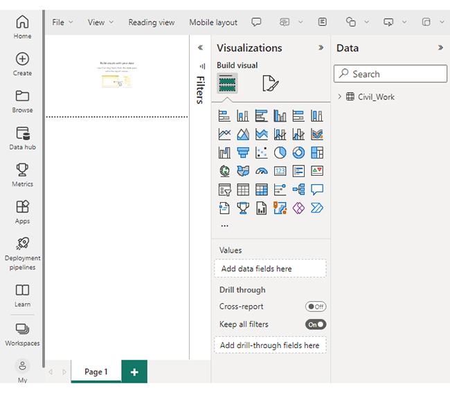
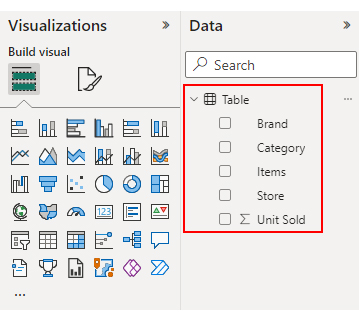
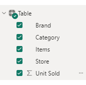
To utilize Power BI metrics;

  1. Import relevant data sources.
  2. Design interactive visualizations like charts and graphs.
  3. Analyze trends and patterns to make informed decisions.
  4. Share insights through collaborative dashboards.
  5. Adjust strategies based on real-time feedback for optimal results.

What is the use of metrics in Power BI?

Metrics in Power BI serve to quantify and visualize data, revealing trends, patterns, and performance insights. They aid in data-driven decision-making, enabling businesses to monitor and improve various aspects for better outcomes.

Wrap Up

In the ever-evolving business landscape, the significance of BI Metrics shines brighter than ever. It’s not just about deciphering data; it’s about harnessing its transformative potential.

With Power BI Metrics, you will no longer be constrained by overwhelming data heaps. You have a compass that guides you through the labyrinth of decisions, powered by data-driven intelligence. Trends light up, outliers raise their hands for attention, and strategies are no longer rooted in assumptions.

The collaborative dance of PBI Metrics and visualizations paints a vivid picture that transcends language barriers. From sales teams strategizing their moves to financial analysts deciphering complex numbers, the impact ripples through every department.

That’s not all.

Collaboration becomes a symphony with shared dashboards. Every note of data contributes to a harmonious crescendo of understanding.

With Power BI Metrics and ChartExpo, you’re just a click away from illuminating your business insights. It’s not just a tool; it’s a paradigm shift. It’s the ignition switch for innovation, the compass for growth, and the enabler of agile decision-making.

How much did you enjoy this article?

PBIAd2
Start Free Trial!
128982

Related articles

next previous
Power BI12 min read

Power BI Group By Guide for Effective Data Insights

Learn how Power BI Group By helps you aggregate data, clarify trends, and create reports by grouping values to make large datasets manageable & insightful.

Power BI12 min read

How to Create Sankey Diagram in Microsoft Power BI?

Learn How to Create Sankey Diagram in Microsoft Power BI using Desktop & Web Service. What they are and how to use them effectively.

Power BI8 min read

Power BI Artificial Intelligence: Insights Using Visuals

Discover all there is to know about the Power BI artificial intelligence. You'll also discover how AI is used in Power BI, and how to use it for analysis and more.

Power BI9 min read

Budgeting in Healthcare: Use Visuals to Spot Budget Gaps

This guide helps you discover what budgeting in healthcare is. You'll also discover the factors that affect hospital budgets and types of budgeting in healthcare.

Power BI9 min read

Predictive Analytics in Power BI for Making Insightful Visuals

This guide shows you everything you need to know about Predictive Analytics in Power BI. It also shows you how it works, and how to interpret the results.

ChartExpo logo

Turn Data into Visual
Stories

CHARTEXPO

  • Home
  • Gallery
  • Videos
  • Services
  • Pricing
  • Contact us
  • FAQs
  • Privacy policy
  • Terms of Service
  • Sitemap

TOOLS

  • ChartExpo for Google Sheets
  • ChartExpo for Microsoft Excel
  • Power BI Custom Visuals by ChartExpo
  • Word Cloud

CATEGORIES

  • Bar Charts
  • Circle Graphs
  • Column Charts
  • Combo Charts
  • Comparison Charts
  • Line Graphs
  • PPC Charts
  • Sentiment Analysis Charts
  • Survey Charts

TOP CHARTS

  • Sankey Diagram
  • Likert Scale Chart
  • Comparison Bar Chart
  • Pareto Chart
  • Funnel Chart
  • Gauge Chart
  • Radar Chart
  • Radial Bar Chart
  • Sunburst Chart
  • see more
  • Scatter Plot Chart
  • CSAT Survey Bar Chart
  • CSAT Survey Chart
  • Dot Plot Chart
  • Double Bar Graph
  • Matrix Chart
  • Multi Axis Line Chart
  • Overlapping Bar Chart
  • Control Chart
  • Slope Chart
  • Clustered Bar Chart
  • Clustered Column Chart
  • Box and Whisker Plot
  • Tornado Chart
  • Waterfall Chart
  • Word Cloud
  • see less

RESOURCES

  • Blog
  • Resources
  • YouTube
SIGN UP FOR UPDATES

We wouldn't dream of spamming you or selling your info.

© 2025 ChartExpo, all rights reserved.