Categories
How to find the yield? This question often arises when working with DAX. Whether you’re a seasoned analyst or just starting, how to find the yield is crucial for informed decision-making.


Imagine you have a dataset at your fingertips and are eager to extract valuable insights. How do you find the yield in this vast expanse of data?
It’s not as complicated as it may seem. You can uncover the yield and use it to enhance your analysis by mastering a few key techniques.
First things first, let’s demystify the process of how to find the yield. DAX offers a range of functions and tools that you can leverage to calculate yields with precision. From simple calculations to more advanced formulas, DAX provides a framework for tackling this task.
Now, imagine the impact of confidently finding the yield in your data. It opens doors to deeper understanding and more informed decision-making. This guide will walk you through the essential steps, empowering you to maneuver DAX confidently.
We’ll explore practical tips and techniques for how to find the yield. From leveraging key functions to optimizing your formulas, you’ll gain actionable insights that you can apply immediately.
To solidify your understanding, we’ll walk through real-world examples of how to find the yield in DAX. Seeing these concepts in action will help you connect the dots and apply your newfound knowledge confidently.
Let’s get started.
First…
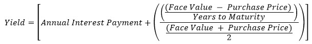
Definition: The YIELD function calculates the annual yield of a security that pays periodic interest. It requires inputs such as settlement date, maturity date, and annual coupon rate.
The YIELD function calculates yield based on the price of the security and its settlement date. It is commonly used in bond valuation and investment analysis.
For example, you might calculate the yield of a bond using the following formula:
Incorporating the YIELD function into DAX measures helps you perform complex financial calculations directly within Power BI reports. This enhances the capability of reports to provide insights into investment performance and risk. Moreover, mastering the YIELD function helps you create more sophisticated and accurate financial models, contributing to better decision-making.
The DAX YIELD function holds significant importance in financial analysis within Power BI. Let’s explore why it’s crucial:
DAX YIELD is vital for evaluating investment performance, particularly in the context of fixed-income securities like bonds. By calculating the yield of a security, you can assess its profitability and compare it against other investment opportunities. This facilitates data-driven decisions regarding portfolio management and asset allocation, ensuring optimal investment performance.
The YIELD function in DAX plays a crucial role in risk assessment. How? It provides insights into the potential returns of an investment relative to its price. Higher yields may indicate higher risk, as they could be associated with lower credit quality or longer maturity periods. Conversely, lower yields may signal lower risk and imply lower returns. Understanding the relationship between yield and risk helps to make risk-adjusted investment decisions, balancing potential returns with risk tolerance.
DAX YIELD enables you to project future cash flows and assess the suitability of investment opportunities. Incorporating yield calculations into financial models helps to forecast income streams. Moreover, you can evaluate the impact of different investment scenarios on overall financial health. This supports strategic decision-making and helps develop robust financial plans aligned with organizational objectives.
The DAX YIELD function is indispensable for determining the fair value of bonds in the secondary market. By calculating the yield to maturity (YTM). Or yield to call (YTC), you can assess whether a bond is trading at a premium, discount, or par value. This information is crucial for investors looking to buy or sell bonds. Why? It helps them gauge whether a bond is overvalued or undervalued relative to its intrinsic worth.
DAX YIELD provides a key metric for evaluating the profitability of bond investments over time. You can compare actual yields to expected yields or benchmark rates. From this, you can assess the effectiveness of investment strategies and identify areas for improvement. This enables you to track investment performance accurately and make necessary adjustments to optimize returns.
While DAX YIELD and DAX DIVIDEND YIELD are essential for financial analysis, they serve distinct purposes. Let’s explore the key differences between these two functions:
| Criteria | DAX YIELD | DAX DIVIDEND YIELD |
| Definition | Calculates the yield of a fixed-income security | Calculates the dividend yield of a stock or investment |
| Usage | Primarily used for bond valuation and analysis | Mainly employed in equity analysis and stock valuation |
| Inputs | Requires parameters such as settlement date, maturity date, and annual coupon rate | Relies on parameters like dividend per share and stock price |
| Output | Returns the yield of the security as a percentage | Returns the dividend yield as a percentage |
| Calculation | Computes yield based on the bond’s coupon payments, face value, and current price | Calculates dividend yield by dividing annual dividends by the stock’s current market price |
| Application | Commonly applied in fixed-income investment analysis | Frequently used in equity research and portfolio management |
Calculating yield in Power BI demands a systematic approach to ensure precision and effectiveness. Here are steps on how to find the yield in Power BI:
YIELD (<Settlement>, <Maturity>, <Rate>, <Pr>, <Redemption>, <Frequency> [, <Basis>] )
| PARAMETER | ATTRIBUTES | DESCRIPTION |
| Settlement | The security’s settlement date is the date after the issue date when the security is traded to the buyer. | |
| Maturity | The security’s maturity date is when the security expires. | |
| Rate | The security’s annual coupon rate. | |
| Pr | The security’s price per $100 face value. | |
| Redemption | The security’s redemption value per $100 face value. | |
| Frequency | The number of coupon payments per year. For annual payments, frequency = 1; for semiannual, frequency = 2; for quarterly, frequency = 4. | |
| Basis | Optional | The type of day count basis to use. |
| Data | Description |
| 15-Feb-08 | Settlement date |
| 15-Nov-16 | Maturity date |
| 5.75% | Percent coupon |
| 95.04287 | Price |
| $100 | Redemption value |
| 2 | Frequency is semiannual (see above) |
| 0 | 30/360 basis (see above) |
The following DAX query:
EVALUATE
{
YIELD(DATE(2008,2,15), DATE(2016,11,15), 0.0575, 95.04287, 100, 2,0)
}
Returns the yield on a bond with the terms specified above.
| [Value] |
| 0.0650000068807314 |
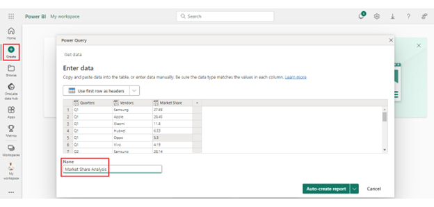
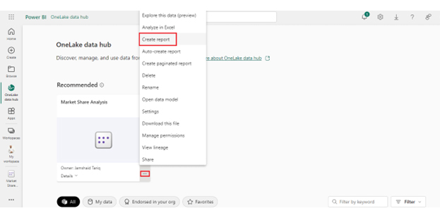
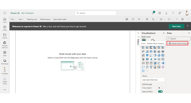
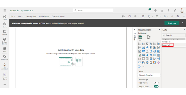
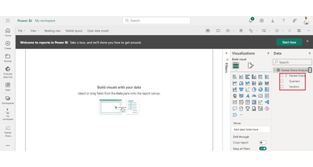
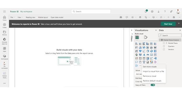
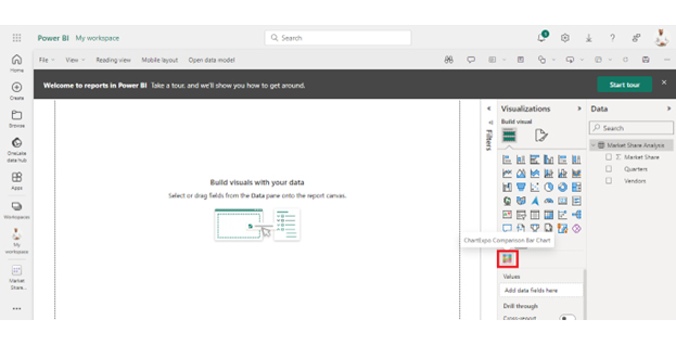
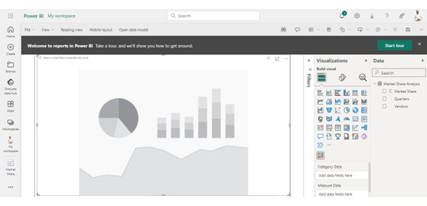
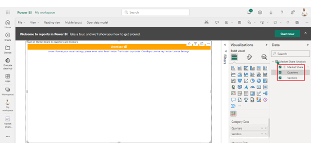
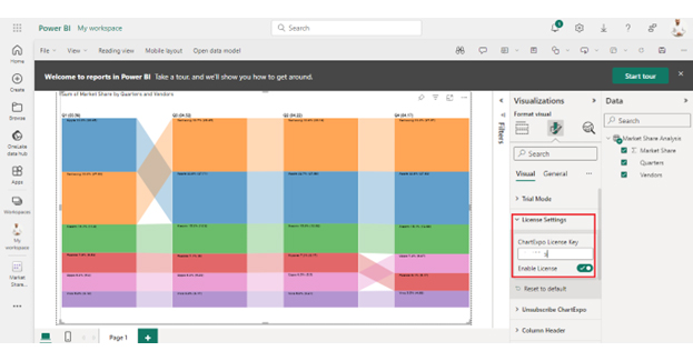
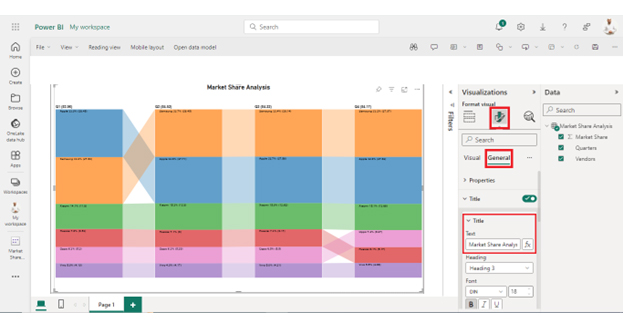
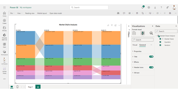
Follow these steps to visualize data in Power BI.


| Quarters | Vendors | Market Share |
| Q1 | Samsung | 27.69 |
| Q1 | Apple | 28.45 |
| Q1 | Xiaomi | 11.8 |
| Q1 | Huawei | 6.53 |
| Q1 | Oppo | 5.3 |
| Q1 | Vivo | 4.19 |
| Q2 | Samsung | 28.14 |
| Q2 | Apple | 27.58 |
| Q2 | Xiaomi | 12.62 |
| Q2 | Huawei | 6.17 |
| Q2 | Oppo | 5.5 |
| Q2 | Vivo | 4.21 |
| Q3 | Samsung | 28.45 |
| Q3 | Apple | 27.71 |
| Q3 | Xiaomi | 12.9 |
| Q3 | Huawei | 6 |
| Q3 | Oppo | 5.29 |
| Q3 | Vivo | 4.17 |
| Q4 | Samsung | 27.97 |
| Q4 | Apple | 27.62 |
| Q4 | Xiaomi | 12.68 |
| Q4 | Huawei | 5.17 |
| Q4 | Oppo | 6.07 |
| Q4 | Vivo | 4.66 |
The YIELD function in DAX calculates the yield of a security, such as a bond. It requires inputs such as settlement date, maturity date, and annual coupon rate. This function returns the yield as a percentage.
The advantages of the YIELD function in DAX include accurately calculating the securities yield. This aids in bond valuation and investment analysis. It provides insights into profitability and risk, enabling informed investment decisions within Power BI reports.
How to find yield requires a systematic approach. It begins with a clear understanding of the requirements and objectives for yield calculation. Defining clear parameters is essential to analyzing bond yields, dividend yields, or other financial metrics. This clarity ensures alignment with stakeholders’ needs and objectives, laying a solid foundation for accurate analysis.
Data preparation plays a crucial role in the yield-finding process. Before making calculations, ensure the data is clean, consistent, and reliable. This sets the stage for accurate and meaningful yield calculations.
Selecting the appropriate calculation method is another critical step in finding yield effectively. You may require different calculation methods depending on the type of yield, such as bond yield or dividend yield. For example, bond yield calculations involve complex formulas considering factors like coupon payments, face value, and current price. Understanding the intricacies of each calculation method is essential for accurate results.
Once you perform the calculations, it’s essential to leverage time intelligence functions and optimize performance to enhance accuracy and efficiency. Time intelligence functions like TOTALYTD or DATEADD can be invaluable for analyzing time-series data. Moreover, they are vital in calculating yields over different periods.
Optimizing performance through data summarization, indexing, and minimizing resource-intensive calculations further improves the efficiency of the yield-finding process. Proficiency in finding yield will help you make informed financial decisions and succeed within Power BI and beyond.
How much did you enjoy this article?


Calculate accounts receivable turnover ratio to measure credit collection speed, improve cash flow, and strengthen your financial strategy. Read on!

Change Management KPIs are the key to tracking adoption, performance, and ROI during transitions. Find out which metrics matter. Read on!

Data collection methods and techniques determine the quality of every insight you act on. Explore key approaches for gathering reliable data. Read on!


