• Home
  • Tools dropdown img
    • Spreadsheet Charts

      • ChartExpo for Google Sheets
      • ChartExpo for Microsoft Excel
    • Power BI Charts

      • Power BI Custom Visuals by ChartExpo
    • Word Cloud

  • Charts dropdown img
    • Chart Category

      • Bar Charts
      • Circle Graphs
      • Column Charts
      • Combo Charts
      • Comparison Charts
      • Line Graphs
      • PPC Charts
      • Sentiment Analysis Charts
      • Survey Charts
    • Chart Type

      • Box and Whisker Plot
      • Clustered Bar Chart
      • Clustered Column Chart
      • Comparison Bar Chart
      • Control Chart
      • CSAT Survey Bar Chart
      • CSAT Survey Chart
      • Dot Plot Chart
      • Double Bar Graph
      • Funnel Chart
      • Gauge Chart
      • Likert Scale Chart
      • Matrix Chart
      • Multi Axis Line Chart
      • Overlapping Bar Chart
      • Pareto Chart
      • Radar Chart
      • Radial Bar Chart
      • Sankey Diagram
      • Scatter Plot Chart
      • Slope Chart
      • Sunburst Chart
      • Tornado Chart
      • Waterfall Chart
      • Word Cloud
    • Google Sheets
      Microsoft Excel
  • Services
  • Pricing
  • Contact us
  • Blog
  • Support dropdown img
      • Gallery
      • Videos
      • Contact us
      • FAQs
      • Resources
    • Please feel free to contact us

      atsupport@chartexpo.com

Categories
All Data Visualizations Data Analytics Surveys
Add-ons/
  • Google Sheets
  • Microsoft Excel
  • Power BI
All Data Visualizations Data Analytics Surveys
Add-ons
  • Google Sheets
  • Microsoft Excel
  • Power BI

We use cookies

This website uses cookies to provide better user experience and user's session management.
By continuing visiting this website you consent the use of these cookies.

Ok

ChartExpo Survey


Home > Blog > Google Sheets

Google Sheets Tips and Tricks to Work Like a Pro

Google Sheets tips and tricks—aren’t you curious how far they can take your productivity? Whether you’re managing a team, tracking expenses, or organizing a project, time matters. And so does accuracy.

Google Sheets Tips and Tricks

Many users still treat Google Sheets as a digital ledger. That’s wasted potential. Features like VLOOKUP for Google Sheets and IMPORTDATA in Google Sheets can do heavy lifting with minimal effort. Data flows faster, and tasks become more manageable.

Small changes create significant wins. Think of automating your weekly reports or syncing real-time stock data using Google Finance in Google Sheets. Google Sheets tips and tricks help you forecast and stop guessing.

Efficiency isn’t about doing more—it’s about doing things better. And that begins with how you use your tools—starting with Google Sheets. Most people scratch the surface. They copy and paste, hoping the formatting doesn’t break. But once you know what’s possible, you can build more intelligent workflows.

This blog will guide you through powerful, often-overlooked techniques. Whether you’re an analyst or a business owner, these Google Sheets tips and tricks can enhance your daily workflow.

Table of Contents:

  1. What are the Tips and Tricks for Google Sheets?
  2. Why Use Google Sheets Tips?
  3. Explaining the Best Google Spreadsheets Tips and Tricks
  4. How to Use Google Sheets Tips and Tricks for Charting?
  5. Benefits of Using Google Sheets Tricks
  6. Google Spreadsheets Tips and Tricks to Solve Common Problems
  7. FAQs
  8. Wrap Up

What are the Tips and Tricks for Google Sheets?

Definition: Google Sheets tips and tricks are innovative ways to work faster and smarter with data. These include using Google Sheets functionality to apply formulas and automate tasks, and learning features that improve workflow.

Tools like Remove duplicates in Google Sheets help clean data quickly. Others, such as conditional formatting, make patterns easy to spot. These tricks save time and reduce errors.

And the best part is that anyone can use them—no coding needed. The goal is simple: work smarter in less time.

Why Use Google Sheets Tips?

Have you ever felt like you’re doing too much grunt work in your spreadsheets? Don’t worry; with the right Google Sheets tips and tricks, you can transform dull data entry into streamlined processes. These smart methods save time and reduce stress.

Why?

  • Boost productivity: Use built-in functions to eliminate repetitive tasks. Use innovative features to pull live info without switching tabs.
  • Enhance collaboration: Google Sheets updates live, allowing multiple people to work together without conflict. Learning how to share a Google Sheet ensures your team always has access to the latest version.
  • Clean data efficiently: Cleaning up messy data becomes effortless. Tools like Remove duplicates in Google Sheets quickly organize your info with a single click.
  • Add more functionality: You’re not stuck with the basics—add-ons expand what Sheets can do. A powerful Google Sheets extension can automate workflows, import APIs, or even send emails.
  • Make meaningful graphics: Visuals bring data to life. When you create a dashboard, you turn numbers into insights using charts, color coding, and filters.

Explaining the Best Google Spreadsheets Tips and Tricks

Have you ever felt buried under rows and columns of spreadsheet chaos? Were you managing data or planning projects? Let me tell you one thing: Google Sheets can be your best friend—or your biggest time sink. But with the proper Google Sheets tips and tricks, the grind becomes a breeze.

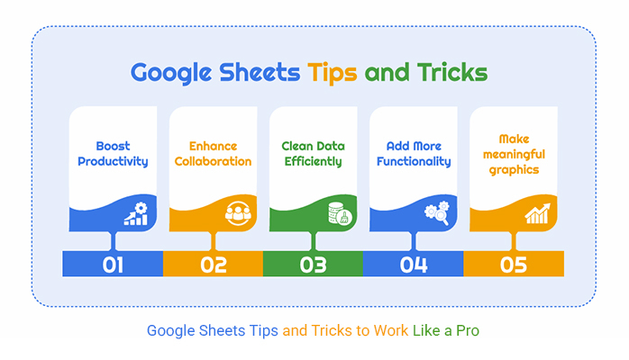
Let’s dig into five underrated ways to streamline your workflow:

  • Use a template to save time in G Suite: Use built-in templates to skip the setup phase and start working instantly. Whether building a Google Sheet to-do list template or a financial report, there’s a format for that.
Google Sheets Tips and Tricks
  • Find and replace: Manually editing big data? That’s outdated. Use Google Sheets’ Find and Replace feature to swap names, fix errors, or update fields fast.

Steps:

    • Go to Edit > Find and Replace.
    • Enter the old and new text.
    • Choose from options like “Match case” or “Search using regular expressions”.
    • Click Replace or Replace All.
  • Filtering and sorting data in Google Sheets: Organize chaos with filters and sort tools. For instance, you can alphabetize contacts or group sales figures. Follow these steps:
    • Highlight your data.
    • Click Data > Sort range.
    • Choose A–Z, Z–A, or numeric order.

To apply filters:

    • Click Data > Create a filter.
    • Use drop-downs in each column to hide or show specific info.
    • Want to view custom filters without affecting others?
    • Go to Data > Filter view > Create new filter view.
  • Viewing and restoring version history in Google Sheets: Did you accidentally delete something? Or you want to see what changed last week? Google Sheets saves every move. Click File > Version History > See version history. To bring something back, click “Restore this version”.
Google Sheets Tips and Tricks
  • Freeze feature: Did you just lose your headers again while scrolling? Freeze rows or columns to keep them locked at the top or left. Select the cell in the row or column you want to freeze. Go to View > Freeze > Choose the row(s) or column(s).
Google Sheets Tips and Tricks

Top 10 Visuals Using Tips and Tricks in Google Sheets Using ChartExpo

Have you ever looked at a spreadsheet and felt overwhelmed by the numbers? You’re not alone. That’s where visuals come in. With tools like ChartExpo and Google Sheets functionality, you can transform raw data into visuals that tell stories.

  • Comparison Bar Chart: This chart lets you compare multiple categories side by side using simple horizontal bars. It’s perfect for highlighting revenue, performance, or survey results at a glance.
Google Sheets Tips and Tricks
  • Clustered Stacked Bar Chart: It combines both stacked and grouped bar charts for a detailed look into multiple data sets. Use it to compare groups while still showing internal breakdowns—great for time-based or regional analysis.
Google Sheets Tips and Tricks
  • Gauge Chart: Gauge Charts resemble a speed dial and track how close you are to a target. They’re excellent for displaying KPIs and progress on Google Sheets time tracking dashboards.
Google Sheets Tips and Tricks
  • Mosaic Plot Chart: This chart uses both height and width to show proportions across categories. It’s beneficial for analyzing customer segments, market share, or behavior by group.
Google Sheets Tips and Tricks
  • Multi-Axis Line Chart: Track different data sets—like revenue, orders, and costs—on separate Y-axes within the same chart. It helps you identify trends and relationships that a single axis can’t show.
Google Sheets Tips and Tricks
  • Progress Chart: This chart shows how far you’ve come toward a goal using color-coded visuals. It is ideal for monitoring personal goals, project completion, or team performance metrics.
Google Sheets Tips and Tricks
  • Sankey Chart: Sankey charts illustrate the flow of data between categories, helping to identify inefficiencies. They’re excellent for tracking conversions, processes, or resource allocation.
Google Sheets Tips and Tricks
  • Scatter Plot Chart: Scatter plots show relationships between two variables by plotting points on an X-Y grid. They’re ideal for spotting trends, outliers, and clusters—perfect for what-if analysis in Google Sheets.
Google Sheets Tips and Tricks
  • Slope Chart: Use a slope chart to show the change between two points in time across categories. It’s excellent for before-and-after comparisons and makes performance shifts obvious.
Google Sheets Tips and Tricks
  • Stacked Waterfall Chart: This chart shows how each positive and negative value contributes to a total. It’s beneficial in financial reports or project cost breakdowns.
Google Sheets Tips and Tricks

How to Use Google Sheets Tips and Tricks for Charting?

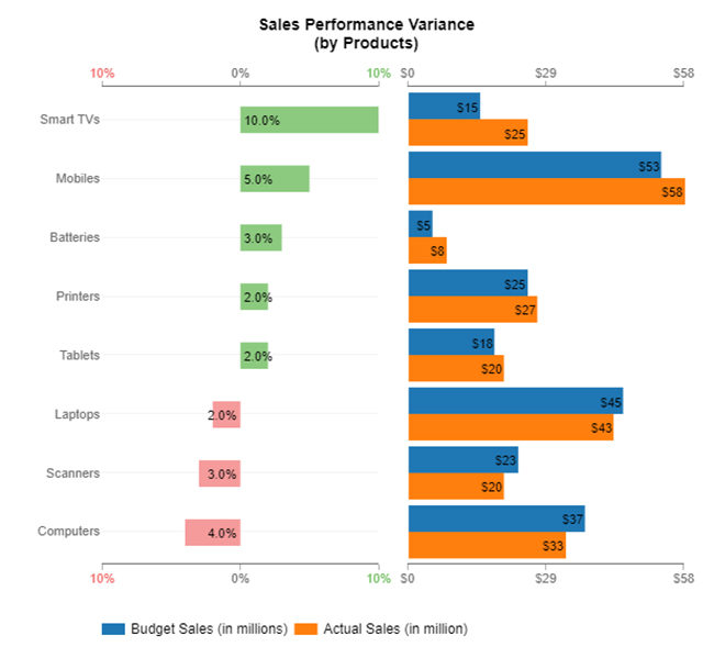
So…Do you think your spreadsheet is working hard? Think again. Most people only scratch the surface of what Google Sheets can do. Sure, it’s excellent for formulas and sorting. But when it comes to data visualization, Google Sheets starts to fumble. Charts are limited, and the styling is minimal. That’s where your analysis can fall flat.

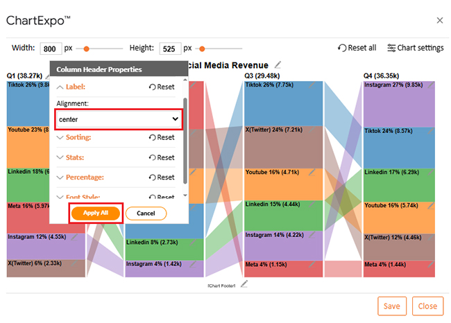
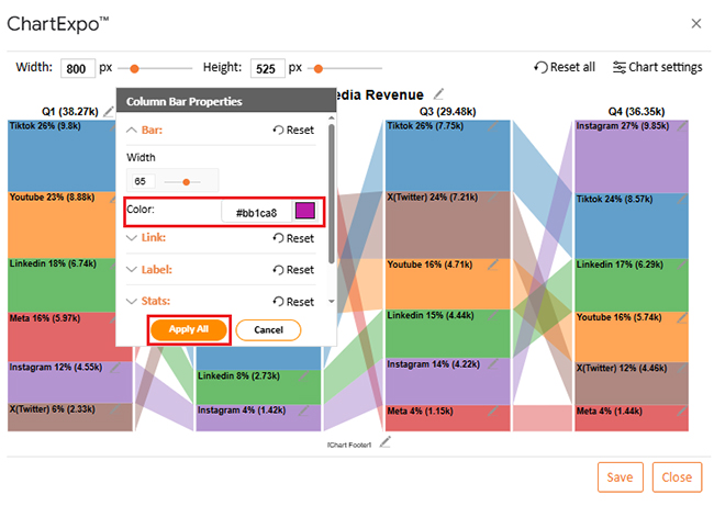
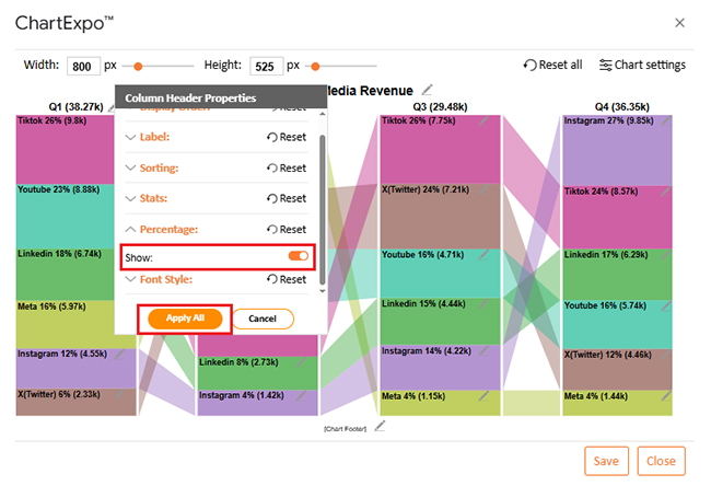
But don’t worry; we have ChartExpo—a more innovative, faster way to turn raw data into stunning visuals. If you maximize efficiency with Google Sheets tips and tricks, pairing it with powerful visuals is a must. Your insights deserve more than basic pie charts.

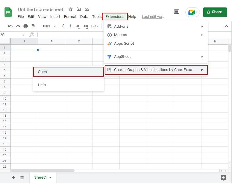
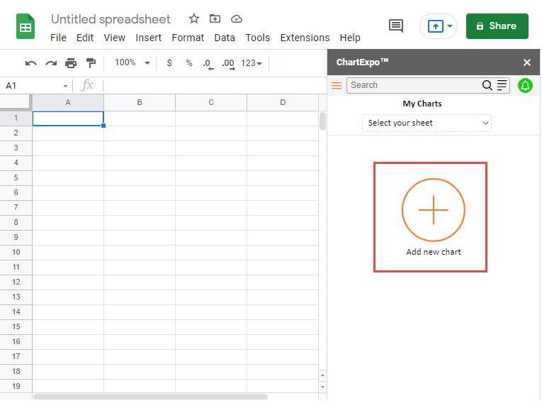
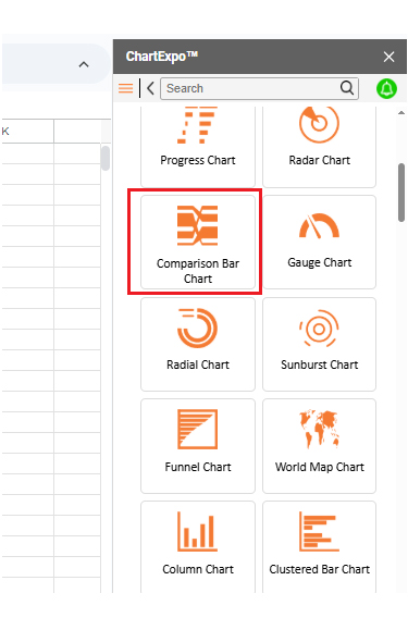
How to Install ChartExpo in Google Sheets?

  1. To start using ChartExpo, download it directly from the Google Sheets program. To do this, select Extensions from the top toolbar.
  2. A menu will appear. Click the Get add-ons option.
  3. Search for ChartExpo, and click on Charts, Graphs & Visualizations by ChartExpo when it appears in the results.
  4. Click the Install button. You will have to confirm your Google account and accept some permissions.

ChartExpo charts are available both in Google Sheets and Microsoft Excel. Please use the following CTAs to install the tool of your choice and create beautiful visualizations in a few clicks in your favorite tool.

Example

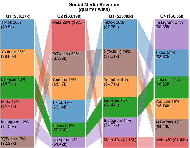
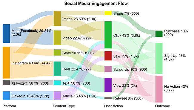
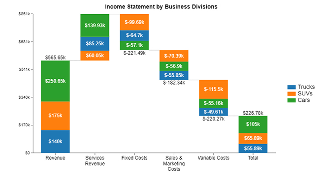
Let’s visualize the data below using ChartExpo, and learn how to share a Google Sheet.

Quarter

Channel

Revenue

Q1 YouTube 8879
Q2 YouTube 6168
Q3 YouTube 4708
Q4 YouTube 5739
Q1 TikTok 9798
Q2 TikTok 6144
Q3 TikTok 7750
Q4 TikTok 8569
Q1 X(Twitter) 2333
Q2 X(Twitter) 7233
Q3 X(Twitter) 7212
Q4 X(Twitter) 4463
Q1 Meta 5973
Q2 Meta 9504
Q3 Meta 1149
Q4 Meta 1441
Q1 Instagram 4549
Q2 Instagram 1419
Q3 Instagram 4216
Q4 Instagram 9848
Q1 LinkedIn 6743
Q2 LinkedIn 2725
Q3 LinkedIn 4443
Q4 LinkedIn 6289
  • To get started with ChartExpo, install ChartExpo in Google Sheets.
  • Go to Extensions > Charts, Graphs & Visualizations by ChartExpo > Open.
Google Sheets Tips and Tricks
  • To access the charts library, click the Add new chart button.
Google Sheets Tips and Tricks
  • Once it loads, scroll through the charts list to locate and choose the “Comparison Bar Chart”.
Google Sheets Tips and Tricks
  • Put the data table in the sheet first. Then, choose the Sheet name from the drop-down in the ChartExpo section.
  • Select the metric column; metric is the numeric column in your data sheet.
  • Select the dimensions column; the dimension is the categorical column in your datasheet that contains text information.
  • Click the Create chart button to complete the process.
Google Sheets Tips and Tricks
  • If you want to add anything to the chart, click the Edit Chart button:
Google Sheets Tips and Tricks
  • Click the pencil icon next to the Chart Header to change the title.
  • It will open the properties dialog. Under the Text section, you can add a heading in Line 1 and enable Show.
  • Give the appropriate title of your chart and click the Apply button.
Google Sheets Tips and Tricks
  • Change the alignment of the label as follows:
Google Sheets Tips and Tricks
  • Change bar color from the “Column Bar Properties” menu as follows:
Google Sheets Tips and Tricks
  • You can show the percentage on the label as follows:
Google Sheets Tips and Tricks
  • You can increase font size for better readability from “Font Style”:
Google Sheets Tips and Tricks
  • After making all changes, click on the “Save” button:
Google Sheets Tips and Tricks
  • Your final chart will look like the one below.
Google Sheets Tips and Tricks

Insights

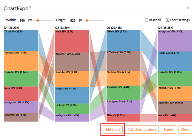
Total revenue trends

  • Q1: $38.7K
  • Q2 (highest): $39.19K
  • Q3 (lowest): $29.48K
  • Q4: $36.35K

TikTok

  • Q1: 26% ($9.8K)
  • Q4: 24% ($8.57K)
  • Performance remained fairly stable

YouTube

  • Q1: 23% ($8.88K)
  • Q4: 15% ($5.74K)
  • Notable decline over time

LinkedIn

  • Q1: 18% ($6.74K)
  • Q4: 17% ($6.29K)
  • Slight decrease, relatively stable

Instagram

  • Q1: 12% ($4.55K)
  • Q4: 27% ($9.85K)
  • Strong growth, finishing the year strong

Meta

  • Q2 (peak): 29% ($9.5K)
  • Q4: 4% ($1.44K)
  • Significant decline across the quarters

X/Twitter

  • Q3 (peak): 24% ($7.17K)
  • Q4: 12% ($4.46K)
  • Saw a mid-year spike followed by a drop

Benefits of Using Google Sheets Tricks

Are you tired of repeating the same tasks in spreadsheets and wasting hours cleaning up messy data? You’re not alone. Most people use Google Sheets for the basics—rows, columns, maybe a sum here and there. But once you start using Google Sheets tricks, everything changes.

Here’s how these tricks help:

  • Save time: Automate boring steps. Spend less time formatting and more time making decisions.
  • Stay organized: Use tools like Remove Duplicates to clean messy lists in seconds. Sorting and filtering become effortless.
  • Make smarter decisions: Use tools like VLOOKUP for Google Sheets and what-if analysis in Google Sheets to analyze scenarios quickly. No more second-guessing your numbers.
  • Collaborate better: Tricks simplify how you share, comment, and edit in real-time. Combine that with knowing how to share a Google Sheet, and your team stays in sync.
  • Add functionality: Integrate with live data using IMPORTDATA in Google Sheets. Or use a Google Sheets extension to bring in charts, analytics, and AI tools.
  • Visualize instantly: Whether you want to track time or create comparisons, time tracking and visuals help bring your data to life.

Google Spreadsheets Tips and Tricks to Solve Common Problems

Spreadsheets can be frustrating. One wrong cell, and everything falls apart. But small changes make a big difference. You don’t need to be a tech wizard—just know the right moves. These quick tricks solve common headaches and save serious time:

  • Skip the manual sorting: Instead of dragging rows up and down, use built-in sort tools to rearrange data instantly. It keeps everything clean and easy to scan.
  • Stop losing your headers: Freeze the top row so your labels stay visible as you scroll through the data. It’s simple, and it makes extensive datasets way less confusing.
  • Avoid typing the same thing over and over: Use drop-down lists for repetitive entries. It reduces typos and ensures your data remains consistent.
  • Don’t panic over deleted work: You can check version history and restore old edits in seconds. Think of it as an undo button that goes way back.

FAQs

How to do cool things on Google Sheets?

  • Use conditional formatting for color-coded insights.
  • Automate with formulas.
  • Add checkboxes for interactivity.
  • Pull live data with built-in functions.
  • Create charts and mini dashboards.
  • Link sheets for dynamic updates.

How do I make a Google Sheet attractive?

  • Use clean fonts and align data neatly.
  • Add color to headers and categories.
  • Freeze the top rows for easy viewing.
  • Apply borders to separate sections.
  • Use charts for visual appeal.
  • Keep the layout simple.

Wrap Up

Want to work faster and smarter? Start learning the top Google Sheets tips and tricks. These aren’t just convenient shortcuts—they’re true game-changers for anyone who works with data. You can use formulas to simplify complex calculations or layout tricks that make your spreadsheets more readable. These tools can dramatically cut down the time you spend on repetitive tasks. Instead of constantly correcting or reformatting spreadsheets, you’ll be focused on what matters—getting results.

With Google Sheets’ Artificial Intelligence, your workflow becomes even more efficient. You can clean, predict, and organize data with just a few clicks. It doesn’t matter whether you’re preparing a report, analyzing trends, or organizing data from different sources. AI features help you work smarter, not harder.

Need to monitor your team’s performance or keep tabs on business goals? Google Sheets allows you to create powerful dashboards that update in real-time. Use charts, conditional formatting, slicers, and automation tools to visualize progress and insights clearly.

And when it comes to sharing updates, collaboration becomes seamless. One well-designed dashboard can serve your entire team for months. Build once, update forever.

In conclusion, Google Sheets is more than just a spreadsheet—it’s a platform for making smarter decisions and streamlining teamwork. Every click you save adds up – small changes lead to substantial efficiency gains.

So, do not hesitate; start applying these tricks today and see the difference.

How much did you enjoy this article?

GSAd2
Start Free Trial!
156128

Related articles

next previous
Google Sheets13 min read

Google Spreadsheet Templates: You Can Use Today

Google spreadsheet templates simplify tracking, planning, and reporting. Click here to learn how to use them with examples, tips, visual tools, and more.

Google Sheets14 min read

How to Import HTML into Google Sheets for Better Insights

Discover how Import HTML Google Sheets brings live web data into your sheet. Learn HLOOKUP, data tips, and chart tricks to simplify analysis.

Google Sheets5 min read

How to Create a Sankey Diagram in Google Sheets?

Learn how to create a Sankey Diagram in Google Sheets to visualize flows like customer journeys, energy transfers, and cash movement for deeper analysis.

Google Sheets11 min read

How to Edit a Google Sheet Like a Pro

Learn how to edit a Google Sheet easily. Discover step-by-step guidance, permission settings, and top chart techniques to boost your productivity.

Google Sheets10 min read

Import CSV to Google Sheets: A Quick Walkthrough

Importing CSV to Google Sheets allows you to upload and use CSV data. Click here to learn how to import, analyze, and manage CSV files in Google Sheets.

ChartExpo logo

Turn Data into Visual
Stories

CHARTEXPO

  • Home
  • Gallery
  • Videos
  • Services
  • Pricing
  • Contact us
  • FAQs
  • Privacy policy
  • Terms of Service
  • Sitemap

TOOLS

  • ChartExpo for Google Sheets
  • ChartExpo for Microsoft Excel
  • Power BI Custom Visuals by ChartExpo
  • Word Cloud

CATEGORIES

  • Bar Charts
  • Circle Graphs
  • Column Charts
  • Combo Charts
  • Comparison Charts
  • Line Graphs
  • PPC Charts
  • Sentiment Analysis Charts
  • Survey Charts

TOP CHARTS

  • Sankey Diagram
  • Likert Scale Chart
  • Comparison Bar Chart
  • Pareto Chart
  • Funnel Chart
  • Gauge Chart
  • Radar Chart
  • Radial Bar Chart
  • Sunburst Chart
  • see more
  • Scatter Plot Chart
  • CSAT Survey Bar Chart
  • CSAT Survey Chart
  • Dot Plot Chart
  • Double Bar Graph
  • Matrix Chart
  • Multi Axis Line Chart
  • Overlapping Bar Chart
  • Control Chart
  • Slope Chart
  • Clustered Bar Chart
  • Clustered Column Chart
  • Box and Whisker Plot
  • Tornado Chart
  • Waterfall Chart
  • Word Cloud
  • see less

RESOURCES

  • Blog
  • Resources
  • YouTube
SIGN UP FOR UPDATES

We wouldn't dream of spamming you or selling your info.

© 2025 ChartExpo, all rights reserved.