Categories
By ChartExpo Content Team
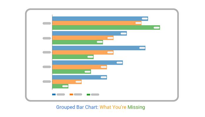
You’ve probably seen a grouped bar chart in a meeting, or maybe you’ve used one in a report. But, have you ever stopped to think: Is it the right choice for the data you’re showing?
A grouped bar chart can be an effective tool for displaying data, but it can also fall flat if not used correctly. It’s easy to get lost in the clutter of bars and lose your audience’s attention.
The problem? Many people don’t realize that a grouped bar chart isn’t just a “one-size-fits-all” solution. If it’s not set up well, it can confuse more than it clarifies. Instead of sparking conversation, your chart might lead to silence in the room. And that’s the last thing you want during an important presentation.
So, how can you fix this? It’s all about how you use your grouped bar chart. This guide will show you how to avoid common mistakes, make your data clear, and ensure your chart grabs attention for the right reasons. Ready to learn how to present your data with confidence?
Ever sat in a meeting where your grouped bar charts are on the screen, but the room’s silent? It’s unnerving. No questions, no feedback. Just a quiet room staring at your work. That silence screams one thing: your chart failed. People aren’t engaging because they don’t get it. They’re checking their phones, not your data. Silence in this case is not golden.
So, how do you catch that early? Watch for signs. If your audience isn’t asking questions, they might be confused. If there’s no debate, they might not care. A chart that doesn’t provoke conversation is a chart that missed its mark. Your job is to make sure your data sparks more than a glance. It’s about turning that silence into dialogue before it’s too late.
Here’s the deal: the middle of your grouped bar chart often fades into the background. Eyes drift to the edges, leaving the center ignored. Key data hiding in plain sight. It’s a cognitive blind spot that can sink your presentation. And if that middle data is crucial, you’re in trouble.
How to fix it? Give it a spotlight. Bold colors or distinct patterns can draw attention back to where it’s needed. Reordering categories might help. The aim is to break the pattern of neglect. Make sure your middle data stands out, not fades away. It’s about ensuring every piece of your chart gets the attention it deserves.
Two bars side by side? Doesn’t mean they’re related. Our eyes lie to us, creating connections where none exist. This false relationship can lead to wrong conclusions. Proximity tricks the brain into seeing links that aren’t there, muddling your message.
How do you clear the fog? Introduce spacing or lines to break the illusion. Use colors to differentiate groups that shouldn’t be linked. It’s about clarity, not confusion. Your grouped bar chart should guide, not mislead. Keep the relationships clear, because misinterpretation can sink your data’s impact.
Ever tried handing your chart to someone who has no clue about your project? It’s like watching a magic trick with the secrets revealed. Give it to a colleague who’s not in the loop. Watch where they get lost. Their confusion is gold. It shows you where your chart fails to communicate.
Those blank stares? They tell you everything you need to know. If your chart can’t speak for itself without a backstory, it’s not ready. You want your visuals to do the talking. If they can’t, back to the drawing board.
Before your chart sees the light of a meeting room, run a quick checklist. Are the labels clear? Do the colors make sense? Can a stranger understand the story? This is your five-minute audit.
Look for potential pitfalls. Does the chart raise more questions than it answers? If yes, it’s not ready. You want to head into that meeting knowing your chart won’t leave you open to a barrage of questions.
Ever had an argument over which version of a chart was the latest? It’s a nightmare. Keep a trail of every change. Jot down design tweaks, metric updates, and context shifts. It’s your insurance policy against confusion.
Version control saves you from the chaos of miscommunication. You don’t want to be guessing which chart is the right one when the pressure’s on. Document everything. It’ll save your sanity later.
A failed presentation is no fun. But it’s a goldmine of lessons. If your chart bombs in the meeting, dissect it that night. Identify the misreads, the signals that didn’t land, and where you lost them.
Capture those mistakes while they’re fresh. This is your chance to fix paths and dodge the same pitfalls next time. Don’t wait until the sting wears off. Learn from it immediately, and your next meeting will go smoother.
The following video will help you perform a Grouped Bar Chart in Microsoft Excel.
The following video will help you perform a Grouped Bar Chart in Google Sheets.
Ever stare at a chart and wonder if there’s an easier way? Enter the line plot. It’s the go-to when you need to show trends over time or compare changes across multiple groups. The simplicity of a line plot can often convey a message faster than a bunch of bars grouped together. When you want to show how things change, a line is direct. No confusion, just clarity.
Now, let’s talk speed. In a fast-paced meeting, a line plot might be your best friend. It’s quick to read and understand. If your audience needs to grasp changes fast, they’ll thank you for choosing a line plot. It’s about getting to the point without any fuss. So, when bars feel like too much, think of lines.
Small multiples might sound like a fancy term, but they’re just a series of mini-charts. Each one shows a slice of your data. Think of them as a way to keep things tidy when your data gets messy. They let you maintain uniformity while comparing multiple datasets side by side. It’s like having multiple windows open on your screen, each with a clear view.
When you’re dealing with complex stories, small multiples can save the day. They help break down information into digestible pieces. Instead of cramming everything into one giant chart, you get clarity by showing each dataset in its own space. It’s a neat way to avoid overwhelming your audience.
Complexity for complexity’s sake? Not worth it. If your chart takes longer to explain than the insight it provides, it’s time to rethink. Ask yourself: Does every element serve a purpose? If not, simplify. A chart should guide your audience, not confuse them. Stripping down unnecessary elements can lead to a more impactful presentation.
When you’re in the hot seat, defending a complex chart can be tough. If you can’t clearly explain why it’s designed that way, maybe it’s time to rethink the approach. Aim for simplicity. Make sure every piece of your chart earns its place. A straightforward chart can deliver powerful insights without any extra fluff.
Ever seen a chart that looks like a rainbow but tells you nothing? That’s what happens when a chart lacks a narrative. It’s crucial to embed a story into the visual so viewers don’t get lost in the colors. Start by identifying the key points you need to convey, then arrange the data to highlight these insights.
Think of it like telling a story, where each bar is a sentence leading to the big reveal. Use annotations to guide the viewer. Highlight trends or anomalies with callouts that explain why they matter. This helps the audience follow along without getting sidetracked.
Critics are everywhere, and they love to poke holes in your visuals. Anticipate their questions before they even glance at your chart. Consider who will be analyzing it and think about their perspective. Are they detail-oriented or big-picture thinkers?
Add layers of detail for those who like to dig deep, while ensuring the main message is clear for everyone else. Use colors and labels wisely to avoid misinterpretation. This way, even the toughest critic will struggle to find something to argue about.
Walking into a meeting without priming your audience is a recipe for disaster. The goal is to have them understand your visual before you even start talking. Send out pre-reads or have side chats to set the stage. This gets everyone on the same page early.
Think of it as setting up a domino effect. A little nudge beforehand makes the entire presentation smoother. When your audience knows what to expect, they’re more likely to engage and less likely to question the fundamentals. It’s about controlling the narrative from the start.
You know the feeling. You’re standing in front of the room, chart up on the screen, and there’s silence. That’s when it hits you: not everyone in that room speaks the same data language. Understanding your audience’s data literacy is critical. Some folks can read charts like a novel, others need subtitles. There’s no one-size-fits-all approach.
So, map it out. Who are the visual learners? Who needs numbers spelled out? Tailor your visuals to match their fluency. Use simple visuals for the beginners, complex layers for the pros. This isn’t about dumbing down; it’s about making sure everyone leaves the room knowing what they need to know. If someone’s lost, the chart didn’t do its job.
You’ve got one shot before the questions start flying. Anticipate those objections. You know the ones: “Why does this number look off?” or “What does this trend mean for us?” Your design should answer them before they’re asked. Use annotations to highlight key data points. Make sure your visual hierarchy leads them through the story.
Add emphasis where it’s needed. If a number is critical, make it stand out. Don’t let the audience guess which parts matter. Structure your chart so the path is clear, and the objections lose their edge. The aim? To make your meeting a smooth ride, not a bumpy interrogation.
Context is your ally. Without it, your chart is just a bunch of bars. Bake context into the visuals. Provide background info right there on the chart. If a number spikes, explain it. If a trend shifts, give the reason. The goal is to reduce interpretive gaps so no one is left scratching their head.
Think of it like telling a story. Each bar, each line, should have a purpose and a place in the narrative. When context is layered properly, your audience stays with you. They don’t wander off into confusion. Each view should feel complete on its own, leaving no room for misinterpretation.
Ever tried reading a novel with a hundred main characters? It’s chaos. The same goes for visual data. When you group too many categories into one chart, it becomes a muddled mess. Each bar fights for attention, and in the end, none of them win. The reader’s eyes dart around, trying to make sense of the clutter, but all they get is a headache. Keep it simple. Limit the categories to a few key players. This is your hard cap for clarity.
Think of each category as a guest at a dinner party. Too many, and no one gets a chance to speak. The conversation becomes noise. By trimming the list, you give each category space to breathe, allowing their stories to unfold clearly. This isn’t just about order; it’s about making sure each piece of data truly matters. If a category doesn’t add value, it’s time to let it go.
Ever seen a movie where every scene looks the same? Boring, right? A similar thing happens when your data lacks contrast. If all the bars blend, nothing stands out, and your message disappears into the background. You need standout moments, peaks that grab attention. Use color, size, or labels to highlight what’s critical. Make those key points undeniable.
Flatline charts are the silent killers of engagement. They fail to ignite interest, causing eyes to glaze over in meetings. Avoid this by creating focal points. Draw viewers in with strategic design choices that emphasize differences. When something pops, it prompts discussion, and that’s where data becomes actionable. In the end, you’re not just showing data; you’re telling a story, one that demands attention.
The middle often becomes the Bermuda Triangle of charts. Data goes in, but nothing meaningful comes out. Those central categories? They’re frequently overlooked, lost in a sea of more prominent data points. To fix this, reorder or highlight these critical pieces. Don’t let them vanish into obscurity.
Think of it as rearranging furniture in a room. Sometimes, a small shift can make everything feel new. Prioritize these central points by giving them a spotlight. Use visual cues or reposition them to make sure they’re not ignored. When the center holds, your whole presentation gains balance, and your message gets through without getting lost in translation.
Imagine a company where half the employees don’t contribute. That’s what happens when your chart is cluttered with unnecessary data. Each bar should justify its presence, offering value to the narrative. If it doesn’t, it’s time to cut it loose. This isn’t about being ruthless; it’s about being effective.
In charts, as in life, less can be more. By trimming the excess, you sharpen the focus. This approach forces you to ask the tough questions: Does this data point push the story forward? If not, it’s just dead weight. Streamline the content so every bar stands as a vital piece of the puzzle, ensuring your message lands with impact and clarity.
Scaling in charts might seem harmless, but it’s a trap. Start stretching or shrinking scales, and you’re on thin ice. People want a straightforward story, not a puzzle. If the bar heights mislead viewers, their trust in your data goes out the window. Keep scales consistent. Align them with reality.
Real-world consequences hit hard. Misleading visuals can wreck credibility. Once lost, trust is tough to regain. A misstep could lead to misinformed decisions, and nobody wants to explain that mess. It’s all about transparency. Keep it honest, or prepare for fallout.
Clarity is king. When labels are vague, you’re inviting confusion. A chart should answer questions, not create them. If viewers start guessing, you’ve already lost them. Precision in labeling is key. Make every label count, reduce room for error.
The cost of ambiguity isn’t minor. Misinterpretations lead to wrong outcomes, and you’re the one holding the bag. Accurate labels save time and face. They guide the viewer’s eye, making the story crystal clear. Avoid the ambiguity tax, and your charts will deliver clarity.
Assumptions are the silent killers in data. If buried, they turn on you. Lay them out clearly. Make sure viewers understand the ‘why’ behind the numbers. Hidden assumptions are landmines, ready to explode at the worst moment.
Transparency isn’t optional. When assumptions are explicit, you build a safety net. It’s about setting the stage for informed decisions. State them clearly, and you avoid nasty surprises later. It’s all about owning the narrative, not letting it own you.
Annotations are like road signs on a highway. If someone has to guess which exit to take, they’re probably going to end up lost. Label every significant data point with care, focusing on guiding the viewer to the right conclusions. It’s about precision, not decoration. Imagine the relief when your audience doesn’t have to play detective, piecing together what the numbers might mean.
Clear labeling is your secret weapon. Each label should point directly to an action or decision. If a bar represents a spike in sales, don’t just say, “Sales increased.” Instead, highlight what drove that spike. Was it a holiday promotion? A new product launch? Put it right there on the chart. The goal is to make it unmistakable what needs to be done next.
Think of your chart as a conversation starter. It should scream the next step without a whisper of doubt. Embed cues directly into your visuals. Use arrows, bold text, or even simple color shifts to signal where attention should go next. It’s about steering the room’s energy toward action, not debate.
Every data set should lead to a clear path forward. If your sales data shows a dip, your chart must guide the discussion to solutions, not just the problem. Maybe it means reallocating resources or revisiting marketing strategies. Make sure it’s all laid out clearly. That way, when the meeting ends, everyone knows exactly what to do.
In meetings, time is currency. Start with the headline insight. Give the big picture first, then drill down if needed. This isn’t about withholding information; it’s about prioritizing what matters most. Let the key takeaway hit them first, and then, if they want more, the details are there, ready and waiting.
Imagine being in front of a room full of executives. They want the answer now, not a walk-through of your process. So, lead with the punchline. “Our revenue increased by 20% due to digital sales,” and then offer deeper insights if they ask. This approach ensures that even if time runs short, the most important message is delivered.
Think of your chart as a dish served at a dinner party. You wouldn’t bring it out without letting your guests know what to expect. Brief your audience ahead of the meeting. Send a quick email or have a side conversation to set the scene. This primes them for what’s to come, ensuring they’re not caught off guard when the chart appears.
Pre-conditioning your audience isn’t just about avoiding surprise. It’s about aligning their expectations with your narrative. If there’s a big shift in data, let them know why it happened before the meeting. This way, they walk in with the right context, ready to engage with the chart and, more importantly, ready to act.
Tailoring visuals to different audiences is key. Executives want clarity and speed. Keep it simple. Focus on key insights, not details, especially when reviewing summarized views like a percentage bar graph. Analysts, though, thrive on depth. Give them the granularity they crave. Operators need functionality. Show them trends that impact operations. Each group sees the world differently. Your visual should, too.
Think of it like this: a chameleon on a changing background. The essence is the same, but the presentation shifts. This is not about creating multiple charts. It’s about tweaking one to fit many perspectives. Misalignment? That’s a meeting killer. Get it right, and you own the room.
Color isn’t just a splash of paint. It’s a tool. Use it wisely. A well-chosen palette draws focus to what’s important. Too many colors, and you lose the plot. Your audience’s eyes dart everywhere, missing the story. Keep it meaningful.
Consider this: red for loss, green for gain. Simple, direct. But it’s not just about red and green. Consistency matters. Stick to a scheme that aligns with your message. Colors should whisper, not shout. Overuse is like a fog that clouds judgment. Clarity depends on restraint.
Size matters. A chart on a projector is not the same as one in an email. Scaling for the medium ensures your message hits home. On paper, fonts can be small. On screen, they need to be legible from afar. A chart that demands squinting is a chart that’s ignored.
Imagine sitting at the back of a meeting room. The slide is up, but you can’t read it. Frustration sets in. Don’t let your audience experience that. Test your visuals in the intended medium. A little foresight prevents a lot of hindsight.
Words are powerful. Use them sparingly. Not every data point needs a label. Focus on what drives decisions. Highlight insights, not noise. This keeps the conversation on track. Labels should guide, not clutter.
Think of labels as signposts. They point you to the right path. Too many, and you’re lost in a maze. The key is to illuminate, not overwhelm. Prioritize clarity. Make each label count. This is about precision, not verbosity.
Grouped bar charts have a shelf life. What made sense last month might not today. Regular audits keep your visuals fresh. Check for relevance. Update outdated data. This isn’t a one-time task. It’s a habit.
Picture it as cleaning out a closet. Remove what no longer fits. Keep what’s still useful. Regular reviews ensure your chart remains a trusted tool, not a relic. Stay vigilant. Your credibility depends on it.
Creating a grouped bar chart that communicates your data requires more than just slapping bars on a graph. It’s about design choices, context, and how well you guide your audience through the story your data tells. Without careful consideration, your chart can leave people confused rather than informed.
It’s easy to fall into the trap of overloading your chart with too many categories or letting colors get in the way of clarity. But with some simple tweaks, you can make a grouped bar chart a powerful tool for comparison and understanding. From reorganizing categories to using spacing effectively, the possibilities for improvement are endless.
In the end, a grouped bar chart should make your data clearer and more impactful, not more complicated. Keep the focus on simplicity, clarity, and relevance, and your chart will deliver the results you need.
Remember: A well-designed chart doesn’t just show data; it tells a story.
How much did you enjoy this article?


Calculate accounts receivable turnover ratio to measure credit collection speed, improve cash flow, and strengthen your financial strategy. Read on!

Change Management KPIs are the key to tracking adoption, performance, and ROI during transitions. Find out which metrics matter. Read on!

Data collection methods and techniques determine the quality of every insight you act on. Explore key approaches for gathering reliable data. Read on!


