Categories
Excel Data to Graph refers to the process of converting your spreadsheet data into visual charts within Excel to help you analyze and understand trends more easily.
By entering your data into rows or columns, selecting it, and using Excel’s chart tools, you can create visual representations like line charts, bar graphs, or pie charts. This makes complex data easier to interpret and helps you present your insights clearly for reporting, analysis, or decision-making.
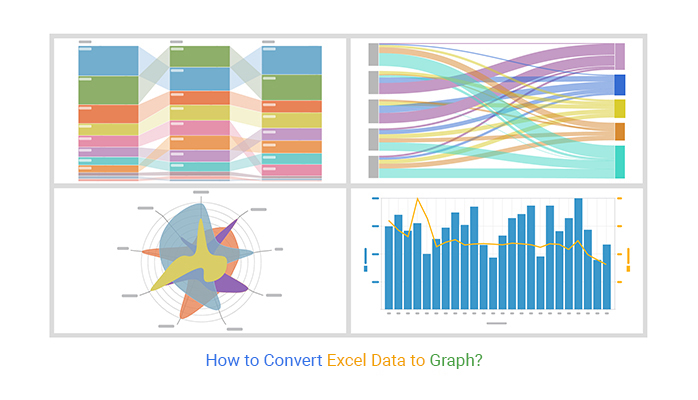


If you have been to business meetings, you know that visual representations play a great role. Many professionals use charts or graphs to explain some aspects of the company. It could be a chart outlining the team’s development on a significant project. Or it might be visualizations that convert Excel data to graphs to compare the company’s revenues to those of its rivals.
In either case, the information is considerably simpler to interpret and absorb, thanks to these graphs and charts. One of the essential features of Microsoft Excel is its charts. Why so? Charts assist you in clearly presenting your data.
And that is just the tip of the iceberg!
You can exhibit your data in Excel using a variety of charts and graphs. What does that mean? It is possible to construct various complex charts and graphs in Excel by making little adjustments to the basic charts. Unfortunately, most Excel users don’t experiment with charting methods very much. You only need a little more work and can learn to convert Excel data into graph.
A tool like ChartExpo for Excel has the advantage of being targeted at a specific type of data to boost its readability. This article will explain how to use Excel to convert your data into charts.
But first, here is a closer look at some things.
Here is why we convert Excel data into a chart. By now, you must know what a misery it can be to navigate through data. It can be challenging to study and process big data sets. Consequently, it could be a difficult task to analyze it. Excel, on the other hand, can save the day.
Excel has functions that can quickly and conveniently process a lot of data. These spreadsheets make it easier to convert Excel data into charts, such as Box and Whisker plots or Scatter charts, which are great for visualizing the distribution of data. But that is not even the best part. These functions are relatively simple, so anyone may use them to examine the data.
Excel is not just helpful but necessary for data analysis because of how quickly, efficiently, and accurately it operates. It can help you save time while making it easy to analyze data, including with a Waterfall chart, without difficulty.
Want to see how it works? Continue reading.
Before we convert Excel data to a graph, you must keep in mind some things. Microsoft Excel’s cells are excellent at holding information. However, long rows of data are typically not the greatest method to display the information to others.
Furthermore, they may make it harder to interpret the data yourself. Instead, learning chord diagrams can offer a more visually intuitive way to present and understand the data.
Thankfully, Excel offers a variety of chart formats, from traditional bar charts to 3-D area charts to circular pie charts. These charts, including the Sunburst graph, assist you in visualizing the cell data. Want to know the best part?
Excel can turn practically any bunch of data into a chart by using Excel data to graph converter. The trick is to arrange the data desirably and select the style of chart you like, whether it’s a circular graph, bar graph, pie chart, or even a Mosaic plot. So, how does an Excel data convert to a graph? Here, let’s get into the magic.
Fill out Excel with your info.
From the nine graph and chart possibilities, select one to create.
Highlight your data and select the suitable graph by clicking “Insert.”
Change the information on each axis as necessary.
Change the font and color scheme for your data.
Adjust the axis labels and legend size on your chart.
Alternatively, you can change the Y-axis measurement choices.
If necessary, rearrange your data.
Name your graph.
Export the graph or chart you created.
As you can see, converting Excel data into a graph is not complicated. But we are not through yet. For more advanced visualizations and impactful presentations, consider incorporating data storytelling techniques to effectively convey your data’s narrative.
You can convert Excel data to graphs using a variety of data visualization tools. These can be simple, complicated, intuitive, or obtuse. ChartExpo is among the best tools available and is used as an Excel data-to-graph converter. It allows you to display all of your data to obtain the insights you need at a glance.


Let’s say you own an online business with three different products: TVs, smartphones, and PCs. After a year, you would be curious to see how your sales have changed with each product after using various digital marketing strategies. For instance, you have the following data and want to use data visualization to examine this report.


| Months | TVs | Smart Phones | Computers |
| Jan | 80 | 100 | 50 |
| Feb | 65 | 60 | 55 |
| Mar | 75 | 95 | 51 |
| Apr | 80 | 75 | 40 |
| May | 90 | 100 | 45 |
| Jun | 85 | 60 | 30 |
| Jul | 65 | 95 | 39 |
| Aug | 70 | 75 | 45 |
| Sep | 80 | 109 | 56 |
| Oct | 93 | 80 | 39 |
| Nov | 99 | 109 | 48 |
| Dec | 80 | 75 | 44 |


After the chart appears, adjust it for better readability:
Here is the catch.
You can quickly assess the performance of your product sales from the given radar chart. You can see that in January, smartphones accounted for the majority of sales. Similarly, Computer sales are down, while smartphone sales are up in March. This visual aid makes it simple to comprehend your sales report at a glance.
We will use another example to help you understand more: how does an Excel data convert to graphs? Suppose you are a business owner who recently employed four new salespeople.
You want to review the report of their sales performance to determine if they are performing well or not. In this case, a Treemap could be particularly useful.
Like a Treemap visualizes hierarchical data by representing it as nested rectangles, which allows you to see the proportion of sales performance for each salesperson at a glance, helping you easily identify top performers and those needing improvement
In that case, the Comparison Bar Chart is the perfect tool for doing so. Assuming you obtained the information below, let’s get to work.
| Months | Name | Sales |
| March | Alan | 90 |
| March | David | 82 |
| March | Lewis | 66 |
| March | Boris | 72 |
| April | Alan | 85 |
| April | David | 62 |
| April | Lewis | 50 |
| April | Boris | 73 |
| May | Alan | 40 |
| May | David | 60 |
| May | Lewis | 80 |
| May | Boris | 76 |
You have the following chart using ChartExpo.


In another example, assume a digital marketing firm is interested in visualizing a company’s monthly sales numbers. At the same time, the company wants to demonstrate how the profit margin has changed. It has the following data to evaluate:
| Months | Revenue | Profit Margin |
| Jan | 5000 | 5 |
| Feb | 2500 | 10 |
| Mar | 3600 | 7 |
| Apr | 3250 | 14 |
| May | 1975 | 19 |
| Jun | 1874 | 20 |
| Jul | 3952 | 6 |
| Aug | 2222 | 9 |
| Sep | 4260 | 4 |
| Oct | 3300 | 22 |
| Nov | 1500 | 17 |
| Dec | 1160 | 9 |
The following Double-axis line and Bar Chart are available with ChartExpo.

This chart lets you easily grasp your annual revenue over profit margin analysis. With the help of this analysis, you may increase the profit you make from your company’s operations. The graph’s blue bars represent revenue, and the yellow line shows how your revenue’s profit margin has changed over the year.
Let us dig a little deeper!
Imagine you want to evaluate ChartExpo’s data to determine what steps to take to increase the profitability of your business. The Sankey chart is the greatest visual representation of this kind of data. Consider that you have gathered the information below.
| Locations | Revenue | Expenses | P&L Analysis | Count |
| North America | Revenue | Loss | Cost of Sales | 132 |
| North America | Revenue | Loss | Cost of General and Administrative | 159 |
| North America | Revenue | Loss | Cost of Marketing | 170 |
| North America | Revenue | Profit | Tax | 182 |
| North America | Revenue | Profit | Profit After Tax | 834 |
| International | Revenue | Loss | Cost of Sales | 162 |
| International | Revenue | Loss | Cost of General and Administrative | 158 |
| International | Revenue | Loss | Cost of Marketing | 145 |
| International | Revenue | Profit | Tax | 171 |
| International | Revenue | Profit | Profit After Tax | 753 |
| Middle East | Revenue | Loss | Cost of Sales | 155 |
| Middle East | Revenue | Loss | Cost of General and Administrative | 166 |
| Middle East | Revenue | Loss | Cost of Marketing | 199 |
| Middle East | Revenue | Profit | Tax | 151 |
| Middle East | Revenue | Profit | Profit After Tax | 685 |
You have the following Excel charts using ChartExpo.

Let’s go back briefly to our previous question on why we convert Excel data to graph. Graphs and charts are crucial because they enable audiences to assess data swiftly and recognize relationships. They aid in simplifying the data so that the audience can easily understand and remember it. Understanding how to make a graph from a table further enhances this process, ensuring that the visual representation is accurate and effective.
To make it simpler to grasp vast amounts of data, as well as the relationships between various series of data. Excel has different chart types that can display data in understandable ways.
Thanks to the competitive modern world, there is so much data gathering in the corporate sector today. As a result, we need a way to visualize the data to understand it. Thankfully, data visualization helps us understand what the information means by providing it with a visual context through maps or graphs. As a result, the data is easier for the human mind to understand.
Data visualization, one of the crucial processes in the business intelligence process, takes the raw data, models it, and visually presents it. It may support you in any business or job by delivering data most effectively. That makes it simpler to spot trends, patterns, and outliers in enormous data sets.
One of the best upgrades for data analysis is ChartExpo. ChartExpo, a tool for advanced analytics. It helps you convert Excel data to a graph for better visualization. Its use of advanced charting techniques is one of the things that sets Excel experts apart from newbies.
To sum up, data visualization makes it simple to ensure your data is as optimal as possible. In addition to making the information more memorable for stakeholders, visualization can help you start asking the correct questions. Finding opportunities in your data using data visualization tools like ChartExpo is quite helpful.
How much did you enjoy this article?


Learn how to use sparklines in Excel to quickly visualize trends inside cells. Discover types, creation steps, customization, use cases, benefits, and best practices.

Learn what a confidence interval graph is, how to create it in Excel, and how to interpret results to make more reliable, data-driven decisions.

A correlation matrix in Excel helps identify relationships between variables. Learn how to create, read, and use it for effective data analysis.


