Categories


Charts tips & tricks, how-to and step-by-step guides that will help you save time and money.

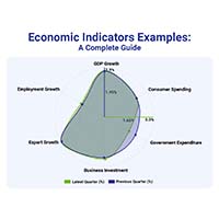
Unlock the power of data with this guide to Segmented Bar Graphs. Learn its types, pros and cons, and when to use it for clear data visualization in Excel.

Measuring Workforce Productivity helps businesses track performance and boost efficiency. Explore key methods, formulas, and metrics. Read on!
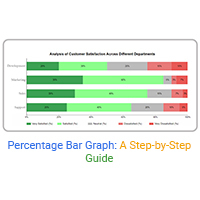
Learn how to create, calculate, and design a percentage bar graph using best practices to clearly visualize data proportions and comparisons for better decisions.