Categories
Whether you are a business owner, financial analyst, or just someone who wants to control your finances, you need to know your monthly cash flow template in Excel.


Why?
The key to growing your business is a monthly cash flow template in Excel. You can only pay your expenses, invest strategically in your company, or look for outside finance if you have it.
You may correctly and purposefully carry out these tasks by keeping track of where cash is coming from and using a monthly cash flow statement. But because creating a monthly cash flow statement can take a toll on you, an excellent tool to use is a monthly cash flow template.
A monthly cash flow template allows you to track your income and expenses over time. This information is essential for making informed financial decisions and saving money.
Definition: A Monthly Cash Flow Template in Excel is a structured spreadsheet designed to track and manage all cash inflows and outflows within a specific month. It helps individuals and businesses record income, expenses, and savings in an organized format, providing a clear picture of financial health.
By using Excel formulas and visualizations, the template makes it easier to monitor spending patterns, identify cash shortages or surpluses, and plan future budgets effectively.
1. Income and Expense Tracking
The template allows you to record and categorize all your inflows and outflows, giving you a clear picture of where your money is coming from and where it’s going.
2. Automated Calculations
Built-in formulas automatically calculate totals, balances, and net cash flow, saving time and reducing errors compared to manual tracking.
3. Easy-to-Read Layout
The structure is simple and organized, making it easy to view monthly financial data at a glance without needing advanced Excel skills.
4. Customizable Columns and Categories
You can adjust income sources, expense categories, and reporting periods to fit the unique needs of your business or household
In this video tutorial, you’ll learn how to create and cash flow diagram in Excel.
A monthly cash flow format in Excel is essential for tracking and managing your finances effectively. It provides a clear picture of your income and expenses, showing exactly where your money is coming from and where it’s going.
By using this format, you can:
For businesses, a monthly cash flow format plays a critical role in coordinating financial activities, managing resources efficiently, and monitoring actual performance against expectations. Even when results differ from forecasts, having a structured template helps maintain financial stability and transparency.
Track inflows and outflows on a monthly basis to monitor short-term financial health and spot spending patterns.
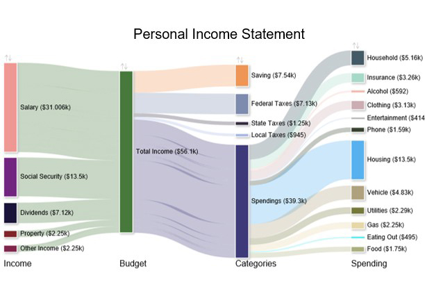
A personal monthly cash flow template in Excel is ideal for individuals. This template helps manage household income, expenses, and savings goals.
Designed for companies, this format includes detailed tracking of operating, investing, and financing activities.
Connects the income statement, balance sheet, and monthly cash flow statement in one template for a complete financial overview.
Let’s say you own a small business and want to track your monthly cash flow effectively. If you use a monthly cash flow template, you can see how much money you’re bringing in and how much you’re spending. You can also see how much money you can make or lose in a month.
This can help you make better financial decisions. You can see how much you spend on things like supplies and payroll. You can then use this information to make changes. You can scale back on the amount you spend on supplies. Or you can decide to increase your payroll to hire more employees.
Here is a short list of things you can track with columns in your monthly cash flow template:
You can also add a column for your net worth. This will give you a clear picture of your finances over time. You can see exactly how much your net worth is growing or shrinking.
Now that we’ve discussed a monthly cash flow template and why we need one, let’s discuss how to create one. To create a monthly cash flow template, you need a data visualization tool. It’s impossible to examine the complex data required to make a monthly cash flow statement without a data visualization tool.
However, the usage of data visualization is broad. There are various applications for each style of data visualization. While many tools are at your disposal to assist you in creating your charts, the majority of them give you only some of the insights you desire from your data.
In this situation, you can construct all the charts in a single dashboard using the ChartExpo add-on. Sankey Diagrams cannot be drawn using the built-in templates of such products; hence, creating one in Excel is complicated.
However, with a Sankey chart maker like the ChartExpo add-in for Excel, creating a Sankey Diagram becomes straightforward. It only takes a few clicks to generate a clear and insightful flow visualization.
How to Install ChartExpo in Excel?
ChartExpo charts are available both in Google Sheets and Microsoft Excel. Please use the following CTA’s to install the tool of your choice and create beautiful visualizations for a monthly cash flow spreadsheet in a few clicks in your favorite tool.
Sankey diagrams are useful for visualizing a monthly cash flow spreadsheet. They can help identify areas for improvement or inefficiencies and can be easily understood by a wide audience.
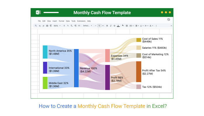
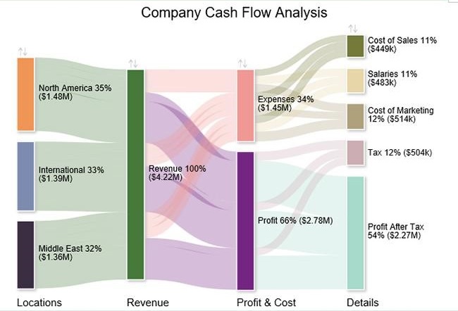
Here, we will track a company’s monthly cash flow plan using a Sankey chart in Excel. Let’s say the following data is your company’s cash flow for one month:
| Locations | Revenue | Profit & Cost | Details | Amount |
| North America | Revenue | Expenses | Cost of Sales | 132000 |
| North America | Revenue | Expenses | Salaries | 159000 |
| North America | Revenue | Expenses | Cost of Marketing | 170000 |
| North America | Revenue | Profit | Tax | 182000 |
| North America | Revenue | Profit | Profit After Tax | 834000 |
| International | Revenue | Expenses | Cost of Sales | 162000 |
| International | Revenue | Expenses | Salaries | 158000 |
| International | Revenue | Expenses | Cost of Marketing | 145000 |
| International | Revenue | Profit | Tax | 171000 |
| International | Revenue | Profit | Profit After Tax | 753000 |
| Middle East | Revenue | Expenses | Cost of Sales | 155000 |
| Middle East | Revenue | Expenses | Salaries | 166000 |
| Middle East | Revenue | Expenses | Cost of Marketing | 199000 |
| Middle East | Revenue | Profit | Tax | 151000 |
| Middle East | Revenue | Profit | Profit After Tax | 685000 |


1. Open Microsoft Excel
Launch Excel on your computer and go to the start screen.
2. Search for Templates
In the search bar, type “Cash Flow Template” or “Monthly Cash Flow” and press Enter.
3. Browse Available Options
Look through the suggested templates and choose one that matches your needs (e.g., personal, small business, or detailed monthly cash flow).
4. Download the Template
Click on the chosen template, then select Create (or Download) to open it directly in Excel.
5. Save and Customize
Save the template to your computer, rename it, and start customizing it with your own financial data and financial charts.
Gives you a snapshot of your monthly income and expenses, making it easier to understand your financial position.
With accurate monthly cash flow analysis, you can plan for investments, cut unnecessary costs, and allocate resources wisely.
Helps you monitor money coming in and going out, so you can avoid cash shortages and maintain stability.
Supports budgeting and forecasting by highlighting trends in spending and earnings.
Organizes data in a simple format that can be easily shared with stakeholders, accountants, or team members.
Record your income and expenses consistently—weekly or monthly—to keep the data accurate and useful.
Use clear categories (rent, payroll, utilities, sales, etc.) to easily identify where your money is going.
Track differences between your projected and actual monthly cash flow to spot trends and make adjustments.
Leverage the template to plan for upcoming expenses or investments and avoid unexpected cash shortages.
A good Excel monthly cash flow template should be simple, easy to update, and provide a clear structure for tracking income and expenses. It should include built-in categories for inflows, outflows, assets, and liabilities, along with formulas that automatically calculate totals and net monthly cash flow.
Flexibility for customization is key, so you can adjust it to fit your needs. Most importantly, it should present the data in a way that’s easy to understand, ideally with summaries or charts that give a quick view of your financial position.
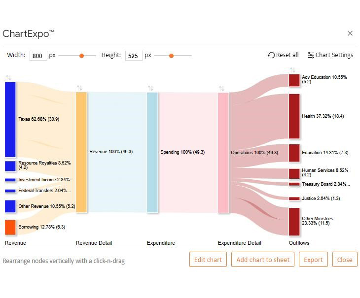
Yes, Excel has a monthly cash flow template when installing the ChartExpo add-in. ChartExpo provides a Sankey visualization. This chart provides a sample data template, but you may change it with your data and create the visualization for your data.
To create a personal cash flow, start by listing all sources of income and tracking monthly expenses. Categorize your spending, subtract expenses from income, and review the balance to understand savings, gaps, or adjustments needed.
A handy, monthly cash flow template is a great way to track money as it comes and goes. It helps you develop better financial habits by watching your income and outgoings line up every month. But what should it look like? How can you make the best use of it?
If you have to track your cash flow from month to month and need help tracking this critical metric, the information above will help. Everything you need to make rapid, informed decisions based on reliable, understandable data is available with ChartExpo explained above.
Organizations can benefit from effective data visualization by making the connections between KPIs. Before the data is visualized, the relationship between one KPI and another is not immediately clear. When that happens, a Sankey Diagram will help you find the opportunities in your data.
Sankey Diagrams are an excellent method for displaying facts. Because of the data complexity, it is essential to consider the user’s knowledge and expertise in data visualization. Also, the Sankey Diagram can help visualize the data.
How much did you enjoy this article?


Learn how to create a Control chart in Excel to track process stability, detect unusual variation early, and improve data-driven decision-making.
Learn how to create and use frequency charts in Excel to simplify data analysis, visualize distributions, and make better business decisions with clear insights.

Learn what box plot outliers in Excel are, how to detect them using the IQR method, and how to interpret them with real-world examples and Excel use cases.