Categories
A Cash Flow Diagram is one of the crucial tools you need to account for every coin getting in and out of your business.
So, what is it?
You can use this chart to visualize the expenses and income generated by your business for clarity.
The visualization design comes in handy in organizing and examining securities, especially investment swaps. You can also leverage it to track installment plans for bonds, mortgages, and other kinds of credits.
The charts are amazingly easy to read and interpret.
Excel lacks a ready-made cash flow diagram for your visualization needs. You don’t have to dump this spreadsheet app in favor of other expensive instruments.
You have an option of installing a particular add-in to access a ready-made and insightful cash flow diagram Excel for your data stories. Keep reading to discover more.
Before jumping right into the how-to guide, we’ll address the following question:
Definition: A Cash Flow Diagram in Excel is a visualization that displays insights into the income and expenses in a specified time. It consists of nodes and flows that represent the inflows and outflows.
Cash flow is the net amount of cash and cash equivalents coming in and out of your business.
The cash you’ve received represents inflows. On the other hand, the expenditures represent outflows. Your ability to create value for shareholders is determined by your brand’s ability to generate positive cash flows. You can also use a Stacked Waterfall chart to show positive and negative cash flows, similar to a simple Waterfall diagram.
The amount of data you can capture with cash flow models is massive. And this means you risk analysis paralysis if you don’t visualize this data for clarity.
This is where a Cash Flow Chart, such as the Sankey Diagram, comes in.
An Excel cash flow diagram is a vital tool for understanding and managing the financial health of a project or business. Here’s why it’s important:
In the following video, we will show you how to create a cash flow chart in Excel in a few clicks without any coding.
Definition: A cash flow diagram generator is a tool for creating a visual representation of your cash flow. It helps you to analyze your financial situation and make better decisions when managing your finances. It uses charts, graphs, and other visuals to illustrate the flow of cash. You can use it to track income, expenses, and investments.
This tool is useful for both individuals and businesses. It helps you identify potential cash flow problems and take the necessary steps to address them.
Cash flow analysis involves analyzing an organization’s inflow and outflow of cash. It helps assess a business’s overall financial health and forecast future cash flow. In addition, it helps to identify the sources of cash, such as sales, investments, and loans. It is vital in identifying cash usages, such as operating expenses, capital expenditures, and debt repayment.
Begin by drawing a horizontal axis in your spreadsheet to serve as the timeline. Define key intervals such as months, quarters, or years along this line, depending on the duration of your project or analysis.
Inflows: Use upward arrows to indicate when money enters the project or business.
Outflows: Use downward arrows to depict expenses or money flowing out. This visual distinction helps clarify the nature of each transaction.
Arrows: Visually link the cash flows to specific time periods using directional arrows.
Positioning: Align the arrows precisely on the timeline to indicate the timing of each cash transaction, ensuring chronological accuracy.
Cash Flow Amounts: Attach labels to each arrow to display the monetary value.
Flow Types: Optionally, annotate the arrows with descriptive categories like “Startup Costs,” “Sales Revenue,” or “Maintenance Expenses” for better context.
Bar Charts: Bar charts help visualize cumulative cash flow over time. You can plot inflows and outflows at each period to assess the financial trend and identify peaks or dips.
Waterfall Charts: Waterfall charts break down how individual cash flows—both positive and negative—affect the total cash position. This type of chart makes it easy to trace how specific expenses or revenues contribute to the net change over time.
Sankey Diagrams: A Sankey diagram offers a more dynamic and intuitive visualization of how money moves through different parts of a project or business. Each flow is represented by a wide or narrow arrow, depending on the amount, showing exactly where cash is coming from and how it’s being allocated (e.g., revenue flowing into costs, investments, fund flow chart, and savings). It’s beneficial when you want to analyze the distribution and efficiency of cash usage across multiple areas or departments.
This reporting typically includes details on expenses, vendor payments, budget adherence, and other financial transactions, presented in a structured and comprehensible format. It may also encompass tools and methods, such as how to generate a monthly budget in Excel, to aid stakeholders, executives, or relevant teams in assessing and acting upon the financial data.
ChartExpo is a customized chart maker to suit your needs. You can add labels and descriptions to the charts to make them easier to understand.
In the coming section, you’ll discover how to make a Cash Flow Diagram Excel.
Excel is one of the most used visualization tools. However, the spreadsheet application lacks a ready-made Cash Flow Diagram, such as the Sankey Diagram.
We’re not advising you to do away with Excel in favor of other expensive tools.
This is because there’s an amazingly affordable visualization tool that comes as an add-in you can easily install in Excel to access an insightful and ready-to-go Cash Flow Diagram Excel.
In the coming section, we’ll take you through how to plot a Cash Flow Chart Example in Excel.
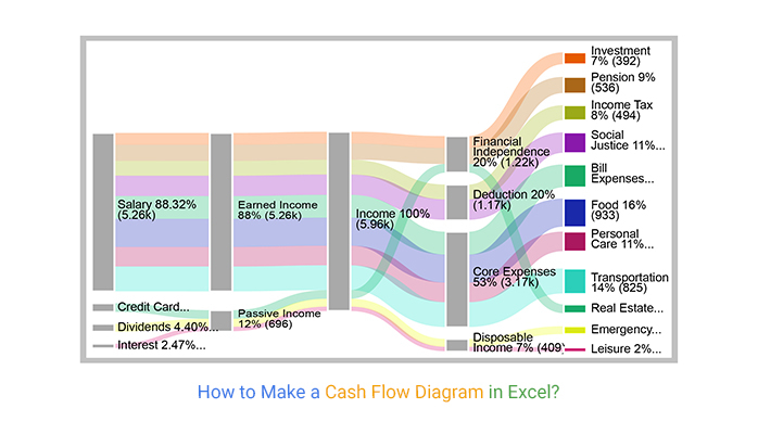
See how income sources, deductions, and expense categories connect in a clear visual format to help you track spending, manage budgets, and improve financial decisions.
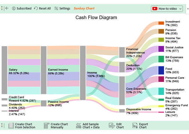
Understand how business revenue flows through different cost centers and contributes to final profit, helping you analyze financial performance and identify optimization opportunities.

Step 1: Adding Chart Title/Header

Step 2: Adding Prefix

Step 3: Adding Color

Step 4: Final Diagram

There are different ways to visualize your cash flow. The prevalent way is to use a cash flow graph generator. It allows you to represent your cash flow using charts and other visuals.
You can also use spreadsheets to visualize your cash flow. For instance, an income statement template in Excel or a finance dashboard in Excel can help you create a timeline of your income, expenses, and investments. This approach enables you to track your financial situation over time effectively.
Here are things to consider when choosing a cash flow diagram generator:
A cash flow diagram generator is a program you can use to create cash flow diagrams. It automates the process of cash flow examination and provides a visual representation.
The first step is to install the add-in. Then, you can enter your income and expenses into Excel. Generate the cash flow chart with add-in. Finally, you can customize the chart to suit your needs.
You can create diagrams that show the sources of income and expenses over time. You can identify cash flow trends that need to be clarified in financial reports.
Common features include the ability to create diagrams that illustrate financial transactions over time. They have customizable graphs and charts, customizable labels and colors, and data import/export capabilities. In addition, many cash flow diagram generators provide forecasting capabilities.
There are three types of cash flows, namely:
Operating cash flow is generated from your operations and cash sales. Cash flow from investments is the money spent on buying stocks or bonds (investments).
Lastly, financing cash flow is the expense of acquiring capital.
A Cash Flow Diagram is one of the crucial tools you need to account for every coin getting in and out of your business.
You can use this chart to visualize the expenses and income generated by your business for clarity.
The visualization design comes in handy in organizing and examining investment securities. You can also leverage it to track installment plans for bonds, mortgages, and other kinds of credits.
The charts are amazingly easy to read and interpret.
Related Articles
How much did you enjoy this article?


Learn how to use sparklines in Excel to quickly visualize trends inside cells. Discover types, creation steps, customization, use cases, benefits, and best practices.

Learn what a confidence interval graph is, how to create it in Excel, and how to interpret results to make more reliable, data-driven decisions.

A correlation matrix in Excel helps identify relationships between variables. Learn how to create, read, and use it for effective data analysis.


