Categories
By ChartExpo Content Team
The bell curve chart isn’t just a graph—it’s a lens that brings clarity to complexity. Whether you’re analyzing student test scores, product quality, or customer behavior, this chart organizes data into a simple, symmetrical story.
The curve peaks where the data is most common, then gently slopes down, giving you a clear view of how the numbers stack up.


Why is the bell curve chart so essential? It turns abstract numbers into patterns you can see. By showing how data clusters around an average and spreads out, the chart makes it easier to identify trends, predict outcomes, and even spot anomalies.
Whether you’re tackling business analytics or scientific research, the bell curve chart equips you with insights you can act on.
What sets the bell curve chart apart is its versatility. From classrooms to boardrooms, it’s a go-to tool for anyone needing to interpret data. It doesn’t just show the averages; it highlights the range and variance, offering a snapshot of the bigger picture. If you’re ready to make sense of your data, the bell curve chart is the first step toward informed decisions.
First…
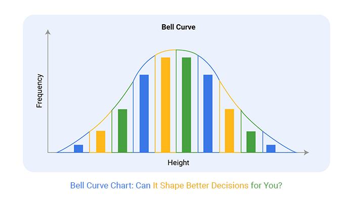
A Bell Curve Chart, also known as a normal distribution chart, is a powerful tool in data presentation. It represents data that clusters around a central peak, decreasing at either end, creating a shape similar to a bell.
This type of chart is a visual representation of normal distribution in statistics, often used in visual analytics. It shows the highest frequency of data points in the middle, with the frequency decreasing symmetrically towards both ends of the chart.
Think of it as showing how things like test scores or heights fall into a natural pattern where most are average, and few are at the extremes.
Now, let’s focus on the key features of a Bell Curve Chart. First and foremost, it’s symmetric! The left side is a mirror image of the right side. The peak in the middle? That’s the mean, median, and mode of your data set, all neatly packed into one central spot. Isn’t it neat when all your averages line up?
Another feature is the spread of the data, known as the standard deviation. It tells you how much the data varies from the average. In a Bell Curve, about 68% of the data falls within one standard deviation of the mean, and about 95% falls within two. This helps to understand how much variation exists in the data you’re looking at, making charting standard deviation a key aspect of data analysis.
Understanding these features helps anyone get a clearer picture of the data’s overall distribution.
Whether you’re a student, a business analyst, or just a curious learner, seeing data in a Bell Curve Chart can really clarify what those numbers and figures are trying to tell you. Don’t you love it when data starts making sense?
Normal distribution is defined by its bell-shaped curve. This curve is symmetric about the mean, meaning half the values fall below the mean and half above.
The mean, median, and mode of a normal distribution are all equal, located at the center of the curve. This symmetry indicates that the data near the mean are more frequent in occurrence than data far from the mean.
The bell curve’s symmetry makes it a useful tool in statistics. It demonstrates that for every point on one side of the mean, there’s a corresponding point on the other side. This balance is crucial for predicting outcomes in various fields like finance, research, and more.
The curve’s shape also helps in identifying outliers or extreme values that deviate from what is typical within the dataset.
First, gather your data set. You need a comprehensive set of data points to plot a meaningful bell curve. Input these data points into a software tool that supports statistical graphing, such as Excel or Google Sheets.
Next, sort your data from smallest to largest. Calculate the mean and standard deviation of your dataset; these statistics are foundational for constructing the bell curve, as they define its center and width, respectively.
Now, plot your data points on a graph. On the horizontal axis, you’ll place the value range of your data. The vertical axis will represent the frequency of data points.
Using the mean and standard deviation, create your bell curve. The peak of the curve will align with the mean on the horizontal axis, and the spread of the data will be evident by the shape of the curve.
Statistical methods are crucial in defining the parameters of a bell curve. The most critical method involves calculating the mean and standard deviation. The mean provides a central value around which the data points are dispersed, while the standard deviation shows the extent of the dispersion, making statistical graphs an essential tool for visualizing this distribution.
To enhance accuracy, consider employing software tools that perform these calculations and plot the curve automatically. This ensures precision and saves time.
By mastering these steps and methods, you can effectively utilize bell curve charts to analyze and interpret complex data, making informed decisions based on statistical insights.
Bell Curve Charts, or normal distribution graphs, show how data points distribute across a mean in most scenarios. Other data visualizations like pie charts or bar graphs highlight different aspects of data, such as proportions or categories.
Bell Curves provide insights into the spread and outliers, emphasizing the standard deviation and mean.
Histograms and Bell Curve Charts both visualize distribution.
Histograms use bars to show frequency of data points within certain ranges.
Bell Curve Charts smooth these bars into a curve, showing a continuous distribution. This smoothing helps in identifying the data’s central tendency and variability more clearly than histograms, which focus more on the frequency within intervals.
Box plots and Bell Curve Charts serve to display data spread, but in different ways.
Box plots offer a five-number summary: minimum, first quartile, median, third quartile, and maximum. They’re great for spotting outliers and understanding the range.
Bell Curve Charts, however, provide a more detailed view of how data points cluster around the mean, which is crucial for seeing the standard deviation and distribution shape.
Bell Curve Charts, in contrast, focus on the distribution of a single variable. They excel in displaying the data’s spread and central values, which is essential for statistical analysis and predicting probabilities, making them a valuable tool in predictive analytics.
A Scatter plot chart doesn’t offer insights into distribution, but it is key in spotting trends and correlations.
The following video will help you create a Histogram in Microsoft Excel.


The following video will help you to create a Histogram in Google Sheets.
In any bell curve, the mean, median, and mode all fall at the center peak. This is the point where the data is most concentrated. Knowing this central point helps in understanding the typical value of your data set.
For instance, if you’re looking at test scores, the peak of the bell curve shows the score most students achieved.
Outliers are data points that don’t fit the general pattern. In a bell curve, you spot outliers in the tails. These are scores or values significantly lower or higher than the rest. Identifying outliers helps in pinpointing errors or exceptional cases in your data.
For instance, if most students scored around 70 and a few got near 100, those high scores are your outliers.
Variance and standard deviation are measures that tell us how spread out the data is around the mean.
A low standard deviation means data points are close to the mean, represented by a steeper bell curve.
A high standard deviation shows more spread, leading to a flatter bell curve.
Understanding these concepts helps in assessing the reliability of the data. For example, in measuring performance, a high variance might indicate inconsistent results across the board.
A bell curve chart is perfect for performance reviews. It shows how most employees perform, highlighting top performers and those needing improvement. This visual representation helps managers quickly see productivity trends and make data-driven decisions.
In quality control, a bell curve chart helps spot products that meet standards and those that don’t. It shows the spread of product quality, making it easier to identify outliers. This helps in maintaining high-quality products and services.
Bell curve charts are valuable in risk analysis. They predict various outcomes and their likelihood, helping businesses prepare for potential risks. This proactive approach aids in minimizing the impact of uncertain events.
Overlaying multiple bell curves can reveal insights into different data sets’ behaviors under similar conditions.
For instance, comparing the performance of two sales teams over the same period can highlight differences in their outcomes. Each team’s data set gets its bell curve, and overlaying these on a single graph allows for direct visual comparison.
Examining data distribution involves more than looking at averages; it focuses on how data spreads across various market segments or demographics. Bell curves help in identifying which segments deviate from the average.
This is crucial for targeting marketing efforts or tailoring products to meet specific customer needs more effectively.
Bell curves are not just snapshots; they can track changes over time.
By plotting bell curves for different periods, analysts can spot shifts in data trends. This might show how customer preferences evolve, indicating a need to adjust business strategies. Detecting these shifts early can be pivotal for maintaining competitive advantage.
In healthcare, Bell Curve Charts map out patient data to show common outcomes or reactions to treatments, providing valuable insights for healthcare analytics.
For instance, if most patient recovery times cluster around a specific period, the Bell Curve peaks there.
This data visualization helps medical professionals identify typical recovery times and spot outliers who recover unusually fast or slow. Hospitals and clinics can use this data to predict patient needs, allocate resources more efficiently, and personalize patient care plans based on common recovery trajectories shown by the curve.
Marketers love Bell Curve Charts because they reveal consumer behavior patterns. By plotting product choices or customer satisfaction scores, a Bell Curve can highlight the most common consumer reactions.
If the curve shows a peak in satisfaction, it’s clear the product hits the mark.
Conversely, a flat curve with data spread out might suggest varied consumer preferences, prompting a strategy rethink. This chart helps marketers adjust campaigns, enhance product features, and tailor experiences to meet consumer needs more effectively.
When your bell curve chart doesn’t look quite right, it’s often due to incorrect scales or skewed data.
First, check the scale of your horizontal axis. The scale should match the range of your data set. If the numbers seem off, adjust the scale settings in your charting software.
Next, examine the data itself. Skewed data can distort your bell curve, making it lean too heavily to one side. To fix this, look for outliers that might be pulling the distribution away from normality. Removing or adjusting these values can help recenter your curve.
Standard deviation is key to plotting an accurate bell curve. Errors here can throw off your entire chart. Ensure you’re using the correct formula—remember, it’s the square root of the variance.
Double-check your calculations or the settings in your software that compute this value. Misentered data points can also lead to incorrect standard deviation. Verify each entry in your data set to make sure they’re correct and consistent.
To align data points with the normal distribution, ensure your data set follows a bell curve pattern. This means most data points should cluster around the mean, with fewer occurrences toward the extremes.
If your data isn’t naturally distributed this way, consider using data transformation techniques. Techniques like logarithmic or square root transformations can help normalize skewed data. After transforming, re-plot your data to check if it now resembles a bell curve. Adjust as necessary until the fit improves.
A well-made bell curve chart can turn a dry report into an engaging narrative. It shows stakeholders not just the outliers but also how most data clusters around the average. This helps in making informed decisions as it points out the extremes while highlighting the common outcomes.
Bell curve charts are excellent for pointing out the thresholds and outliers. They show how far data points deviate from the average. This is crucial for stakeholders who need to focus on exceptions or assess risk levels. It brings clarity by visually segregating the usual from the unusual.
When integrating bell curve charts into narratives, it’s important to align them with the story you want to tell.
Start by defining the main message of your data. Place your bell curve chart strategically in your presentation to support this message.
Make sure to label all parts of your chart clearly—this includes the mean, distribution curves, and any significant data points like outliers or thresholds. This method keeps the audience engaged and makes your narrative stronger and more coherent.
Kurtosis and skewness are two statistical measures that can provide deeper insights into the shape and characteristics of a data distribution.
Kurtosis refers to the “tailedness” of a distribution, or how sharply the tails of the distribution differ from those of a normal distribution.
Skewness, on the other hand, measures the asymmetry of the distribution around its mean.
Analyzing these two aspects can help identify the nature of the distribution and predict patterns that might not be visible from the mean and standard deviation alone.
Understanding the distribution of data is crucial in decision-making processes.
For instance, skewed data might lead to misinterpretation if one assumes that the data is normally distributed. Decisions based on the mean and median of such datasets could be misleading.
Recognizing whether the data is left-skewed or right-skewed will help in making more accurate predictions and better decisions, as it indicates whether the majority of data points fall below or above the average.
Bell Curve Charts, often hailed for their ability to depict data trends and averages, can sometimes fall short in their application. The primary limitation? They assume a normal distribution of data. But what happens when the real-world data we’re dealing with isn’t so tidy?
Imagine you’re looking at test scores from two different classes.
One class shows a classic bell curve distribution, indicating most students performed around the average.
The other class, however, might have scores clustered at both extremes—lots of high scorers and lots of low scorers, with fewer in the middle.
This pattern forms what’s known as a bimodal distribution. Here, using a standard Bell Curve would be like trying to fit a square peg into a round hole; it just doesn’t capture the reality of the data.
Outliers—those data points that stand far apart from the rest—are like the rebels of the data world. They refuse to conform to the norm, and they have a significant impact on your data analysis.
For instance, a single extremely high or low score in a set of data can skew the entire average, pulling the mean up or down. This skew can lead to misguided interpretations and decisions, especially if we rely solely on a Bell Curve for our analysis.
In cases with skewed data, the mean isn’t where most data points lie, which is what a Bell Curve assumes. You might find that the median (the middle value in a list of numbers) or mode (the most frequent value) gives a better sense of “average” under these conditions. This understanding shifts how we approach both the analysis and the subsequent actions based on that analysis.
In essence, while Bell Curve Charts are undoubtedly useful tools in the statistician’s toolbox, they’re not universally applicable. Recognizing their limitations is crucial in avoiding missteps in data interpretation and ensuring that our conclusions are both accurate and relevant.
In the competitive world of Software as a Service (SaaS), understanding customer trends is key to survival. Bell curve charts are a game player here. They help SaaS companies track subscription growth rates effectively.
By plotting the number of subscriptions against time, businesses can identify normal distribution of growth. This shows when growth peaks or if there are declines. Managers use this data to make strategic decisions, like when to push marketing campaigns or enhance features to boost subscriptions.
Manufacturing industries always strive for perfection, but defects happen. That’s where bell curve charts come in handy. They plot the frequency of product defects in a given period. This visualization helps quality assurance teams to pinpoint when defects occur most often and under what conditions.
By analyzing this data, companies can tweak production processes to reduce defects. This not only improves product quality but also enhances customer satisfaction and reduces costs related to wastage and recalls.
In finance, risk management is crucial. Bell curve charts serve as a vital tool for financial analysts to assess portfolio risks and returns.
By plotting the returns of portfolio assets, analysts can observe the normal distribution of returns and identify outliers. This analysis helps in understanding which assets are performing as expected versus those that are too risky.
Armed with this information, financial planners can make informed decisions on asset allocation and risk management, aiming for optimal portfolio performance with controlled risk exposure.
A bell curve chart, also known as a normal distribution chart, is a visual representation of data that clusters symmetrically around a central peak. This chart is famous for its smooth, bell-shaped curve that highlights how values distribute in a dataset. It’s widely used to identify patterns, predict outcomes, and detect outliers in fields like education, business, and healthcare. If you’ve ever wondered how test scores or customer behaviors align with averages, this chart provides a clear and insightful answer.
The bell curve chart simplifies complex data by turning numbers into visible patterns. It shows where most data points fall, usually around the mean, and how they spread out toward the tails. This makes it easier to understand variability and consistency in a dataset. Whether you’re comparing employee performance or evaluating product quality, the bell curve provides actionable insights by visually emphasizing trends and anomalies.
Reading a bell curve chart starts with understanding its symmetry. The peak represents the mean, where most data points cluster. As you move away from the center, the frequencies decrease symmetrically. For example, in employee performance evaluations, the peak may show average performers, while the tails highlight top and underperformers. This visual breakdown helps you pinpoint central trends and identify outliers.
A bell curve chart is known for its symmetry and central peak. The mean, median, and mode align perfectly at the peak, making it a reliable indicator of central tendencies. The spread of the curve, determined by standard deviation, reveals the variability in the data. A narrow curve means less variability, while a wider one shows greater diversity. These features make it invaluable for understanding distribution and consistency in any dataset.
Yes, you can easily customize a bell curve chart to enhance clarity and relevance. Adjust axis scales to match your data range, use annotations to highlight key points like the mean or outliers, and apply color coding to emphasize different sections. These tweaks not only make the chart visually appealing but also ensure it communicates your data story effectively.
Unlike pie charts or bar graphs, which focus on proportions and categories, a bell curve chart emphasizes data distribution and variability. It offers a more nuanced view by showing how data points cluster around the mean and spread out. This makes it particularly useful for identifying trends and predicting probabilities, unlike scatter plots or box plots, which highlight relationships and data range.
While bell curve charts are powerful, they assume a normal distribution of data. This means they may not accurately represent datasets with outliers, skewness, or non-normal distributions. For instance, if your data shows bimodal or highly skewed patterns, a bell curve might oversimplify the story. Being aware of these limitations helps in selecting the right chart for your data analysis.
Bell curve charts simplify complex datasets, making patterns easier to understand and decisions more informed. By visually identifying central tendencies and anomalies, they help managers allocate resources, predict outcomes, and identify areas needing improvement. For instance, tracking employee performance or customer satisfaction scores with a bell curve chart enables targeted interventions that drive growth and efficiency.
The bell curve chart is more than a visual—it’s a tool for understanding. It shows where data clusters and how it spreads, helping you see patterns and spot outliers. Whether analyzing performance, quality, or risk, this chart simplifies complex datasets and guides smarter decisions.
By mastering the basics of creating and interpreting bell curve charts, you gain a skill that applies across industries. You can compare datasets, identify trends, and make informed choices. Its uses span education, business, healthcare, and beyond.
Remember, no tool is perfect. A bell curve assumes a normal distribution, which doesn’t fit every dataset. Recognizing when to use it—and when not to—ensures accurate insights.
The bell curve chart connects numbers to meaning. It turns data into stories that drive action. Now’s the time to use it and take your analysis to the next level.
How much did you enjoy this article?


Calculate accounts receivable turnover ratio to measure credit collection speed, improve cash flow, and strengthen your financial strategy. Read on!

Change Management KPIs are the key to tracking adoption, performance, and ROI during transitions. Find out which metrics matter. Read on!

Data collection methods and techniques determine the quality of every insight you act on. Explore key approaches for gathering reliable data. Read on!


