Categories
By ChartExpo Content Team
Your dashboard says things are fine. Revenue’s steady. Engagement is up. The graphs look great. But something’s not right.
Product analytics can give a false sense of confidence. Teams celebrate trends without questioning what’s underneath. Retention stalls. Churn creeps in. Everyone’s still guessing.
Product analytics isn’t broken. It’s misused. Tools get installed, but no one trusts the numbers. Reports get created, but no one acts. Testing happens, but nothing changes. This isn’t a tracking issue—it’s a thinking issue.
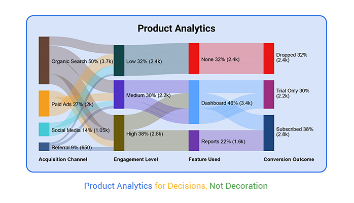
If product analytics isn’t changing how decisions are made, it’s wasting time. The goal isn’t to collect metrics. It’s to change outcomes. That only happens when teams stop treating analytics like decoration and start using them like a compass.
Product analytics should guide focus. Cut noise. Expose friction. Save money. If that’s not happening, you’re not doing product analytics. You’re doing dashboard theater. And it’s expensive.
Success can be a clever disguise. Imagine a bustling restaurant where every table is full. The owner thinks everything is going great, but the kitchen’s quality is slipping. Customers might not notice yet, but eventually, they will. Metrics might show lots of customers, but hidden issues could be brewing.
In the world of metrics, numbers can sometimes lie. A graph going up looks great, but what’s behind those numbers? Maybe customers are visiting but not returning. Or perhaps they’re buying but not satisfied. These hidden truths can lead to decay over time.
Metrics are like the tip of an iceberg. They show a small part of the story. Beneath the surface, there might be problems. It’s not enough to see numbers rise. One must dig deeper. Ask questions. Why are customers leaving negative feedback? Why is engagement dropping? Metrics should guide action, not just pat on the back. Businesses need to look beyond the surface, ensuring they’re not sailing into dangerous waters.
Setting up a shiny new tool feels like progress. It’s like buying a gym membership and then never going. The tool itself doesn’t create value. It needs active use, analysis, and action.
When teams rely on setup as proof of progress, they miss the point. A tool is only as good as its application. Simply having it doesn’t solve problems. It’s the insights and actions from it that matter.
Relying on tools as an excuse can lead to complacency. Teams might say, “We’ve set it up,” and stop there. But data needs interpretation. It requires a curious mind to ask, “What are we learning? What can we do differently?” Tools should serve as a means to an end, not the end itself. Without action, they’re just another unused membership collecting dust.
Having analytics doesn’t mean using them effectively. It’s like owning a map but never looking at it. Teams often claim they have all the tools but still make decisions on hunches. If everyone’s still guessing, then the tools aren’t doing their job. Data should inform every decision, big or small. It’s there to stop the guessing game.
When teams rely on guesswork, it’s a sign they might not trust the data. Maybe they don’t understand it, or perhaps it’s not accessible. Whatever the reason, it’s a missed opportunity. The goal is to turn data into a trusted advisor. One that guides decisions and provides clarity. If guessing is still happening, it’s time to reassess how data is being used. It’s about moving from “we have it” to “we use it.”
| False Beliefs in Product Analytics | ||
| False Belief | Reality | Recommended Mindset |
| More data always means better decisions | Too much data causes analysis paralysis without focus | Focus on key metrics that align with goals |
| Dashboards are automatically insightful | Dashboards can mislead if not tied to outcomes | Design dashboards around decisions, not decoration |
| Product analytics is only for product managers | Marketing, UX, support, and leadership all rely on insights | Democratize analytics across all relevant teams |
| Retention is less important than acquisition | Growth without retention is leaky and costly | Balance acquisition and retention strategies |
| If users sign up, they’ll stick around | Signup ≠ activation or long-term value | Track post-signup behavior and value realization |
| All engagement is good engagement | Some engagement signals friction, not satisfaction | Analyze engagement quality, not just quantity |
| One KPI is enough to guide strategy | Over-relying on one metric blinds teams to blind spots | Use KPI clusters to monitor full performance |
| Tool setup equals data success | Tools without use and trust waste resources | Build trust, literacy, and habits around tools |
| A/B tests always lead to progress | Most tests don’t affect key outcomes or strategy | Prioritize high-impact, strategic experiments |
| Attribution models don’t need updates | User behavior evolves—models must adapt | Continuously refine attribution to reflect reality |
It’s easy to fall into the Four-Tool Trap. Companies often think more tools equal better insights. But it’s a trap. More tools mean more complexity. Employees end up managing tools instead of getting answers. It’s like adding more instruments to a band without a conductor. The result is noise, not music.
Each tool might handle one task well. But together, they create a tangled web of information. Integration is tricky, and data doesn’t flow smoothly. Teams spend more time untangling data than analyzing it. The supposed benefits of extra tools vanish in this chaos.
Many companies install fancy dashboards thinking they’ll provide clarity. But if no one trusts the data, it’s just dashboard theater. People may admire them, but they don’t use them in decision-making. It’s like having a beautiful car with no engine. It looks good, but it doesn’t take you anywhere.
Trust in data is crucial. Without it, decisions are based on assumptions. Employees need to believe in the numbers to use them effectively. Trust grows from consistency and accuracy. If dashboards show conflicting data, they lose credibility. Trust is hard to build and easy to lose.
Ownership Drift often leads to political analytics. Different teams have different data interpretations. Without clear ownership, no one resolves these differences. It’s like a tug-of-war with no referee. The result is a stalemate, where no one moves forward.
Cross-functional teams face roadblocks. They argue over whose data is correct. Meetings become battlegrounds instead of problem-solving sessions. Progress stalls as teams defend their numbers. This wastes time and resources, hindering company growth.
A Clustered Column Chart can highlight accountability. It shows how different teams contribute to analytics output. When teams are accountable, they produce consistent data. It’s like a relay race where everyone knows their part. The baton passes smoothly, leading to a win.
Without accountability, output varies widely. Some teams may excel, while others fall behind. This inconsistency affects company decisions. By using visual tools like this chart, leaders can identify gaps. They can then address these issues, ensuring everyone contributes equally to success.
| Product Analytics Tools: Value vs. Cost | ||
| Tool or Scenario | Value (Perceived or Intended) | Cost / Risk |
| Multiple heatmap tools | Deeper user behavior insights | Overlapping insights, added complexity |
| Separate tools for events and funnels | More granularity in funnel tracking | Fragmented journey view, hard to align |
| Standalone A/B testing tool | Controlled experiments and optimization | Low utilization, steep learning curve |
| Redundant session recording platforms | Rich session playback for UX research | Storage bloat, poor ROI on insight quality |
| Multiple attribution platforms | More precise source attribution | Conflicting data, eroded trust |
| Heavy dashboarding tools with no adoption | Executive-level reporting | High cost with low decision impact |
| CRM + analytics with no integration | Unified customer view | Siloed data, broken user journeys |
| Complex tagging setup across tools | Precise event tracking | Increased dev workload, tagging fatigue |
| Manual data reconciliation processes | Cross-tool validation | Time-intensive, error-prone analysis |
| Using high-end tools for basic reporting | Professional-grade reporting capabilities | Underused features, unjustified expense |
A SaaS company faced ownership confusion. Multiple teams used different tools without clear guidance. This led to redundant processes and wasted money—$180K, to be exact. Imagine that money being flushed down the drain. Not a pretty picture.
The company took action. They clarified ownership roles. They streamlined tools and processes. By dismantling confusion, they saved money and improved efficiency. Now, they operate like a well-oiled machine. This story shows the power of clear ownership and streamlined tools.


(The KPI Hallucination)
Picture this: a company rallies around one shining metric, the North Star. It’s their guiding light, the beacon of success—or so they think. But relying on just one metric can be misleading. It’s like trying to find your way with a broken compass. A single KPI might not tell the whole story. It can mask underlying issues and lead your strategy astray.
By focusing solely on one number, you might miss crucial changes in user behavior or market dynamics. A balanced approach is key. Use a mix of metrics to get a full picture. This way, you’ll spot trends and shifts before they impact your bottom line. Remember, a true North Star should illuminate your path, not blind you.
Imagine standing in front of a mirror that always tells you you’re the fairest of them all. Vanity metrics are those flattering reflections. They make everything seem rosy, even when trouble brews beneath the surface. Metrics like downloads or page views can swell your ego but fail to reveal the churn lurking in the shadows.
These metrics can lull you into a false sense of security. They might show growth, but not all growth is good. Watch out for customers slipping away unnoticed. Focus on metrics that reveal true engagement and retention. It’s better to face hard truths early than to be blindsided by decline.
| Vanity Metrics vs. Actionable Product Analytics KPIs | ||
| Vanity Metric | Why It’s Misleading | Actionable KPI (What to Track Instead) |
| Page Views | Doesn’t reflect engagement or intent | Time on task, scroll depth, or feature interaction |
| App Downloads | Doesn’t mean activation or retention | Day 1/Day 7 retention |
| Total Signups | Ignores whether users see value | Activation rate (first-value event completion) |
| Social Shares | May not lead to meaningful product use | Referral-to-activation conversion rate |
| Bounce Rate | Vague without context | Exit rate on critical flows or friction points |
| Number of Sessions | Doesn’t measure quality of interaction | Session duration tied to conversion intent |
| Email Open Rate | Doesn’t show deeper product engagement | Post-email action rate (e.g., feature usage after click) |
| Total Clicks | Clicks may be misdirected or confused behavior | Task completion rate or goal funnel progress |
| Time Spent in App | Could indicate confusion, not value | Retention by feature usage or task success rate |
| Total Active Users (DAU) | May be inflated by shallow or passive activity | Cohort retention, LTV, or churn rate |
Success isn’t just about first impressions. It’s about long-term relationships. Mapping KPIs to the customer journey helps you track not just acquisition but also conversion and retention. Trial-to-paid conversion is a crucial stage. You want to see how many users become loyal customers. It’s a dance between intrigue and commitment.
Expansion is another vital area. Are existing customers deepening their engagement? Are they buying more or upgrading their plans? When metrics align with these goals, you gain valuable insights. It’s not just about getting new users but about nurturing the ones you have. This alignment helps ensure your strategy supports sustainable growth.
Remember the 80/20 rule? Often, 80% of your results come from 20% of your efforts. Pareto charts help identify these key drivers in your metrics. They highlight which factors most impact your outcomes. This isn’t just for show—it’s about predicting where you’ll see the most bang for your buck.
Using Pareto chart, you can prioritize efforts that truly matter. Instead of spreading resources thin, focus on the areas with the greatest potential. It’s a powerful way to streamline decision-making and maximize impact. By understanding which metrics drive success, you can steer your business in the right direction.
Here’s a tale of transformation: an app once obsessed with daily active users (DAUs) decided to shift its focus. The company realized that DAUs didn’t capture long-term value. They pivoted to retention cohorts, tracking user engagement over time. This change revealed insights into how users interacted and where improvements were needed.
The result? A 27% increase in lifetime value (LTV). By focusing on retention, the app fostered deeper user relationships. This story shows how changing the lens through which you view data can lead to better outcomes. It’s not just about attracting users but keeping them engaged and coming back for more.
The following video will help you to create a Sankey Diagram in Microsoft Excel.
The following video will help you to create a Sankey Diagram in Google Sheets.
The following video will help you to create a Sankey Diagram in Microsoft Power BI.
Signups can feel like the starting line of a race. But, they don’t always mark the first hurdle. Users often hit bumps before they even sign up. Friction can start with confusing info or a hard-to-navigate site. These issues can push potential users away before they even get started.
Considering the user’s journey before the signup is key. It helps in identifying barriers that might go unnoticed. Addressing these early friction points can make the path to signup smoother. This way, users are more likely to stick around and complete the journey.
Funnels suggest a one-way street, but user paths often loop back. They revisit pages, rethink choices, or hit dead ends. This non-linear behavior is normal. Yet, many analytics tools miss it because they expect a straight line. Understanding user behavior means embracing this complexity.
Abandonment isn’t always a sign of failure. Users might leave an app for valid reasons, planning to return. Recognizing these patterns helps in designing better user experiences. It’s about adapting to real user paths, not forcing them into a mold.
Time-based funnels focus on how long users take to complete steps. But, they can miss why users struggle. Behavioral funnels, on the other hand, reveal user actions. They show where users click, pause, or leave. This insight highlights friction points that time-based views can hide.
Time alone doesn’t tell the whole story. It’s the actions users take—or don’t take—that reveal their challenges. Understanding both sides gives a clearer picture of user behavior. This dual approach helps in addressing issues and improving user flow.
| Product Analytics Funnel Types Compared | ||
| Funnel Type | Strength | Weakness |
| Time-Based Funnel | Easy to implement and track timing | Misses context of user behavior and intent |
| Behavioral Funnel | Reveals actual user paths and decision points | Can be harder to set up and interpret |
| Linear Funnel | Simple visualization of step-by-step flow | Assumes user journeys are strictly sequential |
| Segmented Funnel | Highlights drop-offs by user type or behavior | Requires thoughtful segmentation strategy |
| Goal-Based Funnel | Tied directly to defined outcomes | Can overlook micro-interactions or optional steps |
| Event-Based Funnel | Tracks specific user actions | May miss broader user intent and goals |
| Conversion Funnel | Optimized for measuring conversion efficiency | Often blind to pre- and post-conversion behavior |
| Time-to-Event Funnel | Focuses on speed of progression through stages | Doesn’t explain why delays happen |
| Retention Funnel | Emphasizes long-term engagement trends | Doesn’t show how users got to retention in the first place |
| Custom Journey Funnel | Adaptable to unique product workflows | Can be difficult to standardize or benchmark |
Assumptions about user drop-offs can be dangerously misleading. Many analytics tools rely on predictive models that overlook the nuances of real behavioral data. In reality, drop-off points often diverge significantly from expectations—especially when analyzed through the lens of user segments and behavioral patterns.
A funnel chart can make this discrepancy visually clear, showing where assumed drop-offs (e.g., after onboarding) fail to align with actual user behavior (e.g., high drop-off during checkout for one segment but not another).
(The Testing Mirage)
A/B tests sound like the holy grail of decision-making. But what happens when the results don’t actually mean much? A test might show a tiny improvement, statistically speaking. Yet, the change doesn’t move the needle in a meaningful way. It’s like finding a penny on the street—not worth bending down for.
This is where many teams get stuck. They chase numbers instead of real value. You can get a positive result, but if it doesn’t align with bigger goals, it’s like winning a battle and losing the war. The real challenge is to distinguish between statistical noise and strategic gems that lead to real growth.
Think of a theater production where everyone’s acting, but there’s no plot. Experiments can feel like this—busy but without direction. You run tests to show activity, but the results are as empty as an unwritten script. It’s all show, no substance.
The focus should be on quality over quantity. Fewer experiments with clearer objectives can lead to more actionable insights. Instead of measuring success by the number of tests, look at the impact of the findings. What truly matters is aligning tests with goals that drive your product forward.
| Product Analytics Experiments That Waste Time | ||
| Experiment Type | Why It Wastes Time | Better Alternative |
| Button color A/B test | Often yields negligible impact | Prioritize experiments tied to conversion or retention goals |
| Homepage headline variation | May not influence downstream engagement | Test onboarding flow or first-feature adoption |
| Micro-copy test on low-traffic page | Insufficient sample size for meaningful insights | Focus on high-traffic or high-friction pages |
| CTA wording change | Rarely shifts behavior significantly | Optimize user journey friction instead |
| Minor UI animation tweaks | Aesthetic-only with no performance correlation | Test user satisfaction or task completion time |
| Testing during major product launch | External noise skews results | Schedule tests in stable product environments |
| Split-testing low-priority features | Consumes bandwidth without strategic value | Reserve tests for features critical to user activation |
| Redundant tests already run | Duplicates past insights, offers no new value | Maintain experiment documentation to avoid repetition |
| Tests with no success metric | No way to evaluate value or make decisions | Define clear primary and secondary KPIs before running tests |
| Testing multiple variables at once | Confuses attribution of results | Isolate variables or use multivariate methods intentionally |
Frequent testing can wear down trust like sandpaper on wood. When every test brings a different lesson, it’s hard to know which direction to trust. Teams feel like they’re always learning but never truly understanding. This constant churn can erode confidence both in decision-making and among team members.
Think of it as crying wolf. After a while, stakeholders stop listening. They start doubting the insights, seeing them as ever-changing whims rather than reliable guidance. To rebuild trust, focus on fewer, more impactful tests that provide clear and consistent direction.
Picture a multi axis line chart with two axes—one for test volume, another for strategic value. As test numbers rise, strategic value often plateaus or even drops. This is because more tests don’t always translate to more insights. The key is to find the sweet spot where tests lead to real, impactful value.
The chart serves as a reminder to align test efforts with strategic goals. It’s crucial to regularly evaluate whether the insights gained are worth the resources spent. By doing so, teams can focus on what truly matters, keeping the balance between experimentation and progress.
A fintech company that faced this exact dilemma. They were drowning in tests, each one offering a morsel of insight but no real feast. By cutting their test pipeline by 40%, they concentrated on initiatives aligned with strategic goals. The result? Conversion rates doubled.
This demonstrates how less can indeed be more. The fintech’s story shows that focusing on fewer, high-impact tests can yield better results than a scattershot approach. It’s all about prioritizing efforts that align with long-term goals, leading to success that’s both meaningful and measurable.
Ever felt stuck in a rut with your analytic models? It’s tempting to stick to what you know, but model loyalty can be a trap. Relying too heavily on one framework might feel safe, but it can limit your perspective. Think of it as clinging to an old map in a rapidly changing city. The streets are shifting, but your map stays the same.
In today’s fast-paced digital age, being flexible is essential. Sticking to outdated models can blind you to opportunities or threats just around the corner. It’s like wearing blinders in a bustling market; you miss the vibrant action happening right beside you.
| Outdated Attribution Models in Product Analytics | ||
| Outdated Attribution Model | Why It Fails | Modern Alternative |
| Last-Touch Attribution | Ignores all earlier interactions | Multi-touch or weighted attribution |
| First-Touch Attribution | Misses influence of nurturing or re-engagement | Linear or time-decay attribution |
| Single-Channel Attribution | Discounts cross-channel impact | Cross-channel behavioral modeling |
| Equal Split Attribution | Oversimplifies contribution of touchpoints | U-shaped or W-shaped models |
| Platform-Default Models | Often biased toward the platform reporting it | Neutral, customizable models (e.g., using external tools) |
| Manual Spreadsheet Tracking | Prone to error and lacks scalability | Automated analytics platforms with integrated attribution |
| Rule-Based Models | Don’t adapt to user behavior changes | Data-driven, ML-based attribution models |
| Click-Based Attribution Only | Ignores views, assists, and engagement depth | Engagement-weighted attribution |
| Sales-Focused Attribution Only | Overlooks self-serve or PLG-driven journeys | Full funnel attribution including product signals |
| Last Non-Direct Click | Ignores organic re-engagement or brand familiarity | Hybrid models blending awareness and conversion phases |
Old frameworks might not be as reliable as they once were. They tend to warp when faced with new user behaviors. It’s like trying to fit a square peg into a round hole. When user behaviors evolve, clinging to old frameworks might distort your understanding of the data.
Think of it as using a vintage camera in a digital age. The pictures might come out, but they won’t capture the full scene. New behaviors require new lenses to see them clearly. Without updating your approach, you risk missing out on crucial insights.
Layered attribution can feel like a tangled ball of yarn. It’s messy and often painful to unravel, but boy, is it necessary. This approach acknowledges that users don’t just take a single path; they weave through various touchpoints before making decisions. It’s like following a winding trail through a dense forest.
Though complicated, layered attribution provides a more complete picture of user journeys. It’s the difference between seeing a tree and seeing the whole forest. By embracing the complexity, you can gain more insightful and accurate data. This helps tailor strategies to better meet users’ needs.
Sankey diagrams are like the Rosetta Stone for multi-touch behavior paths. They break down single-source logic, revealing the true complexity behind user actions. Imagine trying to understand a bustling city with a single street map. You’d miss the alleyways and shortcuts that make the city tick.
These diagrams showcase the flow of interactions, making it easier to spot where users engage most. It’s like having a bird’s-eye view of traffic patterns instead of just looking at traffic lights. This broader view helps refine strategies, ensuring they’re based on real user behavior rather than assumptions.
A direct-to-consumer brand once found itself in a financial pickle. By clinging to last-touch attribution, it missed out on understanding its customers’ complete journey. This oversight cost the company a whopping $120K. It was like trying to row a boat with one oar: inefficient and frustrating.
Once they abandoned last-touch thinking, the brand saw a dramatic turnaround. By adopting a more nuanced approach to attribution, they recovered those lost funds. It was a lesson in the power of seeing the full customer journey. This shift not only saved money but also provided a clearer picture of what drives customer engagement.
(Everyone Smiles, No One Acts)
Dashboards can be eye-catching. They’re filled with colors and lines, but sometimes they suffer from flash without substance. When dashboards are overloaded with data, they overwhelm instead of inform. It’s like standing in front of a canvas covered in every color imaginable but with no discernible image. The viewer doesn’t know what to focus on.
A sea of metrics can cause decision paralysis. People can’t see the forest for the trees. They need guidance to spot what really matters. So, instead of throwing every possible metric at them, highlight the ones that tell the most important story. Focus their attention. Show them the path, not just the scenery.
There’s a strange phenomenon in the reporting world. More metrics often lead to less action. It’s the paradox of choice. When bombarded with data, decision-makers can’t see what’s important. Too many numbers muddy the waters. The information should be a beacon, not a blinding light.
Simplifying reports can lead to better actions. By narrowing focus to key metrics, you make it easier for decision-makers to see what matters. Less is more. It’s about clarity, not quantity. When you reduce noise, the signal becomes clear.
Imagine standing in a crowded room, trying to have a conversation. Everyone’s talking, and it’s hard to hear one voice. But if one person steps forward and speaks clearly, you start to listen. That’s the power of focusing on one message. In reporting, sometimes one well-chosen metric can say more than a hundred.
When you focus on a single metric, your message becomes stronger. It’s like a spotlight on stage, highlighting the star performer. This clarity helps decision-makers understand the importance and take action. They can rally around a single point, making it easier to get buy-in. In a world full of noise, a clear message stands out.
Think of navigating strategic decisions like crossing a river on stepping stones. When those stones—reports—are placed at regular, thoughtful intervals, each step feels secure. Executive confidence rises with the steady rhythm of clear, timely reporting.
A double bar graph can make this dynamic tangible: one bar shows report frequency by team, the other reflects corresponding executive confidence. Often, you’ll see that teams with consistent, purposeful reporting enjoy higher trust from leadership.
But the graph also reveals another truth: more isn’t always better. Teams flooding dashboards with excessive or unfocused reports may see executive confidence dip. Like an overabundance of stepping stones with no clear direction, too much noise can cloud judgment.
The key is balance. By aligning report cadence with strategic relevance, organizations can foster clarity, not clutter—and transform data into confident action.
Picture this: your analytics dashboard is lighting up with success signals. But users are quietly slipping away, one by one. This is the activation lag. It’s when analytics give a thumbs up, but user retention tells another story. The lag happens because initial metrics look good, but they don’t show if users find ongoing value.
This disconnect can be a sneaky problem. It means users might try the product but don’t find it compelling enough to return. So, the product appears successful at first glance, but under the surface, it’s struggling. Fixing this lag requires looking beyond first impressions and understanding what keeps users engaged over time.
Ever wonder why your most popular feature isn’t leading to more loyal users? UX signal loss might be the culprit. This happens when users engage with a feature but experience friction. They might not even realize it. The feature seems popular, but in reality, it’s causing headaches.
This friction can come from complicated navigation or unclear instructions. Users might be drawn to a feature but leave feeling frustrated. It’s like finding a book you can’t put down, only to discover missing pages. To fix this, it’s crucial to look at user journeys and pinpoint where the friction occurs.
Engagement is good, right? Not always. Sometimes, high engagement with a feature signals confusion, not satisfaction. This is the difference between feature overuse and misuse. Overuse might mean users love it, but misuse indicates they don’t understand it.
Think of it like a GPS that keeps recalculating. Users might keep using it, but they’re not getting where they want to go. Misuse can lead to frustration and eventually drive users away. Understanding the difference between overuse and misuse helps identify if a feature needs simplification or better guidance.
In the analytics world, dot plot charts can reveal hidden insights about user behavior. They show how different user segments experience delays in finding value. This chart helps identify which users take longer to see the benefits of a product. It’s like a treasure map highlighting the path to value.
For example, new users might take longer to understand a feature, while experienced users move through it quickly. A Scatter plot chart helps you spot these delays across different segments so you can tailor the experience for each group. It’s about finding the sweet spot where every user sees value fast, boosting satisfaction and retention.
In a bustling tech company, a team celebrated hitting their success metric. But soon, they noticed a troubling trend: users were dropping off. The metric they trusted was hiding a big issue. They realized they were measuring the wrong thing. It was like celebrating a high score in a game while losing the championship.
The team had been focusing on sign-ups, not on long-term engagement. By shifting their focus, they uncovered the real problem. They began to track metrics that mattered for retention, not just initial interest. This change helped them turn the tide and truly grow their user base.
Picture a credit card bill that keeps growing, unnoticed. That’s analytics debt. It builds up over time, hindering progress. Each unaddressed issue compounds, slowing decisions. Teams get bogged down in outdated reports and irrelevant metrics. They struggle to find value amidst clutter. This debt becomes a heavy anchor, pulling organizations back. Decision-makers face confusion, not clarity.
Analytics debt sneaks in quietly. It comes from neglecting to update processes or review past findings. As it grows, teams feel overwhelmed. They spend more time sifting through old data than acting on fresh insights. This cycle drains energy. It diverts focus from innovation to maintenance. To break free, organizations need a clear strategy. Addressing analytics debt requires commitment and regular review.
| Symptoms of Product Analytics Debt | ||
| Symptom | What It Looks Like | Underlying Cause |
| Conflicting reports across teams | Different numbers for the same metric | Lack of source of truth and alignment |
| Dashboards no one checks | Data exists but is ignored | Misalignment with actual decision needs |
| Overreliance on outdated metrics | KPIs still tracked despite losing relevance | No review or audit of metric strategy |
| Constant “re-learning” in meetings | Teams rediscover insights repeatedly | Poor documentation and knowledge sharing |
| Multiple tools for the same data | Redundant event tracking or reporting tools | Tool sprawl and unclear ownership |
| Slow decision-making | Time wasted validating or interpreting data | Low trust in analytics systems |
| Guesswork in strategy sessions | People revert to gut feeling over data | Data perceived as unreliable or inaccessible |
| Unused reports piling up | Regularly generated reports with no clear action | Reporting cadence driven by habit, not insight value |
| Disputes over “what the numbers mean” | Meetings devolve into metric interpretation battles | Lack of defined definitions and data governance |
| High turnover in analytics roles | Analysts leave frequently or feel underutilized | Analytics seen as support, not strategic enabler |
Imagine a play where actors pretend to know their lines. The audience senses the uncertainty. Similarly, when no one believes the data, but acts as if they do, dysfunction thrives. Discussions become superficial. Decisions lack conviction. Everyone nods in agreement, but doubt lingers. This charade creates a fragile foundation for strategy. It risks everything, from project timelines to company objectives.
The trust collapse isn’t always visible. On the surface, processes continue. Behind the scenes, skepticism grows. People privately question the integrity of reports. This silent disagreement weakens team cohesion. It leads to conflicting interpretations and stalled initiatives. Restoring genuine trust requires open dialogue and accurate data. It’s about rebuilding confidence in analytics, one step at a time.
Think of a cluttered garage. It’s full of tools, but finding what you need is a struggle. Simplifying the analytics stack is like tidying up that space. It’s about keeping only what’s essential. By reducing tools, organizations can focus on clarity. They prioritize quality over quantity, ensuring sharper insights. The key is to identify overlapping functions and eliminate redundancies.
Simplification doesn’t mean sacrificing depth. It involves the strategic selection of tools that deliver the most value. Organizations must assess their needs, aligning them with the right solutions. This approach reduces noise and enhances signal strength. It’s about achieving more with less, making data work harder and smarter. The journey to a leaner stack requires deliberate choices and a focus on outcomes.
Picture a waterfall, each level representing a tool. As data trickles down, its value diminishes. This is the reality in a bloated analytics stack. Each tool adds complexity, but not necessarily insight. The horizontal waterfall illustrates this decay. Data loses its potency, diluted by excess layers. Organizations face diminishing returns, struggling to extract meaningful insights.
Value decay isn’t always obvious. At first glance, more tools might seem beneficial. But each addition can dilute focus, leading to fragmented analysis. Teams spend more time managing tools than interpreting data. This inefficiency hinders progress, creating bottlenecks. Simplifying the stack is vital to reversing this trend. It restores data’s full potential, ensuring every drop counts.
Product analytics is the process of tracking and analyzing how users interact with a product. It helps teams understand user behavior, identify patterns, and make informed decisions based on actual usage data. By collecting insights from user actions—such as clicks, sessions, and feature usage—product analytics reveals what’s working, what’s not, and where improvements are needed to support product growth and user retention.
Product analytics helps teams make decisions based on facts, not guesses. It shows how users actually behave, not just what they say. This clarity leads to better features, smoother experiences, and fewer wasted resources. Without product analytics, teams risk chasing vanity metrics, missing churn signals, and building things no one needs. It turns raw behavior into insight that drives real product outcomes and long-term success.
Product analytics focuses on user engagement, retention, conversion, and feature usage. It tracks how users move through the product, where they drop off, and what drives them to return. It also examines how different segments behave, helping teams personalize and prioritize. These insights shape product strategy, guide development, and support better decision-making across teams—from product and design to marketing and support.
Most teams think their product analytics is working. Charts look good. Dashboards load. Reports get sent. But if people are still guessing, the system’s broken.
Product analytics isn’t about collecting more numbers. It’s about asking better questions. It’s about using the right data to make clear decisions. When teams trust the signals, they move faster, waste less, and build products that actually work.
Stop chasing vanity. Start measuring what matters. That’s where product analytics begins to pay off.
How much did you enjoy this article?


Calculate accounts receivable turnover ratio to measure credit collection speed, improve cash flow, and strengthen your financial strategy. Read on!

Change Management KPIs are the key to tracking adoption, performance, and ROI during transitions. Find out which metrics matter. Read on!

Data collection methods and techniques determine the quality of every insight you act on. Explore key approaches for gathering reliable data. Read on!


