Categories
A finance dashboard in Excel is a visual reporting tool that helps businesses monitor key financial metrics such as revenue, expenses, cash flow, and profitability in one place. By combining tables, charts, and KPI indicators, it transforms raw financial data into clear insights that support faster decision-making.
Organizations use Excel dashboards to track performance trends, compare budgets against actual results, and identify risks before they affect operations. Instead of reviewing multiple spreadsheets, stakeholders can quickly understand financial health through interactive visuals and summaries.
A well-designed finance dashboard improves accuracy, enhances reporting efficiency, and supports better strategic planning. Whether you’re managing a small business budget or preparing executive financial reports, Excel provides flexible tools to build customized dashboards tailored to your needs.
In this guide, you’ll learn how to create, analyze, and visualize a finance dashboard in Excel step by step using practical examples.
Definition: A finance dashboard in Excel is a visual reporting tool that tracks financial KPIs such as revenue, expenses, cash flow, profit margins, and ROI in a single view. Businesses use it to monitor financial performance, compare budgets with actual results, and identify trends quickly for better decision-making.
Your data must be in a clean, tabular format. Avoid merged cells or empty rows. Convert your range into an Official Excel Table so your charts “grow” as you add data.
Action: Select data -> Ctrl + T -> Name it Finance_Data.
Don’t build charts directly from raw data. Create a “Calculation Sheet” and insert PivotTables to summarize your totals. This keeps your dashboard fast and organized.
Action: Insert > Pivot Table. Use “Category” for Rows and “Sum of Amount” for Values.
On a fresh sheet (your Dashboard), insert your charts. For finance, Bar Charts are best for categories, and Line Charts are best for cash flow trends.
To make it look like a custom app rather than a spreadsheet, you need to “hide” the Excel interface elements.
A finance dashboard in Excel helps monitor business performance by tracking key metrics that guide informed decisions. Using built-in Excel features or add-ins, you can visualize these metrics efficiently. The most important metrics to prioritize include:
Several studies show that dashboards significantly improve financial reporting and decision-making.
Finance dashboards in Excel come in different types to meet specific business needs. They turn raw financial data into visual insights, making it easier to track performance and make informed decisions. Common types include:
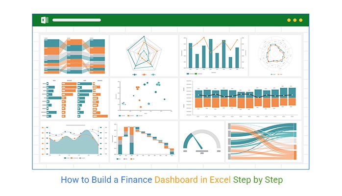
Here are the top 10 financial dashboard examples in Excel, built with clear and insightful visuals:
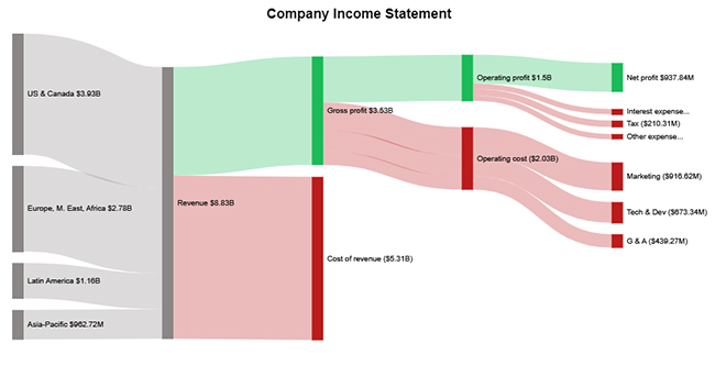
This dashboard summarizes revenue, expenses, and net profit in a single view, helping organizations track overall financial performance.
Key metrics include:
Best for monitoring company profitability and financial health.
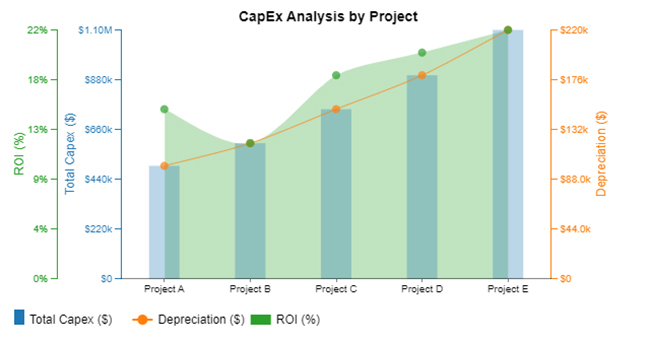
A CapEx dashboard tracks capital investments across projects and departments. It helps organizations monitor spending and evaluate return on investment.
Key metrics include:
Useful for companies managing multiple investment initiatives.
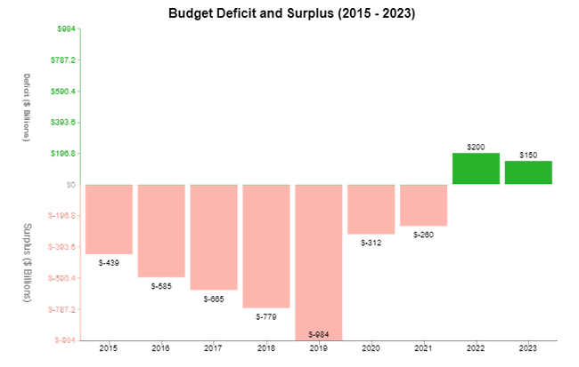
This dashboard highlights whether a business is operating within its budget or exceeding planned spending.
Key metrics include:
It helps finance teams quickly detect overspending and adjust financial strategies.
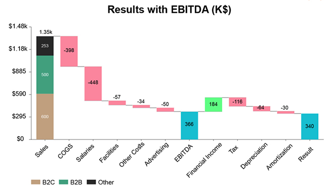
An EBITDA dashboard focuses on earnings before interest, taxes, depreciation, and amortization. It helps evaluate the core operational profitability of a business.
Key metrics include:
This dashboard is commonly used in financial reporting and investor presentations.
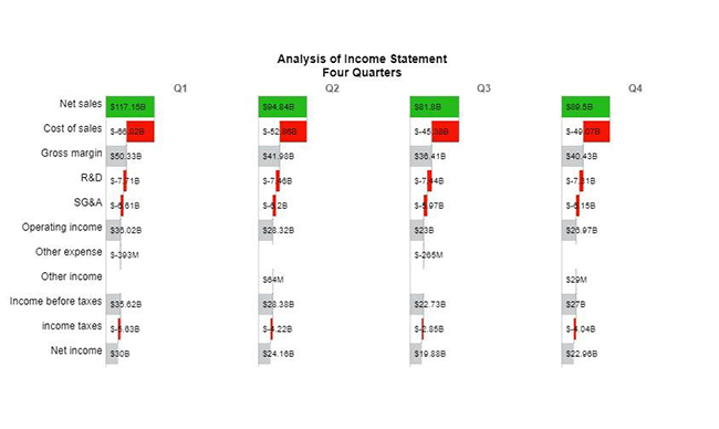
This dashboard compares financial performance across four quarters to identify seasonal patterns and growth trends.
Key metrics include:
It helps management understand how performance changes throughout the year.
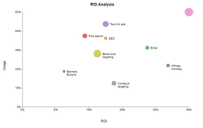
An ROI dashboard measures the profitability of investments and projects. It helps decision-makers prioritize initiatives that generate the highest returns.
Key metrics include:
This dashboard is valuable for evaluating marketing campaigns, projects, or product launches.
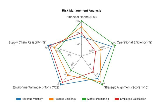
This dashboard identifies potential financial risks by analyzing debt levels, liquidity, and cost fluctuations.
Key metrics include:
It helps businesses maintain financial stability and reduce exposure to risk.
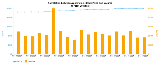
A stock dashboard tracks share price movements and trading activity, helping investors monitor market performance.
Key metrics include:
This dashboard is commonly used by investors and financial analysts.
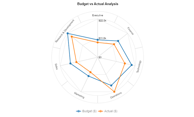
This dashboard compares planned budgets with actual financial results to highlight spending variances.
Key metrics include:
It helps businesses control spending and improve financial planning.
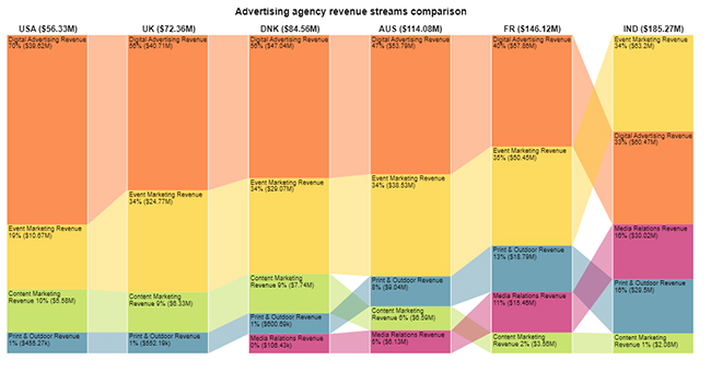
This dashboard analyzes revenue generated from different products, services, or business units.
Key metrics include:
It helps organizations identify their most profitable revenue sources.
Managing your finances can be overwhelming, but an Excel personal finance dashboard makes it simple and actionable. Key benefits include:
Want to build an effective finance dashboard? Follow these best practices:
How do you automate a finance dashboard in Excel?
Automation can be achieved using Excel Tables, Power Query, and PivotTables. These tools allow dashboards to update automatically when new data is added.
Include metrics that give a complete view of your financial health:
A dashboard offers insights that raw spreadsheets cannot:
A finance dashboard in Excel is a powerful tool for consolidating financial data into a clear, organized view. It enables faster, more informed decisions and helps businesses track key metrics such as revenue, expenses, and cash flow.
Visual charts and graphs make complex data easy to understand, highlighting trends and areas for improvement. Dashboards are also customizable—allowing focus on ROI, working capital, or profit margins—and including various chart types enhances analysis.
Excel’s familiar interface and features make dashboards accessible, while regular updates ensure accuracy and alignment with your financial goals. This reduces risk and supports long-term success.
In short, a finance dashboard is more than a spreadsheet—it’s a strategic guide to smarter financial decisions.
For advanced visualization and deeper insights, install ChartExpo to transform your data into actionable strategies.
Related Articles:
How much did you enjoy this article?


Learn how to use sparklines in Excel to quickly visualize trends inside cells. Discover types, creation steps, customization, use cases, benefits, and best practices.

Learn what a confidence interval graph is, how to create it in Excel, and how to interpret results to make more reliable, data-driven decisions.

A correlation matrix in Excel helps identify relationships between variables. Learn how to create, read, and use it for effective data analysis.


