• Home
  • Tools dropdown img
    • Spreadsheet Charts

      • ChartExpo for Google Sheets
      • ChartExpo for Microsoft Excel
    • Power BI Charts

      • Power BI Custom Visuals by ChartExpo
    • Word Cloud

  • Charts dropdown img
    • Chart Category

      • Bar Charts
      • Circle Graphs
      • Column Charts
      • Combo Charts
      • Comparison Charts
      • Line Graphs
      • PPC Charts
      • Sentiment Analysis Charts
      • Survey Charts
    • Chart Type

      • Box and Whisker Plot
      • Clustered Bar Chart
      • Clustered Column Chart
      • Comparison Bar Chart
      • Control Chart
      • CSAT Survey Bar Chart
      • CSAT Survey Chart
      • Dot Plot Chart
      • Double Bar Graph
      • Funnel Chart
      • Gauge Chart
      • Likert Scale Chart
      • Matrix Chart
      • Multi Axis Line Chart
      • Overlapping Bar Chart
      • Pareto Chart
      • Radar Chart
      • Radial Bar Chart
      • Sankey Diagram
      • Scatter Plot Chart
      • Slope Chart
      • Sunburst Chart
      • Tornado Chart
      • Waterfall Chart
      • Word Cloud
    • Google Sheets
      Microsoft Excel
  • Services
  • Pricing
  • Contact us
  • Blog
  • Support dropdown img
      • Gallery
      • Videos
      • Contact us
      • FAQs
      • Resources
    • Please feel free to contact us

      atsupport@chartexpo.com

Categories
All Data Visualizations Data Analytics Surveys
Add-ons/
  • Google Sheets
  • Microsoft Excel
  • Power BI
All Data Visualizations Data Analytics Surveys
Add-ons
  • Google Sheets
  • Microsoft Excel
  • Power BI

We use cookies

This website uses cookies to provide better user experience and user's session management.
By continuing visiting this website you consent the use of these cookies.

Ok

ChartExpo Survey


Home > Blog > Power BI

Power BI Semantic Model Unlocking the Potential Insights

The Power BI semantic model bridges raw data sources and user-friendly reports. And that facilitates meaningful data interaction.

Power BI Semantic Model

In this guide, you’ll discover what the Power BI semantic model is, the elements of a semantic model, examples of semantic data model, and the benefits of the semantic model in Power BI.

Table of Contents:

  1. What is Power BI Semantic Model?
  2. What are the Elements of a Semantic Model?
  3. What are Semantic Model Modes?
  4. How Do You Create a Semantic Data Model in Power BI?
  5. How to Analyze the Semantic Model?
  6. How to Visualize Your Data Using Power BI?
  7. What are the Benefits of the Semantic Model in Power BI?
  8. What are the Best Practices for Creating a Power BI Semantic Model?
  9. What are the Limitations of the Semantic Model in Power BI?
  10. Wrap Up

First…

What is Power BI Semantic Model?

Definition: The Power BI semantic model is a logical layer that organizes transformations, relationships, and calculations across data sources. It serves as the foundation for building Power BI dashboards and reports, ensuring seamless integration and accurate data interpretation for insightful visualizations.

What are the Elements of a Semantic Model?

A Semantic Model in Power BI is crafted to deliver a user-friendly, logical, and interactive data presentation. Its core elements collaborate to make data easily consumable for reporting and analysis. Below are the key components of a semantic model:

  • Data connections to one or multiple data sources. It could be imported, through DirectQuery, or a part of the composite model.
  • Transformations that prepare and clean the data for reporting.
  • Defined calculations and metrics based on business rules to ascertain consistent reports built from the semantic model. It eliminates discrepancies and ensures clarity between analyses and reports.
  • Defined relationships between tables allow users to focus on designing reports without prior knowledge of the underlying database structures and Power BI data models.

What are Semantic Model Modes?

The three modes of semantic models in Power BI are:

  • Import mode
  • Composite mode
  • DirectQuery mode.

The import mode loads data into the Power BI ( .pbix) file. Whenever the Power BI report refreshes, the Vertipaq storage engine compresses, stores, and optimizes the data to disk.

The DirectQuery mode only stores metadata about the model structure rather than the data itself. When the model is queried (like by rendering a visual), the data is retrieved from the underlying data source.

The Composite mode is a combination of the import and DirectQuery mode. It comes into play when the power and performance of import mode are needed. It also has the ability to view real-time data.

How Do You Create a Semantic Data Model in Power BI?

Creating a Semantic Data Model in Power BI involves several steps to ensure the data is structured, optimized, and user-friendly for reporting and data analysis. Here’s a step-by-step guide:

  • Import (or connect) to the required data sources using the import mode, DirectQuery, or composite models.
  • Transform and clean the data to make it useful for users. It involves Power BI removing duplicates, addressing missing data, and cleaning up text-based data columns. The data transformation step is dependent on the data’s unique requirements.
  • Define relationships between your data tables using good Power BI data modeling principles like the star schema.
  • Create calculations and measures based on your unique business requirements.
  • If you’re happy with the semantic model, publish it to the Power BI service.

How to Analyze the Semantic Model?

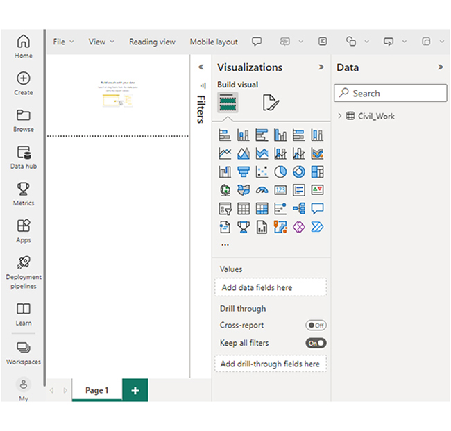
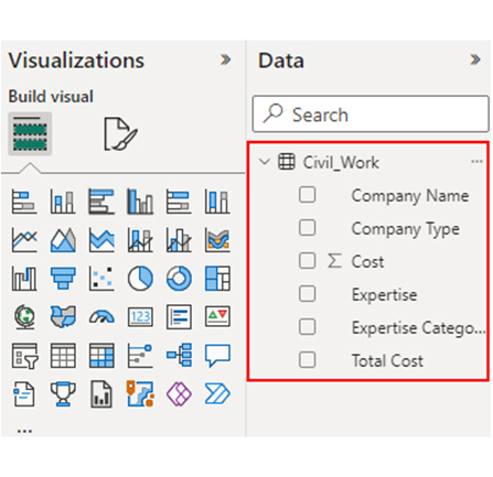
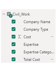
Navigate to the “Data” view and figure out the tables, columns, and relationships. Next, review the fields pane to grasp the structure of the model. After that, switch to the “Report” view to create visualizations. Drag and drop fields onto the canvas to generate tables, charts, and other visuals.

To explore your data, use slicers and filters. You can also analyze your data by drilling down into hierarchies, grouping, and sorting. Calculated fields (or measures) can be created using DAX expressions.

There’s the option of sharing the Power BI report with stakeholders. Sharing helps all stakeholders involved to collaborate and make decisions together.

Example

Manually enable the “Sync the default Power BI semantic model” setting for each Data Warehouse (or SQL analytics endpoint) in the workspace. It will restart the background sync that incurs consumption costs.

Restart Background Sync Incurs Consumption Costs for Learning Power BI Semantic Model

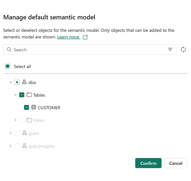
Manually pick tables and views to be added to the semantic model. To do that, navigate to the “Manage default Power BI semantic model” in the info (or ribbon) bar.

Manage Default Power BI Semantic Model for Learning Power BI Semantic Model

Access the Default Power BI Semantic Model

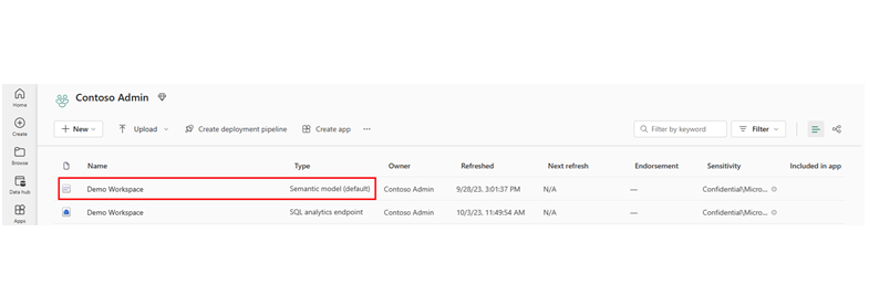
To access default Power BI semantic models, navigate to the workspace, and find the semantic model that matches the name of your desired Lakehouse. The default Power BI semantic model follows the naming convention of the Lakehouse.
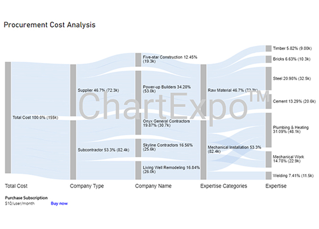
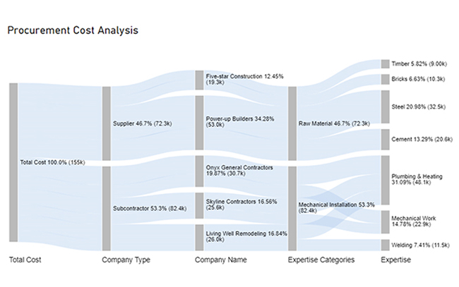
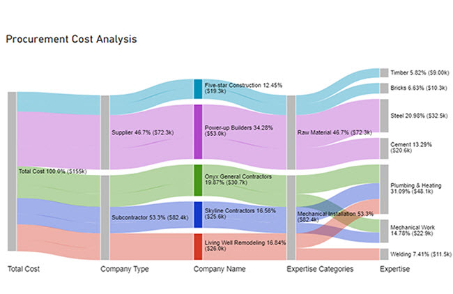
Follow Naming Convention of Lakehouse for Learning Power BI Semantic Model

How to Visualize Your Data Using Power BI?

Stage 1: Log into Power BI, enter your email, and click “Submit.”

    • Log in to Power BI.
    • Enter your email address and click the “Submit” button.
Enter email to login to Power BI
  • You are redirected to your Microsoft account.
  • Enter your password and click “Sign in“.
Enter Password to login to Power BI
  • You can choose whether to stay signed in.
Click on stay signed in
  • Once done, the Power BI home screen will open.

Stage 2: Create a Data Set and Select the Data Set to Use in the Sankey Chart

  • Go to the left-side menu and click the “Create” button.
  • Select “Paste or manually enter data“.
select Paste or manually enter data in Power BI ce487
  • We’ll use the sample data below for this example.
Total Cost Company Type Company Name Expertise Categories Expertise Cost
Total Cost Subcontractor Skyline Contractors Mechanical Installation Plumbing & Heating 15456
Total Cost Subcontractor Skyline Contractors Mechanical Installation Mechanical Work 10159
Total Cost Subcontractor Onyx General Contractors Mechanical Installation Plumbing & Heating 18045
Total Cost Subcontractor Onyx General Contractors Mechanical Installation Mechanical Work 12695
Total Cost Subcontractor Living Well Remodeling Mechanical Installation Plumbing & Heating 14589
Total Cost Subcontractor Living Well Remodeling Mechanical Installation Welding 11456
Total Cost Supplier Power-up Builders Raw Material Cement 20561
Total Cost Supplier Power-up Builders Raw Material Steel 32456
Total Cost Supplier Five-star Construction Raw Material Bricks 10253
Total Cost Supplier Five-star Construction Raw Material Timber 9000
  • Paste the data table above into the “Power Query” window. Next, select the “Create a dataset only” option.
Select Create a Dataset Only After Learning Power BI Semantic Model
  • Navigate to the left-side menu, and click on the “Data Hub” option. Power BI will populate the data set list. If no data set has been created, you’ll get an error message.
Click on Data Hub After Learning Power BI Semantic Model
  • Choose the data set to be used to create the Sankey diagram. Power BI will populate the screen as shown below.
Choose Data Set to Used to Create Sankey Diagram After Learning Power BI Semantic Model
  • Click on the “Create a report” dropdown, and select “Start from scratch.”
Click on Create a Report After Learning Power BI Semantic Model
  • The report canvas screen appears as shown below.
Report Canvas Screen After Learning Power BI Semantic Model

Stage 3: Add the Power BI Sankey Diagram Extension by ChartExpo

  • To create the Sankey Diagram, you’ll have to use an add-in or Power BI visual from AppSource. Navigate to the right side of the Power BI dashboard, and open the Power BI Visualizations panel. Click the ellipsis symbol (…) to import the Power BI Sankey Diagram extension by ChartExpo.
Open Power Bi Visualizations Panel After Learning Power BI Semantic Model
  • In the next menu that opens, select the “Get more visuals” option.
Select Get more visuals After Learning Power BI Semantic Model
  • Enter “Sankey Diagram for Power BI by ChartExpo” in the highlighted search box. You’ll see the “Sankey Diagram for Power BI by ChartExpo.”
Enter Sankey Diagram in Search Box After Learning Power BI Semantic Model
  • Click the highlighted “Add” button.
Click Add Button After Learning Power BI Semantic Model
  • Power BI will add the “Sankey Diagram for Power BI by ChartExpo” icon in the visualization panel.
Add Sankey Diagram Icon in Visualization Panel After Learning Power BI Semantic Model

Stage 4: Draw a Sankey Diagram with ChartExpo’s Power BI extension

  • Select the “Sankey Diagram for Power BI by ChartExpo” icon in the visualization panel. You’ll see a report section similar to the image below displayed on your dashboard.
Select Sankey Diagram Icon in Visualization Panel After Learning Power BI Semantic Model
  • There’s the option to resize the visual. Navigate to the right side of the Power BI dashboard. You’ll see “Fields” next to “Visualizations.”
See Fields Next to Visualizations After Learning Power BI Semantic Model
  • Follow the sequence below when selecting the fields in the Sankey chart.
    • Total Cost
    • Company Type
    • Company Name
    • Expertise Categories
    • Expertise
    • Cost
Follow Sequence Below Selecting Fields in Sankey Chart After Learning Power BI Semantic Model
  • You’ll have to provide your email address or the ChartExpo license key.
Provide Email Address After Learning Power BI Semantic Model

Stage 5: Activate the ChartExpo Trial or Apply a Subscription Key

  • Select the ChartExpo visual. You’ll see three icons below “Build Visual” in the Visualizations panel.
See Three Icons Below Build Visual in Panel After Learning Power BI Semantic Model
  • Select the middle icon, “Format visual.” The visual properties will be populated.
Select Middle Icon Format Visual After Learning Power BI Semantic Model
  • As a new user, you’ll have to enter your email address in the textbox under the ‘Trial Mode” section. Toggle “Enable Trial” to activate the 7-day trial.
Toggle Enable Trial to Activate 7-Day Trial After Learning Power BI Semantic Model
  • The Sankey Diagram created with the 7-day trial comes with the ChartExpo watermark.
Sankey Diagram with ChartExpo Watermark After Learning Power BI Semantic Model
  • If you have a license key, enter it in the “ChartExpo License Key” textbox in the “License Settings” section. Slide the toggle switch next to “Enable License” to “On.”
Enter License Key After Learning Power BI Semantic Model
  • The Sankey diagram created does not come with a watermark.
Sankey Diagram without ChartExpo Watermark After Learning Power BI Semantic Model
  • You can add a Prefix (like the $ sign) with the numeric values in the chart. To do that, expand the “Stats” properties and include the Prefix value.
Add Prefix with Numeric Values in Chart After Learning Power BI Semantic Model
  • To add colors to each node, expand the “Level Colors” properties and select the colors.
Add Colors to Each Node After Learning Power BI Semantic Model
  • The changes will be automatically saved.
Final Power BI Semantic Model

Insights

  • At Level 1 (Total Cost), the procurement cost is $155K.
  • At Level 2 (Company Type), out of the $155K cost, $82K (53.3%) was spent on subcontractors, while $72K (46.7%) was allocated to the supplier.
  • At Level 3 (Company Name), the supplier cost of $72K was divided between two companies: Five-star Construction and Power-up Builder, with charges of $19.3K and $53.0K, respectively.
  • The subcontractor cost of $82.4K was distributed among three companies: Onyx General Contractors, Skyline Contractors, and Living Well Remodeling. They charged $30.7K, $25.6K, and $26.0K, respectively.

Uncover Hidden Connections in Power BI Semantic Model Using Insightful Charts in Power BI:

  1. Open your Power BI Desktop or Web.
  2. From the Power BI Visualizations pane, expand three dots at the bottom and select “Get more visuals”.
  3. Search for “Sankey Chart by ChartExpo” on the AppSource.
  4. Add the custom visual.
  5. Select your data and configure the chart settings to create the chart.
  6. Customize your chart properties to add header, axis, legends, and other required information.
  7. Share the chart with your audience.

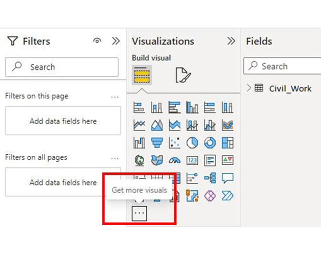
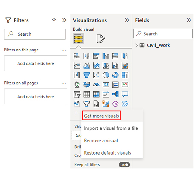
The following video will help you create a Sankey Chart in Microsoft Power BI.

What are the Benefits of the Semantic Model in Power BI?

The Semantic Model in Power BI provides several significant benefits, enabling users to create and consume data more effectively. Here are the key benefits:

  • Unified View of Data: It provides a single, coherent view of data from multiple sources. This enables comprehensive analysis and reporting.
  • Data Consistency: It ensures consistency in data representation and calculations across reports and data visualizations. This will, in turn, reduce errors and discrepancies.
  • Ease of Use: The intuitive navigation and hierarchical organization helps simplify data exploration and analysis. It also boosts the user experience.
  • Data Integration: It facilitates integration of diverse data sources and tables through relationships. It also enables cross-functional analysis and insights.

What are the Best Practices for Creating a Power BI Semantic Model?

Creating an effective Power BI Semantic Model is key to ensuring optimal performance, usability, and maintainability of your reports. Here are the best practices to follow:

  • Understand Business Requirements: You need to understand the business objectives and data analysis needs. This will help you design a model that meets the organization’s requirements.
  • Data Profiling and Preparation: Perform thorough data profiling to figure out the data quality, dependencies, and relationships. You also have to cleanse and transform data before importing it into Power BI.
  • Normalize Data: Normalizing data helps you improve efficiency and reduce redundancy. You can get started by using separate tables for distinct entities, and establish relationships between them.
  • Use Meaningful Names: Use descriptive and consistent names for columns, tables, measures, and relationships. It helps enhance clarity and understanding.

What are the Limitations of the Semantic Model in Power BI?

While the Semantic Model in Power BI offers many benefits, it also comes with certain limitations that users should be aware of. These limitations may impact performance, usability, or scalability depending on the use case. Here are some of the key limitations:

  • Size Limitation: In Power BI Desktop, the size of semantic model is capped at 10 GB. The same limit applies to user who use the Power BI Premium.
  • Refresh Limitation: If you opt for the standard Power BI service, the refresh limit for the semantic models is about eight times per day.
  • Performance Impact: The way the model works can affect its performance.
  • Dataflow Considerations: When moving a semantic model from the Power BI Desktop to the Power BI service, you should consider that dataflows have limitations. For instance, Power BI Premium users can only refresh their data once every 24 hours.

FAQs

What is the difference between a dataset and a semantic model in Power BI?

The Power BI data set represents the raw data imported into the tool, while a semantic model structures and organizes the data for analysis. And that includes relationships, calculations, and hierarchies.

What are the models of semantics?

The models of semantics in Power BI include dimensional, relational, and composite models. Each of these models organizes data entities, measures, relationships, and calculations differently to support various analytical scenarios and needs.

What are the three semantic models?

The three semantic models in Power BI are dimensional, relational, and composite. They organize data entities, measures, relationships, and calculations differently to support various analytical scenarios and requirements.

Wrap Up

Power BI semantic model organizes and structures data for analysis. And that includes tables, measures, relationships, and calculations.

To get the most out of the Power BI semantic model, you’ll have to use calculated columns sparingly. That is, limit the use of calculated columns to avoid performance degradation. You also have to implement row-level security. Implementing row-level security (RLS) helps restrict access to sensitive data based on user permissions and roles.

Document the model structure, calculations, relationships, and business rules to facilitate understanding and maintenance by other users.

Finally, you have to establish regular data refresh schedules and monitor the data sources for changes. This will help you ascertain data accuracy and reliability.

Are you ready to take advantage of the Power BI semantic model? You can get started by creating the Sankey Chart in Power BI using ChartExpo.

How much did you enjoy this article?

PBIAd2
Start Free Trial!
145436

Related articles

next previous
Power BI12 min read

Power BI Group By Guide for Effective Data Insights

Learn how Power BI Group By helps you aggregate data, clarify trends, and create reports by grouping values to make large datasets manageable & insightful.

Power BI12 min read

How to Create Sankey Diagram in Microsoft Power BI?

Learn How to Create Sankey Diagram in Microsoft Power BI using Desktop & Web Service. What they are and how to use them effectively.

Power BI8 min read

Power BI Artificial Intelligence: Insights Using Visuals

Discover all there is to know about the Power BI artificial intelligence. You'll also discover how AI is used in Power BI, and how to use it for analysis and more.

Power BI9 min read

Budgeting in Healthcare: Use Visuals to Spot Budget Gaps

This guide helps you discover what budgeting in healthcare is. You'll also discover the factors that affect hospital budgets and types of budgeting in healthcare.

Power BI9 min read

Predictive Analytics in Power BI for Making Insightful Visuals

This guide shows you everything you need to know about Predictive Analytics in Power BI. It also shows you how it works, and how to interpret the results.

ChartExpo logo

Turn Data into Visual
Stories

CHARTEXPO

  • Home
  • Gallery
  • Videos
  • Services
  • Pricing
  • Contact us
  • FAQs
  • Privacy policy
  • Terms of Service
  • Sitemap

TOOLS

  • ChartExpo for Google Sheets
  • ChartExpo for Microsoft Excel
  • Power BI Custom Visuals by ChartExpo
  • Word Cloud

CATEGORIES

  • Bar Charts
  • Circle Graphs
  • Column Charts
  • Combo Charts
  • Comparison Charts
  • Line Graphs
  • PPC Charts
  • Sentiment Analysis Charts
  • Survey Charts

TOP CHARTS

  • Sankey Diagram
  • Likert Scale Chart
  • Comparison Bar Chart
  • Pareto Chart
  • Funnel Chart
  • Gauge Chart
  • Radar Chart
  • Radial Bar Chart
  • Sunburst Chart
  • see more
  • Scatter Plot Chart
  • CSAT Survey Bar Chart
  • CSAT Survey Chart
  • Dot Plot Chart
  • Double Bar Graph
  • Matrix Chart
  • Multi Axis Line Chart
  • Overlapping Bar Chart
  • Control Chart
  • Slope Chart
  • Clustered Bar Chart
  • Clustered Column Chart
  • Box and Whisker Plot
  • Tornado Chart
  • Waterfall Chart
  • Word Cloud
  • see less

RESOURCES

  • Blog
  • Resources
  • YouTube
SIGN UP FOR UPDATES

We wouldn't dream of spamming you or selling your info.

© 2025 ChartExpo, all rights reserved.