Categories
By ChartExpo Content Team
Ever felt stuck between two options? Or five? Decision-making doesn’t get easier as choices multiply, but there’s a tool that can help cut through the confusion: the decision matrix.
Think of it as a grid for organizing, comparing, and weighing your choices, helping you decide which option meets your needs best. A decision matrix keeps things clear and direct, showing which options fit your criteria without the guesswork.


So, what exactly does a decision matrix do? It gives each option a score based on factors that matter to you, from cost to convenience, effectiveness, or priority. By placing all your options and their scores in a simple table, you can see—at a glance—where each option stands. This makes decision-making straightforward, especially for those big choices where multiple factors are in play.
Using a decision matrix is a practical way to manage complex choices and avoid overlooking key details. Rather than debating endlessly, this method lets you quantify each option’s strengths and weaknesses, bringing clarity to what’s most important. Ready to make more confident, informed choices? Let’s break down how a decision matrix can simplify your decision-making process.
First…
A decision matrix sorts out the chaos when you face multiple options and variables. Imagine deciding which apartment to rent—you juggle factors like rent, location, size, and amenities.
A decision matrix helps you rank these based on what’s most important to you, turning a tough decision into a clear-cut one. It’s especially handy when your gut feeling is all over the place and you need something more concrete to base your decisions on.
You’ll know it’s time for a decision matrix when you’re swamped with options and criteria.
If your team’s hitting dead ends, not making progress, or circling back to the same points in decision-making, it’s a sign. This tool is perfect for those moments when you want to ensure every option is evaluated fairly and systematically.
Start with the end in mind. What’s the ultimate goal of your decision? Pin this down first. Then, resist the urge to throw in every possible factor. Keep your matrix focused on what really affects your decision—this prevents information overload and avoids the mess of an overloaded matrix that leaves you more baffled than before.
The size and complexity of your decision matrix should mirror the real weight of your decision. Not every decision needs a beast of a matrix; sometimes a simple one does the trick.
If you’re choosing a lunch spot, a light matrix works. But if you’re deciding on a new company policy, you might need a more detailed approach. Match the tool to the task to keep things efficient and relevant.
When setting up a decision matrix, it’s vital to pinpoint what’s really important. Ask yourself: What are the goals of this decision? This helps in keeping the decision matrix focused and effective. For example, if the decision involves choosing a new software tool, relevant criteria might include cost, user-friendliness, and tech support.
Start with a clear head and a sharp focus on the end objective. A popular technique is mind mapping, which allows for a visual brainstorming session with team members. This method encourages everyone to think about and contribute different criteria that align with the overall business goals.
It’s easy to get sidetracked by less important details. To avoid this, always refer back to your main objectives. Does this criterion impact our main goal? If it doesn’t, it’s probably noise. Keeping meetings focused and time-boxed helps teams avoid going off on tangents.
When you’re setting up a weighted decision matrix, think about how you assign importance to each criterion. Using a 1-10 scale is straightforward. You give a score to each factor based on its importance. The bigger the number, the more critical the criterion.
Now, pairwise comparisons might sound fancy but it’s really about comparing each criterion directly against every other criterion to see which one weighs more in your decision-making process. This method makes sure every criterion is considered fairly and helps prevent any oversight.
Don’t overlook the power of diverse opinions. When you’re deciding the weights in your matrix, pulling in insights from different stakeholders can be a game changer. Why? Because you get a rounded view of what’s essential.
Each stakeholder brings a unique perspective, highlighting different priorities. This way, you can balance the matrix to reflect a comprehensive understanding of what’s at stake, not just your personal or a singular viewpoint.
Here’s a fun part: tweaking the weights and watching what happens. Adjust the weights slightly in your matrix and observe how it changes the outcomes. This isn’t just academic; it’s a practical way to see potential scenarios based on different priorities. It helps you understand which criteria are most sensitive and which ones don’t shift the needle much on the decision.
Think of it as a stress test for your decision-making process. You’re making sure your final decision will hold up no matter how the weights are adjusted.
When you’re juggling qualitative data in a decision matrix, you’re essentially looking at data that’s more about words than numbers. Think about it like this: it’s the difference between asking, “How much?” and “How do you feel?” This type of data can cover anything from customer feedback to employee satisfaction and needs special handling because it’s not straightforward.
Breaking down qualitative data means turning those tricky subjective opinions into something you can actually use. Let’s say you want to measure customer satisfaction. You’d start by collecting feedback through surveys or interviews. Then, you’d categorize responses into themes like “service speed” or “friendliness.” This way, you can see patterns and make sense of what your customers are really saying.
Likert scales are a go-to when you need to quantify opinions. They range from “strongly disagree” to “strongly agree” and let people rate their feelings on a scale. This method is super helpful when you need to turn soft, fuzzy feedback into hard data. For instance, you might ask your team to rate their agreement with the statement, “I feel valued at work.” Their responses give you a clearer picture of team morale.
Every decision-making matrix can fall prey to biases. These biases skew our understanding and can lead to less optimal outcomes.
To manage bias effectively, one must first identify it. Common biases include confirmation bias, where we favor information that confirms our existing beliefs, and anchoring bias, where we rely too heavily on the first piece of information we receive.
Recognizing these biases is the first step toward neutralizing them and making more data-driven decisions.
Cognitive biases can cloud judgment. Some of the most prevalent in decision-making include the bandwagon effect, where the opinions of the majority influence our decisions, and the status quo bias, where we prefer things to stay the same.
By acknowledging these biases, we can strive to minimize their impact by consciously adjusting our thought processes.
Bringing diverse stakeholders into the decision-making process can enhance objectivity. Different perspectives can help challenge and dilute individual biases, leading to more balanced decisions.
It’s vital to create a safe space where all voices are heard and valued equally, encouraging open and honest dialogue.
Assumptions are the bedrock of any decision matrix, but they can also be its Achilles’ heel if not properly vetted.
Regularly reviewing and questioning these assumptions can help ensure they are still valid and relevant. This practice not only strengthens the decision-making matrix but also helps in maintaining its adaptability to changing circumstances.
When setting up decision matrices, it’s vital to start with dependable data. Without it, you’re shooting in the dark. So, how do you make sure your inputs are up to snuff? It starts with choosing the right data sources and methods. Think about what you need to know and then match that with sources that can provide that information reliably.
Let’s break it down. Surveys are great for gathering quantitative data from a large group. The key? Well-designed questions and a representative sample. Research, on the other hand, digs into existing data to pull out the nuggets you need. Don’t forget about interviews—they’re your go-to for qualitative insights straight from the horse’s mouth.
Here’s a thought: always keep a tab on uncertainty. Why? Because it’s honest. Show your work—where your data comes from, how sure you are about it, and the fuzzy edges around your conclusions. This doesn’t just cover your back; it also helps everyone understand the bigger picture and make smarter decisions.
The following video will help you create a Likert Scale Chart in Microsoft Excel.
The following video will help you create a Likert Scale Chart in Google Sheets.
When creating a decision matrix, it’s essential to set clear scoring scales. Think of it as setting the rules of the game before you start playing. Each criterion in your matrix needs a scale that matches the decision’s impact level.
For instance, if you’re evaluating software, criteria like cost might be on a scale of 1-10, while ease of use might be on a scale of 1-5, depending on their relative importance to your final decision.
A scoring rubric does more than just list numbers; it explains what each score means. Let’s say you’re scoring customer support in your decision matrix. A score of 1 might mean support is almost non-existent, while a 5 could indicate award-winning service that wows every time.
By defining these levels clearly, you make sure everyone scores each option consistently, reducing bias and making your decision process smoother.
Imagine you’re in the healthcare industry, evaluating new medical equipment. Your decision matrix might include criteria like cost, ease of use, compatibility with existing systems, and vendor reputation.
Each of these will have a scoring rubric. Cost might be straightforward—less expensive products score higher. But what about vendor reputation? Here, a 1 could be a new, untested vendor, while a 5 might be a well-known vendor with a track record of excellence.
In the tech industry, if you’re choosing a cloud service provider, you might evaluate based on criteria like uptime, customer support, and scalability. Each of these areas will have its own detailed scoring rubric, helping your team make an informed choice that aligns with your company’s needs and goals.
Making big decisions isn’t always straightforward. However, multiple decision matrices can clear up the fog. Think of it as using multiple maps to find the best route to your destination.
Each matrix acts as a filter, narrowing down your options based on different criteria until you’re left with the most favorable choice. It’s like having a series of checkpoints that ensure every aspect of the decision is vetted thoroughly.
For really big decisions, multi-stage matrices are your go-to tool. Imagine you’re piecing together a puzzle; you wouldn’t start with all the pieces at once. Instead, you tackle it section by section. Similarly, multi-stage matrices break down the decision into manageable chunks, allowing for detailed analysis at each stage.
This method ensures that each part of the decision gets the attention it deserves, leading to a more informed and precise outcome.
Zeroing in on what truly matters can make or break your decision-making process. It’s essential to identify and prioritize the options and criteria that will have the greatest impact on the outcome.
Think of it as focusing your camera lens: you need to adjust your focus to ensure the most important elements are clear and sharp. This focused approach not only simplifies the decision-making process but also enhances the quality of your decisions.
When you’re tasked with decision-making in business, a decision matrix can be your best friend. It’s a tool that helps you evaluate and prioritize various options based on specific, predefined criteria. However, the real challenge lies in presenting this matrix in a way that everyone can quickly grasp and make informed decisions. Let’s dive into how to make your decision matrix not only insightful but also visually intuitive.
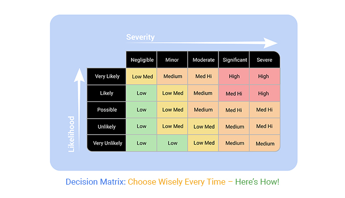
Color coding is a straightforward yet effective way to enhance the readability of your decision matrix. By assigning different colors to various levels of performance or risk, you can create a visual hierarchy that immediately communicates which options are favorable and which are less so.
For instance, using green for high-performance scores and red for low scores allows stakeholders to instantly see which choices stand out.
Incorporating charts and graphs can further clarify your matrix. A bar chart, for example, can represent the scores of each criterion for a quick comparative analysis. This visual representation helps stakeholders to digest complex data at a glance, facilitating quicker and more confident decision-making.
Keeping your matrix presentation simple is key to effective communication. Avoid overcrowding your matrix with too much data or overly technical jargon. Instead, focus on the essential criteria and the final scores.
Use clear labels and keep your formatting consistent throughout the document. This approach helps to maintain clarity and prevents any confusion during the decision-making process.
When it comes to making decisions in business, the decision matrix method is a go-to for many. But how do you explain the results? Start with the basics. Lay out the decision criteria and scores clearly. Use simple charts or tables to show how options were compared. Highlight the winning choice and provide a few bullet points on why it scored the highest. This makes it easy for everyone, no matter their role, to grasp the outcome quickly.
Ever tried explaining a complex idea and received blank stares in return? We’ve all been there. The trick is to break it down. Use analogies that relate to everyday experiences.
Avoid jargon and instead, use plain language. Imagine explaining it to a friend who knows nothing about the topic. What words would you use? Keep it friendly and straightforward, and you’ll see those nods of understanding in no time.
A picture is worth a thousand words, right? Visuals can be a game-saver in explaining detailed processes.
Use diagrams, flowcharts, or even infographics. These help to map out complex information in a way that’s easy to follow. Color-code different parts of the process or outcomes to guide the viewer’s eye. Visuals not only make the explanation clearer but also more engaging.
When you’re faced with decisions in business, it’s like trying to pick the best dessert at a buffet—you want it all, but you can’t.
A decision analysis matrix helps. Think of it as your menu to make smarter choices without the guesswork. But what happens when your criteria conflict? Say, cost clashes with quality. Here’s a neat trick: rate each option against each criterion. Then, push through the tug-of-war by deciding which criteria are deal-breakers and which you can flex on. It’s like deciding if you’d skip the chocolate cake if it’s a tad pricey.
Balancing trade-offs isn’t just a skill; it’s an art. Imagine you’re juggling—cost in one hand, quality in the other, and maybe speed or sustainability in others. Dropping one? Not an option! So, you tweak and tune until you find a sweet spot.
It’s about giving a little here to gain a bit there. Think of it as tuning a guitar to get the perfect harmony. No one said it’d be easy, but hey, who doesn’t enjoy a good challenge?
Ever had too many tasks and not enough time? We’ve all been there. List your tasks, assign importance to each task (that’s your weight), and then score them based on impact or effort. Multiply and get a magic number for each task. High number? Priority!
It turns the chaos of your to-do list into a neat, orderly queue. Think of it as organizing a messy room so everything just clicks into place.
When you’re rolling out a new decision matrix template, the first step is to get your stakeholders on board. You want them to be as excited about this tool as you are! The trick is to show how this template can make their decision-making process smoother and more efficient.
Start by presenting the template during a meeting where you can walk them through how it works and its benefits.
Now, let’s talk about getting everyone to agree on the criteria, weights, and scores. This can be a bit like herding cats, but it’s not impossible. Host a workshop where all stakeholders can voice their opinions and suggestions.
Use a whiteboard for visual aid and let everyone put up their ideas. Then, discuss each suggestion openly and democratically decide which criteria make the cut. Remember, everyone should feel heard—this builds commitment and eases the decision process.
Facilitating collaborative decisions is key. Once your criteria are set, introduce ranking and voting methods. This can be as simple as giving everyone stickers to place on the ideas they support most. It’s a bit like voting for your favorite singer on a talent show—everyone gets a say, and the best ideas naturally rise to the top.
Ensure the process is transparent so that all participants can see the results in real time, which helps in maintaining trust and enthusiasm.
Working with diverse teams can be challenging but also rewarding. To effectively engage everyone, adapt your communication style. Not everyone responds well to the same approach. Some might prefer detailed emails; others thrive on quick, face-to-face meetings.
Keep your interactions frequent and varied to suit different preferences, ensuring everyone stays on the same page and feels valued.
A decision matrix is a tool that helps you evaluate and prioritize options based on criteria that matter to you. It’s structured as a table where each row represents an option and each column represents a criterion, like cost, quality, or time. You assign scores to each option based on how well it meets each criterion. Once completed, the decision matrix clearly shows which option best aligns with your goals, making complex decisions easier and more objective.
To create a decision matrix, start by listing all options you’re considering in rows on the left side of a table. Then, identify the criteria that are most relevant to your decision, and add these as column headings at the top. Next, score each option for each criterion, usually on a scale from 1 to 10. If some criteria are more important than others, you can assign weights to give them greater influence. Multiply each score by its criterion’s weight, then add up the total scores for each option. The option with the highest score represents the best choice according to your criteria.
The Pugh matrix, also known as the decision matrix method, is a variation that’s often used for comparing a base option against others. In this matrix, you list one “baseline” option (often an existing or default choice) and compare each alternative against it. Each criterion is scored as either better, worse, or the same as the baseline. This approach highlights which options outperform the baseline, making it especially useful in design and engineering fields for refining ideas or solutions.
A decision matrix gives you a clear path through complex choices, letting you see your options side-by-side and weigh each factor objectively. Whether you’re deciding on a business investment, a personal purchase, or a team project, this tool helps you break down each option, score it based on your needs, and feel confident in your choice.
Creating a decision matrix is as simple as listing your options and criteria, then scoring and calculating to reveal the best option. With variations like the Pugh matrix for comparing alternatives or the Eisenhower matrix for time management, you can tackle different types of decisions effectively.
Use a decision matrix when you need to compare several factors, clarify priorities, or find an objective answer. It saves time, keeps you focused, and reduces second-guessing. So, the next time you’re at a crossroads, remember—you’ve got a decision-making tool that’s all about clarity and confidence.
How much did you enjoy this article?


Calculate accounts receivable turnover ratio to measure credit collection speed, improve cash flow, and strengthen your financial strategy. Read on!

Change Management KPIs are the key to tracking adoption, performance, and ROI during transitions. Find out which metrics matter. Read on!

Data collection methods and techniques determine the quality of every insight you act on. Explore key approaches for gathering reliable data. Read on!


