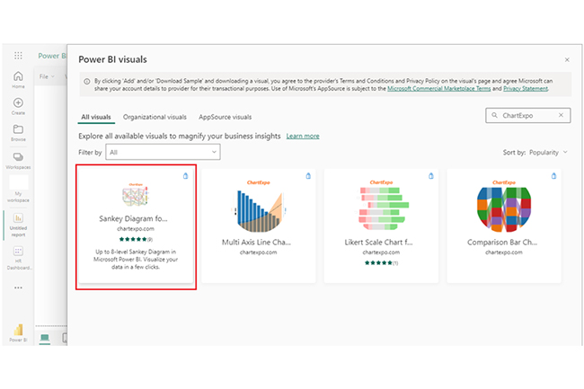
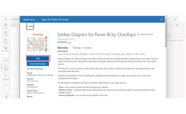
• Home
  • Tools dropdown img
    • Spreadsheet Charts

      • ChartExpo for Google Sheets
      • ChartExpo for Microsoft Excel
    • Power BI Charts

      • Power BI Custom Visuals by ChartExpo
    • Word Cloud

  • Charts dropdown img
    • Chart Category

      • Bar Charts
      • Circle Graphs
      • Column Charts
      • Combo Charts
      • Comparison Charts
      • Line Graphs
      • PPC Charts
      • Sentiment Analysis Charts
      • Survey Charts
    • Chart Type

      • Box and Whisker Plot
      • Clustered Bar Chart
      • Clustered Column Chart
      • Comparison Bar Chart
      • Control Chart
      • CSAT Survey Bar Chart
      • CSAT Survey Chart
      • Dot Plot Chart
      • Double Bar Graph
      • Funnel Chart
      • Gauge Chart
      • Likert Scale Chart
      • Matrix Chart
      • Multi Axis Line Chart
      • Overlapping Bar Chart
      • Pareto Chart
      • Radar Chart
      • Radial Bar Chart
      • Sankey Diagram
      • Scatter Plot Chart
      • Slope Chart
      • Sunburst Chart
      • Tornado Chart
      • Waterfall Chart
      • Word Cloud
    • Google Sheets
      Microsoft Excel
  • Services
  • Pricing
  • Contact us
  • Blog
  • Support dropdown img
      • Gallery
      • Videos
      • Contact us
      • FAQs
      • Resources
    • Please feel free to contact us

      atsupport@chartexpo.com

Categories
All Data Visualizations Data Analytics Surveys
Add-ons/
  • Google Sheets
  • Microsoft Excel
  • Power BI
All Data Visualizations Data Analytics Surveys
Add-ons
  • Google Sheets
  • Microsoft Excel
  • Power BI

We use cookies

This website uses cookies to provide better user experience and user's session management.
By continuing visiting this website you consent the use of these cookies.

Ok

ChartExpo Survey


Home > Blog > Power BI

Power BI Group By Guide for Effective Data Insights

The Group By feature in Power BI is used to summarize data based on one or multiple aggregate functions.

With the Group By feature, you can find the average, min, max, count, and other aggregate values for one column. And that will be based on the unique values in other columns.

Power BI Group By

In this guide, you’ll learn what the Power BI Group By is, why it functions in Power BI, and an example of the group by in Power BI DAX.

Table of Content:

  1. What is Power BI Group By?
  2. What is the Importance of Power BI GroupBy?
  3. Why Use the Group By Function in Power BI?
  4. How to Use Power BI Group By Measure?
  5. How to Visualize Grouped Data in Power BI?
  6. What are the Benefits of Using GroupBy in Power BI?
  7. Wrap Up

First…

What is Power BI Group By?

Definition: The “Group By’ feature in Power BI is used to aggregate data by grouping similar values together. Users are allowed to summarize and analyze data by creating groups based on one or multiple columns.

For instance, sales data can be grouped by region to see total sales per region. The “Group By’ feature helps in creating summarized reports, simplifying complex datasets, and calculating aggregates like sums and averages.

What is the Importance of Power BI GroupBy?

The Power BI GroupBy functionality plays a crucial role in data visualization and analysis. Since users have the option to aggregate and group data based on specific attributes, they’ll more likely gain a granular understanding of the information.

The GroupBy features also help in summarizing large datasets, creating concise visualizations, and extracting meaningful insights. Power BI GroupBy gives room for efficient data exploration, and that makes it easy for the user to identify trends, patterns, and outliers within the data.

It also plays a major role in creating interactive reports and dashboards, thereby serving as a tool for analysts and business intelligence professionals to gain valuable conclusions from complex datasets.

Power BI GroupBy streamlines data summarization and analysis processes, which contributes to more informed decision-making within an organization.

Why Use the Group By Function in Power BI?

  • Data Summarization: Grouping allows you to aggregate data by specific categories. It also allows you to simplify large datasets into more manageable and insightful summaries. For instance, there’s the option of grouping sales data by product category to see total sales for each category. All these make it easy to identify trends and patterns.
  • Enhanced Analysis: Grouping data helps you perform aggregate calculations like sums, averages, counts, and the number of days between two dates. It enables users to analyze and compare different data groups while focusing on key metrics. This, in turn, helps you analyze data more effectively.
  • Improved Clarity: Grouping data helps reduce clutter, thereby showcasing a clearer picture of the data.
  • Customized Reports: It helps users create customized reports that focus on specific aspects of the data. For instance, you can group sales data by year to track performance over time. You can also group sales data by department to evaluate departmental contributions.
  • Facilitation of Insights: Grouped data can be visualized in multiple ways like bar charts, tables, and pie charts. This way, the user gains a different perspective about the data.

How to Use Power BI Group By Measure?

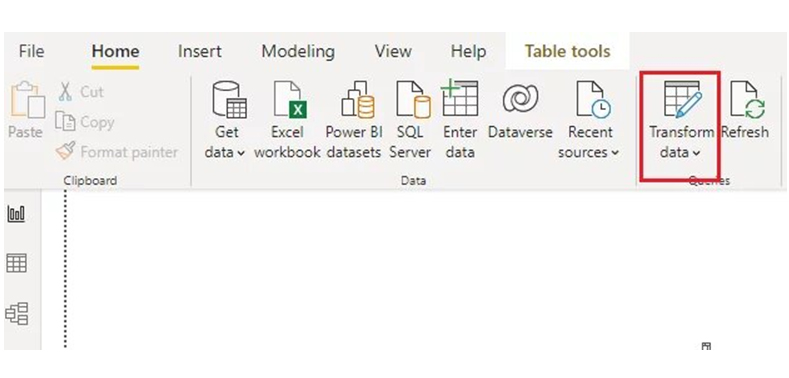
The Power BI Group By feature is found in the Power Query editor. There are two ways of loading the dataset into the Power Query editor.

  • You’ll see the window below when importing data. Click on the “Transform Data” button to open the Power Query editor.
Click on Transform Data to Open Power Query Editor for Doing Power BI Group By
  • If the data has been imported into the reports, you’ll view it by clicking the “Load” button. This can also open the Power Query editor. Next, click the “Transform data” option in the ribbon.
Click the Load Button in Ribbon for Doing Power BI Group By

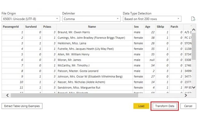
The window below displays when the Power Query editor opens. Click the “Group By” option in the ribbon.

Click the Group By Option in the Ribbon for Doing Power BI Group By

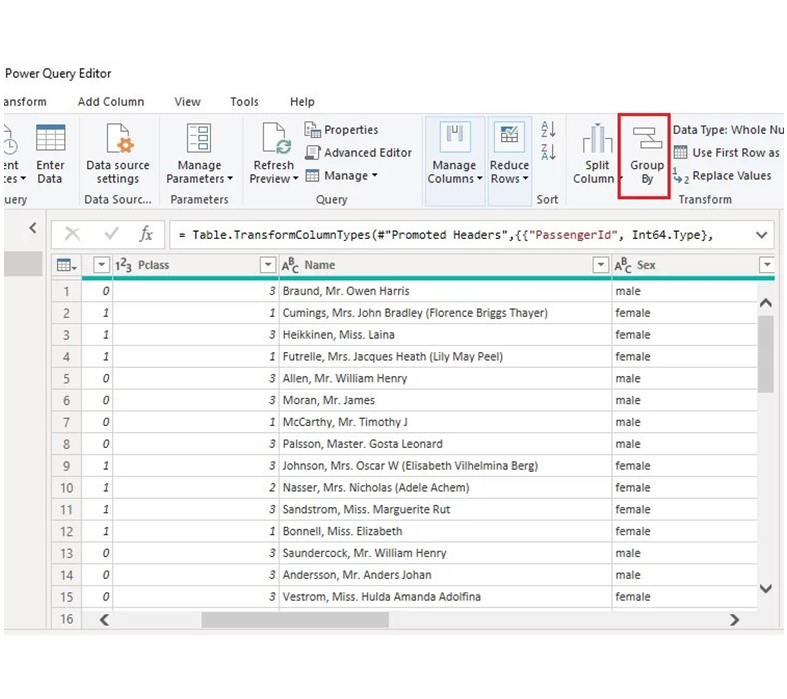
The Group By window will open.

Group By Window will Open for Doing Power BI Group By

Using Group By On Multiple Columns

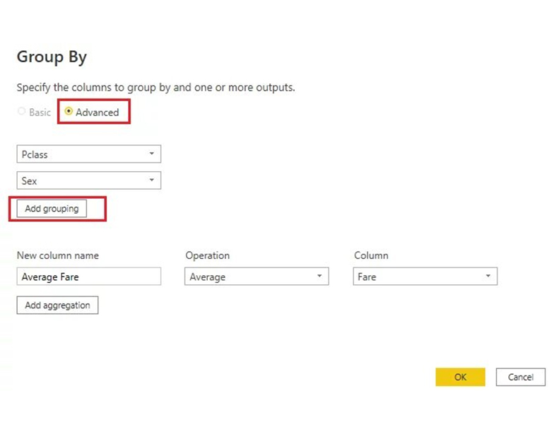
Group by can also be used to group data using multiple columns. To do that, you’ll have to select the “Advanced” option in the Group By window.

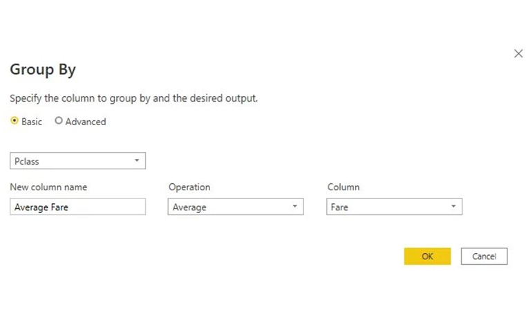
In this illustration, you’ll see how to group average fares by the Pclass (passenger class) and Sex columns. You’re allowed to select one column to use in the Group By feature by default. To add more columns, click the “Add grouping” button. All other options will remain as they were in the previous section.

Click Add Grouping Button for Doing Power BI Group By

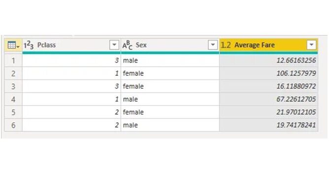
You’ll see three columns in the output table as shown in the image below. The unique values in the Pclass column are repeated for each of the unique values in the Sex column. The average fare paid by the male passengers traveling in the first class was 67.22. On the flip side, the female passengers from the first class paid an average fare of 106.12.

Unique Values in Sex Column for Doing Power BI Group By

Group By with Multiple Aggregation Functions.

To group data using multiple aggregate functions, you’ll have to click the “Add aggregation” button in the Group By window. This will add another row of input boxes to enable you to enter the relevant data.

Click Add Aggregation Button for Doing Power BI Group By

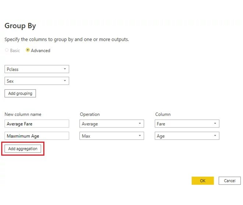
The Group By feature in the image above uses two aggregate functions.

  • The first aggregate function groups the average fare by the “Pclass” and “Sex” columns.
  • The second aggregate function groups the maximum age by the “Pclass” and “Sex” columns.

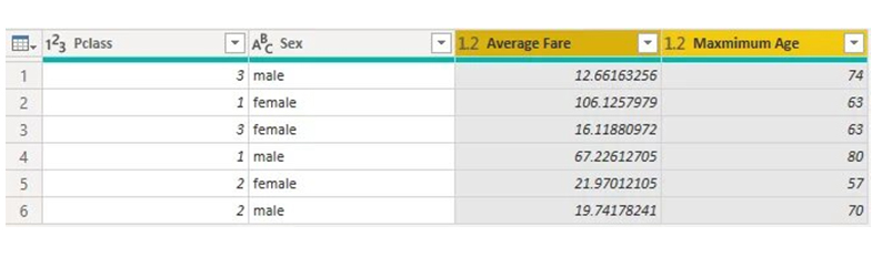
The table summarizes the data. All the rows of data in the original table have generated valuable, actionable data. You can see the average fares paid by different genders in the various classes on the Titanic. You can also see the maximum age of the passengers in these groupings.

Maximum Age of Passengers in Groupings for Doing Power BI Group By

How to Visualize Grouped Data in Power BI?

Stage 1: Logging in to Power BI
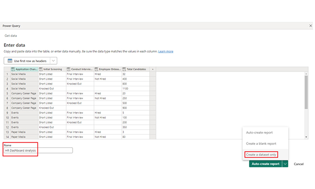
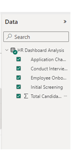
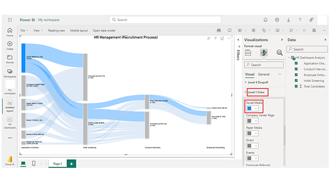
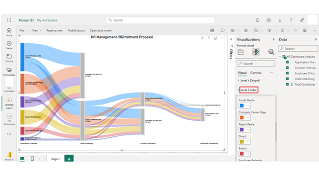
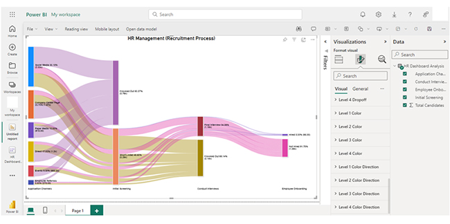
  • Log in to Power BI.
  • Enter your email address and click the “Submit” button.
Enter email to login to Power BI
  • You are redirected to your Microsoft account.
  • Enter your password and click “Sign in“.
Enter Password to login to Power BI
  • You can choose whether to stay signed in.
Click on stay signed in
  • Once done, the Power BI home screen will open.

Stage 2: Creating a Data Set and Selecting the Data Set to Use in Your Chart

  • Go to the left-side menu and click the “Create” button.
  • Select “Paste or manually enter data“.
select Paste or manually enter data in Power BI ce487
  • We’ll use the sample data below for this example.
Application Channels Initial Screening Conduct Interviews Employee Onboarding
Total Candidates
Social Media Short Listed Final Interview Hired 32
Social Media Short Listed Final Interview Not Hired 400
Social Media Short Listed Knocked Out 800
Social Media Knocked Out 1100
Company Career Page Short Listed Final Interview Hired 20
Company Career Page Short Listed Final Interview Not Hired 250
Company Career Page Short Listed Knocked Out 500
Company Career Page Knocked Out 900
Events Short Listed Final Interview Hired 5
Events Short Listed Final Interview Not Hired 100
Events Short Listed Knocked Out 200
Events Knocked Out 350
Paper Media Short Listed Final Interview Hired 3
Paper Media Short Listed Final Interview Not Hired 80
Paper Media Short Listed Knocked Out 135
Paper Media Knocked Out 700
Employee Referrals Short Listed Final Interview Hired 10
Employee Referrals Short Listed Final Interview Not Hired 70
Employee Referrals Short Listed Knocked Out 80
Employee Referrals Knocked Out 110
Direct Short Listed Final Interview Hired 25
Direct Short Listed Final Interview Not Hired 150
Direct Short Listed Knocked Out 425
Direct Knocked Out 600
  • Paste the data table above into the “Power Query” window. After that, select the “Create a dataset only” option.
Select on Create A Dataset Only for Doing Power BI Group By
  • Navigate to the left-side menu, and click on the “Data Hub” option. Power BI will populate the data set list. If no data set has been created, you’ll get an error message.
Click on Data Hub Option for Doing Power BI Group By
  • Click on the “Create report” dropdown.
Click on Create Report for Doing Power BI Group By
  • To add the Power BI Sankey Diagram Extension by ChartExpo, you’ll have to use an add-in or Power BI visual from AppSource. To do that, Navigate to the right side of the Power BI dashboard, and open the Power BI Visualizations panel. Next, click the ellipsis symbol (…) to import the Power BI Sankey Diagram extension by ChartExpo. In the menu that opens, select the “Get more visuals” option.
Select Get More Visuals for Doing Power BI Group By
  • Enter “ChartExpo” in the highlighted search box. You’ll see the “Sankey Diagram for Power BI by ChartExpo” similar to the image below.
Enter ChartExpo in Search Box for Doing Power BI Group By
  • Click on the Sankey Diagram. After that, click the highlighted “Add” button.
Click on Add Button for Doing Power BI Group By
  • Power BI adds the “Sankey Diagram for Power BI by ChartExpo” icon in the visualization panel.
Select Sankey Diagram Icon in Visualization Panel for Doing Power BI Group By
  • To draw a Sankey Diagram with ChartExpo’s Power BI extension, you’ll have to select the “Sankey Diagram for Power BI by ChartExpo” icon in the visualization panel. You’ll see a window like the one below open in the report section of the Power BI dashboard.
Open Report Section of Dashboard for Doing Power BI Group By
  • At this point, select the fields to use in the Sankey Chart.
Select Fields to Use in Sankey Chart for Doing Power BI Group By
  • When selecting the fields, follow the sequence below:
    • Application Channels
    • Initial Screening
    • Conduct Interviews
    • Employee Onboarding
    • Total Candidates
  • You’ll have to provide your email address or ChartExpo license key. Add the key under the visual section.
Enter License Key for Doing Power BI Group By
  • After that, the Sankey Chart will be displayed on your screen. You can add the top header text in the chart under the “General” section.
Add Top Header Text for Doing Power BI Group By
  • Click on Visual to set the number. You should also enable the options as shown below.
Click on Visual to Set Number for Doing Power BI Group By
  • You can change the “Node Font Style.”
Change Node Font Style for Doing Power BI Group By
  • There’s the option to change the “Level Font Style.”
Change Level Font Style for Doing Power BI Group By
  • You’ll see the Level Labels as shown below.
See Level Labels for Doing Power BI Group By
  • The image below shows you how to change the Nodes color.
Change Nodes Color for Doing Power BI Group By
  • Since you’ve seen “How to change Level 1 color,” follow the same steps to change the Nodes color of other levels.
Change Color of Level 1 for Doing Power BI Group By
  • After changing the all-nodes color, here’s what the HR Dashboard in Power BI using ChartExpo will look like.
Final Power BI Group By

Insights

  • Social Media is the primary application channel with the highest number of candidates (1100).
  • The company Career Page has 900 candidates.
  • Paper Media and Events have comparatively lower candidate counts of 700 and 350, respectively.
  • Direct applications have 600 candidates.

Refine Visual Analysis with Power BI Group By for Graphs:

Dive into the concept of Power BI’s Group By function with this interactive tutorial, where you’ll learn how to organize and summarize your data effectively through dynamic charts and graphs. This powerful feature allows you to group data by specific categories, enabling you to spot trends, compare values, and uncover patterns more easily.

What are the Benefits of Using GroupBy in Power BI?

Using GroupBy in Power BI offers great benefits. It’s crucial for data visualization and analysis. Here are some major benefits of using GroupBy in Power BI:

  • Data Summarization: GroupBy gives users the room to group data based on specific attributes. This helps in facilitating the summarization of Power BI datasets into more meaningful and manageable insights.
  • Enhanced Data Exploration: GroupBy enhances the efficiency of data interpretation by organizing and presenting information in a structured manner. This approach simplifies the process of identifying trends, patterns, and outliers, enabling more effective data exploration.
  • Time-Series Analysis: GroupBy is a great fit for time-series analysis. It enables users to group data by time intervals and analyze trends over specific periods.
  • Quick Insights: GroupBy facilitates the rapid generation of insights. That is done by condensing extensive datasets into relevant categories. This will, in turn, save time and resources in the analysis process.
  • Efficient Reporting: The GroupBy feature supports the creation of insightful and interactive reports. This will, in turn, make it easy for stakeholders to understand complex data by drilling down into specific grouped categories.
  • Aggregation Capabilities: It helps the user apply various aggregation functions (like sum, average, and count) to the grouped data. This will, in turn, provide a consolidated view of key metrics.
  • Improved Visualization: Grouping data plays a major role in creating clear and concise visualizations. This gives room for the representation of aggregated information through graphs, tables, and charts.
  • Streamlined Decision-making: The clear and organized data view provided by GroupBy contributes to more data-driven decision-making within an organization. For instance, stakeholders can quickly grasp key metrics and trends.
  • Customizable Analysis: Users can define multiple grouping levels and apply complex criteria. This allows for a more customized and detailed analysis of the data based on specific business requirements.
  • Compatibility with Diverse Data Sources: GroupBy is compatible with various data sources, and that makes it a versatile tool for analyzing and interpreting data from multiple platforms and systems within the Power BI ecosystem.

FAQs

What is “Power BI Group By” in data analysis?

“Power BI Group By” in data analysis aggregates data into categories. This enables summary statistics like averages and sums. It simplifies large datasets and makes it easy to analyze and visualize key insights.

Can “Power BI Group By” be used for creating charts and visuals?

Yes, “Power BI Group By” can be used to create charts and visuals. It’s done by aggregating data into categories.

Is “Power BI Group By” useful for trend analysis?

Yes, “Power BI Group By’ is useful for trend analysis. It allows the aggregation of data by time periods or categories. This will, in turn, help highlight trends and patterns over time for clearer insights.

How do you group data in a Power BI table?

If you’re looking to group data in a table in Power BI, use the “Group By” feature. Here’s how to group data in Power BI table:

  • Open Power BI Desktop and load the data into the report.
  • Select the “Model” icon on the left sidebar to navigate to the data model view.
  • Select the table you want to perform the grouping.
  • Click on the “Modeling” tab at the top of the screen.
  • Click on “New Group” in the ribbon. Alternatively, right-click on the column you want to group by and select “New Group.”
  • From the dropdown list, choose the column you want to group by.
  • To define the grouping criteria, add columns you want to aggregate or summarize. For instance, you can choose to sum, average, count, or perform other calculations on specific columns within each group.
  • Name the group so you can easily identify it later.
  • Click “OK” to create the group.
  • To see the newly grouped data, you’ll have to navigate back to your report view.

Wrap Up

Power BI Group By aggregate data into categories, and summarizes metrics like sums or averages. It simplifies analysis by organizing data, supports effective trend visualization and reporting, and enhances clarity.

The Power BI Group By feature is the best for data (or business) analysts who will be handling large datasets. It helps them consolidate information and interpret large datasets.

The creation of customized reports is another benefit of using the Group By feature. With the Group By feature, you can focus on specific aspects of your data. It also helps present a clearer picture of your data. This will, in turn, reduce clutter, and highlight significant trends and comparisons.

Now you know what the Power BI Group By feature is all about, what kind of data will you be analyzing with it?

How much did you enjoy this article?

PBIAd2
Start Free Trial!
143531

Related articles

next previous
Power BI12 min read

In-depth Look at Effective Healthcare Dashboard Examples

Immerse yourself in Healthcare Dashboard Examples, illustrating innovative ways to transform complex data into actionable insights for healthcare professionals.

Power BI12 min read

How to Create Sankey Diagram in Microsoft Power BI?

Learn How to Create Sankey Diagram in Microsoft Power BI using Desktop & Web Service. What they are and how to use them effectively.

Power BI8 min read

Power BI Artificial Intelligence: Insights Using Visuals

Discover all there is to know about the Power BI artificial intelligence. You'll also discover how AI is used in Power BI, and how to use it for analysis and more.

Power BI9 min read

Budgeting in Healthcare: Use Visuals to Spot Budget Gaps

This guide helps you discover what budgeting in healthcare is. You'll also discover the factors that affect hospital budgets and types of budgeting in healthcare.

Power BI9 min read

Predictive Analytics in Power BI for Making Insightful Visuals

This guide shows you everything you need to know about Predictive Analytics in Power BI. It also shows you how it works, and how to interpret the results.

ChartExpo logo

Turn Data into Visual
Stories

CHARTEXPO

  • Home
  • Gallery
  • Videos
  • Services
  • Pricing
  • Contact us
  • FAQs
  • Privacy policy
  • Terms of Service
  • Sitemap

TOOLS

  • ChartExpo for Google Sheets
  • ChartExpo for Microsoft Excel
  • Power BI Custom Visuals by ChartExpo
  • Word Cloud

CATEGORIES

  • Bar Charts
  • Circle Graphs
  • Column Charts
  • Combo Charts
  • Comparison Charts
  • Line Graphs
  • PPC Charts
  • Sentiment Analysis Charts
  • Survey Charts

TOP CHARTS

  • Sankey Diagram
  • Likert Scale Chart
  • Comparison Bar Chart
  • Pareto Chart
  • Funnel Chart
  • Gauge Chart
  • Radar Chart
  • Radial Bar Chart
  • Sunburst Chart
  • see more
  • Scatter Plot Chart
  • CSAT Survey Bar Chart
  • CSAT Survey Chart
  • Dot Plot Chart
  • Double Bar Graph
  • Matrix Chart
  • Multi Axis Line Chart
  • Overlapping Bar Chart
  • Control Chart
  • Slope Chart
  • Clustered Bar Chart
  • Clustered Column Chart
  • Box and Whisker Plot
  • Tornado Chart
  • Waterfall Chart
  • Word Cloud
  • see less

RESOURCES

  • Blog
  • Resources
  • YouTube
SIGN UP FOR UPDATES

We wouldn't dream of spamming you or selling your info.

© 2025 ChartExpo, all rights reserved.