Categories
By ChartExpo Content Team
Tired of spending hours sifting through endless reports and spreadsheets? A digital dashboard cuts straight to what matters. It gives you one place to track your key metrics, showing you real-time data that’s easy to digest. Instead of drowning in numbers, you’ll be making decisions faster and with more confidence.


Businesses today can’t afford to waste time pulling data from different sources. A digital dashboard solves that by centralizing everything in one view. You’ll spot trends, track performance, and identify issues – all without flipping between tabs or running manual reports. It’s not about more data; it’s about getting the right data when you need it most.
The real power of a digital dashboard is its impact on efficiency. Your team gets what they need quickly, from sales figures to customer behavior insights. When everyone’s on the same page, decision-making speeds up. This leads to fewer missteps and better results. It’s a simple, practical tool that drives smarter business moves.
First…
A dashboard is more than just a pretty display; it’s the brain of your business operations. It shows you the key metrics and KPIs at a glance, helping you make quick and informed decisions. No more digging through reports or sheets; everything you need is right there, clear and present.
Why wait for end-of-week reports when you can have real-time data at your fingertips? With a digital dashboard, you can react swiftly to shifts in your business landscape.
Spot a drop in sales? A quick peek at your dashboard lets you address the issue before it turns into a real headache.
A top-notch performance marketing dashboard should have these key bits:
With these components, you’ll not only keep your marketing sharp but also save time and cut down on guesswork. It’s all about making your data work for you, not the other way around!
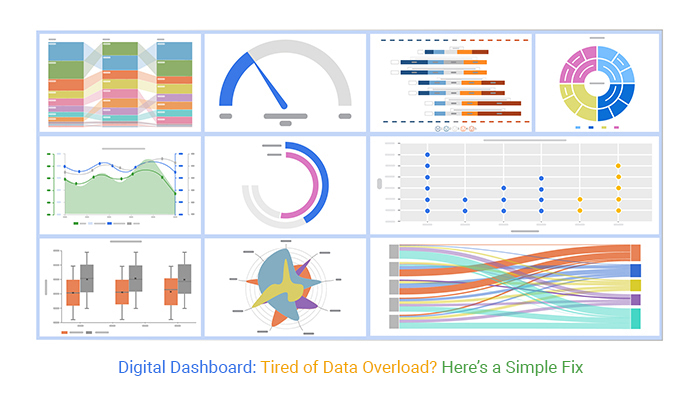
Ever felt lost in a sea of numbers and charts? You’re not alone. Digital dashboards can quickly turn into a mess of data. The trick? Keep it simple. Focus on what matters. Ignore the rest. This way, you make sure the important stuff stands out.
Too much data on your dashboard? It’s a common headache. Start by asking, “What do I need to know?” Strip away anything that doesn’t answer this question. This approach keeps your dashboard clean and your mind clear.
Think of your data like an onion. Some layers are for basic viewing, others for deeper inspection. Start with the overview. Need more details? Peel back a layer. This method helps keep your dashboard organized and prevents information overload.
What’s the secret to a best-designed dashboard? Key metrics. Identify a few indicators that truly reflect your goals. Stick to these, and don’t get distracted by the noise. This keeps you focused and makes your dashboard a tool, not a hindrance.
Do you ever feel lost in a sea of data? Think of your data as a treasure map. To find the gold – clear insights – you need the right tools. Data visualization turns complex data into a map that’s easy to read. Focus on clean, simple designs that highlight the key info. This way, you’ll spot the valuable insights faster, like spotting a lighthouse in the dark!
Choosing the right chart can make or break your dashboard. Sankey Diagrams are great for showing data flow, while line charts are perfect for trends over time. Think of your data’s story. What’s the best way to tell it? Selecting the right chart is like choosing the right glasses; it brings everything into focus.
Consistency is your friend! Keep colors, fonts, and layout uniform across your dashboard. This doesn’t just make it pretty – it makes it usable. It’s like setting up a good campsite; everything is where you expect it to be, which makes it easier to use. Stick to a grid layout and use the best colors for graphs, limiting your color palette for the best results.
Ever wish adding advanced charts to your dashboard was easier? Meet tools like ChartExpo. With just a few clicks, you can add stunning visuals to your data. It’s like having a magic wand for your dashboard! These tools help you create visuals that are not only informative but also eye-catching. Make your data not just smart, but also beautiful.
The following video will help you create the required chart in Microsoft Excel.


When setting up digital dashboards, aim for a perfect fit for user needs. First, understand what the end user really needs to see. What are their daily tasks? What decisions do they need to make? This initial step will guide the entire customization process. Engage users in this process. Ask them directly what information is most helpful. This direct feedback loop ensures the dashboard serves its intended purpose effectively.
Flexibility is key in dashboard design. Widgets that users can modify as needed make a huge difference. Allow users to move, resize, and toggle widgets based on their current focus. This adaptability means that as the user’s tasks evolve, so too can their dashboard. It’s like having a tool that grows with you, ensuring longevity and continued relevance.
Why stick with a one-size-fits-all approach when it comes to metrics? Personalizing metrics on your digital marketing dashboard lets each team member see what matters most to them. Sales teams might focus on lead conversion rates, while marketing teams might keep an eye on engagement metrics.
By setting up the dashboard to display relevant metrics by role, everyone gets precisely what they need to perform at their best.
Don’t let important data slip through the cracks. Use conditional formatting to make critical data stand out. Set rules to change the color of metrics when they hit certain thresholds. For instance, if response times to customer queries slow down, that metric can turn red.
This visual cue grabs attention quickly, prompting immediate action and keeping performance on track.
Let’s make sure everyone can use your digital tools on the go! A ton of your customers likely access data on their phones, so prioritizing mobile optimization isn’t just smart; it’s essential. Think about it – when was the last time you left home without your phone? Exactly. Your dashboard needs to be handy and responsive, making sure that users find what they need without a hitch, no matter where they are.
Okay, so you’re designing a dashboard. Start with mobile in mind from the get-go. This means your layout should fit well on smaller screens. Big, clunky designs won’t do. You need something sleek and easy to navigate.
Buttons should be big enough to tap without zooming in, and important info should jump out, not hide away. This approach not only improves usability but also ensures that the most critical data is easily accessible.
What’s really needed on a tiny screen? Prioritize clarity and speed. Your mobile dashboard should display key data at a glance – think sales figures, marketing metrics, or customer activity.
And don’t forget a search function; it’s a lifesaver for users needing specific info fast. Also, integrate refresh and “back to home” buttons prominently. Users love those; they make navigation a breeze and keep frustration at bay.
Navigating on a small device can be a pain, so let’s ease that. Make sure your mobile interface includes a straightforward menu – think hamburger icon that’s easy to tap.
Dropdowns should be uncomplicated, guiding users smoothly from point A to B. Remember, if users can’t find it, they can’t use it.
Swipe gestures? Yes, please! They’re intuitive and quick. Lastly, ensure that loading times are minimal; speedy access is key to keeping those busy bees happy.
Ever feel like your digital dashboard takes forever to load? Let’s fix that! Imagine cutting down those annoying load times and getting the info you need quicker. Here’s how you can make that happen.
Caching is your new best friend. It’s like storing snacks in your desk drawer. Instead of walking to the cafeteria every time you’re hungry, you just reach in and grab a bite. Caching stores parts of your dashboard data so when you come back, it loads way faster. Implement caching and watch your dashboard speed up like a race car!
Asynchronous loading is a bit like multitasking. While one part of your dashboard is loading, the rest doesn’t have to wait. It’s like cooking dinner while you’re doing laundry. Everything gets done faster, and you don’t waste time staring at a loading screen. Set up asynchronous loading and let your data multitask!
Dealing with huge data sets? Aggregation simplifies them by summarizing the data. Think of it as creating a highlight reel of a long game. Instead of analyzing every play, you get the key moments. This makes your dashboard quicker and your decisions smarter. Start aggregating data to keep your dashboard swift and efficient!
When you’re trying to make smart choices, knowing the full picture is key. Imagine you’re deciding on what snack to eat. If you know you’ve got a big dinner later, you might skip the chips and go for an apple.
It’s the same in business. Adding context to your data lets you make decisions that are right for the moment. It’s about seeing the whole playground, not just the swings.
Think of a digital dashboard as your control room. Now, having everything thrown at you at once would be overwhelming, right? That’s where hierarchical navigation steps in. It’s like having files sorted in drawers.
The big drawer labeled “Marketing” might have smaller ones inside for “Social Media,” “Email Campaigns,” and “Web Analytics Dashboard .” This setup helps you find exactly what you need without digging through a mess.
Let’s say you’re racing against your buddy. Wouldn’t you want to know if your last lap was faster? That’s where benchmarks and historical data come into play. They act as your previous race times, giving you something to beat. By comparing today’s performance with past data, you can see where you’re acing it and where you need to pick up the pace.
Ever tried finding your friend in a crowded place? A bright hat or a waving hand can be a lifesaver. That’s what visual cues do on your dashboard. They’re like those bright hats in a sea of information.
Maybe it’s a bold color highlighting a surge in sales, or an arrow pointing down to show a drop in website traffic. These cues grab your attention, making the important stuff stand out so you can act quickly.
Think of your data as puzzle pieces scattered across different boxes. Integrating multiple data sources means bringing all these pieces together to see the big picture. You pull data from sales, customer service, and marketing to create a complete view of your customer’s journey.
This helps you understand patterns and trends that you might miss if you only look at one source. The goal is to have all your data in one place, so making decisions becomes easier and faster.
Your performance marketing dashboard should be the go-to spot for all your marketing data insights. But if it’s pulling data from different platforms without syncing up, things can get messy. You want a dashboard where data from social media ads, email campaigns, and PPC efforts all speak the same language.
This means setting up your systems to automatically translate and adjust data so that everything reads clearly in one unified report. It’s like making sure every musician in an orchestra is playing from the same sheet of music to create harmony.
Building data pipelines is like setting up a series of relay races where data passes smoothly from one point to the next. Each segment of the pipeline is designed to handle specific types of data, transforming and transporting it to the next stage without any hiccups. This smooth flow is crucial for maintaining data integrity and timeliness.
By automating these pipelines, you ensure that data is always fresh and ready for analysis, helping you make quick, data-driven decisions.
A centralized data warehouse acts as your data’s home base. It’s where all your data comes to live under one roof. Having a single storage place for all your data ensures that everyone in your organization is accessing the same information.
This consistency is key to maintaining accuracy in reports and analytics. It’s like having a single source of truth that everyone can rely on, which helps in building trust and alignment across different teams.
Ever wondered how to make sense of all that data without getting lost? Let’s dive right in! The key is making your data interactive. Think about it: if you can play around with your data, you’re more likely to understand it.
Tools that let you explore data interactively help you see patterns and outliers quickly. It’s like turning a static picture into a movie – suddenly, everything comes to life!
Imagine you’re searching for a needle in a haystack. Now, what if you could remove all the hay that definitely doesn’t have the needle? That’s what filtering does in your marketing dashboards. It strips away the data you don’t need to see.
Drill-down capabilities take you one step closer, letting you zoom into the data that matters. It’s like having a magic magnifying glass for your data!
Linking different sets of data can give you amazing insights. It’s like putting together pieces of a puzzle. When you link sales data with customer feedback, you might discover that people love your product but hate the packaging. Data linking helps you see the full picture, leading to smarter decisions. It’s all about connecting the dots to see the bigger picture.
Data accuracy is the backbone of any digital dashboard. If your data’s off, your decisions will be too. How do you keep it spot on? First, focus on the source. Make sure your data sources are reliable. Next, automate the data collection process where possible to reduce human error. Regular audits are a must. They help catch and correct errors, keeping your dashboard accurate and trustworthy.
A solid data quality framework acts as your roadmap to error-free data. Start by defining what quality data looks like for your needs. What metrics are you tracking? What are the thresholds for accuracy?
Once you’ve set the standards, implement processes to monitor data quality continuously. Educate your team about these standards. Everyone should know how to spot quality data and fix what doesn’t meet the mark.
Think of validation rules as the gatekeepers of your data. These rules check incoming data for errors and ensure only the clean and correct data gets through. How do you set effective rules? Identify key data points that are essential for your data analysis. Set criteria for what valid data should look like for each of these points. Implement these rules into your data entry processes to catch errors as they happen, not after.
Consistency is key in data management. Standardizing how data is entered into your systems helps keep the chaos at bay. Create a manual or digital guide that outlines how to enter each type of data. Make it mandatory for all team members to follow these guidelines.
Monitoring is just as important. Regularly check the data entry process and ensure compliance with your standards. This proactive approach prevents errors and maintains the integrity of your data.
Let’s dive into the exciting world of trends and anomalies! Imagine you’re a detective in the world of data. Your mission? To spot what doesn’t quite fit and understand the patterns at play.
Trends show us the general direction things are moving over time, like a crowd heading to a concert. Anomalies? They’re the odd ones out, like someone walking in the opposite direction of the crowd. By identifying these, businesses can make smarter decisions, almost like predicting the future!
Think of a digital marketing dashboard as your command center. It’s where all the action happens! Predictive analytics acts as your crystal ball within this dashboard. It uses past data to guess what might happen next. Will customers click more on red or blue banners? Predictive analytics can make an educated guess. This tool helps marketers adjust their strategies on the fly, making sure they’re always one step ahead.
Machine learning isn’t just a buzzword – it’s like having a super smart assistant that learns on the job. In anomaly detection, machine learning algorithms are trained to spot outliers in data. It’s like teaching your dog to bark when someone unfamiliar comes to the door.
These algorithms sift through tons of information, learn what’s normal, and then bark (figuratively) when something unusual pops up. This can help prevent fraud or spot operational snags before they become real problems.
Looking at historical data is like flipping through a photo album; it tells you the story of what’s happened so far. By comparing past data, businesses can see patterns. Did sales spike every July? Is there a drop in website traffic every winter?
Understanding these patterns helps predict future trends and prepare better. It’s a bit like knowing it always rains in April, so you bring an umbrella!
Are you looking to amp up your business insights? Microsoft Power BI makes it simple. This tool transforms your raw data into attractive, easy-to-understand digital dashboards. Imagine having all your vital stats in one place – sales, customer behaviors, and operational efficiencies – displayed through vivid charts and live reports. Power BI does that without breaking a sweat.
Think of Power BI as your data’s new best friend. It lets you build custom dashboards that do exactly what you need. Want to track your latest marketing campaign or monitor inventory levels? No problem. Power BI pulls real-time data from various sources, allowing you to tweak your dashboards on the fly. This means more time acting on insights and less time wrestling with spreadsheets.
Real-time data sounds techy, but here’s the simple scoop: it keeps you ahead. With Power BI, you get updates instantly. No delays, no out-of-date reports. Plus, it plays well with tools you already use like Excel and SharePoint. Integration is so smooth, it’s like these tools have been best pals for years. This seamless setup lets you make decisions based on the latest data, keeping you nimble.
Let’s talk about making your data pretty and understandable. ChartExpo for Power BI offers you eye-catching visuals that are a breeze to create. No need to be a tech wizard. You pick the data, and ChartExpo turns it into a visual feast. This tool helps you tell the story behind your numbers, making it easier for everyone to get the picture.
If you’re looking to bump up productivity and innovation, boosting collaboration and sharing is your go-to strategy. In any business, especially if you’re wrangling with customer retention, getting your team to work together seamlessly can work wonders. It’s all about making sure everyone’s on the same page.
Ever tried real-time collaboration on digital marketing dashboards? It’s a game-changer! Imagine updating a dashboard and having your team see changes as they happen. This means instant feedback and quicker decision-making. It’s like having a team huddle but way more tech-savvy and without the cramped conference room.
Now, let’s talk about sharing the good stuff. Exporting and sharing digital dashboards can be a breeze, but only if you do it right. Make sure your dashboards are easy to read and accessible. You want them to be useful tools that anyone in your team can understand at a glance. No one should need a decoder ring to make sense of the data.
Ever felt stuck when trying to learn something new? You’re not alone! Breaking down learning barriers is key. First, identify what’s holding you back. Is it the fear of the unknown, or perhaps a lack of resources?
Once you spot these hurdles, tackling them becomes easier. Use simple, clear instructions and ask for feedback. Remember, every expert was once a beginner. Keep things light and don’t be afraid to make mistakes – they’re just stepping stones!
Think of a digital dashboard as your car’s control panel. You want it to show you exactly what you need to know, without causing confusion. To keep users happy, make sure your dashboard is clean and simple.
Big buttons, clear labels, and a logical layout do wonders. No one likes to hunt for information, so put everything in plain sight. This approach helps users feel at home, making their digital journey smooth and stress-free.
Remember your first day at a new job and how you wished someone would show you the ropes? That’s what guided tours and tutorials do for new users. They’re like friendly guides that help you explore new territories without feeling lost. By providing step-by-step instructions, these tools help users feel confident and reduce frustration. It’s like having a good friend walk you through a process, making sure you’re set for success.
Let’s talk about growing your digital dashboard without missing a beat. You’ve got a great setup, but as your business expands, so must your dashboards. It’s all about keeping them fast and functional, no matter how many users are hammering away at them.
First, check your dashboard’s current capability. Can it handle more users? If it lags with increased traffic, it’s time for an upgrade. Think of it as making sure your car can handle a road trip packed with all your friends.
Keep things modular. This means building your dashboard in chunks that can be improved independently. It’s like upgrading your car’s engine without having to buy a new one. This approach lets you tweak parts that need more juice without redoing the whole system.
When your data grows, your infrastructure must grow too. You don’t want the system to stumble just when you’re getting good at what you do.
Invest in scalable storage solutions. Whether it’s cloud storage or more dynamic solutions, make sure they grow as your data does. It’s like having a closet that expands as you buy more clothes – quite handy!
Process data efficiently. Use smarter methods to process data so your system isn’t bogged down. Think of it as hiring a better chef so your restaurant can serve more customers without a hitch.
Distributed computing is your best friend as you scale. It’s about many hands making light work.
Distribute the workload across multiple machines. This way, no single machine gets overwhelmed. It’s like having several smaller engines working together to power one big ship.
Make your computing resources elastic. They should stretch or shrink according to demand. Imagine a balloon that inflates when you need more air and deflates when you don’t – that’s your goal.
Your dashboard must remain smooth and responsive, even under pressure. Here’s how to keep things running smoothly:
Keep an eye on your dashboard’s performance. Regular checks can help you spot problems before they affect users, especially when working with healthcare dashboard examples that may scale as data volume grows. It’s like having a health check-up to ensure everything is working as it should.
Tweak and optimize wherever necessary. This might mean simplifying complex queries or caching commonly accessed data. Think of it as tuning your car to get the best performance.
You need a digital dashboard to simplify how you view your data. Instead of looking at several reports or spreadsheets, it brings everything together in one place. It saves you time and helps you make quicker, smarter decisions by showing key metrics at a glance.
The biggest benefit? Speed. You get fast insights without digging through tons of data. It makes decision-making quicker and more informed. Plus, with real-time updates, you’re never behind on what’s happening in your business.
You can track almost anything – sales, marketing, operations, customer data, or even financials. If there’s data, there’s a way to display it on a dashboard. It’s all about showing the right information in a way that helps you make better choices.
Absolutely. By showing the right data in real-time, it helps you spot trends, track progress, and act fast when something needs attention. It takes guesswork out of decision-making.
That depends on the dashboard. Some update in real time, others on a schedule. You can often set how often you want updates to happen, depending on the data source.
It’s not as tough as it sounds. Many platforms have drag-and-drop features that let you build dashboards without needing a tech background. Plus, lots of guides and templates are available to make the setup process smoother.
A report is static. It’s like a snapshot of data at a specific moment. A dashboard is alive – it updates automatically and keeps you informed in real-time. Think of it as having your finger on the pulse without needing a new report every time something changes.
Digital dashboards aren’t just fancy visuals – they’re essential tools for smarter business decisions. By bringing together all your key metrics, these dashboards allow you to see what’s happening in real time. No more relying on outdated reports. Whether you’re tracking performance, managing marketing campaigns, or keeping an eye on costs, the dashboard is your go-to resource.
You’ve learned how to avoid data overload, focus on key metrics, and create a dashboard that truly serves your needs. The power lies in simplicity and clarity. Too much data can confuse, but a well-organized dashboard cuts through the noise and highlights what’s important.
From choosing the right charts to improving mobile usability, every step you take in refining your dashboard will make your data work harder for you. Integrating tools like ChartExpo can make this process even more seamless, giving you the visuals you need with minimal effort.
As your business grows, your dashboard will need to scale too. Optimizing performance, embracing modular designs, and ensuring your dashboard can handle increased traffic are essential steps. Keeping your dashboard flexible and interactive means that as your business changes, your dashboard adapts with you.
In the end, your dashboard isn’t just a tool – it’s your business’s control center. It keeps you informed, helps you react faster, and ultimately drives your success.
How much did you enjoy this article?


Calculate accounts receivable turnover ratio to measure credit collection speed, improve cash flow, and strengthen your financial strategy. Read on!

Change Management KPIs are the key to tracking adoption, performance, and ROI during transitions. Find out which metrics matter. Read on!

Data collection methods and techniques determine the quality of every insight you act on. Explore key approaches for gathering reliable data. Read on!


