• Home
  • Tools dropdown img
    • Spreadsheet Charts

      • ChartExpo for Google Sheets
      • ChartExpo for Microsoft Excel
    • Power BI Charts

      • Power BI Custom Visuals by ChartExpo
    • Word Cloud

  • Charts dropdown img
    • Chart Category

      • Bar Charts
      • Circle Graphs
      • Column Charts
      • Combo Charts
      • Comparison Charts
      • Line Graphs
      • PPC Charts
      • Sentiment Analysis Charts
      • Survey Charts
    • Chart Type

      • Box and Whisker Plot
      • Clustered Bar Chart
      • Clustered Column Chart
      • Comparison Bar Chart
      • Control Chart
      • CSAT Survey Bar Chart
      • CSAT Survey Chart
      • Dot Plot Chart
      • Double Bar Graph
      • Funnel Chart
      • Gauge Chart
      • Likert Scale Chart
      • Matrix Chart
      • Multi Axis Line Chart
      • Overlapping Bar Chart
      • Pareto Chart
      • Radar Chart
      • Radial Bar Chart
      • Sankey Diagram
      • Scatter Plot Chart
      • Slope Chart
      • Sunburst Chart
      • Tornado Chart
      • Waterfall Chart
      • Word Cloud
    • Google Sheets
      Microsoft Excel
  • Services
  • Pricing
  • Contact us
  • Blog
  • Support dropdown img
      • Gallery
      • Videos
      • Contact us
      • FAQs
      • Resources
    • Please feel free to contact us

      atsupport@chartexpo.com

Categories
All Data Visualizations Data Analytics Surveys
Add-ons/
  • Google Sheets
  • Microsoft Excel
  • Power BI
All Data Visualizations Data Analytics Surveys
Add-ons
  • Google Sheets
  • Microsoft Excel
  • Power BI

We use cookies

This website uses cookies to provide better user experience and user's session management.
By continuing visiting this website you consent the use of these cookies.

Ok

ChartExpo Survey


Home > Blog > Power BI

Views in Power BI: Key Tips for Creating Impactful Insights

Having Power BI at your fingertips is one of the best ways to get the most out of your business data. With Power BI, you’ll create simple visuals from complex information. One way of getting the most out of the tool is using views in Power BI.

Views in Power BI

In this guide, you’ll discover what views in Power BI are, why it matters, different views in Power BI, and how to use views in Power BI.

Table of Contents:

  1. What are Views on Power BI?
  2. Why Does the Power BI View Matter?
  3. How to Use Views in Power BI?
  4. How to Create Visualizations in Power BI?
  5. What are the Best Practices for creating views in Microsoft Power BI?
  6. Wrap Up

First…

What are Views on Power BI?

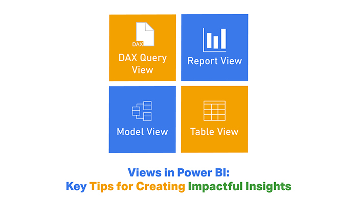
The Power BI Desktop mode is free for everyone, and it comes with three views namely:

  • Report
  • Data
  • Relationships

These three functions help creators to quickly access their data, build their visualizations, and work on multiple charts.

  • Report View

The Report view is the default view, and that’s what you’ll see as you open the Power BI Desktop. Creators use the report view to create visual reports based on the data. Most of the time, creators work with this screen.

  • Data View

The Data view is the middle option, and you’ll see it after modeling your data. In the Data view, Visuals are laid out piece by piece in a grid format.

  • Relationship View

Also known as the Model view, the Relationship view enables creators to see the relationship between their data models.

Why Does the Power BI View Matter?

Here are the major reasons why Power BI views are important.

  • Data Management and Exploration
  • Enhanced Data Visualization and Reporting
  • Collaboration and Sharing
  • User-Centric Analysis
  • Efficiency in Data-Driven Decision Making

How to Use Views in Power BI?

In this section, you’ll discover easy ways of using views in Power BI.

Use Model View

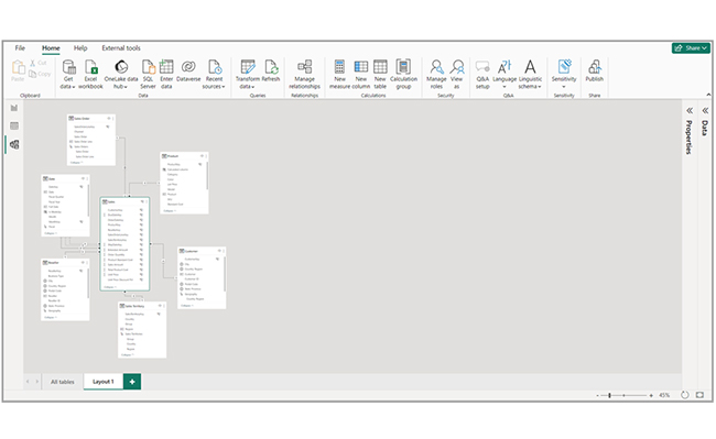
Navigate to the left side of Power BI Desktop, and select the Model icon.

Select Model Icon for Adding Views in Power BI

Create Separate Diagrams

The Model view enables you to create diagrams of your model that have only a subset of the tables in the model. This setup helps the user to easily work with complex semantic models and also provides a clearer view of the tables.

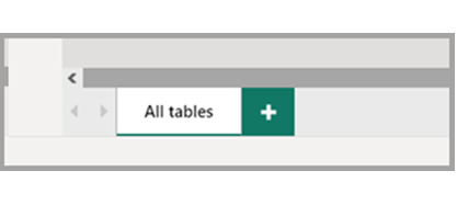
To create a new diagram with the subset of the tables, you’ll have to navigate to the bottom of the Power BI Desktop window, look out for the “+” button next to the “All tables” tab, and select it.

Create New Diagram with Subset for Adding Views in Power BI

The tool allows you to drag a table from the “Data pane” onto the diagram surface. You can also right-click the table, and choose “Add related tables” from the options displayed.

Choose Add Related Tables for Adding Views in Power BI

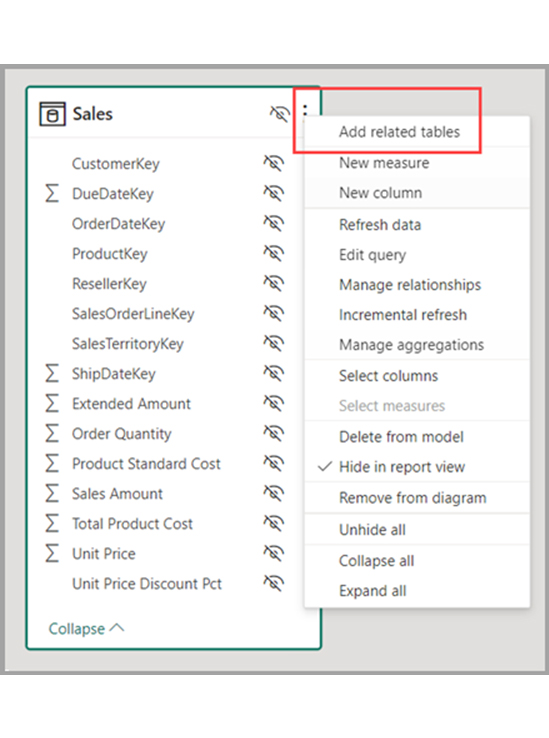
After that, tables related to the original table are displayed in the new diagram. The image below will be displayed after choosing the “Add related tables” option.

Original Table are Displayed in New Diagram for Adding Views in Power BI

Use Model Explorer (Preview)

Navigate to the left side of the Power BI Desktop, and select the Model icon. This ascertains that you’re in Model view. Next, select “Model” in the “Data pane” to see an image similar to the one below.

Select Model in Data Pane for Adding Views in Power BI

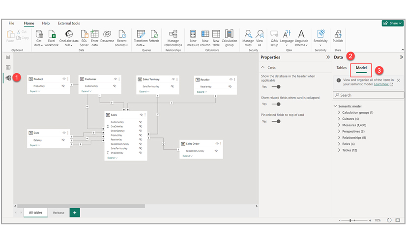
The Model explorer displays a tree view of the data model or semantic model along with the number of items in each node.

Set Common Properties

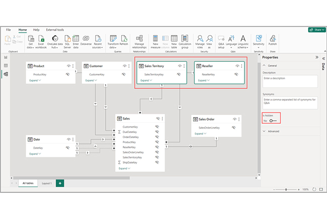
To select multiple objects at once, hold down the “Ctrl” key and select multiple tables. After selecting multiple tables, they become highlighted in the Modeling view. Since multiple tables are highlighted, changes applied in the “Properties” pane will apply to the selected tables.

For instance, users can change the visibility for multiple tables in the diagram view by holding down the “Ctrl” key, selecting the tables, and changing the “hidden” setting in the “Properties” pane.
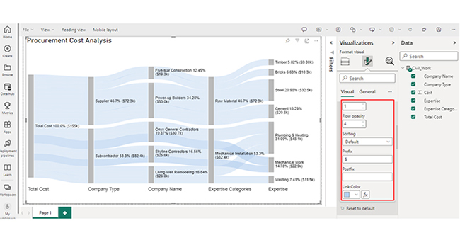
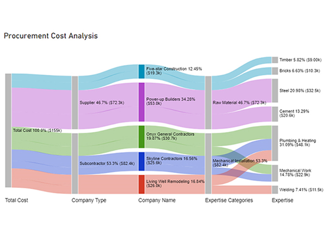
Changing Hidden Setting in Properties Pane for Adding Views in Power BI

How to Create Visualizations in Power BI?

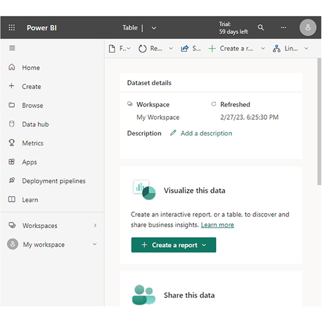
Stage 1: Logging in to Power BI
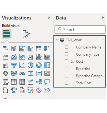
  • Log in to Power BI.
  • Enter your email address and click the “Submit” button.
Enter email to login to Power BI
  • You are redirected to your Microsoft account.
  • Enter your password and click “Sign in“.
Enter Password to login to Power BI
  • You can choose whether to stay signed in.
Click on stay signed in
  • Once done, the Power BI home screen will open.

Stage 2: Creating a Data Set and Selecting the Data Set to Use in Your Chart

  • Go to the left-side menu and click the “Create” button.
  • Select “Paste or manually enter data“.
select Paste or manually enter data in Power BI ce487
  • We’ll use the sample data below for this example.
Total Cost Company Type Company Name Expertise Categories Expertise Cost
Total Cost Subcontractor Skyline Contractors Mechanical Installation Plumbing & Heating 15456
Total Cost Subcontractor Skyline Contractors Mechanical Installation Mechanical Work 10159
Total Cost Subcontractor Onyx General Contractors Mechanical Installation Plumbing & Heating 18045
Total Cost Subcontractor Onyx General Contractors Mechanical Installation Mechanical Work 12695
Total Cost Subcontractor Living Well Remodeling Mechanical Installation Plumbing & Heating 14589
Total Cost Subcontractor Living Well Remodeling Mechanical Installation Welding 11456
Total Cost Supplier Power-up Builders Raw Material Cement 20561
Total Cost Supplier Power-up Builders Raw Material Steel 32456
Total Cost Supplier Five-star Construction Raw Material Bricks 10253
Total Cost Supplier Five-star Construction Raw Material Timber 9000
  • Paste the data table into the “Power Query” window. Next, choose the “Create a dataset only” option.
Click Create a Dataset Only After Connecting Power BI and AWS
  • Navigate to the left-side menu, and click the “Data Hub” option. Power BI will populate the data set list. If the data set has not been created, you’ll get an error message.
Click Data Hub After Connecting Power BI and AWS
  • Choose your preferred data set to be used for the Sankey diagram. After that, Power BI will populate the screen as shown below.
Choose Preferred Data Set After Connecting Power BI and AWS
  • Click on the “Create a report” dropdown, and select “Start from scratch.”
Click Create a Report After Connecting Power BI and AWS
  • The Report Canvas screen will appear as shown below:
See Report Canvas After Connecting Power BI and AWS

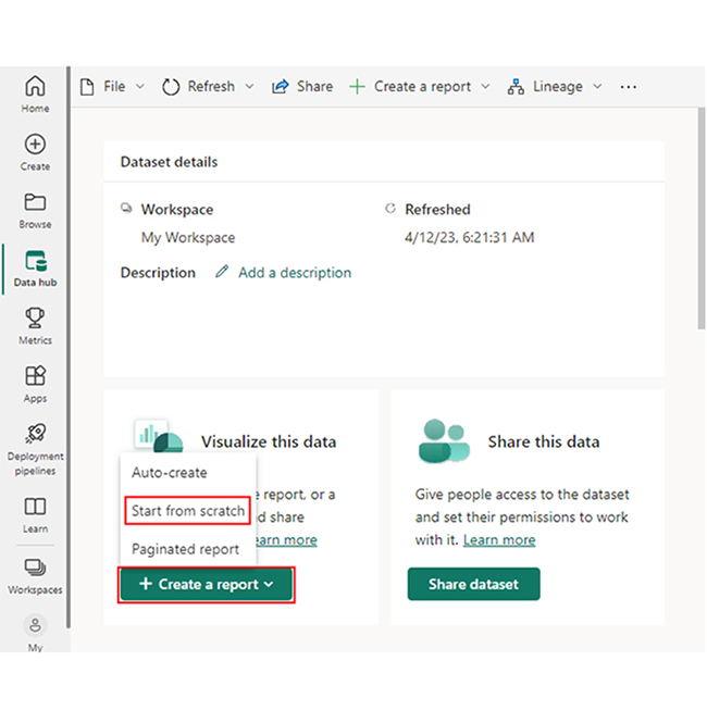
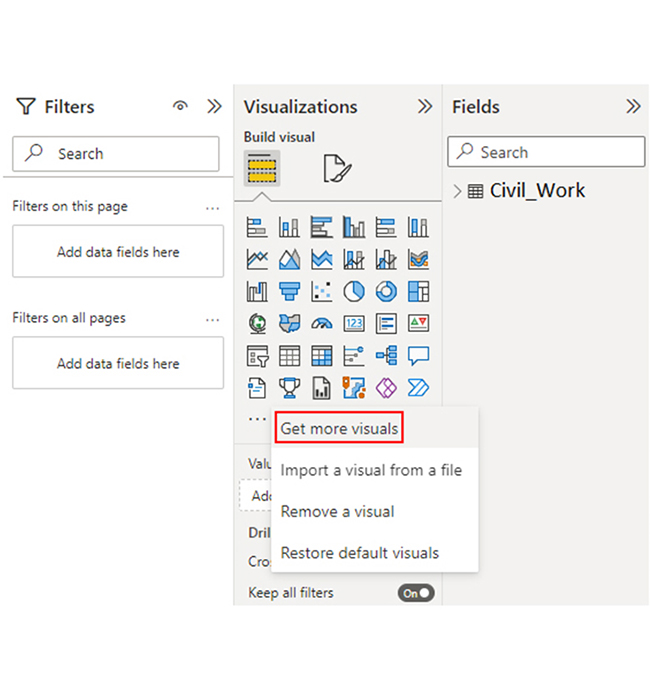
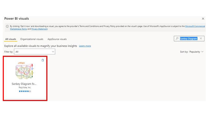
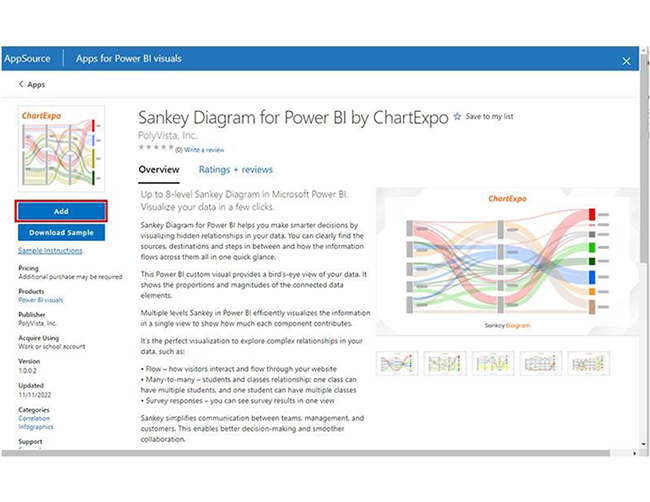
Stage 3: Add the Power BI Sankey Diagram Extension by ChartExpo

  • To create a Sankey Diagram, you’ll need an add-in or Power BI visual from AppSource. You’ll have to navigate to the right side of the Power BI dashboard and open the visualizations panel. To import the Power BI Sankey Diagram extension by ChartExpo, click the ellipsis symbol (…).
Click 3 Dots After Connecting Power BI and AWS
  • On the menu that opens, select the “Get more visuals” option.
Select Get More Visuals After Connecting Power BI and AWS
  • Input “Sankey Diagram for Power by ChartExpo” into the search box. After that, you’ll see the “Sankey Diagram for Power BI by ChartExpo.”
Search Sankey Diagram After Connecting Power BI and AWS
  • Click the “Add” button.
Click Add Button After Connecting Power BI and AWS
  • The “Sankey Diagram for Power BI by ChartExpo” icon will be added to the visualization panel.
See Sankey Diagram in Visualization Panel After Connecting Power BI and AWS

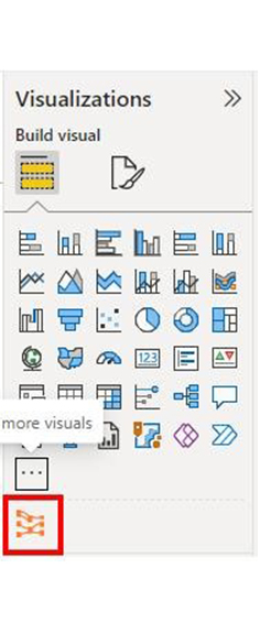
Stage 4: Draw a Sankey Diagram with ChartExpo’s Power BI extension

  • To do that, select the “Sankey Diagram for Power BI by ChartExpo” icon from the visualization panel. A window similar to the one below will open in the report section of your dashboard.
Select Sankey Diagram Icon From Visualization Panel After Connecting Power BI and AWS
  • You can resize the visual. Next, navigate to the right side of the Power BI dashboard. Look out for “Fields” found next to “Visualizations.”
Look Out Fields After Connecting Power BI and AWS
  • You have to select the fields in the following sequence:
    • Total Cost
    • Company Type
    • Company Name
    • Expertise Categories
    • Expertise
    • Cost
Select Fields After Connecting Power BI and AWS
  • You’ll have to provide your email address or ChartExpo license key.
Enter Email Address After Connecting Power BI and AWS

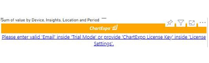
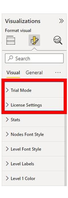
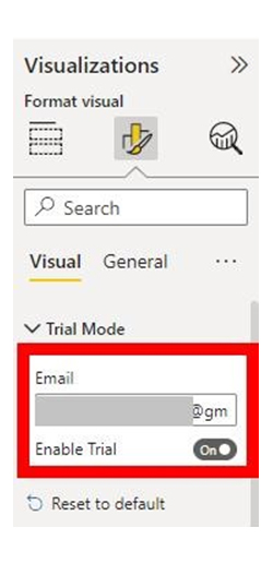
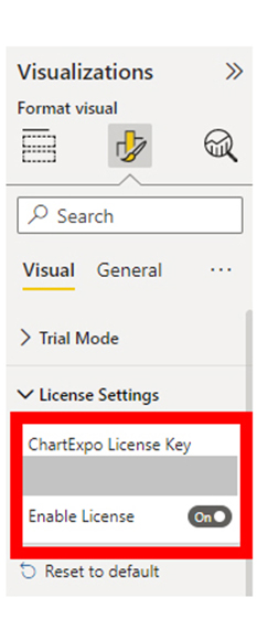
Stage 5: Activate the ChartExpo Trial or Apply a Subscription Key

  • Select the ChartExpo visual. After that, navigate to the visualizations panel and look out for the three icons below “Build Visual.”
Select Visual Look For Three Icon After Connecting Power BI and AWS
  • Choose the middle icon “Format visual.” Next, the visual properties will be populated as shown below.
Choose Format Visual After Connecting Power BI and AWS
  • As a new user, look out for the textbox under the “Trial Mode,” and input your email address. After that, toggle “Enable Trial’ to activate the 7-day trial.
Activate 7 Day Trial After Connecting Power BI and AWS
  • You’ll notice that the Sankey Diagram comes with the ChartExpo watermark.
Notice Sankey Diagram With Watermark After Connecting Power BI and AWS
  • If you have a license key, navigate to the “License Settings” section, and input it into the “ChartExpo License Key” textbox. After that, you’ll have to slide the toggle switch next to “Enable License” to “On.”
Enter License Key After Connecting Power BI and AWS
  • You’ll notice that the Sankey diagram doesn’t come with a watermark.
Notice Sankey Diagram WIthout Watermark After Connecting Power BI and AWS
  • To add a prefix (like the $ sign) with the numeric values in the chart, you’ll have to expand the “Stats” properties and include the prefix value.
Add Prefix in Chart After Connecting Power BI and AWS
  • To add colors to each node, expand the “Level Colors” properties and select the colors.
Add Colors to Each Node After Connecting Power BI and AWS
  • Changes will be saved automatically.
Final Power BI and AWS

Insights

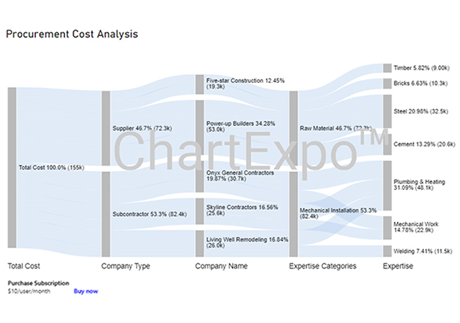
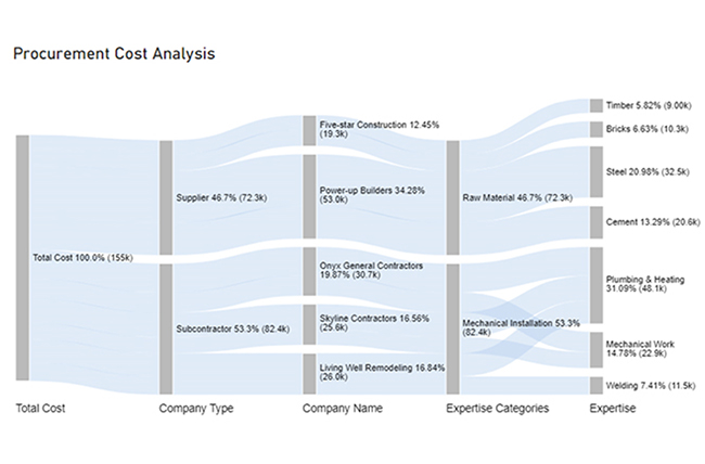
Here are three insights from the chart.

  • At Level 1 (Total Cost), the procurement cost is $155K.
  • At Level 2 (Company Type), out of the $155K cost, $82.4K (53.3%) was spent on subcontractors, while $72.3K (46.7%) was allocated to the supplier.
  • At Level 3 (Company Name), the 72.3K supplier cost was divided into two: Five-star Construction and Power-up Builder with charges of $19.3K and $53.0K, respectively.

Unlock Seamless Chart Navigation with Views in Power BI:

Unlock new possibilities in data visualization with Views in Power BI through this interactive tutorial. This feature empowers you to customize and manage how charts and graphs are displayed, offering tailored perspectives for diverse audiences. Whether you’re toggling between data layouts, comparing visualizations, or showcasing key metrics, mastering Views in Power BI ensures your dashboards remain intuitive and insightful. By seamlessly adapting to user needs, you can enhance data exploration, foster deeper understanding, and present findings that drive impactful decisions. With dynamic views and optimized charts, Power BI helps you turn raw data into compelling stories.

What are the Best Practices for creating views in Microsoft Power BI?

Here are the best practices for creating views in Power BI.

  1. Understand Your Audience: Your data presentation and visuals should be tailored to meet the preferences and needs of your audience. Always use terms and languages your audience can relate to.
  2. Plan Your Reports and Dashboards: Always sketch out your dashboard or report on paper before building it in Power BI. Whiteboard is also a great alternative for this process. Define the Key Performance Indicators (KPIs) and metrics that are to be highlighted.
  3. Data Preparation and Modeling: Your data has to be accurate, clean, and well-structured before you import it into Power BI. The data model has to be robust in such a way that enables well-defined relationships between tables. You can enhance your data model by using calculated measures, columns, and hierarchies.
  4. Use Appropriate Visuals: You need to choose the visual that best fits the data you’re presenting. For instance, users who will be making comparisons should opt for bar charts, while those looking out for trends should opt for line charts. Additionally, do not use multiple types of visuals on one page.

FAQs

How many views are there in Power BI?

There are three main views in Power BI. They include Report View, Data View, and Model View.

What are the three core views of Power BI?

The three core views in Power BI are:

  • Report View for report creation
  • Data View for data inspection and cleaning
  • Model View for creating calculations and managing relationships.

Why use views instead of tables in Power BI?

Views allow for better performance, optimized data transformations, consistent data structures, simplified data management, and improving the overall report maintainability and efficiency.

Wrap Up

Views in Power BI help in the creation of reports, inspecting data, and managing relationships. With it, users can easily improve their data visualization, management, and performance.

The different views in Power BI include the Report View, Model View, and Data View. Power BI Views can be used in creating visuals, managing relationships, and cleaning data.

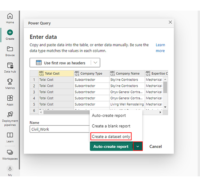
To get started, you’ll have to create a dashboard in Power BI. After that, use visualizations like the Sankey chart to represent the evolving total over time. All these help in having an effective data evaluation.

How much did you enjoy this article?

PBIAd2
Start Free Trial!
139804

Related articles

next previous
Power BI12 min read

Power BI Group By Guide for Effective Data Insights

Learn how Power BI Group By helps you aggregate data, clarify trends, and create reports by grouping values to make large datasets manageable & insightful.

Power BI12 min read

How to Create Sankey Diagram in Microsoft Power BI?

Learn How to Create Sankey Diagram in Microsoft Power BI using Desktop & Web Service. What they are and how to use them effectively.

Power BI8 min read

Power BI Artificial Intelligence: Insights Using Visuals

Discover all there is to know about the Power BI artificial intelligence. You'll also discover how AI is used in Power BI, and how to use it for analysis and more.

Power BI9 min read

Budgeting in Healthcare: Use Visuals to Spot Budget Gaps

This guide helps you discover what budgeting in healthcare is. You'll also discover the factors that affect hospital budgets and types of budgeting in healthcare.

Power BI9 min read

Predictive Analytics in Power BI for Making Insightful Visuals

This guide shows you everything you need to know about Predictive Analytics in Power BI. It also shows you how it works, and how to interpret the results.

ChartExpo logo

Turn Data into Visual
Stories

CHARTEXPO

  • Home
  • Gallery
  • Videos
  • Services
  • Pricing
  • Contact us
  • FAQs
  • Privacy policy
  • Terms of Service
  • Sitemap

TOOLS

  • ChartExpo for Google Sheets
  • ChartExpo for Microsoft Excel
  • Power BI Custom Visuals by ChartExpo
  • Word Cloud

CATEGORIES

  • Bar Charts
  • Circle Graphs
  • Column Charts
  • Combo Charts
  • Comparison Charts
  • Line Graphs
  • PPC Charts
  • Sentiment Analysis Charts
  • Survey Charts

TOP CHARTS

  • Sankey Diagram
  • Likert Scale Chart
  • Comparison Bar Chart
  • Pareto Chart
  • Funnel Chart
  • Gauge Chart
  • Radar Chart
  • Radial Bar Chart
  • Sunburst Chart
  • see more
  • Scatter Plot Chart
  • CSAT Survey Bar Chart
  • CSAT Survey Chart
  • Dot Plot Chart
  • Double Bar Graph
  • Matrix Chart
  • Multi Axis Line Chart
  • Overlapping Bar Chart
  • Control Chart
  • Slope Chart
  • Clustered Bar Chart
  • Clustered Column Chart
  • Box and Whisker Plot
  • Tornado Chart
  • Waterfall Chart
  • Word Cloud
  • see less

RESOURCES

  • Blog
  • Resources
  • YouTube
SIGN UP FOR UPDATES

We wouldn't dream of spamming you or selling your info.

© 2025 ChartExpo, all rights reserved.