Categories
Power BI vs. Excel is a hot topic.
Picture this: you’re a project manager tasked with examining sales data to discover patterns and make critical business choices. You rely on Excel, a reliable instrument for analyzing data. It is common, adaptable, and widely employed, yet the constraints become apparent as your data sets grow.


This is when Power BI makes an appearance.
The Microsoft Power BI tool is specifically designed to handle big datasets. It goes beyond simple spreadsheet software. It is a powerful business intelligence tool that can quickly analyze and display intricate data.
On the other hand, Excel has been a fundamental tool for analyzing data for many years. Many professionals choose it due to its user-friendly interface and familiarity. Nevertheless, as the amount and intricacy of data increase, Excel’s constraints become apparent. Many individuals discover that they dedicate more time to manipulating data than analyzing it.
So, what distinguishes these two tools? Understanding Power BI vs. Excel is essential to determine which tool is most suitable for your analytical needs.
Let’s explore further the functionalities, capabilities, and real-world uses of these two powerful data tools.
First…
Choosing Power BI over Excel can significantly enhance your data analysis and visualization capabilities. Here are some key reasons to use Power BI over Excel:
Power BI vs. Excel is a powerful data analysis and reporting tool. But they serve different purposes and offer distinct functionalities. This table highlights the key differences between Power BI vs. Excel.
| Aspect | Excel | Power BI |
| Purpose and Functionality | Primarily used for spreadsheet calculations, data entry, and basic data analysis. It is well-suited for tasks like budgeting, forecasting, and simple reporting. | Designed for business intelligence, data visualization, and advanced analytics. It is better suited for organizations looking to gain deep insights from their data and make data-driven decisions. |
| Data Handling and Scalability | Handles smaller datasets well but can struggle with very large datasets. | Optimized for handling large datasets efficiently, supporting complex data modeling and transformations. |
| Visualization and Collaboration | Offers basic charting and graphing capabilities sufficient for simple data visualization needs. However, its interactive features are limited. | Provides advanced, interactive visualizations and dashboards where you can create dynamic reports with drill-down capabilities
It provides robust sharing and collaboration features through its cloud service. |
Power BI and Excel are both powerful data visualization tools, each with distinct features and use cases. Understanding when to use each tool can help maximize their benefits for different business needs. This table highlights the similarities and when to use Power BI vs. Excel:
| Aspect | Similarities | When to Use Excel | When to Use Power BI |
| Microsoft Ecosystem | Both integrate well with other Microsoft products, ensuring seamless data sharing and collaboration. | Use Excel for tasks requiring integration with Microsoft Office applications like Word and Outlook. | Use Power BI when integrating with cloud services and online collaboration tools like SharePoint and Teams. |
| Data Manipulation | Both offer robust data manipulation capabilities, including sorting, filtering, and performing calculations. | Use Excel for simple data manipulation tasks and when working with small to medium-sized datasets. | Use Power BI for advanced data transformations, cleaning, and handling large and complex datasets. |
| Charts and Visualizations | Both provide charting and visualization features. | Use Excel for basic charting and when static reports are sufficient. | Use Power BI for interactive, dynamic visualizations and when creating detailed, interactive dashboards. |
| Formula Language | Both allow sophisticated calculations to analyze data. | Use Excel for straightforward calculations and when familiar with Excel’s formula language. | Use Power BI when complex data modeling is needed and for leveraging DAX for advanced analytical capabilities. |
Power BI vs. Excel. Each tool has strengths and is suitable for different types of tasks. Understanding how to use each to handle data can help maximize business productivity and analytical capabilities.
Choosing between Power BI vs. Excel ultimately depends on your data and analysis requirements.
Power BI is proficient in handling complicated data sets, creating interactive reports, and facilitating collaboration. If the criteria you need encompass:
Power BI is the optimal choice. Its capacity to simulate intricate data sets and generate interactive visual representations will support deeper examination.
Excel is most effective for basic, impromptu examination of mid-sized data sets. If you need:
Excel would be the better option. Excel may not have all the advanced analysis features of Power BI. However, it still provides a flexible, customizable, efficient platform for medium-scale data projects.
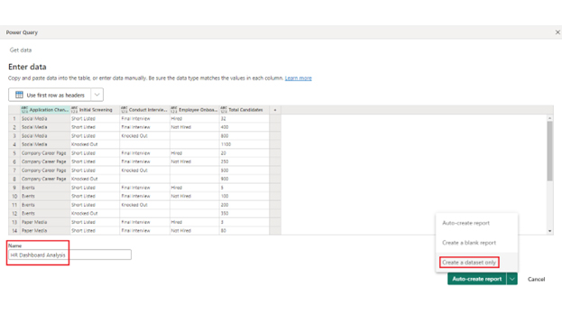
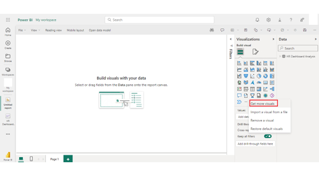
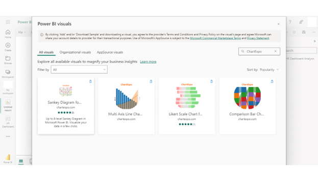
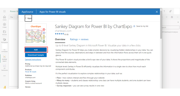
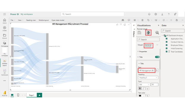
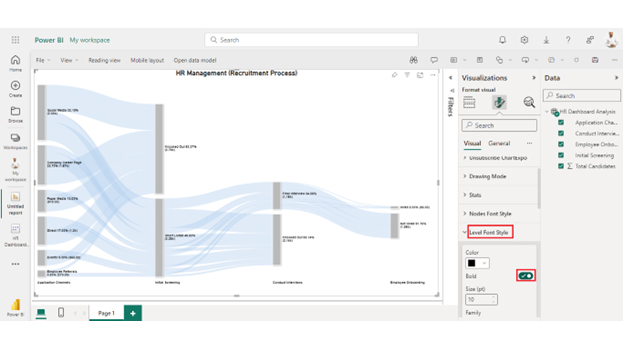
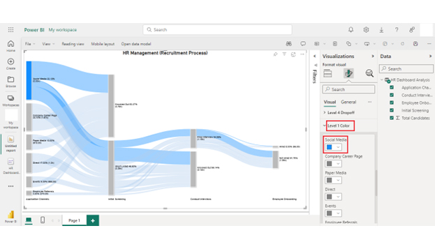
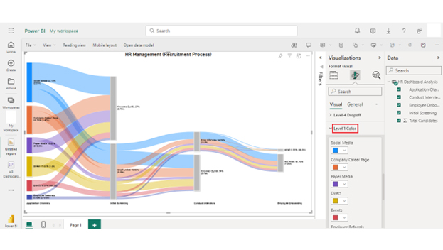
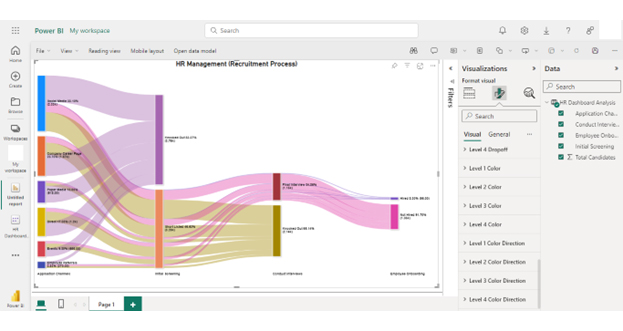
You can use the Sankey chart in Power BI to create dynamic visualizations that go beyond what’s possible in Excel by designing detailed data flow visuals with a Sankey diagram generator.


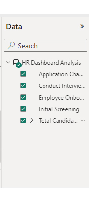
| Application Channels | Initial Screening | Conduct Interviews | Employee Onboarding | Total Candidates |
| Social Media | Short Listed | Final Interview | Hired | 32 |
| Social Media | Short Listed | Final Interview | Not Hired | 400 |
| Social Media | Short Listed | Knocked Out | 800 | |
| Social Media | Knocked Out | 1100 | ||
| Company Career Page | Short Listed | Final Interview | Hired | 20 |
| Company Career Page | Short Listed | Final Interview | Not Hired | 250 |
| Company Career Page | Short Listed | Knocked Out | 500 | |
| Company Career Page | Knocked Out | 900 | ||
| Events | Short Listed | Final Interview | Hired | 5 |
| Events | Short Listed | Final Interview | Not Hired | 100 |
| Events | Short Listed | Knocked Out | 200 | |
| Events | Knocked Out | 350 | ||
| Paper Media | Short Listed | Final Interview | Hired | 3 |
| Paper Media | Short Listed | Final Interview | Not Hired | 80 |
| Paper Media | Short Listed | Knocked Out | 135 | |
| Paper Media | Knocked Out | 700 | ||
| Employee Referrals | Short Listed | Final Interview | Hired | 10 |
| Employee Referrals | Short Listed | Final Interview | Not Hired | 70 |
| Employee Referrals | Short Listed | Knocked Out | 80 | |
| Employee Referrals | Knocked Out | 110 | ||
| Direct | Short Listed | Final Interview | Hired | 25 |
| Direct | Short Listed | Final Interview | Not Hired | 150 |
| Direct | Short Listed | Knocked Out | 425 | |
| Direct | Knocked Out | 600 |


Power BI vs. Excel are powerful tools within the Microsoft ecosystem, each with distinct advantages and disadvantages. Choosing the right tool depends on specific needs and capabilities. Here’s a detailed comparison of the pros and cons of Power BI vs. Excel.
Power BI is not going to replace Excel. Each tool has unique strengths. Power BI excels in advanced data visualization and large-scale analysis. Conversely, Excel is ideal for data entry, basic analysis, and financial modeling. Both tools complement each other.
Learn Excel first. It provides foundational skills in data manipulation and analysis. Excel’s user-friendly interface makes it easier to understand basic concepts. Once proficient, learning Power BI will be easier, enhancing your data visualization and advanced analytics skills.
Power BI is better than Excel for advanced data visualization and handling large datasets. It offers interactive dashboards and real-time data analysis. However, Excel is superior for data entry, basic analysis, and financial modeling. Each tool has its strengths.
Power BI vs. Excel differ in their distinct strengths and capabilities. Each caters to different aspects of data analysis and visualization.
Power BI excels in advanced data visualization. It offers interactive dashboards and dynamic charts, allowing deep data exploration and insight discovery. Its ability to handle large datasets efficiently makes it ideal for businesses with extensive data needs.
On the other hand, Excel is preferred for its versatility and ease of use. It remains a go-to tool for data entry, basic analysis, and financial modeling tasks. Excel’s familiar interface and wide range of functionalities make it accessible to users of all skill levels.
Power BI provides robust data modeling capabilities and supports complex transformations and calculations. Excel offers powerful tools for data manipulation and organization. Its Pivot Tables and formulas are valuable for summarizing and analyzing data in a tabular format.
Power BI seamlessly integrates with various data sources and Microsoft products, facilitating real-time data analysis and collaboration. Excel integrates well with other Microsoft Office applications, enhancing productivity and ease of use within the Office suite.
Ultimately, the choice between Power BI vs. Excel depends on the specific needs of the task. Power BI is preferred for advanced data analysis and visualization, especially when handling large datasets requiring interactive dashboards. Conversely, Excel remains indispensable for simpler tasks, data entry, and basic analysis.
How much did you enjoy this article?


Discover diverse and high-quality Power BI report examples for inspiration and insights. Elevate your reporting with strategic visualization techniques.

A Customer Relationship Management Dashboard centralizes data, tracks key metrics, and drives smarter business decisions. Discover now!

Explore Healthcare Dashboard Examples and learn how to turn complex healthcare data into clear, actionable insights for better decision-making.


