• Home
  • Tools dropdown img
    • Spreadsheet Charts

      • ChartExpo for Google Sheets
      • ChartExpo for Microsoft Excel
    • Power BI Charts

      • Power BI Custom Visuals by ChartExpo
    • Word Cloud

  • Charts dropdown img
    • Chart Category

      • Bar Charts
      • Circle Graphs
      • Column Charts
      • Combo Charts
      • Comparison Charts
      • Line Graphs
      • PPC Charts
      • Sentiment Analysis Charts
      • Survey Charts
    • Chart Type

      • Box and Whisker Plot
      • Clustered Bar Chart
      • Clustered Column Chart
      • Comparison Bar Chart
      • Control Chart
      • CSAT Survey Bar Chart
      • CSAT Survey Chart
      • Dot Plot Chart
      • Double Bar Graph
      • Funnel Chart
      • Gauge Chart
      • Likert Scale Chart
      • Matrix Chart
      • Multi Axis Line Chart
      • Overlapping Bar Chart
      • Pareto Chart
      • Radar Chart
      • Radial Bar Chart
      • Sankey Diagram
      • Scatter Plot Chart
      • Slope Chart
      • Sunburst Chart
      • Tornado Chart
      • Waterfall Chart
      • Word Cloud
    • Google Sheets
      Microsoft Excel
  • Services
  • Pricing
  • Contact us
  • Blog
  • Support dropdown img
      • Gallery
      • Videos
      • Contact us
      • FAQs
      • Resources
    • Please feel free to contact us

      atsupport@chartexpo.com

Categories
All Data Visualizations Data Analytics Surveys
Add-ons/
  • Google Sheets
  • Microsoft Excel
  • Power BI
All Data Visualizations Data Analytics Surveys
Add-ons
  • Google Sheets
  • Microsoft Excel
  • Power BI

We use cookies

This website uses cookies to provide better user experience and user's session management.
By continuing visiting this website you consent the use of these cookies.

Ok

ChartExpo Survey


Home > Blog > Power BI

SELECTEDVALUE in Power BI DAX: Maximizing Insights

The Power BI SELECTEDVALUE function is crucial for extracting specific values from data sets. It addresses common data manipulation challenges encountered in Power BI and similar platforms. This function retrieves a single value from a column based on the data context. As a result, it simplifies handling multiple selections and helps to avoid errors.

Power BI Selectedvalue

Picture this: You are a data analyst at a fast-growing e-commerce company. You want to create a dynamic sales performance dashboard using Power BI. You’ve encountered a data analysis challenge – handling multiple selections from a dropdown menu and ensuring accurate calculations.

This is where the Power BI SELECTEDVALUE DAX function comes into play. It streamlines the data manipulation process and ensures precision and efficiency in your reporting and analysis. Consequently, you can present actionable insights to the management team with confidence.

The Power BI SELECTEDVALUE function has been adopted widely across industries. This underscores its significance in ensuring the reliability and accuracy of data analysis and visualization. Its role becomes even more critical in the competitive e-commerce landscape, where data-driven decisions are paramount for profitability.

Table of Content:

  1. What is Power BI SELECTEDVALUE?
  2. Why is the Power BI SELECTEDVALUE Useful?
  3. How to Implement Power BI SELECTEDVALUE for Enhanced Data Evaluation?
  4. How to Visualize Your Data in Power BI?
  5. Top Tips for Power BI SELECTEDVALUE Function
  6. Wrap Up

Let’s explore how it revolutionizes data analysis and empowers informed decision-making in various industries.

What is Power BI SELECTEDVALUE?

Definition: Power BI SELECTEDVALUE is a DAX function like Format Dax that extracts a single value from a column within a specified context. This retrieval is based on the prevailing context or filter conditions. The SELECTEDVALUE function is useful in situations where there is an expectation of only one possible value. It helps avoid errors that arise from multiple or no values.

By leveraging DAX SELECTEDVALUE, you can enhance your data analysis and visualization within Power BI. It simplifies the process of obtaining a specific data point within a given context. Thus, it streamlines calculations and contributes to the overall efficiency of data-driven decision-making. This SELECTEDVALUE in Power BI also proves valuable in creating dynamic and interactive reports. This provides users with a more seamless and tailored experience.

Here is the syntax of the SELECTEDVALUE function in Power BI:

SELECTEDVALUE ( <ColumnName>, [AlternateResult] )

  • ColumnName: The name of the column you want to check.
  • AlternateResult (optional): The value you want to return if no selection is made or if multiple values are chosen.

Why is the Power BI SELECTEDVALUE Useful?

The Power BI DAX SELECTEDVALUE function plays a pivotal role, offering nuanced data retrieval capabilities. When integrated with a connector in Power BI, this function’s advantages become even more pronounced, positioning it as an indispensable asset in your data analysis toolkit. Let’s explore the multifaceted benefits that make the SELECTEDVALUE function a key component of effective data management.

  • Single-value retrieval: At its core, SELECTEDVALUE excels in precision. It allows you to extract a singular value from a designated column. This focused approach aids in zeroing in on specific data points critical to the analytical context.
  • Context-awareness: One of SELECTEDVALUE’s standout features is its context-aware nature. It adapts dynamically to prevailing filtering conditions, ensuring the output remains relevant and responsive across diverse analytical scenarios.
  • Error handling: The SELECTEDVALUE demonstrates its prowess in error handling by addressing scenarios with multiple or zero values. This capability contributes significantly to maintaining data integrity and preventing calculation discrepancies.
  • Dynamic calculations: SELECTEDVALUE’s responsiveness to changes in context or filters adds a layer of dynamism to calculations. This adaptability enhances the flexibility of data analysis, allowing for real-time adjustments based on contextual shifts.
  • Enhanced readability: Integrating SELECTEDVALUE into measures and calculated columns improves code readability. This simplifies expressions and aids users and developers in understanding and navigating the logic seamlessly.
  • Conditional logic: The seamless integration of SELECTEDVALUE into conditional logic empowers creating logic based on the singular value it retrieves. This proves invaluable in constructing responsive and context-driven reports.
  • User-friendly: In the hands of report designers and business analysts, SELECTEDVALUE brings a user-friendly dimension to Power BI. Its application facilitates effortless navigation and analysis, contributing to an intuitive and interactive reporting experience.

How to Implement Power BI SELECTEDVALUE for Enhanced Data Evaluation?

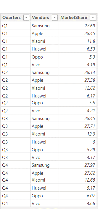
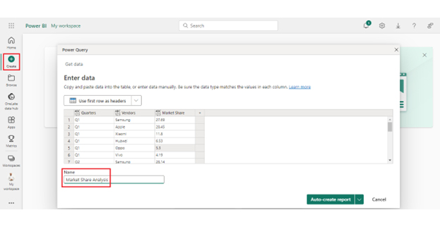
The following example shows what “filtered down to one distinct value only” means. We’ll use the following data table named MarketShareAnalysis.

Power BI Selectedvalue 1

Using this table, create a measure named MarketShareMeasure

MarketShare_Measure = SELECTEDVALUE(MarketShareAnalysis[MarketShare], “Not Distinct Value”)

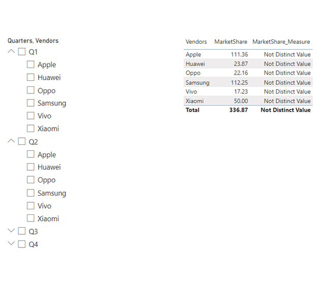
To understand how it works, let’s utilize a Table visual and slicer in Power BI for value filtering. In the image below, the table displays the alternate value “Not Distinct Value” in the “Market_Measure” column. This occurs because the table visual employs a single column, “Vendor”, with multiple values for different quarters. This leads to the display of an “alternate value”.

Power BI Selectedvalue 2

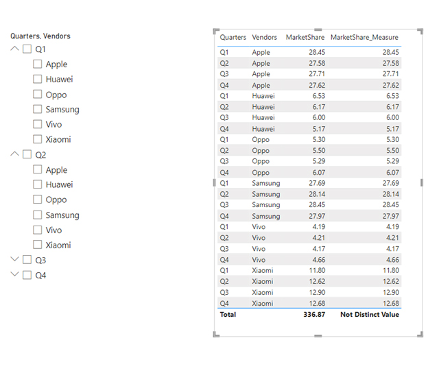
Now, we use or drop the “Quarters” column in the table visual to make it a distinct value. It becomes evident that every row is unique, and the values are prominently displayed in the measure column. It’s important to observe that the Total row exhibits alternating values. This occurs because the total row takes into account multiple rows, not just a singular one.

Power BI Selectedvalue 3

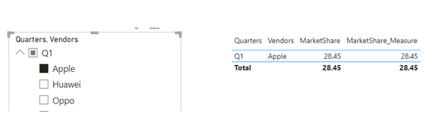
Now, we employ the slicer to filter by quarter and vendor, like Q1 and Apple. This results in a single unique record display after applying the filter. That’s why the row shows a numeric value instead of the alternate total value.

Power BI Selectedvalue 4

How to Visualize Your Data in Power BI?

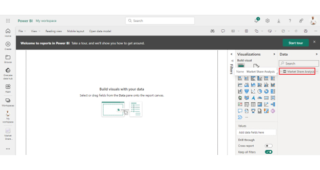
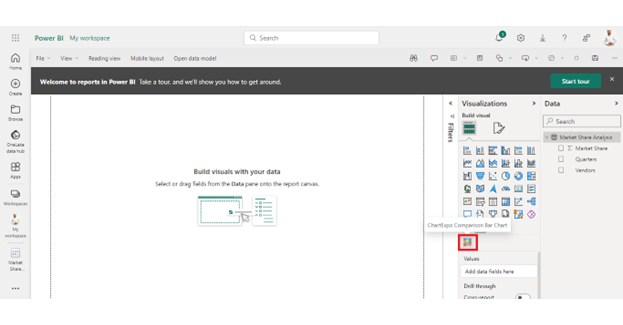
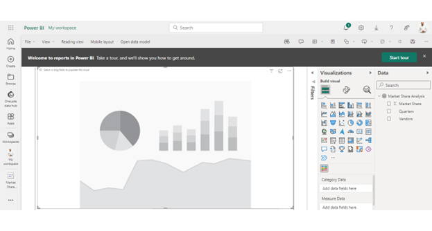
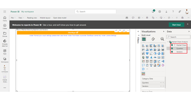
We’ve learned how to use the Power SELECTEDVALUE. Now, let’s learn how to create an appealing, insightful data visualization of your data in Power BI.

Stage 1: Logging in to Power BI

  1. Log in to Power BI.
  2. Enter your email address and click the “Submit” button.
Enter email to login to Power BI
  • You are redirected to your Microsoft account.
  • Enter your password and click “Sign in“.
Enter Password to login to Power BI
  • You can choose whether to stay signed in.
Click on stay signed in
  • Once done, the Power BI home screen will open.

Stage 2: Creating a Data Set and Selecting the Data Set to Use in Your Chart

  • Go to the left-side menu and click the “Create” button.
  • Select “Paste or manually enter data“.
select Paste or manually enter data in Power BI ce487
  • We’ll use the sample data below for this example.
Quarters Vendors Market Share
Q1 Samsung 27.69
Q1 Apple 28.45
Q1 Xiaomi 11.8
Q1 Huawei 6.53
Q1 Oppo 5.3
Q1 Vivo 4.19
Q2 Samsung 28.14
Q2 Apple 27.58
Q2 Xiaomi 12.62
Q2 Huawei 6.17
Q2 Oppo 5.5
Q2 Vivo 4.21
Q3 Samsung 28.45
Q3 Apple 27.71
Q3 Xiaomi 12.9
Q3 Huawei 6
Q3 Oppo 5.29
Q3 Vivo 4.17
Q4 Samsung 27.97
Q4 Apple 27.62
Q4 Xiaomi 12.68
Q4 Huawei 5.17
Q4 Oppo 6.07
Q4 Vivo 4.66
  • Paste the above data table in the Power Query Window.
  • Select the “Create a dataset only” option.
Create a dataset ce508
  • On the left-side menu, click “Data Hub“.
  • Power BI populates the data set list. (If you have not created a data set, refer to the Error! Reference source not found section).
Click on Data Hub ce508
  • Click on the “Create a report” dropdown.
Create a report ce508
  • Click on Market Share Analysis:
Click on Market Share Analysis ce508
  • Click the “Expand All” button.
Click Expand All ce508
  • You can see your chart metrics:
chart metrics ce508
  • Click on “Get more visuals“.
click on to get more visuals ce508
  • Search for ChartExpo and select the Comparison Bar Chart:
Comparison Bar CHart for Power BI by ChartExpo ce487
  • Click the “Add” button.
Click the Add button ce518
  • You can now see the Comparison Bar Chart in the visualizations list.
Chart in the visualizations list ce508
  • Expand your chart space.
Expand your chart space ce508
  • Select the metrics of your data:
Select the metrics ce508
  • Click the second icon of Format Visuals and click on Visual:
click on Visual ce508
  • In Visual, click License Settings, add the key, and enable the license.
  • After adding the key, you can see the comparison bar chart.
click License Settings ce508
  • Click the General tab to add the header text.
add the header text ce508
  • The final Comparison Bar Chart in Power BI will appear as below.
Final DAX COUNTIF

Insights

  • Samsung dominates the vendor market share, with Apple following closely.
  • Xiaomi is gaining ground in market share, whereas Huawei is on the decline.
  • Oppo and Vivo consistently hold their market shares, and there was a recent shift from Huawei to Oppo in the last quarter.

Top Tips for Power BI SELECTEDVALUE Function

Harnessing the full potential of Power BI SELECTEDVALUE involves adopting best practices that ensure a seamless analytical experience. Let’s delve into key tips that optimize the utilization of Power BI SELECTEDVALUE.

  1. Single-value expectation: Emphasize the function’s inherent purpose in extracting a single value. Align its usage with scenarios where a singular outcome is anticipated, reinforcing clarity and precision in data retrieval.
  2. Column validation: Before deploying Power BI SELECTEDVALUE, validate the appropriateness of the column in which it operates. Ensuring the column aligns with the intended context aids in avoiding unexpected results and enhances the function’s reliability.
  3. Use in measures and calculated columns: Incorporate Power BI SELECTEDVALUE judiciously within measures in Power BI as well as calculated columns. This strategic placement enhances the functionality of these elements, contributing to the Power BI model’s overall coherence.
  4. Documentation: Document the application of Power BI SELECTEDVALUE within your Power BI projects. This elucidates the logic, aids collaboration, and facilitates a smoother transition for other users interacting with the reports and dashboards.
  5. Testing and validation: Prioritize rigorous testing of Power BI SELECTEDVALUE in varied scenarios. Verify its performance across different data contexts to ensure it consistently delivers the anticipated results.
  6. Avoid ambiguity: Steer clear of scenarios where Power BI SELECTEDVALUE could encounter multiple or zero values. Implement safeguards or alternative measures to handle such situations and bolster the robustness of your calculations.
  7. Performance considerations: Mindful of potential performance impacts, evaluate the usage of Power BI SELECTEDVALUE, particularly in large datasets. Optimize its application and, if necessary, explore alternative approaches to maintain optimal report performance.
  8. Stay informed: Given the dynamic nature of Power BI updates, stay informed about any changes related to the Power BI SELECTEDVALUE function. Keeping abreast of updates ensures you leverage the latest features and functionalities.

FAQs

What is the SELECTEDVALUE function in DAX?

SELECTEDVALUE is a DAX function used in Power BI. It retrieves a single value from a column in a context-aware manner. Helpful for dynamic calculations, error handling, and enhancing readability, SELECTEDVALUE simplifies data retrieval in Power BI reports.

What is the DAX filter by SELECTEDVALUE?

DAX Filter by SELECTEDVALUE is a dynamic way to filter data in Power BI. It allows you to interactively select a value from a slicer or filter, influencing calculations and visuals. This feature enhances user control and adaptability in report analysis.

What is the Power BI SELECTEDVALUE?

Power BI SELECTEDVALUE is a DAX function that retrieves a single value based on the current context. It’s valuable for extracting a unique value, often from a slicer or filter. This enhances interactivity and provides dynamic insights in Power BI reports.

Wrap Up

The Power BI SELECTEDVALUE DAX function enhances data analysis and report generation within the Power BI ecosystem. Its focus on retrieving a specific value in the existing data context fosters a highly interactive user experience. The function’s prowess is evident in its ability to handle errors and enhance the overall readability of reports.

By introducing SELECTEDVALUE, Power BI reports gain unprecedented context awareness. This allows users to delve into data nuances with precision. This functionality significantly contributes to the user-friendliness of analytical processes. Consequently, stakeholders can make more informed decisions based on the current data context.

Moreover, the SELECTEDVALUE function offers clarity and stability in creating measures and calculated columns. Its versatility ensures that you can harness its capabilities across various scenarios. This adds depth and efficiency to your analytical endeavors.

The landscape of data analytics is continuously evolving. Therefore, a deep understanding of functions like SELECTEDVALUE is essential to unlock your Power BI reports’ full potential. This function improves the efficacy and user satisfaction of your analytical applications.

Do not hesitate.

Make Power BI SELECTED VALUE a component in your analysis toolkit to enable meaningful insights and informed decision-making.

How much did you enjoy this article?

PBIAd2
Start Free Trial!
133547

Related articles

next previous
Power BI12 min read

Power BI Group By Guide for Effective Data Insights

Learn how Power BI Group By helps you aggregate data, clarify trends, and create reports by grouping values to make large datasets manageable & insightful.

Power BI12 min read

How to Create Sankey Diagram in Microsoft Power BI?

Learn How to Create Sankey Diagram in Microsoft Power BI using Desktop & Web Service. What they are and how to use them effectively.

Power BI8 min read

Power BI Artificial Intelligence: Insights Using Visuals

Discover all there is to know about the Power BI artificial intelligence. You'll also discover how AI is used in Power BI, and how to use it for analysis and more.

Power BI9 min read

Budgeting in Healthcare: Use Visuals to Spot Budget Gaps

This guide helps you discover what budgeting in healthcare is. You'll also discover the factors that affect hospital budgets and types of budgeting in healthcare.

Power BI9 min read

Predictive Analytics in Power BI for Making Insightful Visuals

This guide shows you everything you need to know about Predictive Analytics in Power BI. It also shows you how it works, and how to interpret the results.

ChartExpo logo

Turn Data into Visual
Stories

CHARTEXPO

  • Home
  • Gallery
  • Videos
  • Services
  • Pricing
  • Contact us
  • FAQs
  • Privacy policy
  • Terms of Service
  • Sitemap

TOOLS

  • ChartExpo for Google Sheets
  • ChartExpo for Microsoft Excel
  • Power BI Custom Visuals by ChartExpo
  • Word Cloud

CATEGORIES

  • Bar Charts
  • Circle Graphs
  • Column Charts
  • Combo Charts
  • Comparison Charts
  • Line Graphs
  • PPC Charts
  • Sentiment Analysis Charts
  • Survey Charts

TOP CHARTS

  • Sankey Diagram
  • Likert Scale Chart
  • Comparison Bar Chart
  • Pareto Chart
  • Funnel Chart
  • Gauge Chart
  • Radar Chart
  • Radial Bar Chart
  • Sunburst Chart
  • see more
  • Scatter Plot Chart
  • CSAT Survey Bar Chart
  • CSAT Survey Chart
  • Dot Plot Chart
  • Double Bar Graph
  • Matrix Chart
  • Multi Axis Line Chart
  • Overlapping Bar Chart
  • Control Chart
  • Slope Chart
  • Clustered Bar Chart
  • Clustered Column Chart
  • Box and Whisker Plot
  • Tornado Chart
  • Waterfall Chart
  • Word Cloud
  • see less

RESOURCES

  • Blog
  • Resources
  • YouTube
SIGN UP FOR UPDATES

We wouldn't dream of spamming you or selling your info.

© 2025 ChartExpo, all rights reserved.