Categories
Is it true or not that you are hoping to step up your Power BI game?
You’ve come to the right place.
We’ll delve into expert tips and strategies for optimizing your Power BI experience. From data modeling to visualization design, we’ll cover it all. We aim to empower you with the knowledge and skills to create insightful, high-performance Power BI solutions.


But first, let’s set the stage. When designing your Power BI dashboard, always consider your audience. Think about their needs, preferences, and level of expertise. After all, you want to create a masterpiece that speaks directly to them.
Now, onto storytelling – a key aspect of Power BI Best Practices. Instead of overwhelming your audience with screens, create a captivating story on one screen. Guide them through a memorable data journey, embracing the essence of Power BI Best Practices for a truly impactful experience.
Power BI best practices encompass guidelines for efficient data designing, compelling visualization design, and performance optimization. They also address security, governance, and deployment strategies, ensuring robust, scalable, and insightful Power BI solutions. Following these practices enhances the effectiveness of Power BI projects.
Properly structuring your data design is foundational. Use relationships wisely, create hierarchies, and maintain a clear star or snowflake schema in Power BI For Mac. This ensures efficient data retrieval and accurate results.
Clean, change, and shape your information before stacking it into Power BI. Best practices in data preparation include handling missing values, removing duplicates, and shaping data into a usable format.
Creating visually appealing and user-friendly reports is a critical aspect of Power BI. Use consistent color schemes, fonts, and layouts while ensuring that the Power BI cross-filter direction is clearly defined to facilitate seamless data interactions. Additionally, utilize intuitive navigation and interactive features to enhance the user experience.
Optimize report performance by reducing unnecessary data, aggregations, and complex calculations. Use summary tables and calculated columns sparingly to minimize query overhead.
Implement robust security measures to protect sensitive data. Leverage role-based and row-level security to control access based on user roles and permissions.
Maintain version control for your Power BI projects using source control systems like Git. This helps track changes, collaborate effectively, and recover from errors.
Continuously monitor the performance of your Power BI reports and dashboards. Best practices involve setting up usage metrics, identifying bottlenecks, and optimizing accordingly.
Scheduled data refresh is vital to keep reports up-to-date. Best practices include optimizing data source queries, considering the no. of days between two dates, and scheduling refreshes during non-peak hours to minimize disruptions.
Power BI allows collaboration and sharing of reports and dashboards. Collaborate with team members and ensure everyone works with the same data source. Power BI collaboration features include workspaces and shared datasets.
Maintain comprehensive documentation for your Power BI projects. This includes data source details, transformation steps, report design decisions, and security configurations. This aids in troubleshooting and knowledge sharing.
Rigorous testing and validation of reports are essential to catch errors and ensure data accuracy. Best practices include creating test scenarios and involving end-users in the validation process.
Power BI is continually evolving. Stay updated with the latest Power BI developments, features, and best practices. Attend training, join the Power BI community, and follow Microsoft’s official resources to maximize your expertise.
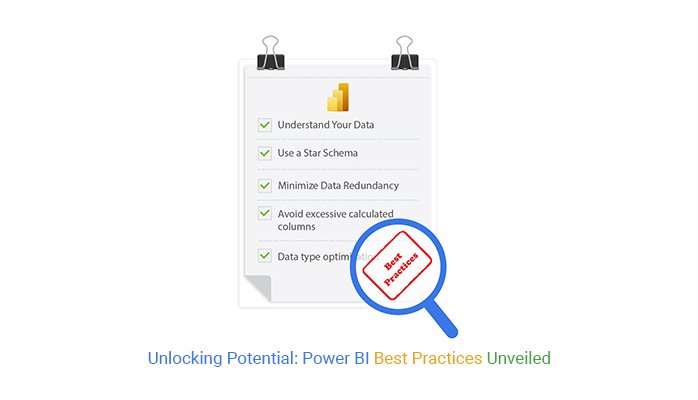
Follow these Power BI data designing best practices to create efficient, insightful reports and dashboards:
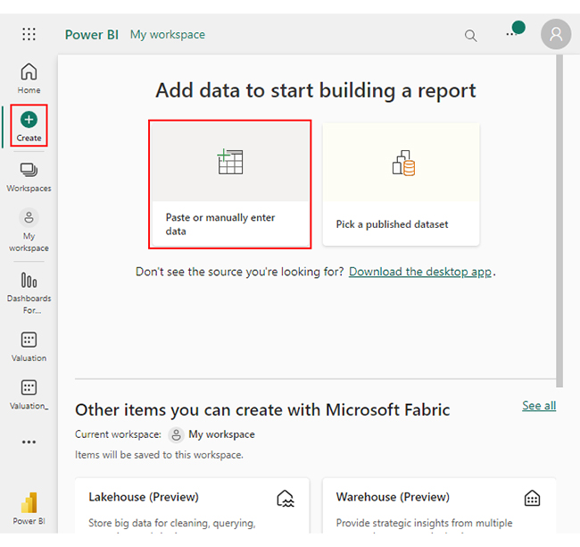
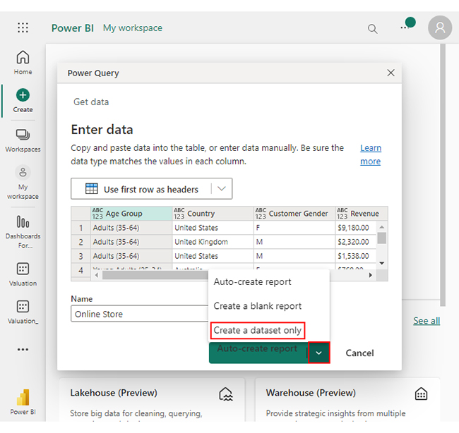
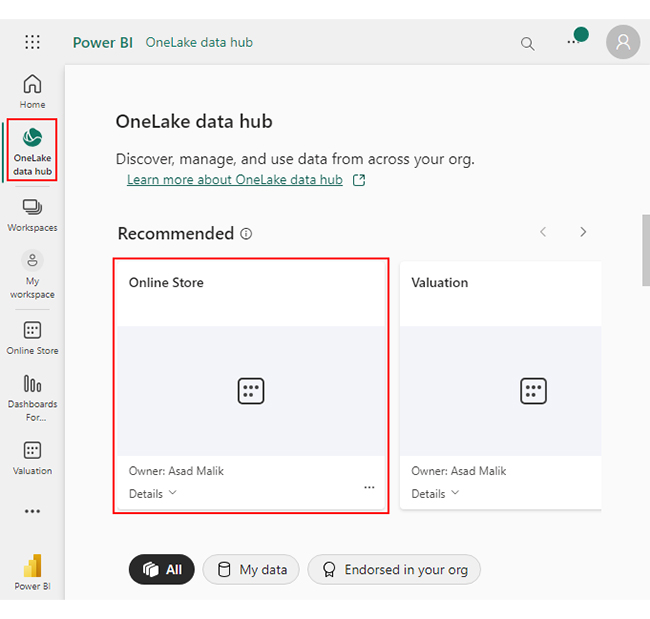
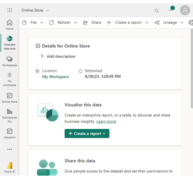
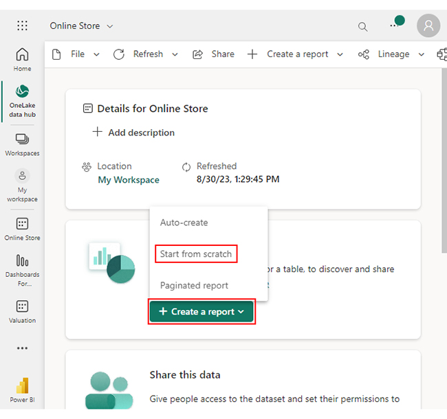
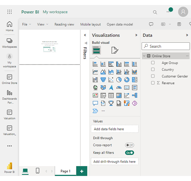
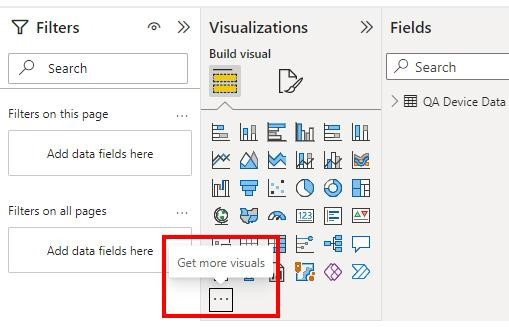
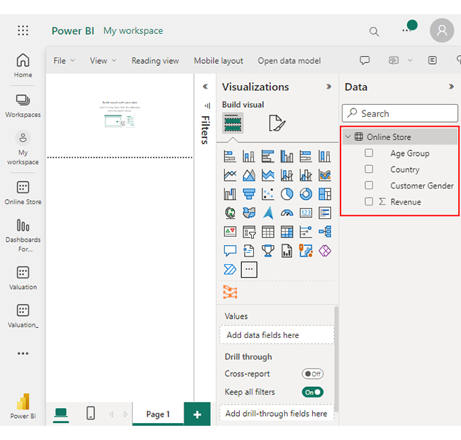
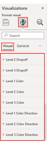
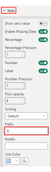
Let’s learn how to apply Power BI best practices to create a dashboard using a Sankey Diagram. We will break down the process into 5 steps to enhance understanding. Now we will create the Sankey Diagram in Power BI.


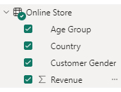
| Age Group | Country | Customer Gender | Revenue |
| Adults (35-64) | United States | F | $9,180.00 |
| Adults (35-64) | United Kingdom | M | $2,320.00 |
| Adults (35-64) | United States | M | $1,538.00 |
| Young Adults (25-34) | Australia | F | $769.00 |
| Adults (35-64) | United States | F | $4,590.00 |
| Youth (<25) | United Kingdom | F | $2,295.00 |
| Adults (35-64) | United States | M | $2,295.00 |
| Adults (35-64) | United States | M | $2,295.00 |
| Adults (35-64) | United States | F | $9,180.00 |
| Adults (35-64) | Germany | M | $9,180.00 |


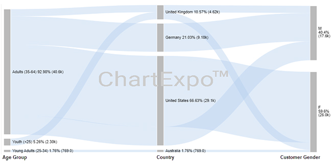

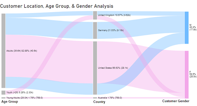
The “Adults (35-64)” age group generates the highest revenue, amounting to $40,578.00. Conversely, the age groups “Young Adults (25-34)” and “Youth (<25)” contribute considerably less to the revenue.
The US leads in revenue with $29,078.00, followed by the UK with $4,615.00. Australia and Germany have lower contributions.
Power BI Best Practices refer to guidelines and strategies designed to optimize the use of Power BI for effective data analysis and visualization. These practices ensure efficient, scalable, and maintainable solutions, contributing to enhanced performance and a better user experience.
Implementing Power BI Best Practices in dashboard design ensures a user-centric approach. It influences decisions related to data modeling, visualization selection, and layout design, ultimately creating dashboards that are intuitive, responsive, and tailored to the audience’s needs.
Yes, Power BI Best Practices are adaptable to various data scenarios. Whether dealing with large datasets, real-time data, or complex business logic, these practices provide a framework to handle diverse situations efficiently. Adhering to these guidelines ensures that your Power BI solutions remain effective and scalable across different data environments.
Power BI best practices are a compass guiding you toward data-driven excellence. These expert tips illuminate the path to creating efficient, insightful, and secure Power BI solutions.
Understanding your data, employing a star schema, and optimizing data modeling are foundational steps. Reducing redundancy and calculated columns enhance performance. Whereas selecting the right data types and nurturing relationships further fortify your model.
Data security and version control safeguard your insights, while performance monitoring ensures they remain robust. Regular data refreshes maintain the currency, and collaboration features foster teamwork. Comprehensive documentation and rigorous testing serve as pillars of reliability.
Staying informed about Power BI’s latest developments is vital to navigating this ever-evolving landscape effectively. Following best practices turns data into insights and gives your organization a competitive advantage.
Embark on your Power BI journey armed with these expert insights. Your reports and dashboards will be more than visual representations; they’ll be the bedrock for informed decisions.
How much did you enjoy this article?


Discover diverse and high-quality Power BI report examples for inspiration and insights. Elevate your reporting with strategic visualization techniques.

A Customer Relationship Management Dashboard centralizes data, tracks key metrics, and drives smarter business decisions. Discover now!

Explore Healthcare Dashboard Examples and learn how to turn complex healthcare data into clear, actionable insights for better decision-making.


