Categories
Raw profit and loss numbers can be overwhelming, and relying solely on tables makes it difficult to spot trends, track expenses, or identify profit opportunities.
Choosing the best graph to show profit and loss can make a significant difference by turning complex data into clear, actionable insights.
With the right visualization, you can quickly understand financial trends and make informed decisions.
In this guide, you’ll learn how to visualize your P&L data effectively and uncover insights that drive smarter business decisions.
Definition: The best graph to show profit and loss depends on your analysis goal. Different visualizations highlight different aspects of financial data, such as trends, comparisons, or profit breakdown.
There is no single “best” chart for every situation. The right choice depends on what you want to analyze, whether it’s tracking performance over time, comparing expenses, or understanding how profits are generated.
Choosing the appropriate visualization helps you turn raw financial data into clear, actionable insights for better decision-making.
Understanding profit and loss through raw tables can be time-consuming and difficult to interpret. Data visualization simplifies complex financial data, helping you quickly identify trends, patterns, and problem areas.
With the right charts, you can:
For example, an income vs. expense graph can instantly show whether your business is operating at a profit or loss, without needing deep analysis.
Visualization also helps you forecast future performance by analyzing past trends, allowing you to plan more effectively and grow your business with confidence.
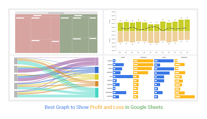
A Waterfall chart shows how revenue is transformed into profit by breaking down each component, such as costs, expenses, and net income.

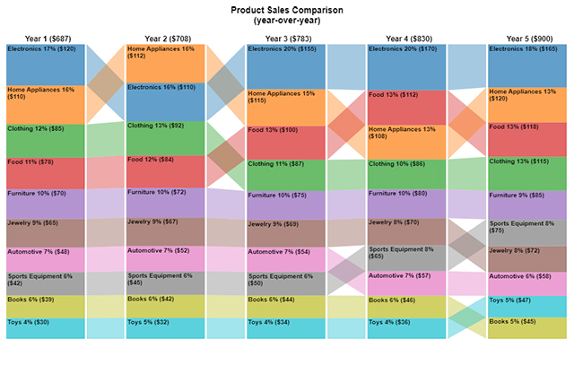
A Sankey diagram visualizes how money flows between different parts of your business, such as departments or cost centers.

A Treemap displays hierarchical data using rectangles, where each block represents a category’s contribution to overall profit or loss.

A Matrix chart helps analyze relationships between multiple financial variables.

A Sentiment trend chart tracks positive vs negative trends over time.

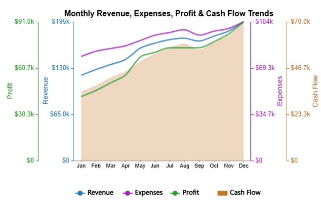
A line chart shows how profit and loss change over time.
A bar chart compares revenue, expenses, and profit across categories.
Choosing the right graph depends on what you want to analyze. If you need to understand how profits are built, use a breakdown-focused visualization.
For tracking performance over time, a trend-based approach works best. If your goal is to compare categories, go with a comparison-focused view.
To understand how money moves across your business, a flow-based visualization is more effective.
Selecting the right option makes your profit and loss data easier to interpret and more useful for decision-making.
Visualizing profit and loss in Google Sheets makes it easier to understand financial trends and make strategic decisions. Follow these steps to create effective charts:

Profit and loss charts do more than just display numbers—they help you make smarter decisions, optimize performance, and communicate insights clearly.
By visualizing your data, you can quickly spot underperforming areas in your business. P&L charts make financial trends easy to interpret, allowing you to reduce unnecessary expenses and focus on profitable activities.
Charts reveal how departments and individuals are performing. With these insights, you can guide underperforming teams, implement mentoring programs, and help employees align their efforts with business goals.
Profit and loss graphs highlight trends over time. This helps you create accurate forecasts, uncover new opportunities, and plan strategies to expand revenue and stay competitive.
Visual charts are easy to understand and share. Stakeholders can collaborate effectively, align on financial goals, and make informed decisions quickly without being overwhelmed by raw data.
Use charts and graphs like Waterfall, Line, Bar, or Sankey diagrams to show revenue, expenses, and profit trends. Visuals make it easier to spot patterns and make data-driven decisions.
Charts simplify complex financial data, helping you identify underperforming areas, track trends, and communicate insights quickly to stakeholders.
Google Sheets and Excel work well for basic charts, while ChartExpo offers advanced, ready-made charts for professional P&L visualization.
Analyzing profit and loss data in tables alone can be time-consuming and may obscure critical insights. Choosing the best graph to show profit and loss helps simplify complex data and makes it easier to understand key financial patterns.
Visualizing your financial data allows you to identify trends, optimize performance, and plan for growth more effectively.
With tools like ChartExpo, you can create professional, customizable charts that reveal key patterns, highlight areas for improvement, and support smarter, data-driven decisions.
Start your 7-day free trial today and transform your profit and loss data into meaningful insights that guide your business strategy.
How much did you enjoy this article?


SUMPRODUCT in Google Sheets handles multi-condition calculations without extra columns. Master its syntax, uses, and errors. Read on!

An annual budget template in Google Sheets organizes your yearly finances, tracks every dollar, and reveals spending patterns. Read on!

Learn how to create a Sankey diagram in Google Sheets to visualize flows such as customer journeys, energy transfers, and cash movements for deeper insights and analysis.