• Home
  • Tools dropdown img
    • Spreadsheet Charts

      • ChartExpo for Google Sheets
      • ChartExpo for Microsoft Excel
    • Power BI Charts

      • Power BI Custom Visuals by ChartExpo
    • Word Cloud

  • Charts dropdown img
    • Chart Category

      • Bar Charts
      • Circle Graphs
      • Column Charts
      • Combo Charts
      • Comparison Charts
      • Line Graphs
      • PPC Charts
      • Sentiment Analysis Charts
      • Survey Charts
    • Chart Type

      • Box and Whisker Plot
      • Clustered Bar Chart
      • Clustered Column Chart
      • Comparison Bar Chart
      • Control Chart
      • CSAT Survey Bar Chart
      • CSAT Survey Chart
      • Dot Plot Chart
      • Double Bar Graph
      • Funnel Chart
      • Gauge Chart
      • Likert Scale Chart
      • Matrix Chart
      • Multi Axis Line Chart
      • Overlapping Bar Chart
      • Pareto Chart
      • Radar Chart
      • Radial Bar Chart
      • Sankey Diagram
      • Scatter Plot Chart
      • Slope Chart
      • Sunburst Chart
      • Tornado Chart
      • Waterfall Chart
      • Word Cloud
    • Google Sheets
      Microsoft Excel
  • Services
  • Pricing
  • Contact us
  • Blog
  • Support dropdown img
      • Gallery
      • Videos
      • Contact us
      • FAQs
      • Resources
    • Please feel free to contact us

      atsupport@chartexpo.com

Categories
All Data Visualizations Data Analytics Surveys
Add-ons/
  • Google Sheets
  • Microsoft Excel
  • Power BI
All Data Visualizations Data Analytics Surveys
Add-ons
  • Google Sheets
  • Microsoft Excel
  • Power BI

We use cookies

This website uses cookies to provide better user experience and user's session management.
By continuing visiting this website you consent the use of these cookies.

Ok

ChartExpo Survey


Home > Blog > Data Analytics

What is a Principal Component Analysis for Data Insights?

Imagine you’re a data scientist with a massive global food consumption dataset. Hundreds of variables, thousands of data points. Your task? To find patterns and insights.

It’s overwhelming, right? Enter principal component analysis (PCA), your statistical superhero.

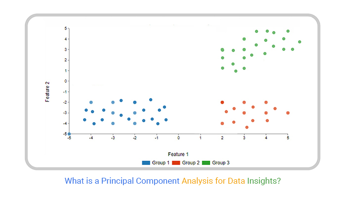
What is a principal component analysis?

PCA, introduced by Karl Pearson in 1901, is a powerful technique for simplifying complex data. It’s the go-to method for dimensionality reduction in data science.

What is a Principal Component Analysis

How does it work its magic?

Let’s say you’re analyzing food consumption across 16 European countries. Each country has data on dozens of food items. PCA swoops in, transforming this jumble of information into a clear, visual map. Suddenly, you see Nordic countries clustered, their diets distinctly different from Mediterranean nations.

PCA’s impact is profound. It’s used in facial recognition, gene expression analysis, and understanding climate patterns. A study using PCA helped identify key factors in global temperature changes over the past century.

PCA isn’t without challenges. Interpreting results can be tricky. Yet, its benefits often outweigh these hurdles. From noise reduction to outlier detection, PCA offers comprehensive data analysis tools.

As we delve deeper into PCA, prepare to see data in a new light. Your journey into the fascinating world of principal component analysis starts here!

Table of Contents:

  1. What is a Principal Component Analysis?
  2. What are the Principal Components?
  3. Why is PCA So Important?
  4. Step-by-Step Explanation of Principal Component Analysis (PCA)
  5. What is PCA Used For?
  6. How Does Principal Component Analysis (PCA) Work?
  7. When to Use Principal Component Analysis?
  8. How to Interpret PCA Results?
  9. How to Visualize and Analyze PCA Results?
  10. What are the Advantages and Disadvantages of PCA?
  11. Wrap Up

First…

What is a Principal Component Analysis?

Definition: Principal Component Analysis (PCA) is a statistical technique. It simplifies data by reducing its dimensions.

PCA transforms the original variables into new uncorrelated variables called principal components. These components capture the most variance in the data. The first principal component has the highest variance. Each subsequent component has the highest variance possible under the constraint of being orthogonal to the preceding components.

PCA helps in visualizing high-dimensional data. It also reduces noise and helps trend analysis.

PCA is widely used in machine learning, finance, and bioinformatics.

What are the Principal Components?

Principal components are new variables created in Principal Component Analysis (PCA). They are linear combinations of the original variables. These components capture the maximum variance in the data.

The first principal component accounts for the highest variance. Each subsequent component captures the highest remaining variance while orthogonal to the previous ones. This means they are uncorrelated with each other.

Principal components help reduce data’s dimensionality while retaining most of its variability. They simplify complex data sets, making them easier to analyze and visualize.

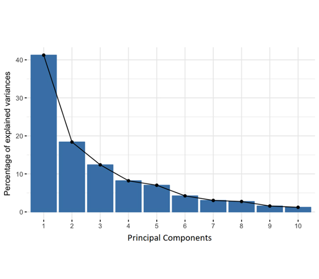
In PCA, 10-dimensional data yields 10 principal components. PCA aims to capture the most information in the first component. Then, the next most in the second, and so on. The Scree Plot illustrates this process.

10-Dimensional Data Yields for Learning What is a Principal Component Analysis

Percentage of Variance (Information) for Each by PC

Organizing information into principal components this way reduces dimensionality while retaining most data. Discard components with low information and use the rest as new variables. However, remember that principal components are less interpretable and are just linear combinations of the original variables.

Why is PCA So Important?

Here’s why PCA is so important:

  • Simplifies complex data: PCA reduces the number of variables in your data, making analyzing and interpreting data easier. This dimensionality reduction keeps the most crucial information while discarding less important details.
  • Enhances data quality: By focusing on the principal components, PCA helps filter out noise, improving the quality and clarity of your data. It also addresses multicollinearity, ensuring your features are independent and not overly correlated.
  • Boosts efficiency and insight: PCA speeds up computations and makes data visualization more straightforward. It also extracts significant features, effectively helping you uncover hidden patterns and insights.

Step-by-Step Explanation of Principal Component Analysis (PCA)

Imagine you’ve got a big, messy pile of data and need to make sense of it. PCA is that magical tool that helps you simplify and understand this data. Here’s how it works:

  1. Standardize the data: Adjust the values to have a mean of zero and a standard deviation of one. This step ensures each feature contributes equally to the analysis.

𝑍 = (X−Ό)/ 𝜎

X is the original data, ÎŒ is the mean, and σ is the standard deviation.

  1. Compute the covariance matrix: This matrix shows how the variables in our data set vary. It helps us understand the relationships between different features.
  2. Calculate Eigenvalues and Eigenvectors: We then calculate the eigenvalues and eigenvectors of the covariance matrix. Eigenvalues indicate the amount of variance captured by each principal component. Eigenvectors determine the direction of these components.
  3. Sort Eigenvalues and select principal components: The eigenvalues are sorted in descending order. We select the top eigenvalues and their corresponding eigenvectors as our principal components. These components capture the most significant variance in the data.
  4. Construct the principal component matrix: Using the selected eigenvectors, we construct the principal component matrix. This matrix transforms the original data into a new coordinate system defined by the principal components.
  5. Transform the original data: This step transforms the original data using the principal component matrix. It creates a new data set with reduced dimensions but retains most of the original variance.
  6. Analyze the results: Analyze the transformed data. Look for patterns, clusters, or trends not apparent in the original data. This analysis helps gain insights and make data-driven decisions.
  7. Use the results: Use the results in practical applications. PCA can be applied in various fields such as finance, biology, and machine learning to:
    • Improve model performance
    • Reduce computation time
    • Enhance data visualization

What is PCA Used For?

PCA is a powerful tool for making sense of complex data. Here’s what it’s used for:

  • Simplifying data: PCA reduces the number of variables, making data easier to handle and analyze.
  • Enhancing clarity: It improves data visualization and highlights important features, aiding in pattern recognition and clustering.
  • Boosting performance: By reducing noise and irrelevant information, PCA enhances the effectiveness of machine learning models.

How Does Principal Component Analysis (PCA) Work?

PCA takes your complex data, cleans it up, and makes it much more manageable and insightful. Here’s how it works:

  1. Standardization: First, standardize your data. This means adjusting values to have a mean of zero and a standard deviation of one. It ensures all variables are on the same scale.
  2. Covariance matrix: Next, calculate the covariance matrix. This matrix shows how variables vary together. It’s crucial for understanding relationships between them.
  3. Eigenvalues and eigenvectors: Find the eigenvalues and eigenvectors of the covariance matrix. Eigenvalues measure the variance captured by each component. Eigenvectors show the direction of these components.
  4. Component selection: Select the principal components based on eigenvalues. Higher eigenvalues mean more important components. Choose the top components that capture most of the variance.
  5. Transformation: Finally, transform data using these components. This reduces the number of dimensions while retaining key information.

When to Use Principal Component Analysis?

Principal Component Analysis (PCA) is a handy tool for various data challenges. Here’s when to use it:

  • High-dimensional data: PCA is great for simplifying complex, high-dimensional data. It reduces the number of variables while keeping essential information.
  • Data visualization and feature selection: It helps visualize data and select the most important features. Focusing on principal components allows you to make sense of large datasets and choose relevant variables.
  • Noise reduction and multicollinearity: PCA reduces noise and addresses multicollinearity. It minimizes redundancy and helps clarify relationships between variables.
  • Preprocessing for machine learning: Use PCA as a preprocessing step for machine learning. It streamlines data and improves algorithm performance.

How to Interpret PCA Results?

Interpreting PCA results can seem daunting, but it’s all about understanding how the data is transformed and what it reveals. Here’s a guide to help make sense of it:

  1. Explained variance: Start by looking at the explained variance. This tells you how much of the total variability is captured by each principal component. Higher values mean the component is more significant.
  2. Principal components: Examine the principal components. These are the new variables that represent combinations of the original ones. They show the directions of maximum variance in your data.
  3. Visualize: Use visual tools to interpret PCA results. Plots, such as scatterplots of the first two principal components, can help you see patterns and clusters.
  4. Biplots: Biplots are handy for understanding PCA. They show the data points and the principal component vectors, providing insight into how variables contribute to each component.
  5. Cumulative variance: Check the cumulative variance plot. It shows how much variance is explained by the first few components combined. This helps in deciding how many components to retain.

How to Visualize and Analyze PCA Results?

Principal Component Analysis is where data gets slimmed down and shaped up. But let’s face it: interpreting PCA results can be as clear as mud. Numbers, vectors, eigenvalues, oh my!

Enter data visualization, the fairy godmother of statistics. It waves its wand, and poof! Those cryptic numbers transform into stunning visual storytelling.

But hold your horses, Excel users. Your trusty spreadsheet might be great for balancing budgets but for PCA visuals? It’s about as useful as a chocolate teapot.

Fear not; ChartExpo is here to save the day. This Excel add-in turns your PCA results into visual masterpieces faster than you can say “eigenvector.” Suddenly, your components aren’t just principals – they’re the show’s stars.

With ChartExpo, you’re not analyzing data but directing a blockbuster starring your variables.

Principal Component Analysis Example

Let’s visualize and analyze the PCA data below using Chartexpo.

Class Groups Feature 1 Feature 2
Class 1 Group 1 -3 -2
Class 1 Group 1 -2 -2
Class 1 Group 1 -3 -3
Class 1 Group 1 -2 -4
Class 1 Group 1 -4 -2
Class 1 Group 1 -2 -3
Class 1 Group 1 -3 -4
Class 1 Group 1 -2 -2
Class 1 Group 1 -1 -3
Class 1 Group 1 -5 -5
Class 2 Group 2 4 -2
Class 2 Group 2 2 -2
Class 2 Group 2 3 -3
Class 2 Group 2 2 -4
Class 2 Group 2 4 -3
Class 2 Group 2 2 -5
Class 2 Group 2 5 -3
Class 2 Group 2 2 -2
Class 2 Group 2 1 -4
Class 2 Group 2 3 -2
Class 3 Group 3 4 2
Class 3 Group 3 2 2
Class 3 Group 3 3 3
Class 3 Group 3 2 4
Class 3 Group 3 4 1
Class 3 Group 3 2 5
Class 3 Group 3 5 5
Class 3 Group 3 2 3
Class 3 Group 3 1 4
Class 3 Group 3 3 4
  • To get started with ChartExpo, install ChartExpo in Excel.
  • Now Click on My Apps from the INSERT menu.
insert chartexpo in excel
  • Choose ChartExpo from My Apps, then click Insert.
open chartexpo in excel
  • Once it loads, scroll through the charts list to locate and choose the “Scatter Plot”.
search scatter plot chart in excel
  • Click the “Create Chart From Selection” button after selecting the data from the sheet, as shown.
Click Create Chart From Selection for Learning What is a Principal Component Analysis
  • ChartExpo will generate the visualization below for you.
Initial Visual for Learning What is a Principal Component Analysis
  • If you want to add anything to the chart, click the Edit Chart button:
  • Click the pencil icon next to the Chart Header to change the title.
  • It will open the properties dialog. Under the Text section, you can add a heading in Line 1 and enable Show.
  • Give the appropriate title of your chart and click the Apply button.
Add Chart Header for Learning What is a Principal Component Analysis
  • You can change the size of the circle:
Change Size of Circle for Learning What is a Principal Component Analysis
  • You can change the color of Group 2 to red:
Change Color of Group 2 to Red for Learning What is a Principal Component Analysis
  • You can change the alignment of the legend into the middle:
Change Alignment of Legends for Learning What is a Principal Component Analysis
  • You can hide datapoint labels showing with circles/dots, as shown below:
Hide Data Point Labels for Learning What is a Principal Component Analysis
  • Click the “Save Changes” button to persist the changes made to the chart.
Click Save Changes for Learning What is a Principal Component Analysis
  • Your final Scatter Plot will look like the one below.
Final What is a Principal Component Analysis

Insights

  • Group/Class 1 (blue): Clusters in the lower-left quadrant indicate similar data points.
  • Group/Class 2 (red): Spreads across the lower-right quadrant, showing moderate variation.
  • Group/Class 3 (green): Positioned in the upper-right quadrant, relatively compact.
  • Feature 1: Key for distinguishing Group 2 from Groups 1 and 3.
  • Feature 2: More effective in differentiating Group 1 from Groups 2 and 3.

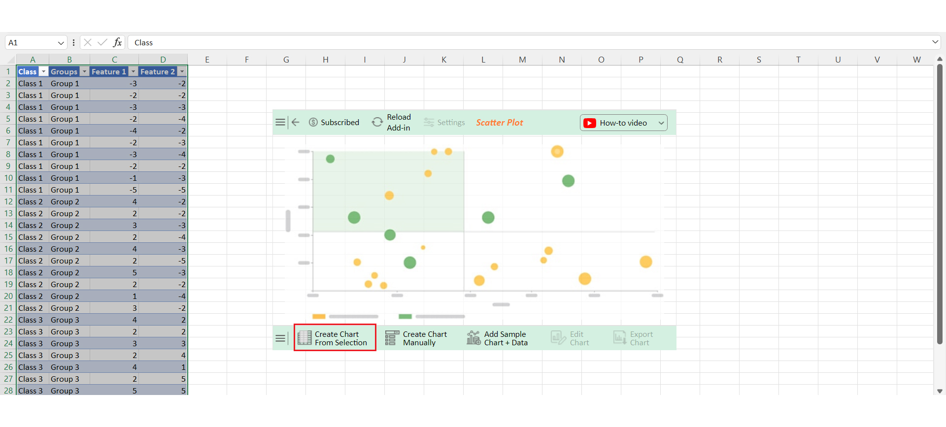
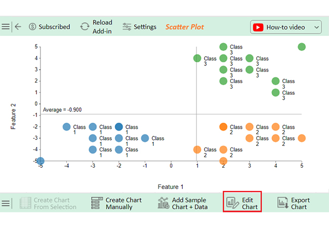
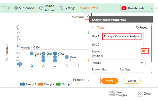
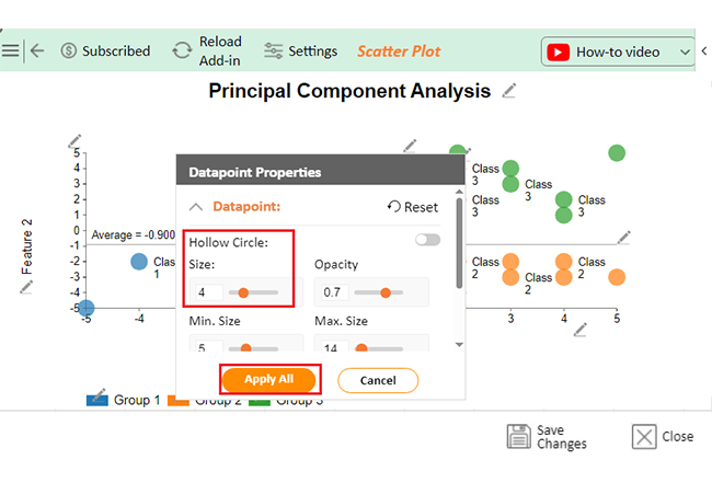
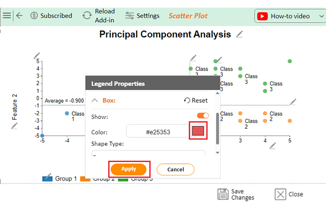
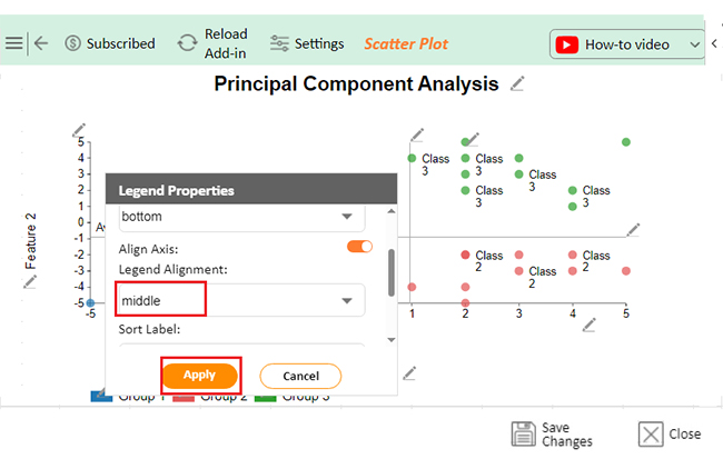
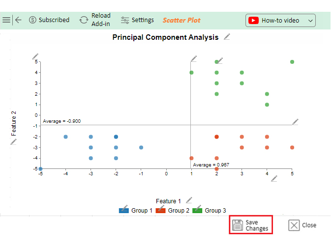
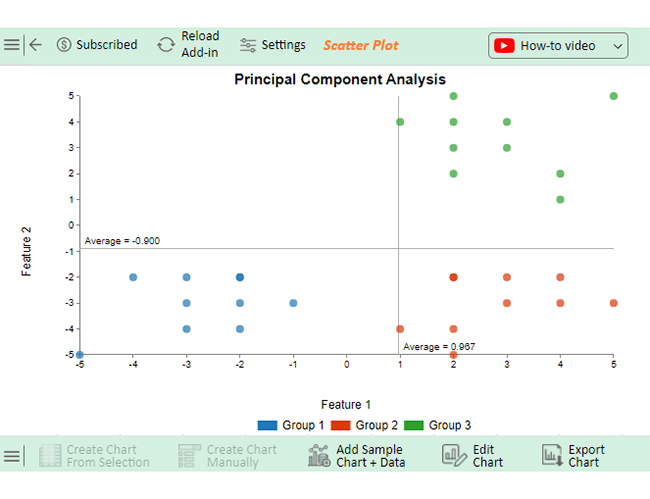
The PCA plot highlights how these groups differ across the principal components, revealing their patterns and similarities.

Discover What Principal Component Analysis is Using Microsoft Excel:

  1. Open your Excel Application.
  2. Install ChartExpo Add-in for Excel from Microsoft AppSource to create interactive visualizations.
  3. Select the Scatter Plot from the list of charts.
  4. Select your data.
  5. Click on the “Create Chart from Selection” button.
  6. Customize your chart properties to add header, axis, legends, and other required information.

The following video will help you create the Scatter Plot in Microsoft Excel.

What are the Advantages and Disadvantages of PCA?

Principal Component Analysis (PCA) is a powerful technique with benefits and drawbacks. Here’s a quick look at its advantages and disadvantages:

Advantages of PCA

  • Dimensionality reduction: PCA simplifies data by reducing the number of dimensions. It retains essential information while making data more manageable.
  • Noise reduction: It reduces noise by focusing on principal components, making the data cleaner and more focused through effective data cleansing techniques.
  • Improved visualization: PCA enhances visualization. It projects complex data into fewer dimensions, making it easier to see patterns and trends.
  • Feature extraction: It extracts key features from the data. This highlights the most important variables and reduces redundancy.

Disadvantages of PCA

  • Loss of interpretability: PCA can make data more challenging to interpret. Principal components are combinations of original variables and may lack clear meaning.
  • Assumption of linearity: It assumes linear relationships between variables. This can be a limitation if the data has non-linear patterns.
  • Sensitivity to scaling: PCA is sensitive to data scaling. Variables need to be standardized to ensure accurate results.

FAQs

What does PCA tell you?

PCA reveals patterns and relationships in data. It shows which variables explain the most variance. PCA reduces dimensionality, making complex data simpler. It highlights key features and helps visualize how data points relate.

What does a PCA graph show?

A PCA graph shows data points plotted along principal components. It reveals how data is distributed across dimensions. The graph highlights clusters, trends, and outliers. It also indicates which variables contribute most to the variance.

How do you explain PCA results?

To explain PCA results:

  1. Start with the explained variance to show which components capture the most information.
  2. Describe principal components and their contributions.
  3. Use visualizations to highlight patterns and clusters.
  4. Interpret how variables influence the components.

Wrap Up

Principal Component Analysis (PCA) is a powerful statistical tool. It simplifies complex data sets.

By reducing dimensions, PCA makes data easier to interpret. It captures the most essential features. This helps in visualizing and understanding data.

The first step in PCA is standardizing the data. This ensures all variables contribute equally. Then, the covariance matrix is computed. This matrix reveals relationships between variables. Understanding these relationships is crucial.

Next, we calculate eigenvalues and eigenvectors. Eigenvalues show the amount of variance each principal component captures. Eigenvectors determine the direction of these components. This step transforms the data’s structure.

We then sort the eigenvalues and select the top ones. These represent the principal components. The principal component matrix is then constructed. This matrix helps transform the original data, which now has reduced dimensions.

Analyzing the transformed data reveals patterns. These patterns might be hidden in the original data. PCA helps identify clusters and trends. This is invaluable for data-driven decision-making. It enhances understanding and insights.

Finally, the results are used in various fields. PCA improves machine learning models, reduces noise, and speeds computation. It is used in finance, biology, and more. PCA’s versatility and efficiency make it essential. It turns complex data into clear, actionable information.

In summary, PCA is a key technique in data analysis. It reduces complexity and highlights important information. This leads to better analysis and decision-making.

How much did you enjoy this article?

ExcelAd1
Start Free Trial!
140091

Related articles

next previous
Data Analytics31 min read

Data Analysis Without Nonsense: Fix the Right Problem, Fast

Data analysis can mislead when metrics look right but outcomes fail. Learn how to spot red flags, fix failures, and make better decisions. Read on!

Data Analytics29 min read

Variance Analysis Isn’t a Math Problem, It’s a Trust Problem

Variance analysis helps identify what went wrong, who owns it, and what to do next. Use it to drive decisions, not just reports. Learn more!

Data Analytics10 min read

Supplier Comparison Template: Download It Now

A supplier comparison template streamlines vendor evaluation by comparing cost and quality. Click here to learn its benefits and how to analyze them.

Data Analytics32 min read

Ecommerce Analytics: How to Fix What It Often Gets Wrong

Ecommerce analytics often lead to mixed signals and costly misreads. Fix attribution gaps, align teams, and act on the right data. Get started now!

Data Analytics30 min read

When Sales Funnel Breaks: Failures, Fixes, & Funnel Debt

Is your sales funnel hiding costly gaps? Learn how pipeline stalls, false metrics, and handoff chaos could be draining revenue. Get started now!

ChartExpo logo

Turn Data into Visual
Stories

CHARTEXPO

  • Home
  • Gallery
  • Videos
  • Services
  • Pricing
  • Contact us
  • FAQs
  • Privacy policy
  • Terms of Service
  • Sitemap

TOOLS

  • ChartExpo for Google Sheets
  • ChartExpo for Microsoft Excel
  • Power BI Custom Visuals by ChartExpo
  • Word Cloud

CATEGORIES

  • Bar Charts
  • Circle Graphs
  • Column Charts
  • Combo Charts
  • Comparison Charts
  • Line Graphs
  • PPC Charts
  • Sentiment Analysis Charts
  • Survey Charts

TOP CHARTS

  • Sankey Diagram
  • Likert Scale Chart
  • Comparison Bar Chart
  • Pareto Chart
  • Funnel Chart
  • Gauge Chart
  • Radar Chart
  • Radial Bar Chart
  • Sunburst Chart
  • see more
  • Scatter Plot Chart
  • CSAT Survey Bar Chart
  • CSAT Survey Chart
  • Dot Plot Chart
  • Double Bar Graph
  • Matrix Chart
  • Multi Axis Line Chart
  • Overlapping Bar Chart
  • Control Chart
  • Slope Chart
  • Clustered Bar Chart
  • Clustered Column Chart
  • Box and Whisker Plot
  • Tornado Chart
  • Waterfall Chart
  • Word Cloud
  • see less

RESOURCES

  • Blog
  • Resources
  • YouTube
SIGN UP FOR UPDATES

We wouldn't dream of spamming you or selling your info.

© 2025 ChartExpo, all rights reserved.