• Home
  • Tools dropdown img
    • Spreadsheet Charts

      • ChartExpo for Google Sheets
      • ChartExpo for Microsoft Excel
    • Power BI Charts

      • Power BI Custom Visuals by ChartExpo
    • Word Cloud

  • Charts dropdown img
    • Chart Category

      • Bar Charts
      • Circle Graphs
      • Column Charts
      • Combo Charts
      • Comparison Charts
      • Line Graphs
      • PPC Charts
      • Sentiment Analysis Charts
      • Survey Charts
    • Chart Type

      • Box and Whisker Plot
      • Clustered Bar Chart
      • Clustered Column Chart
      • Comparison Bar Chart
      • Control Chart
      • CSAT Survey Bar Chart
      • CSAT Survey Chart
      • Dot Plot Chart
      • Double Bar Graph
      • Funnel Chart
      • Gauge Chart
      • Likert Scale Chart
      • Matrix Chart
      • Multi Axis Line Chart
      • Overlapping Bar Chart
      • Pareto Chart
      • Radar Chart
      • Radial Bar Chart
      • Sankey Diagram
      • Scatter Plot Chart
      • Slope Chart
      • Sunburst Chart
      • Tornado Chart
      • Waterfall Chart
      • Word Cloud
    • Google Sheets
      Microsoft Excel
  • Services
  • Pricing
  • Contact us
  • Blog
  • Support dropdown img
      • Gallery
      • Videos
      • Contact us
      • FAQs
      • Resources
    • Please feel free to contact us

      atsupport@chartexpo.com

Categories
All Data Visualizations Data Analytics Surveys
Add-ons/
  • Google Sheets
  • Microsoft Excel
  • Power BI
All Data Visualizations Data Analytics Surveys
Add-ons
  • Google Sheets
  • Microsoft Excel
  • Power BI

We use cookies

This website uses cookies to provide better user experience and user's session management.
By continuing visiting this website you consent the use of these cookies.

Ok

ChartExpo Survey


Home > Blog > Data Analytics

What are Data Pipelines and How They Support Insights?

Her data pipeline explained how data helps organizations make informed decisions, enhances operational efficiency, fosters innovation, and supports strategic planning. It also drives growth and competitive advantage in the business environment.

What are Data Pipelines

But what are data pipeline basics? Well, this guide shows you what data pipeline meaning are, the importance of data pipelines, and how to build data pipelines.

Table of Content:

  1. What is a Data Pipeline?
  2. Why are Building Data Pipelines Important?
  3. Explain Data Pipeline Examples
  4. What are Different Types of Data Pipelines?
  5. What Is a Data Pipeline Architecture?
  6. How Data Pipelines Work?
  7. What are Data Pipeline Tools?
  8. How to Create a Data Pipeline?
    • Step 1: Identify Your Data Sources
    • Step 2: Define Data Requirements
    • Step 3: Design Data Transformations
    • Step 4: Choose Your Destination
    • Step 5: Set Up Orchestration
    • Step 6: Implement Monitoring
    • Step 7: Test and Optimize
  9. How to Create Data Pipeline Visualization in Power BI?
  10. What is the Difference Between Data pipeline vs. ETL pipeline?
  11. What are the Advantages of Data Pipeline?
  12. What are Challenges for Building Data Pipelines?
  13. Tips for an Effective Data Processing Pipeline
  14. Top 5 Use Cases of Data Pipelines
  15. What is the future of Data Pipelines?
  16. Data Pipelines – FAQs
  17. Wrap Up

First…

What is a Data Pipeline?

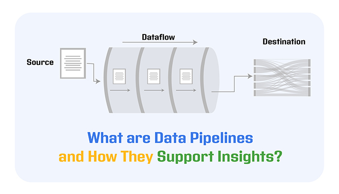
Definition: A data pipeline is a set of automated processes that collects, moves, and transforms data from different sources to a destination where it can be stored, analyzed, and used for decision-making.

Think of it as a system that ensures your data flows smoothly and accurately, cleaning and organizing it along the way so it’s ready for reporting, analytics, or feeding into business tools. By automating these steps, a data pipeline means is that help organizations save time, maintain data quality, and make insights available faster for smarter decisions.

Key Components of Data Pipelines:

  • Sources: These are the starting points where data is collected, including databases, cloud services, applications, and APIs. They provide the raw data that will flow through the pipeline.
  • Transformations: This stage involves cleaning, filtering, and restructuring data to ensure it is accurate, consistent, and ready for analysis. It may include removing duplicates, converting data types, or enriching data with additional information.
  • Destinations: The final location where processed data is stored for analysis and reporting. This could be a data warehouse, data lake, or a business intelligence platform where teams can access and use the data.
  • Orchestration: This manages and schedules the flow of data through the pipeline, ensuring tasks run in the correct order and handling dependencies between steps.
  • Monitoring: A crucial component that tracks the health and performance of the pipeline, identifying issues like delays, failures, or data inconsistencies to ensure reliable data delivery.

Video Tutorial: How to Visualize Data Pipelines in Power BI

Why are Building Data Pipelines Important?

  • The Imperative for Real-Time Data Access

Nowadays, businesses need real-time data access. With a data pipeline, you’ll get a continuous data flow, which can be visualized using data flow diagrams, helping companies react to market changes and make informed decisions.

  • Upholding Data Quality and Integrity

Data is as good as its quality and integrity. With a data pipeline, you’ll have clean, consistent, and reliable data. It automates the process of correcting and detecting errors, and that helps maintain the integrity of the data. It also keeps business owners from making misguided decisions.

  • Enhancing Analytical Capabilities

Insights obtained from data analysis are timely and accurate as the data feeds into the analytical tools. Data pipelines automate data preparation and delivery to these tools, and that ensures that insights generated are based on the most current and well-processed data available.

  • Streaming Data Pipeline

With a data pipeline, businesses are sure to meet the regulatory standards in their region. Data pipelines also provide a clear and controlled data flow with audit trails and governance controls.

Explain Data Pipeline Examples

  • ETL Pipeline for Sales Data

A retail company extracts sales data from its POS systems (Extract), cleans and formats the data (Transform), and loads it into a data warehouse like BigQuery (Load) for weekly sales analysis and reporting.

  • Real-Time Clickstream Analytics

An e-commerce site captures user clickstream data in real time, streams it through tools like Apache Kafka, and processes it using Spark Streaming to analyze user behavior instantly for personalized product recommendations.

  • IoT Sensor Data Pipeline

A manufacturing company collects temperature and vibration data from IoT sensors, processes it in real-time, and stores it in a time-series database to monitor machine health and predict maintenance needs.

  • Social Media Sentiment Analysis Pipeline

A marketing team uses a pipeline to extract tweets mentioning their brand, process text for sentiment analysis, and visualize trends in dashboards to track public perception and adjust campaigns.

What are Different Types of Data Pipelines?

  • Batch Data Pipelines

These pipelines collect and process data in chunks at scheduled intervals (daily, hourly, or weekly). They are ideal for situations where real-time analysis isn’t critical, such as generating daily sales reports or data backups.

Example: Importing CSV sales data into a data warehouse every night for analysis.

  • Real-Time (Streaming) Data Pipelines

These pipelines handle data the moment it’s created, allowing for instant analysis and quick decision-making. They’re ideal for situations like fraud detection, real-time user tracking, or IoT monitoring, where having immediate insights makes all the difference.

Example: Monitoring credit card transactions in real time to detect suspicious activities.

  • Cloud-Native Data Pipelines

These pipelines are designed to run fully in cloud environments, automatically scaling with data volume and providing flexibility for modern data needs. They support both batch and real-time processing while reducing infrastructure management overhead.

Example: Using Google Cloud Dataflow or AWS Glue to handle data movement and transformation across your cloud storage and analytics tools.

What Is a Data Pipeline Architecture?

Data pipeline architecture refers to the structured design of how data moves from its source to its final destination for analysis or storage. It typically includes three core stages:

  1. Data Ingestion: Gathering data from multiple sources, including SaaS tools, IoT devices, and databases, in both structured and unstructured forms. This step often includes initial validations to ensure data consistency before moving to processing.
  2. Data Transformation: Cleaning, enriching, and converting raw data into a usable format using automated processes. This can include flattening nested data, filtering unnecessary information, and applying business rules to prepare the data for analysis.
  3. Data Storage: Storing the transformed data in a data warehouse, data lake, or other repositories where it is accessible for reporting, analytics, and business intelligence tools.

How Data Pipelines Work?

Data pipelines work by collecting data from multiple sources, transforming it for consistency, and sending it to storage or analytics tools for insights.

Data Piplines Working

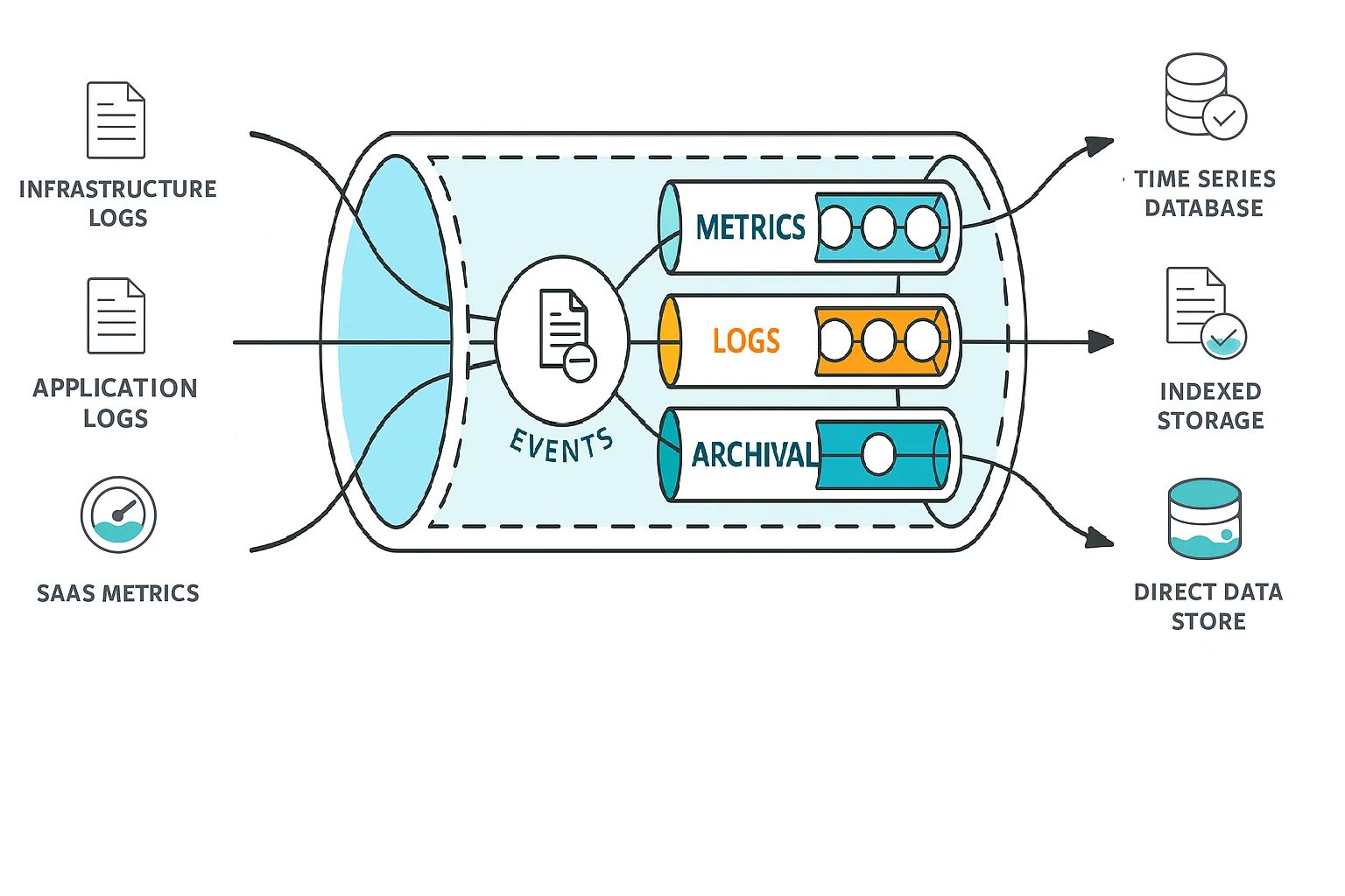
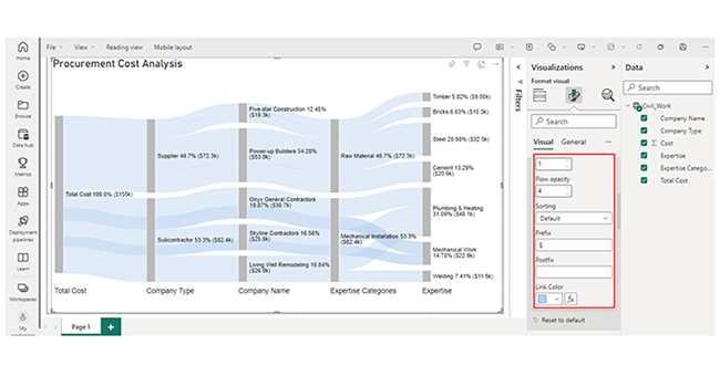
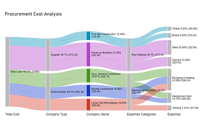
As shown in the image:

  • Data Sources: Infrastructure logs, application logs, and SaaS metrics enter the pipeline as raw data events.
  • Processing: Inside the pipeline, these events are organized into metrics, logs, and archival data for structured processing.
  • Output: Finally, the processed data flows to different destinations:
    • Time series databases for continuous metrics monitoring
    • Indexed storage for easy search and retrieval
    • Direct data stores for deep analysis and reporting

What are Data Pipeline Tools?

Here are four reliable data pipeline tools to help automate, manage, and scale your data workflows:

  • Apache Airflow

An open-source workflow management tool for orchestrating and scheduling pipelines, making it easier to manage complex ETL processes visually and systematically.

  • AWS Glue

A serverless ETL service that automates data discovery, preparation, and transformation, integrating seamlessly with AWS data lakes and analytics services.

  • Fivetran

A fully managed pipeline tool that automates data extraction and loading from multiple sources into your data warehouse with minimal setup, ensuring your data stays updated.

  • Power BI

While known for data visualization, Power BI also supports deployment pipeline basics functionalities, allowing you to connect to various data sources, perform data transformations using Power Query, and automate data refreshes for continuous insights.

How to Create a Data Pipeline?

  • Step 1: Identify Your Data Sources

Decide where your data will come from, such as databases, cloud storage, APIs, or flat files. This ensures you know what data you need to collect for your pipeline.

  • Step 2: Define Data Requirements

Clarify what data you need, the formats, and the frequency of data collection. This helps in planning how to process and structure the data.

  • Step 3: Design Data Transformations

Plan how you will clean, filter, and structure the data to make it usable for analysis. This could include removing duplicates, handling missing values, and converting formats.

  • Step 4: Choose Your Destination

Select where the processed data will be stored, such as a data warehouse, data lake, or an analytics tool, ensuring it aligns with your analysis and reporting needs.

  • Step 5: Set Up Orchestration

Use scheduling tools or pipeline orchestration frameworks to automate and manage the data flow, ensuring each step runs in the correct order.

  • Step 6: Implement Monitoring

Establish monitoring to track the pipeline’s performance and catch issues like failures or delays. This ensures your pipeline delivers reliable and consistent data.

  • Step 7: Test and Optimize

Run tests to ensure the pipeline is working correctly, data is processed accurately, and performance is efficient. Continuously optimize to handle increasing data loads and evolving business needs.
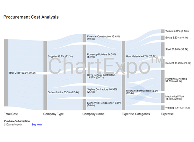
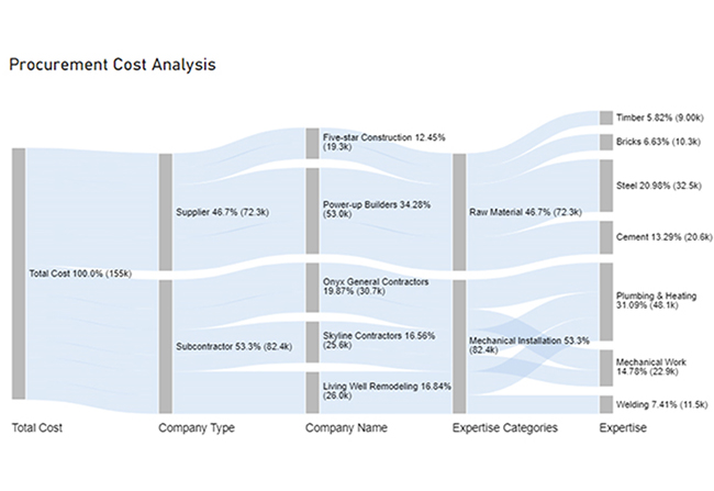
How to Create Data Pipeline Visualization in Power BI?

Stage 1: Log into Power BI, enter your email, and click “Submit.”

  • Log in to Power BI.
  • Enter your email address and click the “Submit” button.
Enter email to login to Power BI
  • You are redirected to your Microsoft account.
  • Enter your password and click “Sign in“.
Enter Password to login to Power BI
  • You can choose whether to stay signed in.
Click on stay signed in
  • Once done, the Power BI home screen will open.

Stage 2: Create a Data Set and Select the Data Set to Use in the Sankey Chart

  • Go to the left-side menu and click the “Create” button.
  • Select “Paste or manually enter data“.
select Paste or manually enter data in Power BI ce487
  • We’ll use the sample data below for this example.
Total Cost Company Type Company Name Expertise Categories Expertise Cost
Total Cost Subcontractor Skyline Contractors Mechanical Installation Plumbing & Heating 15456
Total Cost Subcontractor Skyline Contractors Mechanical Installation Mechanical Work 10159
Total Cost Subcontractor Onyx General Contractors Mechanical Installation Plumbing & Heating 18045
Total Cost Subcontractor Onyx General Contractors Mechanical Installation Mechanical Work 12695
Total Cost Subcontractor Living Well Remodeling Mechanical Installation Plumbing & Heating 14589
Total Cost Subcontractor Living Well Remodeling Mechanical Installation Welding 11456
Total Cost Supplier Power-up Builders Raw Material Cement 20561
Total Cost Supplier Power-up Builders Raw Material Steel 32456
Total Cost Supplier Five-star Construction Raw Material Bricks 10253
Total Cost Supplier Five-star Construction Raw Material Timber 9000
  • Paste the data table above into the “Power Query” window. After that, select the “Create a dataset only” option.
Select Create a Dataset Only After Learning What are Data Pipelines
  • Navigate to the left-side menu, and click on the “Data Hub” option. Power BI will populate the data set list. If no data set has been created, you’ll get an error message.
Click on Data Hub Option After Learning What are Data Pipelines
  • Choose the data set you want to use in the Sankey diagram. After that, you’ll see Power BI populate the screen as shown below.
Choose Data Set to Use in Sankey Diagram After Learning What are Data Pipelines
  • Click on the “Create a report” dropdown. Next, select “Start from scratch.”
Click on Create a Report After Learning What are Data Pipelines
  • A Report Canvas, similar to the one below will appear on your screen.
Report Canvas will Appear on Screen After Learning What are Data Pipelines

Stage 3: Add the Power BI Sankey Diagram Extension by ChartExpo

  • To create the Sankey Diagram, you’ll have to use an add-in or the Power BI visual from AppSource. Navigate to the right side of the Power BI dashboard, and open the Power BI Visualizations panel. Next, click the ellipsis symbol (…) to import the Power BI Sankey Diagram extension by ChartExpo.
Click 3 Dots to Import Sankey Diagram Entension After Learning What are Data Pipelines
  • When the menu opens, select the “Get more visuals” option.
Select Get more visuals After Learning What are Data Pipelines
  • In the following window that opens, enter “Sankey Diagram for Power BI by ChartExpo” in the highlighted search box. You’ll see the “Sankey Diagram for Power BI by ChartExpo.”
Enter Sankey Diagram in Search Box After Learning What are Data Pipelines
  • Click the highlighted “Add” button.
Click on Add Button After Learning What are Data Pipelines
  • Power BI will add the “Sankey Diagram for Power BI by ChartExpo” icon in the visualization panel.
Power BI Sankey Diagram Icon in Visualization Panel After Learning What are Data Pipelines

Stage 4: Draw a Sankey Diagram with ChartExpo’s Power BI extension

  • To do that, select the “Sankey Diagram for Power BI by ChartExpo” icon in the visualization panel. After that, a window similar to the one below will open in the report section of your dashboard.
Open in Report Section of Dashboard After Learning What are Data Pipelines
  • You have the option to resize the visual. Moving on, navigate to the right side of the Power BI dashboard, and look out for “Fields” next to “Visualizations.”
Lookout for Fields Next to Visualizations After Learning What are Data Pipelines
  • Follow the sequence below when selecting the fields to use in the Sankey chart.
    • Total Cost
    • Company Type
    • Company Name
    • Expertise Categories
    • Expertise
    • Cost
Select Fields to Use Sankey Chart After Learning What are Data Pipelines
  • You’ll have to provide your email address or ChartExpo license key.
Provide Email Address After Learning What are Data Pipelines

Stage 5: Activate the ChartExpo Trial or Apply a Subscription Key

  • Select the ChartExpo visual. You’ll see three icons below “Build Visual” in the Visualizations panel.
See Three Icons Below Build Visual in Visualization Panel After Learning What are Data Pipelines
  • Select the middle icon, “Format visual.” After that, the visual properties will be populated.
Select Middle Icon Format Visual After Learning What are Data Pipelines
  • As a new user, you’ll have to enter your email address in the textbox under the “Trial Mode” section. The license key will be sent to the email upon subscription. Toggle “Enable Trial’ to activate the 7-day trial.
Toggle Enable Trial to Activate 7-Day Trial After Learning What are Data Pipelines
  • The Sankey Diagram you create under the 7-day trial comes with the ChartExpo watermark.
Sankey Diagram with Watermark After Learning What are Data Pipelines
  • Enter the license key in the “ChartExpo License Key” textbox in the “License Settings” section. After that, slide the toggle switch next to “Enable License” to “On.”
Enter License Key in License Settings After Learning What are Data Pipelines
  • The Sankey diagram should be ready. It does not come with a watermark.
Sankey Diagram without Watermark After Learning What are Data Pipelines
  • To add a Prefix (like the $ sign) with the numeric values in the chart, you’ll have to expand the “Stats” properties. After that, include the Prefix value.
Add Prefix with Numeric Value in Chart After Learning What are Data Pipelines
  • To add colors to each node, expand the “Level Colors” properties and select the colors.
Add Colors to Each Node After Learning What are Data Pipelines
  • The changes will be saved automatically.
Final What are Data Pipelines

Insights

  • At Level 1 (Total Cost), the procurement cost is $155K.
  • At Level 2 (Company Type), out of the $155K cost, $82.4K (53.3%) was spent on subcontractors, while $72.3K (46.7%) was allocated to the supplier.
  • At Level 3 (Company Name), the supplier cost of $72.3K was divided between two companies: Five-star Construction and Power-up Builder, with charges of $19.3K and $53.0K, respectively.
  • The subcontractor cost of $82.4K was distributed among three companies: Onyx General Contractors, Skyline Contractors, and Living Well Remodeling. They charged $30.7K, $25.6K, and $26.0K, respectively, for their services.

What is the Difference Between Data pipeline vs. ETL pipeline?

A data pipeline is a broader term referring to the automated flow of data from one system to another, including processes like data collection, movement, and storage for various uses such as analytics, machine learning, or reporting.

In contrast, an ETL (Extract, Transform, Load) pipeline is a specific type of data pipeline focused on extracting data from source systems, transforming it into a suitable format, and loading it into a target system like a data warehouse for analysis.

Simply put, while all ETL pipelines are data pipelines, not all data pipelines are ETL pipelines, as managing data pipelines can also include real-time streaming, data replication, or data cleaning tasks without transformation steps.

What are the Advantages of Data Pipeline?

Data pipelines offer several advantages that help businesses manage and utilize data effectively:

  • Automation: Data pipelines automate the collection, movement, and processing of data, reducing manual tasks and saving time for teams.
  • Consistency and Accuracy: By standardizing how data flows between systems, pipelines reduce errors and ensure your data remains clean and reliable for analysis.
  • Real-Time Insights: Many data pipelines support real-time or near-real-time data processing, enabling businesses to monitor key metrics and respond quickly to changes.
  • Scalability: As your data grows, pipelines can handle large volumes efficiently, ensuring your analytics and reporting processes remain fast and effective.
  • Improved Decision-Making: With automated, clean, and timely data delivery, teams can generate insights faster, supporting informed, data-driven decisions across your organization.

What are Challenges for Building Data Pipelines?

Building data pipelines can bring several challenges, including:

  • Data Quality Issues: Ensuring that incoming data is clean, accurate, and consistent can be difficult, especially when dealing with multiple sources and unstructured formats.
  • Scalability: As data volumes grow, pipelines must handle larger loads efficiently without delays or failures, requiring careful design and resource management.
  • Integration Complexity: Connecting various data sources, APIs, and destination systems often requires custom development and ongoing maintenance to keep pipelines functioning.
  • Monitoring and Debugging: Identifying failures or bottlenecks in the pipeline can be challenging without robust monitoring tools, which are essential for ensuring smooth operations.
  • Security and Compliance: Safeguarding sensitive data while ensuring compliance with regulations (such as GDPR) adds complexity to pipeline design and management

Tips for an Effective Data Processing Pipeline

  • Start with Clear Objectives: Define what data you need, why you need it, and how it will be used to guide pipeline design effectively.
  • Ensure Data Quality Early: Add validation and cleansing steps during ingestion to avoid passing errors downstream.
  • Automate Where Possible: Use automation for repetitive processes like data cleaning and transformation to save time and reduce human error.
  • Monitor and Alert: Set up monitoring and automated alerts to quickly detect failures, bottlenecks, or data anomalies in your pipeline.
  • Design for Scalability: Build your pipeline to handle growing data volumes without performance drops, ensuring it remains reliable as your business grows.

Top 5 Use Cases of Data Pipelines

  1. Real-Time Analytics: Stream live data from sensors, apps, or websites to dashboards for instant insights and monitoring.
  2. Data Warehousing: Move and transform raw data into data warehouses for reporting and BI analysis.
  3. Machine Learning Pipelines: Automate data preparation, feature engineering, and model training workflows for ML projects.
  4. Data Migration: Transfer large volumes of data efficiently during system upgrades or cloud migrations.
  5. ETL Processes: Extract, transform, and load data from various sources into structured formats for consistent business analytics.

What is the future of Data Pipelines?

The future of managing data pipelines is moving toward automation, real-time processing, and AI integration. As businesses handle larger and more complex data streams, pipelines will increasingly use machine learning for data quality checks and anomaly detection.

Serverless and cloud-native architectures will make pipelines more scalable and cost-efficient, while low-code tools will enable non-technical teams to build and manage pipelines easily. Overall, data pipelines will become faster, smarter, and more accessible, empowering organizations to make data-driven decisions in real time.

Data Pipelines – FAQs

What are Data Pipelines Used For?

Data pipelines are used to automate the movement and processing of data from multiple sources to destinations like data warehouses or analytics tools. They help clean, transform, and organize data, making it ready for reporting, analysis, and business decision-making efficiently.

What is a simple example of a data pipeline?

A basic pipeline involves the extraction of sales data from a CSV file, transforming it by calculating total revenue and loading the results into a database for analysis.

Is data pipeline the same as ETL?

No, a data pipeline is not the same as ETL. An ETL pipeline (Extract, Transform, Load) is a specific type of data pipeline focused on extracting data from sources, transforming it, and loading it into a target system.

In contrast, a data pipeline is a broader concept that refers to any series of steps that move and process data from one system to another, which can include ETL, ELT, streaming data pipelines, and real-time data flows.

What are the main 3 stages in a data pipeline?

The three main stages in a data pipeline are:

  1. Data Ingestion: Collecting data from various sources such as databases, APIs, and cloud services.
  2. Data Transformation: Cleaning, formatting, and processing the data to make it usable for analysis.
  3. Data Storage: Storing the processed data in a data warehouse, data lake, or analytics platform for reporting and decision-making.

How to use pipelines in Power BI?

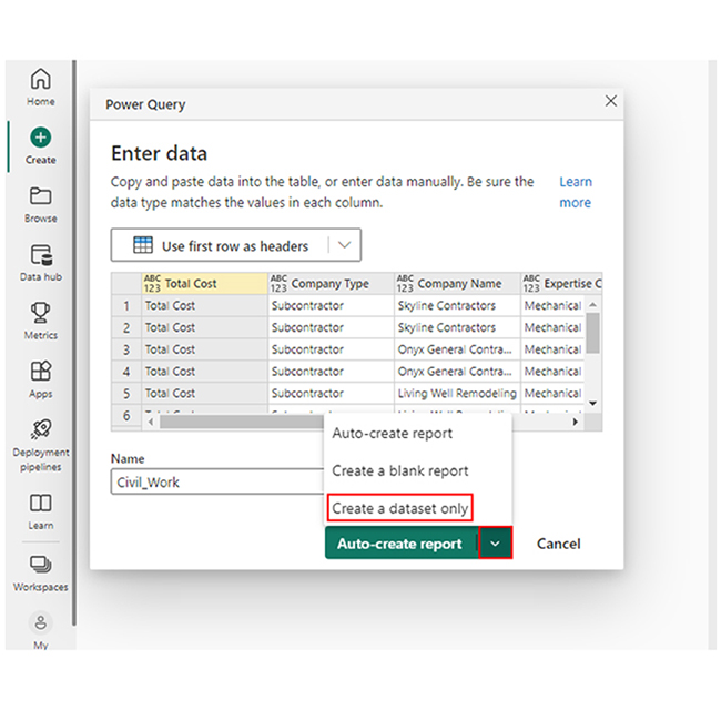
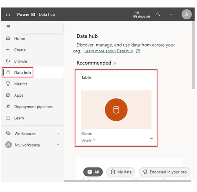
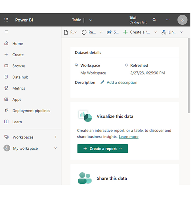
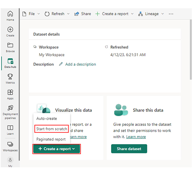
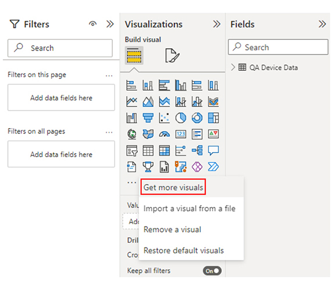
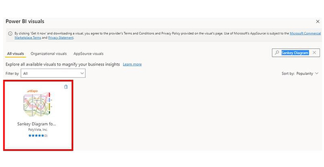
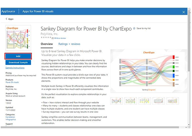
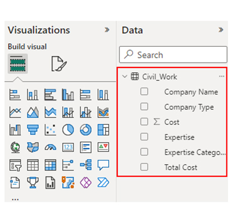
To use pipelines in Power BI:

  • Navigate to Deployment Pipelines in Power BI Service.
  • Create a new pipeline and assign your workspace to the development stage.
  • Deploy your Power BI reports and datasets from development to test, and then to production, using the structured stages for version control.
  • Pipelines in Power BI help manage content lifecycle, ensure consistent updates, and simplify collaboration and governance while moving reports through development, testing, and production environments.

Wrap Up

Data pipelines help organizations automate the systematic flow of data, and it also ensure timely, accurate, and organized movement. Data pipelines can be created in Power BI using Power Query.

To get started, you have to import data from multiple sources, transform it using the Power Query Editor, apply necessary transformations, and load it into Power BI.

One major benefit of using data pipelines is the scalability and flexibility that comes with it. A data pipeline is designed to scale, and it can handle increasing volumes of data without a hitch. The scalability of data pipelines makes it almost impossible for the data infrastructure to crumble under pressure, and that allows the business to expand seamlessly.

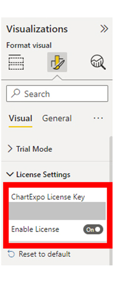
By following the steps in this guide, you’ll be able to easily use the ChartExpo visualization tool to create compelling visuals for your business.

How much did you enjoy this article?

PBIAd1
Start Free Trial!
144057

Related articles

next previous
Data Analytics12 min read

How to Create Financial Analysis Reports in 5 Simple Steps?

Learn what a financial analysis report is, its key components, benefits, and best practices. Discover how to create reports that guide smart business decisions.

Data Analytics9 min read

Software Development KPIs to Share the Project Progress

A software development KPI tracks performance and code quality. Learn key metrics, how to choose them, and ways to analyze and improve your team’s results.

Data Analytics8 min read

Public Relations KPIs: Insights Made Easy for PR

Public relations KPIs measure PR performance. This blog explains key metrics, tracking methods, and benefits to optimize your communications strategy.

Data Analytics7 min read

Customer Experience Dashboard for Quick Insights

This guide explores the importance and features of a customer experience (CX) dashboard.

Data Analytics7 min read

Manufacturing Dashboard: Insights Made Easy

This guide shows you what a manufacturing dashboard is, and how to choose the right production dashboard. It also shows you how the dashboard works.

ChartExpo logo

Turn Data into Visual
Stories

CHARTEXPO

  • Home
  • Gallery
  • Videos
  • Services
  • Pricing
  • Contact us
  • FAQs
  • Privacy policy
  • Terms of Service
  • Sitemap

TOOLS

  • ChartExpo for Google Sheets
  • ChartExpo for Microsoft Excel
  • Power BI Custom Visuals by ChartExpo
  • Word Cloud

CATEGORIES

  • Bar Charts
  • Circle Graphs
  • Column Charts
  • Combo Charts
  • Comparison Charts
  • Line Graphs
  • PPC Charts
  • Sentiment Analysis Charts
  • Survey Charts

TOP CHARTS

  • Sankey Diagram
  • Likert Scale Chart
  • Comparison Bar Chart
  • Pareto Chart
  • Funnel Chart
  • Gauge Chart
  • Radar Chart
  • Radial Bar Chart
  • Sunburst Chart
  • see more
  • Scatter Plot Chart
  • CSAT Survey Bar Chart
  • CSAT Survey Chart
  • Dot Plot Chart
  • Double Bar Graph
  • Matrix Chart
  • Multi Axis Line Chart
  • Overlapping Bar Chart
  • Control Chart
  • Slope Chart
  • Clustered Bar Chart
  • Clustered Column Chart
  • Box and Whisker Plot
  • Tornado Chart
  • Waterfall Chart
  • Word Cloud
  • see less

RESOURCES

  • Blog
  • Resources
  • YouTube
SIGN UP FOR UPDATES

We wouldn't dream of spamming you or selling your info.

© 2025 ChartExpo, all rights reserved.