Categories
Every day, businesses capture vast amounts of customer data inside Salesforce, yet many never tap that information beyond native dashboards.
Moving CRM records outside the platform opens the door to custom analysis, long-term archiving, compliance readiness, and direct integration with third-party tools your team already relies on for reporting.
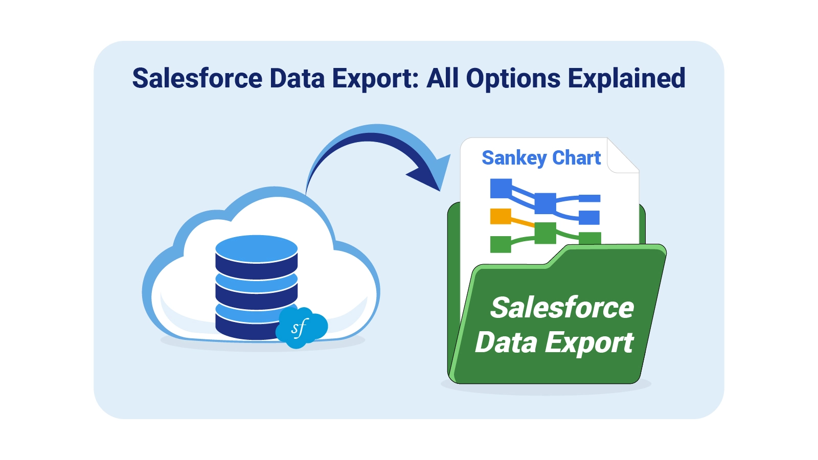
A structured Salesforce data export process gives teams full control over their records without depending on platform availability or native report limitations.
This guide covers the core methods available, the practical reasons to prioritize regular exports, and a step-by-step walkthrough for moving records into Google Sheets for structured analysis and data-driven decisions.
Definition: Salesforce data export is the process of pulling customer, sales, and operational records out of Salesforce into external file formats such as CSV, enabling backup, reporting, migration, or deeper analysis. Organizations use it to create offline copies of CRM data that can be stored securely, shared across teams, or connected to outside systems.
When companies leverage SFDC data export, they preserve ownership of their information and gain flexibility that the platform’s native tools cannot provide alone. Common applications include disaster recovery, regulatory documentation, advanced analytics, and platform migrations, with exports run manually, on a schedule, or through API automation.
With a dependable salesforce data export approach in place, CRM data stays accessible and portable, ready to power performance reviews and inform long-term business strategy.
Every Salesforce data export initiative gives your organization the power to store, analyze, and repurpose critical CRM data on your own terms, without depending on Salesforce availability or native report limits.
Here are the main reasons:
Several approaches exist for a reliable Salesforce data export, each suited to different data volumes, schedules, and technical requirements. Selecting the right approach for the job is the first step toward accuracy and efficiency.
This built-in feature lets administrators schedule exports automatically, packaging records into ZIP files with CSV data. It suits organizations that need recurring backups and compliance archives without manual effort.
The Data Loader is a desktop application built for bulk SFDC data export scenarios. It handles large datasets and supports custom SOQL queries, giving teams granular control over what gets extracted.
Filtered reports can be saved and downloaded as CSV with just a few clicks. This lightweight option works well for smaller datasets, particularly when teams plan to import CSV to Google Sheets for follow-up analysis.
Developers connect to the Salesforce REST or SOAP APIs to automate Salesforce data export pipelines and enable real-time synchronization with external systems.
ETL platforms and connector tools streamline data export from Salesforce by handling transformation, scheduling, and delivery to target destinations without custom code.
Apps from the AppExchange marketplace extend native export capabilities with richer scheduling options, advanced filtering, and enhanced customization for specific business needs.
For quick, low-volume extracts, users can copy visible records directly from list views. This ad-hoc method handles low-volume, targeted extraction without requiring additional tools or setup.
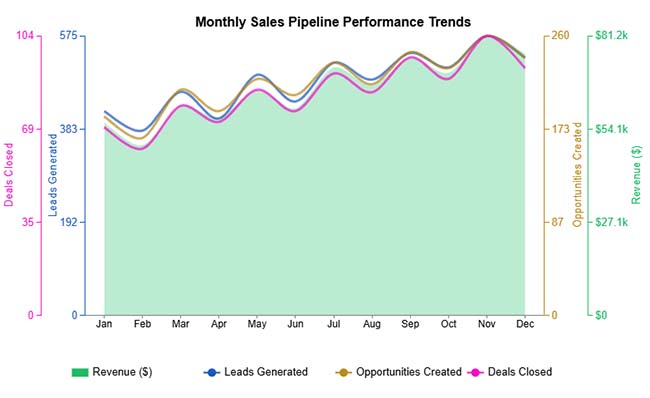
This Multi Axis Line Chart example tracks how leads, opportunities, deals, and revenue shift throughout the year, with a clear uptick in activity toward the final quarter.
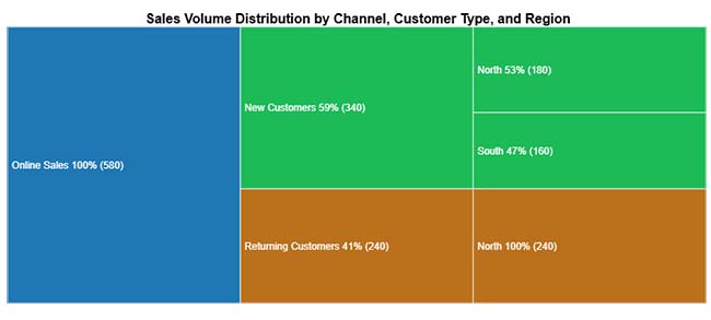
This Treemap example breaks down total online sales between new and returning customers, then distributes those segments across geographic regions for a layered view of the customer base.
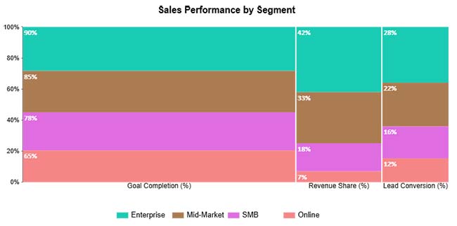
This Mosaic Plot example places key sales metrics side by side, letting teams compare conversion efficiency and overall performance across segments in a single visual.
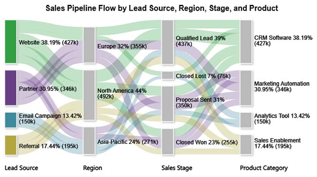
This Sankey Chart example maps the journey from lead source through regional pipeline stages all the way to closed deals or lost opportunities, revealing where volume is gained or lost.
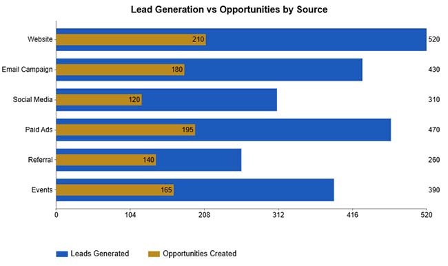
This Overlapping Bar Chart example sets lead volume and opportunity count against each other for every marketing channel, making it easy to spot which sources convert most consistently.
Moving your CRM records into a spreadsheet improves reporting accessibility and opens up a wider range of analysis tools. A well-planned Salesforce data export workflow makes the transition accurate and repeatable.
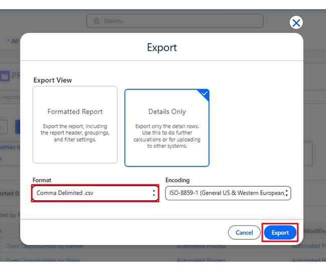
Generate a CSV file using reports, Data Export Service, or Data Loader to extract structured records.
Using Salesforce Reports
Remove duplicates, correct column headers, and standardize date and number formats.
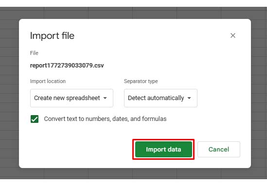
Import the cleaned CSV file into a new or existing spreadsheet for structured access.
If you want to load data from another sheet or file dynamically, use Google Sheets functions.
Example: Import Data from Another Spreadsheet
=IMPORTRANGE(“spreadsheet_url”,”Sheet1!A1:E100″)
Example: Filter Leads by Source
=FILTER(A2:E100, C2:C100=”Website”)
For real-time syncing, use API-based connectors instead of manual CSV exports.
Keeping the spreadsheet current without repeated manual effort requires setting up an automated data refresh.
Once your Salesforce data export is complete, the real work begins in structuring the data for meaningful analysis. Using data analysis in Google Sheets, teams can turn raw CRM exports into clear performance evidence.
TRIM() and CLEAN() to remove extra spaces or non-printable characters.SUMIF(), VLOOKUP(), or ARRAYFORMULA() to calculate KPIs and key metrics.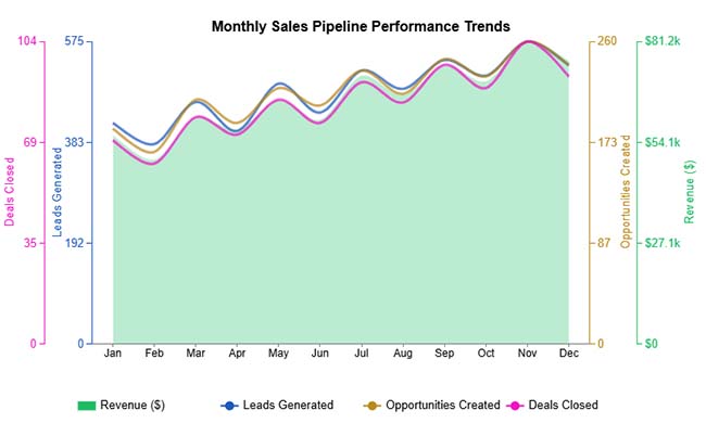
A consistent Salesforce data export process calls for structure, security, and clear ownership. The following practices help teams maintain control over every export.
Salesforce data export offers clear advantages, but teams encounter real friction when volumes grow, permissions tighten, or data quality issues emerge. The following challenges are the most common:
Use the Data Export Service to schedule a complete extract, or run Data Loader for full object-level extraction. Administrator permissions are required to initiate a full Salesforce data export.
The platform pulls records from selected objects and packages them as CSV files. Depending on the method chosen, the process can run manually, on a preset schedule, or automatically through API calls.
Yes. Export records as a CSV file and upload the file directly into Google Sheets, or use an API-based integration tool to keep the spreadsheet in sync automatically without repeated manual steps.
The standard export retrieves only active, visible records, while Export All also includes records that have been deleted or archived. That distinction is critical for compliance audits or complete historical backups.
Treating Salesforce data export as a regular business practice, rather than an occasional task, fundamentally changes how your team uses CRM data. Consistent, well-structured exports keep records secure, migration-ready, and available for the deeper analysis that native Salesforce reporting cannot always support. When data lives only inside the platform, its potential stays limited.
Pair those exports with organized Google Sheets workflows and advanced visualization tools to move beyond raw numbers. When your team can identify patterns quickly and present findings in formats that connect with stakeholders, CRM data stops being a storage obligation and starts informing strategy, accelerating decisions, and producing outcomes your business can act on.
How much did you enjoy this article?


Calculate accounts receivable turnover ratio to measure credit collection speed, improve cash flow, and strengthen your financial strategy. Read on!

Change Management KPIs are the key to tracking adoption, performance, and ROI during transitions. Find out which metrics matter. Read on!

Data collection methods and techniques determine the quality of every insight you act on. Explore key approaches for gathering reliable data. Read on!


