• Home
  • Tools dropdown img
    • Spreadsheet Charts

      • ChartExpo for Google Sheets
      • ChartExpo for Microsoft Excel
    • Power BI Charts

      • Power BI Custom Visuals by ChartExpo
    • Word Cloud

  • Charts dropdown img
    • Chart Category

      • Bar Charts
      • Circle Graphs
      • Column Charts
      • Combo Charts
      • Comparison Charts
      • Line Graphs
      • PPC Charts
      • Sentiment Analysis Charts
      • Survey Charts
    • Chart Type

      • Box and Whisker Plot
      • Clustered Bar Chart
      • Clustered Column Chart
      • Comparison Bar Chart
      • Control Chart
      • CSAT Survey Bar Chart
      • CSAT Survey Chart
      • Dot Plot Chart
      • Double Bar Graph
      • Funnel Chart
      • Gauge Chart
      • Likert Scale Chart
      • Matrix Chart
      • Multi Axis Line Chart
      • Overlapping Bar Chart
      • Pareto Chart
      • Radar Chart
      • Radial Bar Chart
      • Sankey Diagram
      • Scatter Plot Chart
      • Slope Chart
      • Sunburst Chart
      • Tornado Chart
      • Waterfall Chart
      • Word Cloud
    • Google Sheets
      Microsoft Excel
  • Services
  • Pricing
  • Contact us
  • Blog
  • Support dropdown img
      • Gallery
      • Videos
      • Contact us
      • FAQs
      • Resources
    • Please feel free to contact us

      atsupport@chartexpo.com

Categories
All Data Visualizations Data Analytics Surveys
Add-ons/
  • Google Sheets
  • Microsoft Excel
  • Power BI
All Data Visualizations Data Analytics Surveys
Add-ons
  • Google Sheets
  • Microsoft Excel
  • Power BI

We use cookies

This website uses cookies to provide better user experience and user's session management.
By continuing visiting this website you consent the use of these cookies.

Ok

ChartExpo Survey


Home > Blog > Microsoft Excel

MS Excel Uses in Business to Visualize Key Metrics

What is the use of MS Excel in business?

This question is asked daily by professionals worldwide. Why? Excel has become a cornerstone in business operations, offering tools to simplify tasks and solve problems. Many people globally are estimated to use Excel, many for business purposes.

From tracking sales to forecasting trends, using MS Excel in business is endless. Companies rely on spreadsheets for budgeting, data analysis, and reporting. Its flexibility allows enterprises to customize tasks, making it a vital tool for small startups and corporations.

MS Excel Uses in Business

Excel simplifies decision-making using pivot tables. Businesses can analyze thousands of rows of data in seconds, resulting in faster insights and better strategies.

In marketing, Excel tracks campaign performance. In finance, it manages budgets and calculates ROI, while HR teams use it for employee records and payroll. Its applications cut across departments, improving productivity everywhere.

Microsoft reports that 81% of businesses use Excel for data management. It shows its relevance in today’s data-driven business landscape.

This blog explores the practical uses of MS Excel in business. Learn how it enhances efficiency and simplifies complex operations to transform your work.

Table of Contents:

  1. What is MS Excel Uses in Business?
  2. What is the Importance of Microsoft Excel in Business?
  3. What are the Top 10 Uses of Excel in Business?
  4. How to Use Excel for Business?
  5. What are the Excel Best Practices for Business?
  6. Wrap Up

First…

What is MS Excel Uses in Business?

Definition: MS Excel is essential in business for data organization and analysis. It helps manage budgets, track sales, and monitor financial performance.

Businesses use Excel to create reports and visualize data with charts. It supports project planning and scheduling through templates and calendars.

Excel simplifies data entry and reduces errors with formulas and automation tools. It is essential for inventory management and forecasting. Moreover, businesses use Excel for customer data management and making data-driven decisions.

What is the Importance of Microsoft Excel in Business?

Microsoft Excel offers tools that simplify and optimize daily operations. From startups to global enterprises, Excel plays a vital role in keeping processes efficient and organized. Here’s why it’s indispensable for business success:

  • Efficient data management: Excel helps organize and structure large datasets, making accessing and analyzing critical information easier.
  • Informed decision-making: Businesses use Excel to analyze trends, uncover insights, and make data-driven decisions that drive growth.
  • Financial management: Excel provides a reliable way to manage finances effectively.
  • Data visualization and reporting: Its ability to create visually appealing charts, graphs, and reports ensures clear and compelling data.
  • Streamlined operations: Excel simplifies tracking workflows, schedules, inventory, and other operational tasks, saving time and effort.
  • Human resources applications: It centralizes employee records, payroll calculations, and attendance tracking, making HR management more efficient.
  • Automation and productivity: Excel automates repetitive tasks using formulas, functions, and macros, helping save time and increase productivity.

What are the Top 10 Uses of Excel in Business?

Excel isn’t just a spreadsheet; it’s a powerhouse that fuels businesses by simplifying tasks and turning data into actionable insights. Excel is at the heart of everything, whether it’s organizing day-to-day operations or driving strategic decisions. Here are the top 10 ways businesses rely on Excel:

  1. Business analysis: Excel transforms raw data into meaningful insights, helping to identify trends, forecast outcomes, and craft more innovative strategies for success.
  2. People management: Excel streamlines workforce management effortlessly – from tracking attendance and managing payroll to monitoring team performance.
  3. Managing operations: Excel simplifies daily operations by organizing workflows, tracking tasks, and improving overall departmental efficiency.
  4. Performance reporting: Businesses use Excel to create best-designed dashboards and charts that showcase key metrics and KPIs, making it easy to evaluate success.
  5. Office administration: Excel helps manage schedules, budgets, and inventories in one centralized platform, keeping everything organized and accessible.
  6. Strategic analysis: Excel is indispensable for analyzing competitor data, assessing risks, and identifying new opportunities that drive growth.
  7. Project management: With Excel, you can plan projects, track timelines, and monitor tasks to ensure goals are met efficiently and on schedule.
  8. Managing programs:  Excel keeps program details structured, monitors progress, and simplifies reporting on outcomes for stakeholders.
  9. Contract administration: Excel makes managing agreements much easier by maintaining contract records, tracking deadlines, and ensuring compliance.
  10. Account management: Excel enables you to organize client data, track sales, and nurture customer relationships with personalized insights.

How to Use Excel for Business?

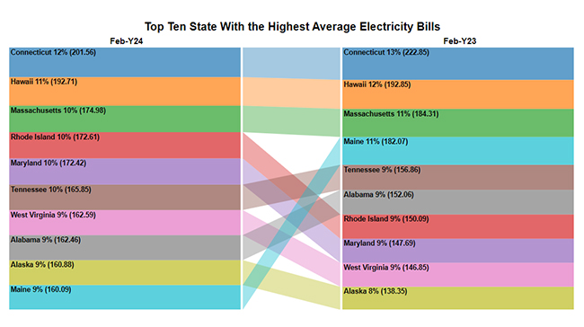
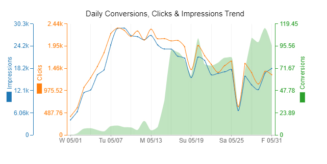
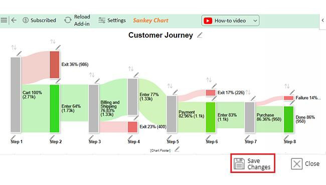
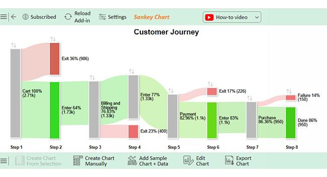
Data is king in today’s fast-paced business world, and MS Excel is its trusted advisor. From managing budgets to analyzing trends, Excel is the go-to tool for countless professionals.

However, when it comes to data visualization, Excel can fall short, making it harder to uncover key insights. That’s where ChartExpo offers powerful, user-friendly charts to transform complex data into clear, compelling visuals.
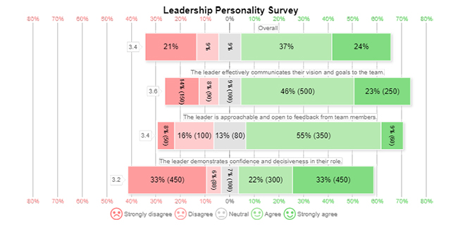
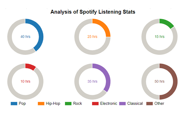
The below charts and graphs are created in Excel using ChartExpo:

Comparison Bar Chart

Comparison Bar Chart for Using MS Excel Uses in Business

Likert Scale Chart

Likert Scale Chart for Using MS Excel Uses in Business

Horizontal Waterfall Chart

Horizontal Waterfall Chart for Using MS Excel Uses in Business

Progress Circle Chart

Progress Circle Chart for Using MS Excel Uses in Business

Multi Axis Line Chart

Multi Axis Line Chart for Using MS Excel Uses in Business

Mosaic Plot (aka Mekko)

Mosaic Plot for Using MS Excel Uses in Business

Multi Axis Spider Chart

Multi Axis Spider Chart for Using MS Excel Uses in Business

Waterfall Chart

Waterfall Chart for Using MS Excel Uses in Business

Progress Chart

Progress Chart for Using MS Excel Uses in Business

Sankey Chart

Sankey Chart for Using MS Excel Uses in Business

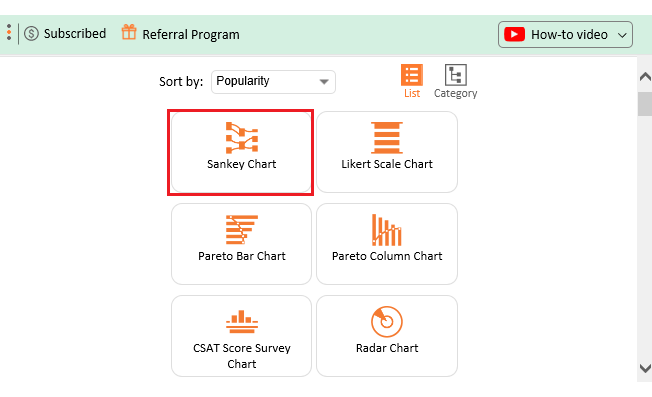
Let’s learn how to install ChartExpo in Excel.
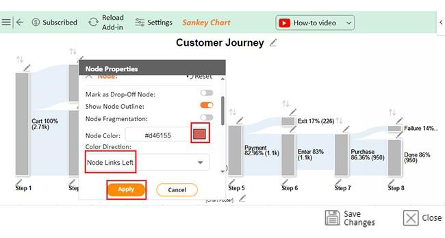
  1. Open your Excel application.
  2. Open the worksheet and click the “Insert” menu.
  3. You’ll see the “My Apps” option.
  4. In the Office Add-ins window, click “Store” and search for ChartExpo on my Apps Store.
  5. Click the “Add” button to install ChartExpo in your Excel.

ChartExpo charts are available both in Google Sheets and Microsoft Excel. Please use the following CTAs to install the tool of your choice and create beautiful visualizations with a few clicks in your favorite tool.

Example

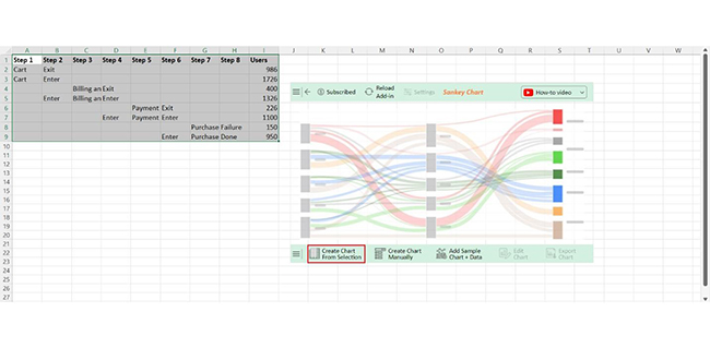
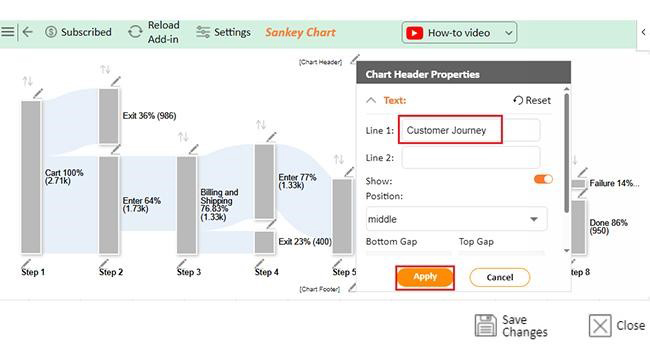
Let’s visualize this data in Excel using ChartExpo, a robust tool for analyzing and interpreting data, to uncover valuable insights.
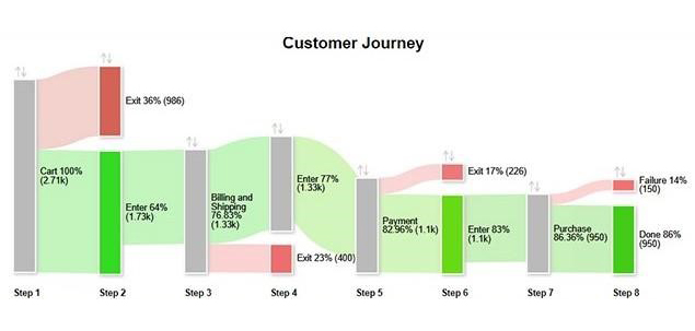
Step 1 Step 2 Step 3 Step 4 Step 5 Step 6 Step 7 Step 8 Users
Cart Exit 986
Cart Enter 1726
Billing and Shipping Exit 400
Enter Billing and Shipping Enter 1326
Payment Exit 226
Enter Payment Enter 1100
Purchase Failure 150
Enter Purchase Done 950
  • To get started with ChartExpo, install ChartExpo in Excel.
  • Now Click on My Apps from the INSERT menu.
insert chartexpo in excel
  • Choose ChartExpo from My Apps, then click Insert.
open chartexpo in excel
  • Once it loads, choose the “Sankey Chart” from the charts list.
search sankey chart in excel
  • Click the “Create Chart From Selection” button after selecting the data from the sheet, as shown.
Click Create Chart From Selection for Using MS Excel Uses in Business
  • ChartExpo will generate the visualization below for you.
Initial Visuals for Using MS Excel Uses in Business
  • If you want to have the chart’s title, click Edit Chart, as shown in the above image.
  • Click the pencil icon next to the Chart Header to change the title.
  • It will open the properties dialog. Under the Text section, you can add a heading in Line 1 and enable Show.
  • Give the appropriate title of your chart and click the Apply button.
Add Chart Header for Using MS Excel Uses in Business
  • Let’s give colors to the nodes. Click the pencil icon at the top of the nodes and go to “Node“. Select the color and click the “Apply” button to save all changes.
Apply Colors to Nodes for Using MS Excel Uses in Business
  • Click the “Save Changes” button to persist the changes.
Click Save Changes for Using MS Excel Uses in Business
  • Your final chart will appear as below.
Final MS Excel Uses in Business

Insights

  • 1,726 users added items to the cart.
  • 950 users completed the purchase.
  • Significant drop-offs occurred at the billing/shipping and payment stages.
  • There are potential areas for improvement in the checkout process.

Simplify Chart Analytics Using MS Excel for Business Solutions in Microsoft Excel:

  1. Open your Excel Application.
  2. Install ChartExpo Add-in for Excel from Microsoft AppSource to create interactive visualizations.
  3. Select Sankey Chart from the list of charts.
  4. Select your data.
  5. Click on the “Create Chart from Selection” button.
  6. Customize your chart properties to add header, axis, legends, and other required information.

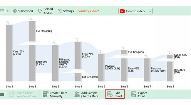
The following video will help you create a Sankey Chart in Microsoft Excel.

What are the Excel Best Practices for Business?

Excel is a powerful tool for businesses, but its true potential lies in how effectively you use it. Follow these best practices to enhance your productivity and accuracy:

  • Keep data organized: Structured data and named ranges make spreadsheets more straightforward to navigate and reduce confusion when handling large datasets.
  • Leverage templates: Pre-built Excel templates save time and provide consistency in budgeting, scheduling, or project-tracking tasks.
  • Work smart with shortcuts: Learn essential keyboard shortcuts to simplify your workflow and make repetitive tasks more manageable.
  • Ensure accuracy and reliability: Data validation helps prevent input errors while auditing formulas ensures correct and reliable calculations.
  • Protect your work and data: Safeguard sensitive information with passwords and ensure regular backups to prevent accidental data loss.
  • Automate and visualize effectively: Use macros to automate repetitive tasks and dynamic dashboards to enhance data presentation, making your information clearer and more interactive.

FAQs

What are the benefits of using Excel in business finance?

Excel helps businesses track financial data, create budgets, and analyze trends. It simplifies calculations, improves accuracy, and supports data visualization with charts. Excel also streamlines financial reporting and forecasting, saving time and enhancing decision-making in business finance.

How can Excel help a business?

Excel helps businesses by organizing data efficiently. It simplifies budgeting, tracking, and reporting tasks. Its formulas and charts enable quick analysis and insights. Excel boosts productivity, enhances decision-making, and supports collaboration across teams and departments.

How many businesses use Excel?

Excel is a go-to tool for small businesses, large corporations, and everything else. Its versatility and ease of use make it essential for financial management, analysis, and reporting.

Wrap Up

MS Excel is an essential tool for businesses. It supports operations, decision-making, and planning. Its versatility makes it valuable across industries, large and small.

Excel simplifies complex tasks, from data analysis to financial modeling helping businesses save time and effort. This efficiency boosts productivity and improves accuracy.

Its features, like formulas and charts, provide deeper insights. These tools allow businesses to make informed decisions quickly. Clear visualizations enhance communication and understanding.

Excel adapts to various business needs seamlessly. It helps in budgeting, inventory tracking, and creating detailed reports. This flexibility benefits startups and corporations alike.

Businesses also rely on Excel for collaboration. Sharing and editing spreadsheets ensures teams stay informed and aligned – it streamlines workflows and encourages teamwork.

Understanding the use of MS Excel in business is critical. It’s more than a tool; it’s a foundation for modern operations. Start mastering it today with ChartExpo and transform how you manage data to achieve success.

How much did you enjoy this article?

ExcelAd2
Start Free Trial!
145914

Related articles

next previous
Microsoft Excel9 min read

KPI Dashboard in Excel: A Complete Guide

A KPI dashboard in Excel helps track key metrics and streamline data visualization. Discover how to create, analyze, and use it with clear guides and examples.

Microsoft Excel11 min read

How to Plot a Speedometer Chart in Excel?

Create a Speedometer Chart in Excel to track KPIs, goals, and performance metrics visually. Explore templates, examples, and step-by-step instructions for better dashboards.

Microsoft Excel13 min read

Excel for Teachers for Insightful Preparation

Excel for teachers simplifies grading, tracks attendance, and organizes data. Find its key features, expert tips, and how ChartExpo enhances data visualization.

Microsoft Excel14 min read

How to Make a Cash Flow Diagram in Excel?

Learn how to make a Cash Flow Diagram in Excel. It will help you learn to visualize and analyze inflows and outflows of your business cash flow.

Microsoft Excel11 min read

Succession Planning Template for Long-Term Success

Succession Planning Templates help businesses prepare for leadership changes. Learn to create, analyze, and use them for seamless transitions and growth.

ChartExpo logo

Turn Data into Visual
Stories

CHARTEXPO

  • Home
  • Gallery
  • Videos
  • Services
  • Pricing
  • Contact us
  • FAQs
  • Privacy policy
  • Terms of Service
  • Sitemap

TOOLS

  • ChartExpo for Google Sheets
  • ChartExpo for Microsoft Excel
  • Power BI Custom Visuals by ChartExpo
  • Word Cloud

CATEGORIES

  • Bar Charts
  • Circle Graphs
  • Column Charts
  • Combo Charts
  • Comparison Charts
  • Line Graphs
  • PPC Charts
  • Sentiment Analysis Charts
  • Survey Charts

TOP CHARTS

  • Sankey Diagram
  • Likert Scale Chart
  • Comparison Bar Chart
  • Pareto Chart
  • Funnel Chart
  • Gauge Chart
  • Radar Chart
  • Radial Bar Chart
  • Sunburst Chart
  • see more
  • Scatter Plot Chart
  • CSAT Survey Bar Chart
  • CSAT Survey Chart
  • Dot Plot Chart
  • Double Bar Graph
  • Matrix Chart
  • Multi Axis Line Chart
  • Overlapping Bar Chart
  • Control Chart
  • Slope Chart
  • Clustered Bar Chart
  • Clustered Column Chart
  • Box and Whisker Plot
  • Tornado Chart
  • Waterfall Chart
  • Word Cloud
  • see less

RESOURCES

  • Blog
  • Resources
  • YouTube
SIGN UP FOR UPDATES

We wouldn't dream of spamming you or selling your info.

© 2025 ChartExpo, all rights reserved.