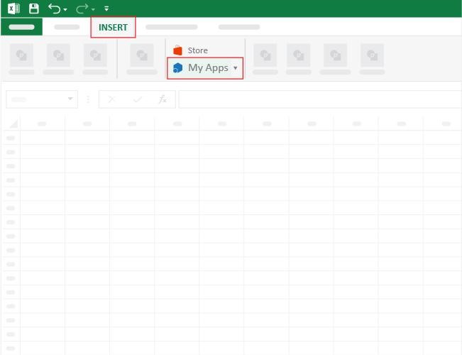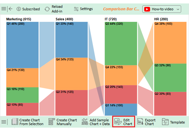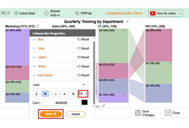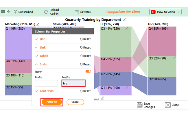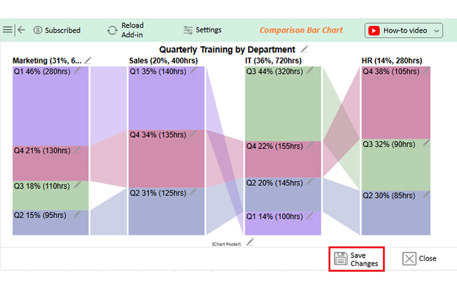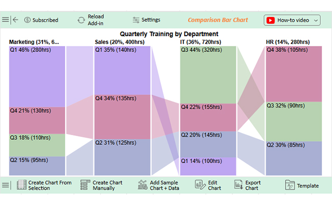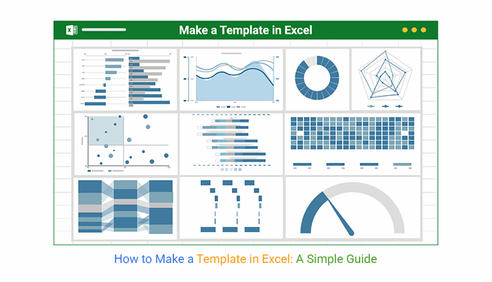


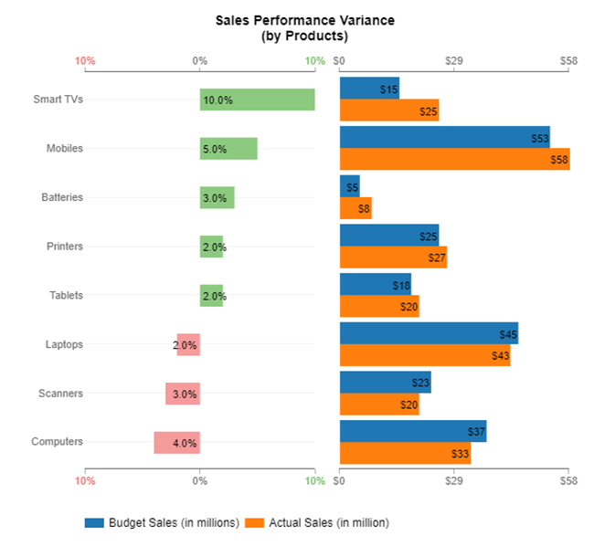
Picture this: You’ve built the perfect Excel template, added formulas, and tracked every number. But when it’s time to see the data through Excel charts, Excel stumbles. The charts are clunky, and insights get buried.
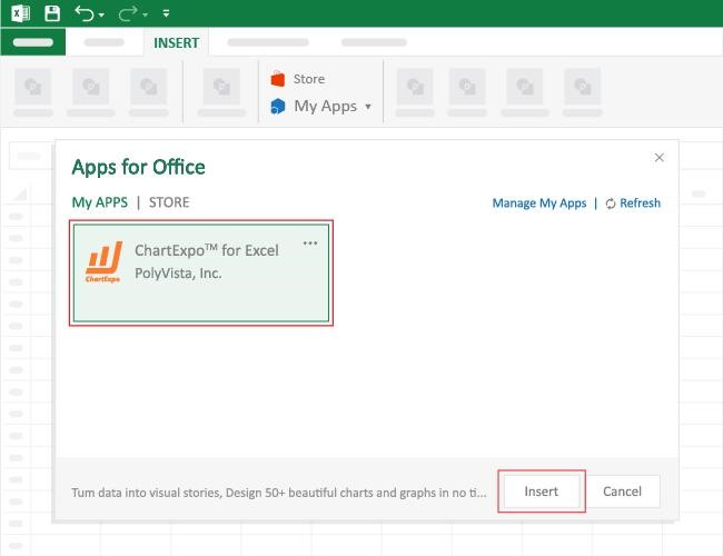
Data analysis needs more than rows and columns. It needs visuals that clearly tell the story behind the numbers. That’s where ChartExpo steps in. It fills the gap Excel leaves behind and helps you create powerful visuals, including a tornado chart in Excel, to make your data easier to understand and present.