• Home
  • Tools dropdown img
    • Spreadsheet Charts

      • ChartExpo for Google Sheets
      • ChartExpo for Microsoft Excel
    • Power BI Charts

      • Power BI Custom Visuals by ChartExpo
    • Word Cloud

  • Charts dropdown img
    • Chart Category

      • Bar Charts
      • Circle Graphs
      • Column Charts
      • Combo Charts
      • Comparison Charts
      • Line Graphs
      • PPC Charts
      • Sentiment Analysis Charts
      • Survey Charts
    • Chart Type

      • Box and Whisker Plot
      • Clustered Bar Chart
      • Clustered Column Chart
      • Comparison Bar Chart
      • Control Chart
      • CSAT Survey Bar Chart
      • CSAT Survey Chart
      • Dot Plot Chart
      • Double Bar Graph
      • Funnel Chart
      • Gauge Chart
      • Likert Scale Chart
      • Matrix Chart
      • Multi Axis Line Chart
      • Overlapping Bar Chart
      • Pareto Chart
      • Radar Chart
      • Radial Bar Chart
      • Sankey Diagram
      • Scatter Plot Chart
      • Slope Chart
      • Sunburst Chart
      • Tornado Chart
      • Waterfall Chart
      • Word Cloud
    • Google Sheets
      Microsoft Excel
  • Services
  • Pricing
  • Contact us
  • Blog
  • Support dropdown img
      • Gallery
      • Videos
      • Contact us
      • FAQs
      • Resources
    • Please feel free to contact us

      atsupport@chartexpo.com

Categories
All Data Visualizations Data Analytics Surveys
Add-ons/
  • Google Sheets
  • Microsoft Excel
  • Power BI
All Data Visualizations Data Analytics Surveys
Add-ons
  • Google Sheets
  • Microsoft Excel
  • Power BI

We use cookies

This website uses cookies to provide better user experience and user's session management.
By continuing visiting this website you consent the use of these cookies.

Ok

ChartExpo Survey


Home > Blog > Data Analytics

Insert Chart in PowerPoint: Easy Steps

Slides packed with raw numbers don’t do anyone any favors. Audiences zone out. Decision-makers miss the point. When you insert a chart in PowerPoint, you’re swapping data overload for clarity.

Insert Chart in PowerPoint

Charts show patterns at a glance, comparisons without squinting, and insights you can actually act on. They turn presentations from data dumps into real conversations about what matters.

Knowing how to insert a chart in PowerPoint isn’t optional anymore. It’s what separates convincing decks from forgettable ones.

Good charts make retention stick, guide attention where it’s needed, and let presenters spend time on analysis instead of reading off cells. Whether you’re building from scratch or pulling from Excel, getting this right pays off.

Table of Contents:

  1. What Does Insert Chart in PowerPoint Mean?
  2. Why is It Important to Insert a Chart in PowerPoint?
  3. Here is the List of Charts We Can Insert in PowerPoint
  4. Step-by-Step Guide: How to Insert a Chart in PowerPoint?
  5. How to Insert a Graph in PowerPoint from Excel?
  6. How to Insert a Chart in PowerPoint from Excel Using ChartExpo?
  7. Common Use Cases to Insert a Chart in PowerPoint
  8. Best Practices for Inserting a Chart in PowerPoint Slides
  9. FAQs
  10. Wrap Up

What Does Insert Chart in PowerPoint Mean?

Definition: When you insert a chart in PowerPoint, you’re adding a visual that represents data through bars, lines, segments, or other shapes. PowerPoint lets you create these directly inside slides or import them from external sources. It’s how numbers become pictures that audiences can actually understand.

The software usually opens a data grid where values go in. Change the numbers, and the chart updates automatically. Or you can insert a graph in PowerPoint from Excel, bringing in existing work without rebuilding it. Either way, charts beat tables when the goal is understanding, not reference.

Why is It Important to Insert a Chart in PowerPoint?

Charts change how information lands. People process visuals faster than they parse spreadsheets. Benefits worth caring about:

  1. Improves data visualization clarity.
  2. Simplifies complex information.
  3. Enhances audience engagement.
  4. Supports decision-making insights.
  5. Strengthens business presentations.
  6. Makes reports more professional.

Visuals cut down on explanations. They let audiences focus on implications rather than doing mental math during a presentation.

Here is the List of Charts We Can Insert in PowerPoint

PowerPoint isn’t short on options. Different types of charts and graphs exist because data tells different stories. Picking the right format makes or breaks whether your point comes across.

Example # 1:

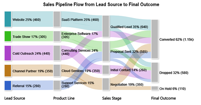
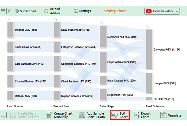
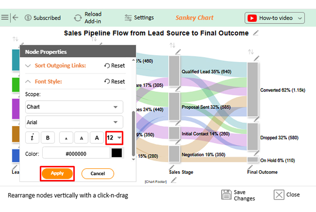
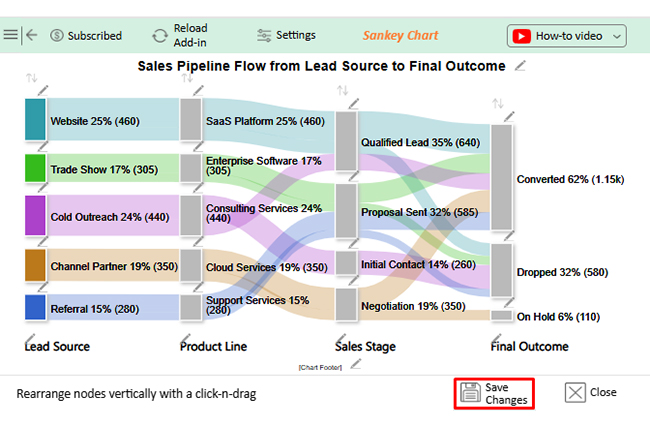
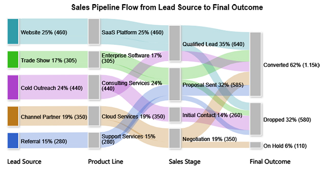
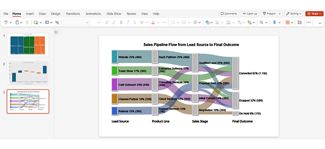
The Sankey chart shows lead flow from source to stage, revealing where conversions strengthen and where they drop off.

Insert Chart in PowerPoint

Example # 2:

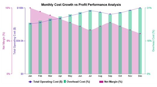
The Multi Axis Line Chart tracks operating costs and overhead against net margin month by month, making profit pressure visible.

Insert Chart in PowerPoint

Example # 3:

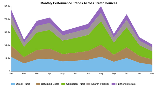
The Stacked Area Chart displays traffic source contributions over time, highlighting seasonal spikes and shifts in channel performance.

Insert Chart in PowerPoint

Example # 4:

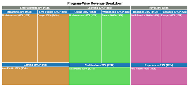
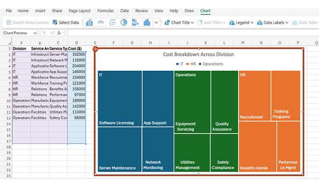
The Treemap breaks down program revenue by category and region, letting you compare size at a glance.

Insert Chart in PowerPoint

Example # 5:

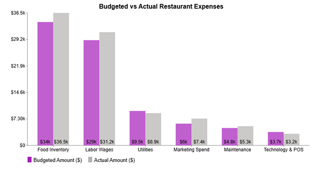
The Clustered Column Chart lines up budgeted and actual restaurant expenses side by side, showing overspend and savings per category.

Insert Chart in PowerPoint

Example # 6:

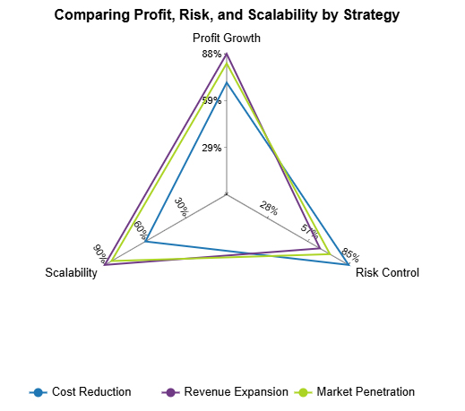
The Multi Axis Spider chart maps business strategies across profit, risk, and scalability, revealing trade-offs in one view.

Insert Chart in PowerPoint

Example # 7:

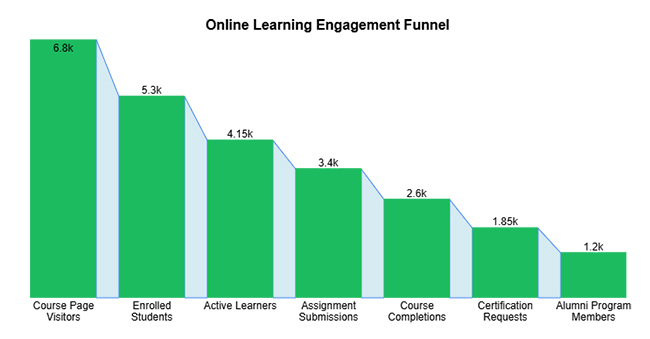
The Expansion Funnel Chart traces volume narrowing through each stage, showing how much gets lost along the way.

Insert Chart in PowerPoint

Example # 8:

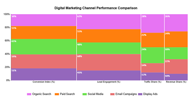
The Mosaic Plot maps digital marketing channels across conversion, engagement, traffic, and revenue, showing where each one contributes most.

Insert Chart in PowerPoint

Example # 9:

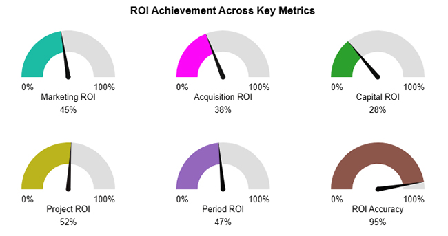
The Gauge Chart plots ROI metrics against a 0-100% scale, making performance status immediately clear.

Insert Chart in PowerPoint

Example # 10:

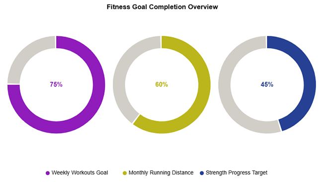
The Progress Circle Chart indicates fitness goal completion across workouts, running, and strength, with visual progress indicators.

Insert Chart in PowerPoint

Step-by-Step Guide: How to Insert a Chart in PowerPoint?

Once you know the workflow, adding charts is straightforward. Here’s how to insert a graph in PowerPoint without confusion.

  • Go to the slide location

Select the slide where the chart should appear.

Insert Chart in PowerPoint
  • Click the Insert tab

Access the Insert tab from the ribbon menu.

Insert Chart in PowerPoint
  • Select the Chart option

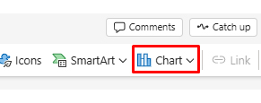
Click the Chart to open the chart selection window.

Insert Chart in PowerPoint
  • Choose a chart type

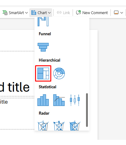
Pick a chart that fits your data and click OK. In this case, we used Treemap.

Insert Chart in PowerPoint
  • Edit chart data in Excel

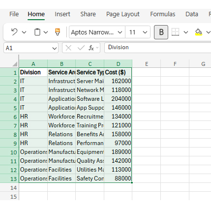
Enter or adjust values using the standard steps on how to add a chart in Excel.

Insert Chart in PowerPoint
  • Format chart design and layout

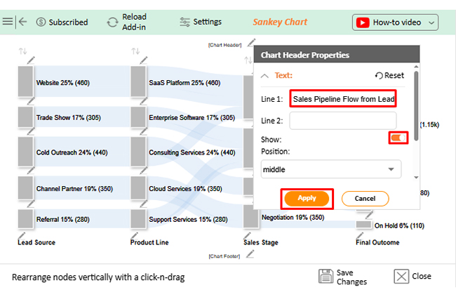
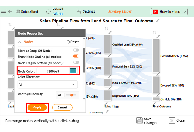
Customize colors, labels, and layout for clarity. This workflow ensures you can insert a graph in PowerPoint while keeping slides clean and professional.

Insert Chart in PowerPoint

How to Insert a Graph in PowerPoint from Excel?

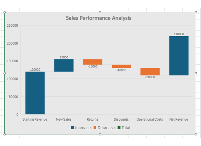
Most people build charts in Excel first. PowerPoint handles this scenario smoothly when you need to move an Excel graph to PowerPoint for presentation use.

  • Prepare a chart in Excel

Ensure your chart is finalized and accurately reflects the data.

Insert Chart in PowerPoint
  • Copy the Excel chart

Right-click the chart that you want to use and select Copy. You can also select it and press Ctrl/Cmd + C.

Insert Chart in PowerPoint
  • Open the PowerPoint slide

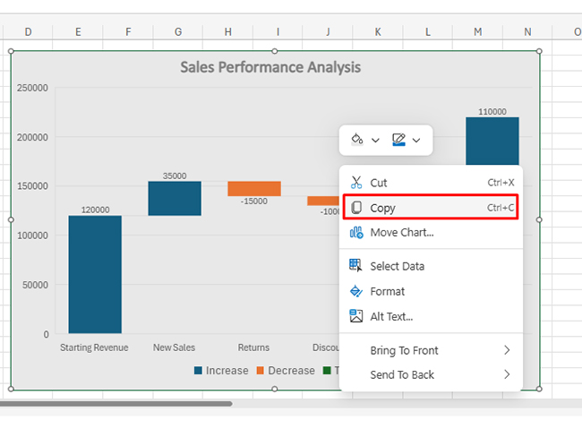
Navigate to the target slide in your presentation.

Insert Chart in PowerPoint
  • Paste the chart using the link or embed

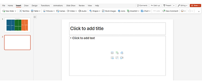
Choose whether to embed or link the chart data. Select the slide and press Ctrl/Cmd + V.

Insert Chart in PowerPoint
  • Update linked chart data

Linked charts refresh automatically when data changes.

  • Adjust chart formatting

Refine layout and size to fit the slide design.

This method works well with a dynamic graph Excel setup where numbers change frequently.

How to Insert a Chart in PowerPoint from Excel Using ChartExpo?

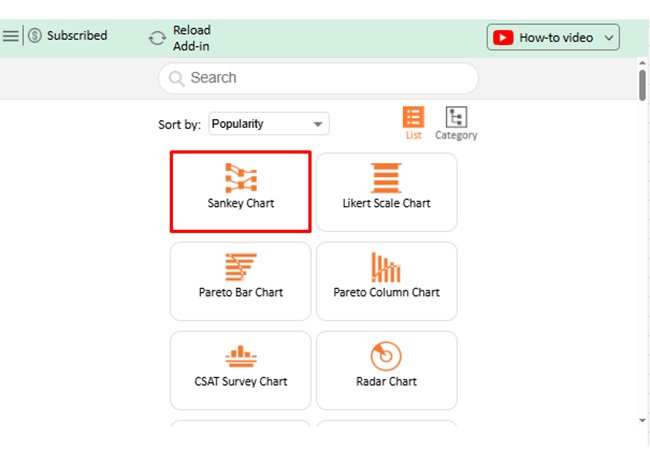
ChartExpo brings more analytical depth before you insert a chart in PowerPoint. It extends Excel with visualizations that go beyond the defaults.

  1. Install ChartExpo as a chart add-in for Excel to unlock extended chart options.
  2. Select your dataset and choose a chart designed for deeper analysis.
  3. Customize visuals to highlight patterns, trends, or comparisons.
  4. Generate the chart directly within your spreadsheet.
  5. Copy the finalized visualization.
  6. Paste it into PowerPoint as a linked or embedded object.

This approach pays off with advanced Excel charts that need precision beyond what PowerPoint’s defaults offer.

Why use ChartExpo?

  1. Delivers insight-driven visuals beyond standard chart options.
  2. Simplifies complex data for faster understanding.
  3. Helps create cool Excel charts and graphs with clarity and impact.
  4. Offers a 7-day free trial and costs just $10/month.

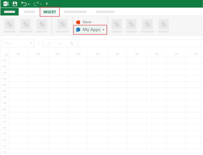
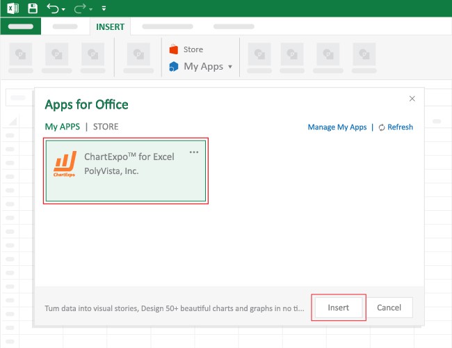
How to install ChartExpo in Excel?

  1. Open your Microsoft Excel.
  2. Start a worksheet and go to the ribbon tab named Insert.
  3. To open the window on Office Add-ins, click on My Apps.
  4. Go to the Add-ins window, and in the “/Store tab,” search ChartExpo.
  5. After finding it, click the Add button to install it.

ChartExpo can be used with both Google Sheets and Microsoft Excel. Follow the CTAs to install your favorite tool and create a beautiful visualization with just a few clicks directly on your favorite platform.

Example:

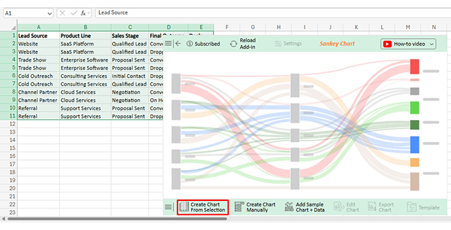
Consider we have the following data for a Sankey Chart.

Lead Source Product Line Sales Stage Final Outcome Deals
Website SaaS Platform Qualified Lead Converted 320
Website SaaS Platform Qualified Lead Dropped 140
Trade Show Enterprise Software Proposal Sent Converted 210
Trade Show Enterprise Software Proposal Sent Dropped 95
Cold Outreach Consulting Services Initial Contact Dropped 260
Cold Outreach Consulting Services Qualified Lead Converted 180
Channel Partner Cloud Services Negotiation Converted 240
Channel Partner Cloud Services Negotiation On Hold 110
Referral Support Services Proposal Sent Converted 195
Referral Support Services Proposal Sent Dropped 85
  • Once ChartExpo is installed, please click on the Microsoft Excel “INSERT” menu and then click on the “My Apps” submenu.
Insert Chart in PowerPoint
  • This will open the Apps for Office window. Find ChartExpo in the list and press the Insert button to make it appear in your Excel workbook.
Insert Chart in PowerPoint
  • Once ChartExpo is loaded into your sheet, you can search or select “Sankey Chart” from the list.
Insert Chart in PowerPoint
  • Next, select your data and click the ‘Create Chart from Selection’ button.
  • This will automatically turn your data into an informative visualization.
Insert Chart in PowerPoint
  • To customize your chart, just click on the “Edit Chart” option to make adjustments effortlessly.
Insert Chart in PowerPoint
  • To change the chart’s title, select the pencil icon on the header. Then, enter the text you want and select “Apply”.
Insert Chart in PowerPoint
  • You can change bar colors by clicking the pencil icon, selecting the node, choosing a color, and clicking Apply to save the changes.
Insert Chart in PowerPoint
  • You can increase font size for better readability as well.
Insert Chart in PowerPoint
  • When you are done with all the changes, click the “Save” button to save them.
Insert Chart in PowerPoint
  • The final look of the Sankey Chart is shown below.
Insert Chart in PowerPoint
  • Next, copy this chart and paste it in PowerPoint slide.
Insert Chart in PowerPoint

Key Insights

  • Website and Cold Outreach bring in the most leads, making them the top sources for pipeline volume.
  • Qualified Lead represents the biggest concentration, meaning that stage deserves focused conversion efforts.
  • Post-proposal drop-offs signal weak closing tactics that need improvement.

Common Use Cases to Insert a Chart in PowerPoint

Industries use charts constantly to show outcomes and progress. When you insert a chart in PowerPoint, credibility and comprehension both improve.

Common use cases include:

  • Business performance presentations.
  • Sales and revenue reports.
  • Marketing analytics dashboards.
  • Financial analysis slides using financial charts.
  • Project progress updates.
  • Executive summary presentations.

Teams often build comparison charts in Excel before bringing them into slides.

Best Practices for Inserting a Chart in PowerPoint Slides

Design carries as much weight as the numbers. Best practices matter when you insert a chart in PowerPoint.

Key recommendations include:

  • Choose the right chart type.
  • Keep chart design simple.
  • Use consistent colours and fonts.
  • Label axes and data clearly.
  • Avoid overcrowding slides.
  • Align charts with the slide narrative for a strong chart presentation.

Knowing how to interpret graphs and charts lets presenters build visuals that direct focus toward insights that matter.

FAQs

How do I import a chart into PowerPoint?

You can import a chart by creating one directly using the Insert Chart feature or by copying it from a spreadsheet and pasting it into a slide.

How do you insert a structure chart in PowerPoint?

A structure chart can be added by selecting an organizational or hierarchy chart type from the chart options. These charts are useful for showing reporting lines and structured relationships.

Can I edit chart data after inserting it in PowerPoint?

Yes. Once you insert a chart in PowerPoint, you can edit the data through the embedded data sheet or by updating the linked source file. Any changes are reflected automatically in the chart.

Wrap Up

Mastering how to insert a chart in PowerPoint quickly turns raw numbers into visuals people remember. You can build charts with the Insert > Chart workflow or paste an Excel chart you already analyzed, linking it for automatic updates or embedding it when the deck must travel.

Aim for clarity: choose the right chart type, keep design simple and consistent, label axes, and avoid overcrowding. If you need more specialized visuals, an Excel add-in like ChartExpo can help you build advanced charts before pasting them into slides. Do this well and your presentation shifts from data dump to decision-ready story.

How much did you enjoy this article?

GSAd1
Start Free Trial!
159198

Related articles

next previous
Data Analytics10 min read

Reporting vs Analytics: Everything You Need to Know

Reporting tracks past performance, while analytics uncovers why results happened and what comes next. Learn how each method strengthens decisions.

Data Analytics10 min read

Booking Dashboard: Charts for Booking Insights

Learn how a Booking Dashboard centralizes reservations, tracks KPIs, and improves forecasting. How to create and analyze booking dashboards in Power BI.

Data Analytics11 min read

Growth Metrics: Growth Insights Made Visual

Growth metrics measure performance and growth. This blog shows key KPIs and tools to help you track progress and make smarter decisions.

Data Analytics11 min read

Renovation Budgeting: A Visual Approach

Learn how to use renovation budgeting to plan and track your home project. This guide shows tips, tools, and visuals to control costs and avoid overspending.

Data Analytics8 min read

What is ROI in Business: ROI Insights Made Simple

Understand ROI in Business, how to calculate it, analyze returns, and use real examples to make smarter, data-driven investment decisions.

ChartExpo logo

Turn Data into Visual
Stories

CHARTEXPO

  • Home
  • Gallery
  • Videos
  • Services
  • Pricing
  • Contact us
  • FAQs
  • Privacy policy
  • Terms of Service
  • Sitemap

TOOLS

  • ChartExpo for Google Sheets
  • ChartExpo for Microsoft Excel
  • Power BI Custom Visuals by ChartExpo
  • Word Cloud

CATEGORIES

  • Bar Charts
  • Circle Graphs
  • Column Charts
  • Combo Charts
  • Comparison Charts
  • Line Graphs
  • PPC Charts
  • Sentiment Analysis Charts
  • Survey Charts

TOP CHARTS

  • Sankey Diagram
  • Likert Scale Chart
  • Comparison Bar Chart
  • Pareto Chart
  • Funnel Chart
  • Gauge Chart
  • Radar Chart
  • Radial Bar Chart
  • Sunburst Chart
  • see more
  • Scatter Plot Chart
  • CSAT Survey Bar Chart
  • CSAT Survey Chart
  • Dot Plot Chart
  • Double Bar Graph
  • Matrix Chart
  • Multi Axis Line Chart
  • Overlapping Bar Chart
  • Control Chart
  • Slope Chart
  • Clustered Bar Chart
  • Clustered Column Chart
  • Box and Whisker Plot
  • Tornado Chart
  • Waterfall Chart
  • Word Cloud
  • see less

RESOURCES

  • Blog
  • Resources
  • YouTube
SIGN UP FOR UPDATES

We wouldn't dream of spamming you or selling your info.

© 2026 ChartExpo, all rights reserved.