• Home
  • Tools dropdown img
    • Spreadsheet Charts

      • ChartExpo for Google Sheets
      • ChartExpo for Microsoft Excel
    • Power BI Charts

      • Power BI Custom Visuals by ChartExpo
    • Word Cloud

  • Charts dropdown img
    • Chart Category

      • Bar Charts
      • Circle Graphs
      • Column Charts
      • Combo Charts
      • Comparison Charts
      • Line Graphs
      • PPC Charts
      • Sentiment Analysis Charts
      • Survey Charts
    • Chart Type

      • Box and Whisker Plot
      • Clustered Bar Chart
      • Clustered Column Chart
      • Comparison Bar Chart
      • Control Chart
      • CSAT Survey Bar Chart
      • CSAT Survey Chart
      • Dot Plot Chart
      • Double Bar Graph
      • Funnel Chart
      • Gauge Chart
      • Likert Scale Chart
      • Matrix Chart
      • Multi Axis Line Chart
      • Overlapping Bar Chart
      • Pareto Chart
      • Radar Chart
      • Radial Bar Chart
      • Sankey Diagram
      • Scatter Plot Chart
      • Slope Chart
      • Sunburst Chart
      • Tornado Chart
      • Waterfall Chart
      • Word Cloud
    • Google Sheets
      Microsoft Excel
  • Services
  • Pricing
  • Contact us
  • Blog
  • Support dropdown img
      • Gallery
      • Videos
      • Contact us
      • FAQs
      • Resources
    • Please feel free to contact us

      atsupport@chartexpo.com

Categories
All Data Visualizations Data Analytics Surveys
Add-ons/
  • Google Sheets
  • Microsoft Excel
  • Power BI
All Data Visualizations Data Analytics Surveys
Add-ons
  • Google Sheets
  • Microsoft Excel
  • Power BI

We use cookies

This website uses cookies to provide better user experience and user's session management.
By continuing visiting this website you consent the use of these cookies.

Ok

ChartExpo Survey


Home > Blog > Microsoft Excel

Excel Graph to PowerPoint: A Complete How-To Guide

Converting data into visuals is crucial for presentations. But how can you smoothly incorporate graphs created in Excel into PowerPoint presentations? This step is essential for successful communication.

In 2022, Microsoft reported that over 1.2 billion people use Office. Many rely on Excel and PowerPoint for data presentation. Yet, transferring graphs can be tricky. Often, formatting gets lost, or data updates don’t sync, leading to errors and inefficiencies.

Why is this important? Clear visuals enhance understanding. They make complex data accessible. A well-placed graph can convey trends and insights instantly. In business, this clarity can drive decisions and strategies.

Excel Graph to PowerPoint

Excel Graph to PowerPoint is more than a technical step. It’s about ensuring your message is both clear and powerful. According to Prezi, 79% of people believe that presentations are essential for attaining success in their professional lives. The use of striking visuals is highly important.

Streamlining the transfer from Excel to PowerPoint saves time, reduces frustration, and improves accuracy. Tools and techniques that simplify this process are invaluable. They help maintain the integrity of your data and the power of your presentation.

So, what is Excel Graph to PowerPoint? It’s a vital skill for anyone who presents data. Mastering it can enhance your ability to communicate insights effectively. It’s about making your data work for you, not against you.

Let’s explore how to transfer Excel Graph to PowerPoint.

Table of Contents:

  1. What is an Excel Graph to PowerPoint?
  2. Why is Excel Graph Important to PowerPoint?
  3. How to Add an Excel Chart to a PowerPoint Presentation?
  4. How to Create Graphs in Excel Using an Add-In?
  5. What are the Best Practices for Linking Excel Graphs to PowerPoint?
  6. Wrap Up

First…

What is an Excel Graph to PowerPoint?

Definition: “Excel Graph to PowerPoint” is creating a graph in Excel that visualizes a dataset’s mean (average). Then, transferring that graph into a PowerPoint presentation. This involves several steps:

  1. Create the mean graph in Excel: First, calculate your data’s mean. Then, use Excel’s charting tools to create a graph, such as a bar chart, visually representing this mean.
  2. Copy and paste the chart: After making the graph, copy it from Excel and paste it into a PowerPoint slide.
  3. Adjust the chart: Once in PowerPoint, you may need to resize or format the chart to fit your presentation’s style.
  4. Linking the chart (optional): Optionally, you can link the chart so that any changes in Excel automatically update in PowerPoint.

Why is Excel Graph Important to PowerPoint?

When creating a PowerPoint presentation, you want to ensure your message hits home. That’s where Excel graphs come in””they’re a game-changer. Here are reasons why Excel graphs are so crucial to PowerPoint:

  • Visual communication of data: Graphs turn numbers into visual stories. They help your audience quickly grasp complex data, making your points more impactful.
  • Data-driven decision making: Including Excel graphs, backs up your insights with concrete data. This strengthens your arguments and helps making data-driven decisions.
  • Efficiency in presentations: Excel graphs streamline your workflow. You can quickly create, update, and import them into PowerPoint, saving time.
  • Consistency across documents: When your data visualizations are consistent across Excel and PowerPoint, they maintain a cohesive, professional, and polished look.
  • Customizability: Excel offers a wide range of customization options. You can tailor your charts and graphs to fit the style and theme of your presentation.
  • Enhanced decision-making: With clear, well-designed dashboards, decision-makers can better understand the data and make quicker, more accurate decisions.

How to Add an Excel Chart to a PowerPoint Presentation?

  1. Open the Excel file with the desired chart and select the chart to copy.
  2. Click Home>Copy.
Click Home and Copy for Excel Graph to PowerPoint
  1. There are alternative methods for copying the chart.
    • Right-click on the chart, then select Copy.
    • Alternatively, you can use the Ctrl+C
  1. Close Excel.

Choose How to Paste Your Chart

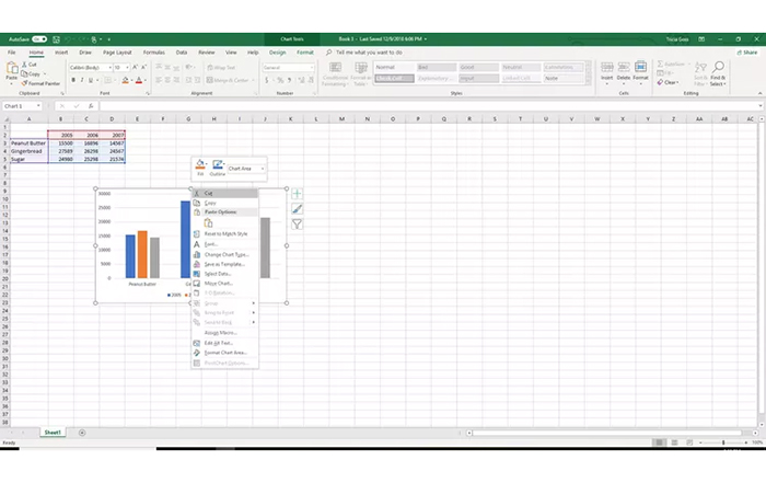
The graph from Excel that you pasted is on the Clipboard. Now is the time to insert it onto a PowerPoint slide.

  1. Open PowerPoint and go to the slide where you want to insert the Excel chart.
  2. Choose Home and click on the arrow pointing downwards for Paste. Alternatively, you can right-click on the slide. These are the various choices for displaying a chart presentation.
  1. Choose the Use Destination Theme & Embed Workbook option to copy and paste your chart into PowerPoint. This allows you to make edits in PowerPoint and coordinate with your presentation’s color palette.
  2. Choose Keep Source Formatting & Embed Workbook to enable editing in PowerPoint while maintaining the original color scheme from Excel.
  3. Choose Use Destination Theme & Link Data to be able to modify the data by editing your original Excel file. The chart will align with your PowerPoint presentation’s color scheme.
  4. Choose Keep Source Formatting & Link Data to modify your original Excel data by adjusting it. The color scheme in Excel will be maintained in the chart.
  5. Choose Picture to insert a picture of your chart in PowerPoint. The image is uneditable and not linked to any data.

Update Excel Charts in PowerPoint

If you choose to Link Data while pasting your Excel chart into PowerPoint, any changes made to the original spreadsheet will automatically update the chart in PowerPoint.

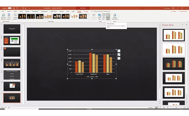
To update chart data manually:

  1. Select the chart in PowerPoint.
  2. Select Chart Tools design.
Choose Home and Click Paste for Excel Graph to PowerPoint
  1. Select Refresh Data.
Select Chart Tools Design for Excel Graph to PowerPoint

How to Create Graphs in Excel Using an Add-In?

Data visualization is crucial for clarity in data analysis. Yet, Excel’s native charts often leave much to be desired. They can be bland and restrictive.

Enter ChartExpo, the game-changer in data visualization. This add-in transforms your Excel experience, turning dull data into vibrant, insightful graphs. With ChartExpo, your charts not only inform but also captivate.

Say goodbye to Excel’s limitations and hello to a new era of visual storytelling.

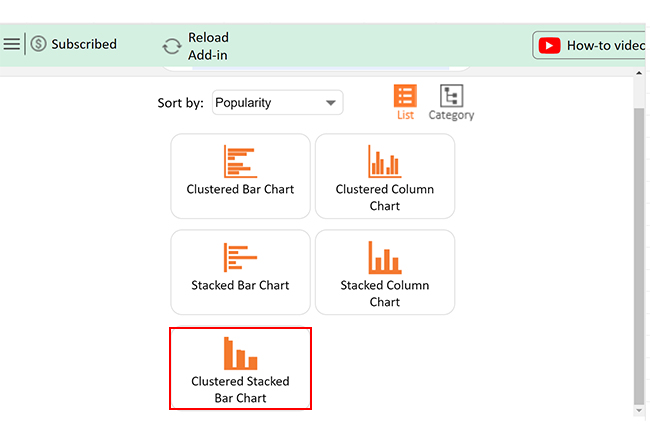
Let’s learn how to install ChartExpo in Excel.

  1. Open your Excel application.
  2. Open the worksheet and click the “Insert” menu.
  3. You’ll see the “My Apps” option.
  4. In the Office Add-ins window, click “Store” and search for ChartExpo on my Apps Store.
  5. Click the “Add” button to install ChartExpo in your Excel.

ChartExpo charts are available both in Google Sheets and Microsoft Excel. Please use the following CTAs to install the tool of your choice and create beautiful visualizations with a few clicks in your favorite tool.

Chart from Excel to PowerPoint Example

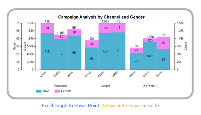
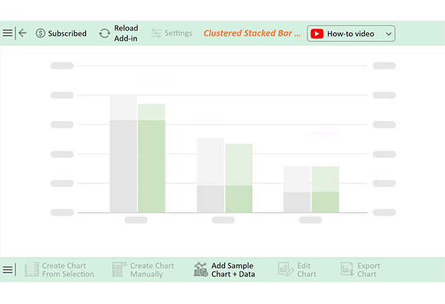
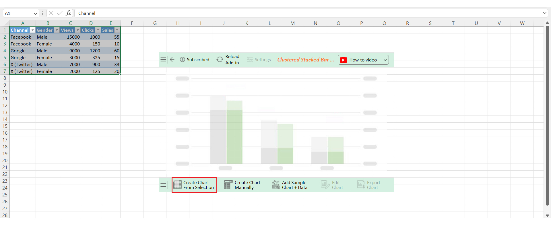
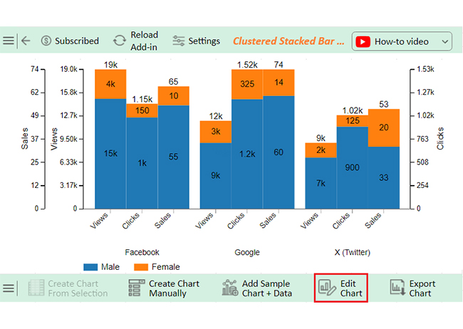
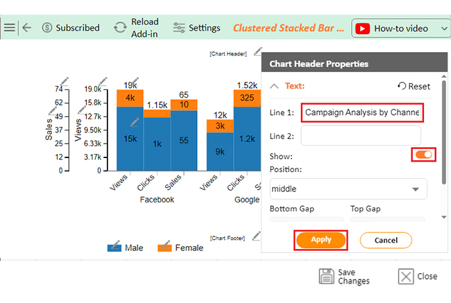
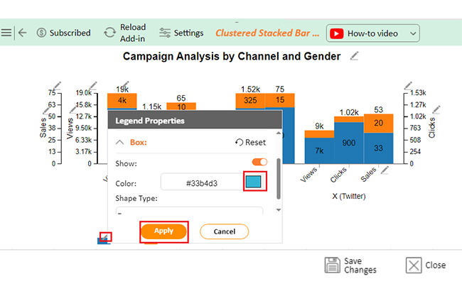
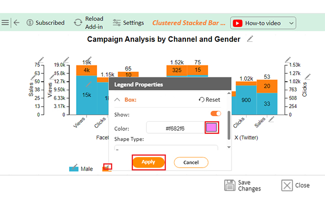
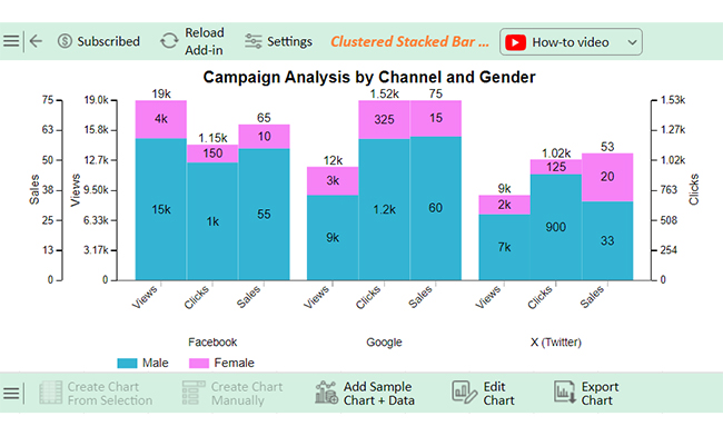
Let’s visualize the PowerPoint data below using ChartExpo and glean valuable insights.

Channel Gender Views Clicks Sales
Facebook Male 15000 1000 55
Facebook Female 4000 150 10
Google Male 9000 1200 60
Google Female 3000 325 15
X (Twitter) Male 7000 900 33
X (Twitter) Female 2000 125 20
  • To get started with ChartExpo, install ChartExpo in Excel.
  • Now Click on My Apps from the INSERT menu.
insert chartexpo in excel
  • Choose ChartExpo from My Apps, then click Insert.
open chartexpo in excel
  • Once it loads, scroll through the charts list to locate and choose the “Clustered Stacked Bar Chart”. This chart is best suited to this scenario.
search clustered stacked bar chart in excel
  • You will see a Clustered Stacked Bar Chart on the screen.
See Clustered Stacked Bar Chart for Excel Graph to PowerPoint
  • Click the “Create Chart From Selection” button after selecting the data from the sheet, as shown.
Click Create Chart From Selection for Excel Graph to PowerPoint
  • ChartExpo will generate the visualization below for you.
Initial Visual for Excel Graph to PowerPoint
  • If you want to have the chart’s title, click Edit Chart, as shown in the above image.
  • Click the pencil icon next to the Chart Header to change the title.
  • It will open the properties dialog. Under the Text section, you can add a heading in Line 1 and enable Show.
  • Give the appropriate title of your chart and click the Apply button.
Add Chart Header for Excel Graph to PowerPoint
  • You can change the color of the Male section by clicking on the Legend small pencil icon:
Change Color of the Male Section for Excel Graph to PowerPoint
  • You can change the color of the Female section by clicking on the Legend small pencil icon:
Change Color of the Female Section for Excel Graph to PowerPoint
  • Click the “Save Changes” button to persist the changes.
Click Save Changes for Excel Graph to PowerPoint
  • Your Clustered Stacked Bar Chart will appear as below.
Final Excel Graph to PowerPoint

Insights

  • Male users generate more views, clicks, and sales than females across all channels.
  • Google excels in sales, especially among males.
  • Facebook leads in views but has lower sales efficiency.

What are the Best Practices for Linking Excel Graphs to PowerPoint?

Linking Excel graphs to PowerPoint can be a powerful way to keep your presentations dynamic and up-to-date. But to get the most out of this feature, it’s essential to follow some best practices:

  • Proper formatting in Excel: Start with a well-formatted graph in Excel. Clean and clear formatting ensures your graph looks polished when transferred to PowerPoint.
  • Select the right graph type: Choose the one that best represents your data. Whether it’s a bar chart, line graph, or pie chart, the right choice makes your data easier to understand.
  • Link instead of embedding: Linking the graph rather than embedding it keeps your PowerPoint file size down. It allows for real-time updates when the Excel data changes.
  • Manage and update links: Regularly check and update your links to ensure the graphs in PowerPoint reflect the latest data. This keeps your data presentation accurate and relevant.
  • Optimize graph size and placement: Position your graph thoughtfully on the slide. Ensure it’s easy to read and doesn’t overwhelm the other content.
  • Test and refresh before presenting: Always test your linked graphs before presenting. Refresh them to ensure everything is displaying correctly and up to date.
  • Use descriptive titles and labels: Clear titles and labels in Excel make your graph more understandable. It helps your audience quickly grasp the key takeaways.
  • Consistency and accessibility: Ensure your graphs are consistent in style and accessible to all viewers, including those with color vision deficiencies. Consistency in design and accessibility features create a more professional and inclusive presentation.

FAQs

Can I link an Excel graph to PowerPoint so it updates automatically?

Yes, you can link an Excel graph to PowerPoint:

  • Copy the graph in Excel.
  • Paste it into PowerPoint using “Paste Special”.
  • Select “Link.”
  • The graph will update automatically when the Excel data changes.

How do I format an Excel graph after inserting it into PowerPoint?

  1. Click on the graph in PowerPoint to select it.
  2. Use the “Chart Tools” or “Format” tab to adjust colors, fonts, and styles.
  3. Right-click elements like axes or data points to customize them further.
  4. Changes are reflected immediately in the presentation.

Can I use Excel data to create a new graph directly in PowerPoint?

Yes, you can create a new graph in PowerPoint using Excel data”:

  1. Select “Insert Chart” in PowerPoint.
  2. Choose your graph type; a mini Excel sheet will open.
  3. Enter or paste your data.
  4. The graph will be generated automatically.

Wrap Up

Excel Graph to PowerPoint is a powerful tool for seamlessly integrating data into presentations. This process helps make complex data easy to understand.

The first step is to create a graph in Excel. Here, you calculate and visualize the data, often using averages. Excel’s charting tools offer various options to represent your data effectively.

Once the graph is ready, you can transfer it to PowerPoint. Copying and pasting the graph is simple. This integration makes your presentations more dynamic and data-driven.

In PowerPoint, you can adjust the graph as needed. Resizing and formatting ensure it matches your presentation’s style, helping to maintain a cohesive and professional look.

Optionally, linking the graph to Excel keeps your data live. Any updates in Excel automatically reflect in PowerPoint. This feature is handy for ongoing projects.

In essence, Excel Graph to PowerPoint is all about enhancing your presentations. It combines visual appeal with data accuracy. This makes your message clear, compelling, and backed by solid data.

Do not hesitate.

Start using Excel Graph to PowerPoint wisely for maximum impact.

How much did you enjoy this article?

ExcelAd2
Start Free Trial!
141302

Related articles

next previous
Microsoft Excel13 min read

Excel for Teachers for Insightful Preparation

Excel for teachers simplifies grading, tracks attendance, and organizes data. Find its key features, expert tips, and how ChartExpo enhances data visualization.

Microsoft Excel14 min read

How to Make a Cash Flow Diagram in Excel?

Learn how to make a Cash Flow Diagram in Excel. It will help you learn to visualize and analyze inflows and outflows of your business cash flow.

Microsoft Excel11 min read

Succession Planning Template for Long-Term Success

Succession Planning Templates help businesses prepare for leadership changes. Learn to create, analyze, and use them for seamless transitions and growth.

Microsoft Excel10 min read

Grant Tracking Spreadsheet: Insights Made Easy

A Grant Tracker Spreadsheet helps track funding, deadlines, and expenses in Excel. Learn to use grant tracking templates, analyze data, and stay organized.

Microsoft Excel10 min read

What is Excel Software Used for: A Complete Guide

What is Excel software used for? It organizes, analyzes, and manages data. Explore its workplace applications, benefits, and top tips for efficiency and more.

ChartExpo logo

Turn Data into Visual
Stories

CHARTEXPO

  • Home
  • Gallery
  • Videos
  • Services
  • Pricing
  • Contact us
  • FAQs
  • Privacy policy
  • Terms of Service
  • Sitemap

TOOLS

  • ChartExpo for Google Sheets
  • ChartExpo for Microsoft Excel
  • Power BI Custom Visuals by ChartExpo
  • Word Cloud

CATEGORIES

  • Bar Charts
  • Circle Graphs
  • Column Charts
  • Combo Charts
  • Comparison Charts
  • Line Graphs
  • PPC Charts
  • Sentiment Analysis Charts
  • Survey Charts

TOP CHARTS

  • Sankey Diagram
  • Likert Scale Chart
  • Comparison Bar Chart
  • Pareto Chart
  • Funnel Chart
  • Gauge Chart
  • Radar Chart
  • Radial Bar Chart
  • Sunburst Chart
  • see more
  • Scatter Plot Chart
  • CSAT Survey Bar Chart
  • CSAT Survey Chart
  • Dot Plot Chart
  • Double Bar Graph
  • Matrix Chart
  • Multi Axis Line Chart
  • Overlapping Bar Chart
  • Control Chart
  • Slope Chart
  • Clustered Bar Chart
  • Clustered Column Chart
  • Box and Whisker Plot
  • Tornado Chart
  • Waterfall Chart
  • Word Cloud
  • see less

RESOURCES

  • Blog
  • Resources
  • YouTube
SIGN UP FOR UPDATES

We wouldn't dream of spamming you or selling your info.

© 2025 ChartExpo, all rights reserved.