Categories
So, you’re knee-deep in data, drowning in numbers, desperately trying to make sense of it all. You need to tally the occurrences of specific criteria using DAX COUNTIF. The traditional methods just aren’t cutting it, and time is of the essence.


I have an escape route for you – the DAX COUNTIF function – the game-changer you’ve been looking for.
This function isn’t just a tool – it’s your ticket to taming unruly data and turning it into valuable insights.
Imagine effortlessly counting and summarizing data based on specific criteria. With DAX COUNTIF, you’ll slice and dice your data with the precision of a samurai. You’ll separate the signal from the noise and uncover hidden patterns.
No more wrestling with complex formulas or drowning in a deluge of irrelevant information. DAX COUNTIF streamlines your data analysis process and gives you the power to make informed decisions with ease.
So, buckle up and prepare to embark on a data-driven adventure. The DAX COUNTIF function is about to become your favorite ally in the quest for spreadsheet supremacy.
Let’s unleash its powers and make you the hero of your data saga!
Definition: The DAX COUNTIF function is a tool in Data Analysis Expressions. It is primarily used in Power BI and Excel Power Pivot. This function counts the number of cells within a specified range that meet a given condition. It operates similarly to the standard COUNTIF function in Excel but is tailored for use in DAX formulas.
With Power BI COUNTIF, you can create dynamic measures that tally occurrences based on specific criteria. The function takes two arguments: the range of values to evaluate and the condition to meet. It efficiently handles complex datasets, allowing you to extract insights by counting occurrences that align with predefined conditions.
With its flexibility and integration into data models, DAX COUNTIF is invaluable when working with large datasets. It enables you to extract meaningful insights and make informed decisions based on specific criteria within your data.
For example, let’s assume you have a table named ‘Sales’ with a column ‘Amount’. You want to count the number of rows where the amount is greater than 100. You could create a DAX measure like this:
CountIfGreaterThan100 = COUNTROWS (FILTER (Sales, Sales [Amount] > 100))
Let’s explore the advanced techniques that elevate the functionality of COUNTIF, making it a complex data analysis powerhouse.
COUNTIF in DAX excels at handling multiple conditions simultaneously. You can define complex criteria by leveraging logical operators and expressions. This allows for nuanced counting operations that address various scenarios within datasets.
For instance, you can count rows based on the intersection of multiple conditions.
CountIfMultipleConditions = COUNTROWS (FILTER (Sales, Sales [Amount] > 100 && Sales [Product] = “XYZ”))
The real strength of COUNTIF lies in its adaptability to dynamic context changes. In a data model where filters and context evolve, COUNTIF adjusts accordingly. It provides accurate counts that reflect the changing conditions in real time. This is particularly useful when altering or overriding the filter context for a specific calculation.
CountIfDynamicContext= COUNTROWS(CALCULATETABLE(Sales, USERPRINCIPALNAME() = “user@domain.com”))
Applying COUNTIF in a time-intelligence context enhances its capabilities. You can count occurrences within specific time frames, perform year-over-year comparisons, or conduct trend analysis. This adds a temporal dimension to the counting operations.
For instance, you can count sales in the current year or the rolling last 12 months.
CountIfCurrentYear = COUNTROWS(FILTER(Sales, YEAR(Sales[Date]) = YEAR(TODAY())))
You can employ COUNTIF for pattern matching. It allows you to count instances that conform to specific patterns or formats. This technique proves invaluable in datasets where counting requires more than a straightforward numerical or logical condition.
CountIfPartialMatch = COUNTROWS(FILTER(Products, SEARCH(“ABC”, Products[ProductName], 1, 0) > 0))
Beyond simple counting, you can combine COUNTIF with other aggregation functions in DAX format to derive more sophisticated measures. This enables you to perform advanced aggregations based on specific criteria, offering a more granular and insightful analysis.
For instance, you can count rows based on the average or sum of another column.
CountIfAvgAmountAboveThreshold = COUNTROWS(FILTER(Sales, AVERAGE(Sales[Amount]) > 500))
The use of parameters enhances the flexibility of Power BI COUNTIF in DAX. You can create parameterized measures, allowing on-the-fly adjustments to counting criteria without modifying the underlying DAX code. This promotes a more interactive and dynamic analysis.
CountIfParameterized =
VAR Threshold = 100
RETURN
COUNTROWS(FILTER(Sales, Sales[Amount] > Threshold))
COUNTIF supports hierarchical filtering, enabling you to count occurrences within specific hierarchies or levels. This technique facilitates a more in-depth and granular counting approach, whether dealing with organizational structures or product hierarchies.
CountIfHierarchyLevel=COUNTROWS(FILTER(Products,PATHCONTAINS(Products[CategoryPath], “Electronics”)))
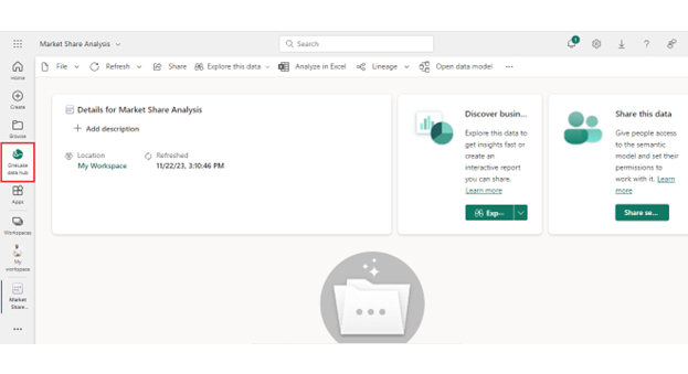
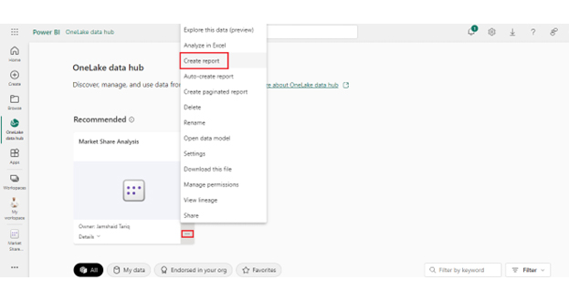
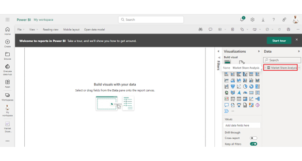
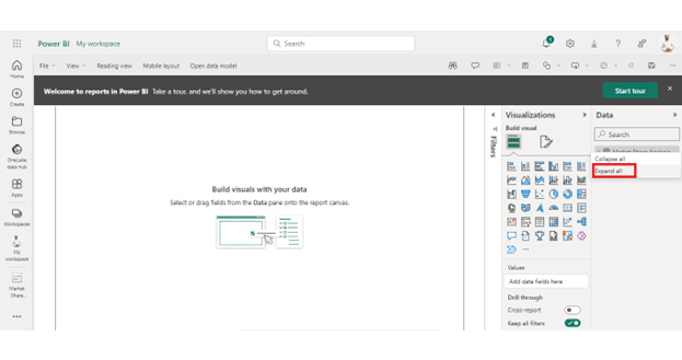
The integration of COUNTIF in Power BI transforms data into an intuitive and dynamic experience. Follow these steps to leverage COUNTIF in Power BI to extract valuable information and enhance your analytical capabilities.
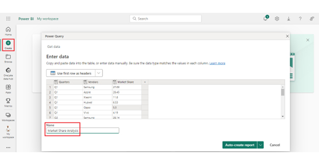
Let’s say you have the data table named ‘Market Share Analysis’ below. You want to count the rows where the ‘Market Share’ is greater than 10.
CountIfGreaterThan10 = COUNTROWS(FILTER(‘Market Share Analysis’,’Market Share Analysis'[Market Share]>10))
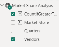
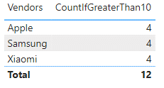
Once you’ve created the measure, you can use it in your Power BI visualizations. Simply drag and drop the measure into tables, charts, or other visuals to showcase the calculated count.
It’s important to note that there is no count attributed to Huawei. It does not meet the criteria specified in the filter function.
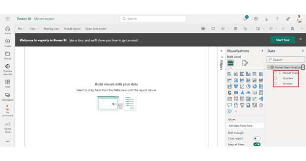
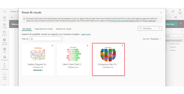
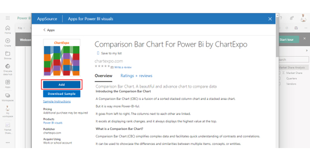
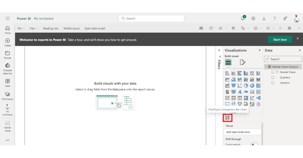
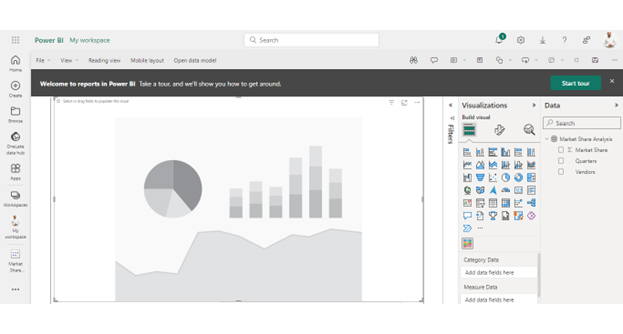
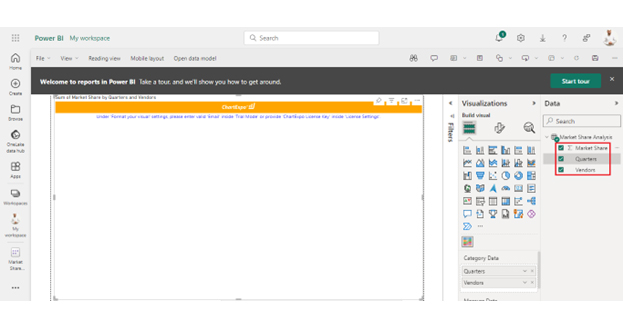
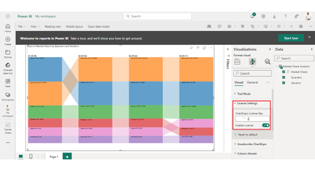
We’ve learned how to use the Power BI COUNTIF measure. Now, let’s learn how to create an appealing, insightful visualization of your data using Power BI charts.


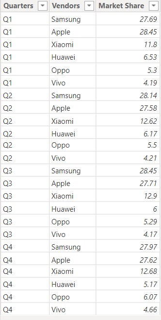
| Quarters | Vendors | Market Share |
| Q1 | Samsung | 27.69 |
| Q1 | Apple | 28.45 |
| Q1 | Xiaomi | 11.8 |
| Q1 | Huawei | 6.53 |
| Q1 | Oppo | 5.3 |
| Q1 | Vivo | 4.19 |
| Q2 | Samsung | 28.14 |
| Q2 | Apple | 27.58 |
| Q2 | Xiaomi | 12.62 |
| Q2 | Huawei | 6.17 |
| Q2 | Oppo | 5.5 |
| Q2 | Vivo | 4.21 |
| Q3 | Samsung | 28.45 |
| Q3 | Apple | 27.71 |
| Q3 | Xiaomi | 12.9 |
| Q3 | Huawei | 6 |
| Q3 | Oppo | 5.29 |
| Q3 | Vivo | 4.17 |
| Q4 | Samsung | 27.97 |
| Q4 | Apple | 27.62 |
| Q4 | Xiaomi | 12.68 |
| Q4 | Huawei | 5.17 |
| Q4 | Oppo | 6.07 |
| Q4 | Vivo | 4.66 |
DAX COUNTIF extends far beyond conventional counting functions. It offers a myriad of benefits that enhance the precision and flexibility of counting operations.
Yes, DAX (Data Analysis Expressions) includes a COUNT function. COUNT is a versatile function that tallies the number of rows in a table or a table expression. It provides valuable insights into the size of datasets and subsets within Power BI and Excel.
To use the COUNT function with conditions in Power BI, create a new measure. Employ the COUNTROWS function along with FILTER to specify conditions. For instance, COUNTROWS(FILTER(Table, [Column] = Condition)) counts rows meeting the defined criteria, providing a conditional count.
In Power BI, use the COUNTIF function with range criteria by creating a new measure. Utilize DAX expressions like COUNTROWS and FILTER to set conditions within the specified range. For instance, COUNTROWS(FILTER(Table, [Column] >= MinValue && [Column] <= MaxValue)) counts rows within a defined range.
The DAX COUNTIF function stands out as a pivotal tool in data analytics. It provides numerous advantages for navigating intricate datasets. Its ability to handle multiple conditions dynamically allows for precise and nuanced analysis, delivering accurate insights.
The function’s adaptability to context changes ensures real-time accuracy in counting operations within the ever-evolving data models. With a robust framework for time intelligence, pattern matching, and advanced aggregation, DAX COUNTIF extends beyond simple counting. It offers a versatile toolkit for sophisticated data analysis.
Moreover, incorporating parameterized measures and hierarchical filtering enhances flexibility. This enables you to tailor counting operations on the fly and delve deeper into granular datasets.
The seamless integration of DAX COUNTIF with Power BI elevates visualization capabilities. You can present counted data in interactive dashboards for a more understandable and visually appealing experience.
Furthermore, the function’s consistency with DAX principles ensures a standardized approach. It fosters a cohesive analytical strategy across different datasets and scenarios.
Conclusively, DAX COUNTIF is vital for actionable insights, strategic decision-making, and a nuanced understanding of the data landscape. Its multifaceted capabilities make it indispensable for unlocking the full potential of your data analytics endeavors.
How much did you enjoy this article?


Discover diverse and high-quality Power BI report examples for inspiration and insights. Elevate your reporting with strategic visualization techniques.

A Customer Relationship Management Dashboard centralizes data, tracks key metrics, and drives smarter business decisions. Discover now!

Explore Healthcare Dashboard Examples and learn how to turn complex healthcare data into clear, actionable insights for better decision-making.


