Categories
The Data Analysis Expressions (DAX) plays a major role in Excel and Power BI for data manipulation, calculations, and analysis in business intelligence. It enables efficient and flexible data modeling and reporting.


This guide will help you get a good grasp of what the DAX ALLSELECTED function is, why the DAX ALLSELECTED function is important, the use of Power BI ALLSELECTED function, and how to use ALLSELECTED in Power BI.
First…
The ALLSELECTED function in DAX returns all the values in a specified column or table. It ignores any filters that have been applied except for those that are specified explicitly using the REMOVEFILTERS or KEEPFILTERS functions.
The ALLSELECTED function comes in handy when the user wants to retrieve all the values from a column or table, disregarding the applied filters, while considering filters that are important for the analysis.
Here’s a breakdown of the ALLSELECTED function:
<table_or_column>: (Optional) Specifies the column or table from the Power BI data model for which you want to retrieve all the values. If not specified, it returns all the values within the entire model context.
The ALLSELECTED DAX function helps analysts to retrieve all the values from a specified column (or table), regardless of the applied filters, except for those explicitly specified using DAX functions like KEEPFILTERS or REMOVEFILTERS.
The function plays a major role in creating dynamic calculations that remain responsive to slicers in Power BI, enabling user interactions while accounting for critical dimensions or filters in the analysis.
Furthermore, the ALLSELECTED function plays a major role in maintaining context sensitivity within calculations. It ensures that calculations respond accurately to changes in selections and filters made by users, and also provides dynamic insights into the underlying data. This feature comes in handy in cases where the analysts have to perform comparative analyses between all values and selected values in a dataset while retaining context relevance.
The Power BI ALLSELECTED function helps analysts perform calculations while putting the current filter context in reports into consideration. It returns all the values from a specified column (or table), regardless of the applied filters except for those explicitly specified using DAX functions like KEEPFILTERS or REMOVEFILTERS.
The ALLSELECTED function is vital in cases where analysts have to perform comparative analyses between all values and selected values in Power BI datasets, ensuring a comprehensive view of the data.
It gives room for the calculation of totals, averages, and other aggregations across all values. This way, the user will have a comprehensive view of data while maintaining context relevance. This feature boosts the depth and flexibility of data analysis in Power BI reports, and also empowers analysts to draw deeper insights and make more informed decisions based on a comprehensive understanding of the underlying data.
Here’s a step-by-step guide to help you use the ALLSELECTED function in Power BI:
Launch the Power BI Desktop and open the dataset (or report) where you want to evaluate data using the ALLSELECTED function.
To create a new measure (or calculated column), you’ll have to right-click on the datasets in the Fields pane and select “New Measure” or “New Calculated Column,” and that depends on where you want to apply the function.
Navigate to the formula bar at the top of the screen, and using the ALLSELECTED function, enter your DAX formula. The syntax of the ALLSELECTED function is as shown below:
Replace <expression> with the aggregation or calculation you want to perform, and [Table/Column] with the column or table you want to evaluate.
There are cases where you’ll have to apply additional filters (or conditions) within the CALCULATE function in Power BI. This will allow the user to further refine the evaluation of data based on specific criteria.
After entering the DAX formula, press Enter to apply the formula and create the new measure (or calculated column).
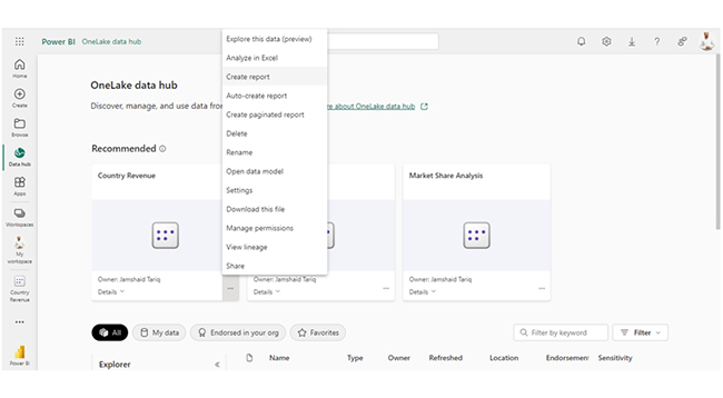
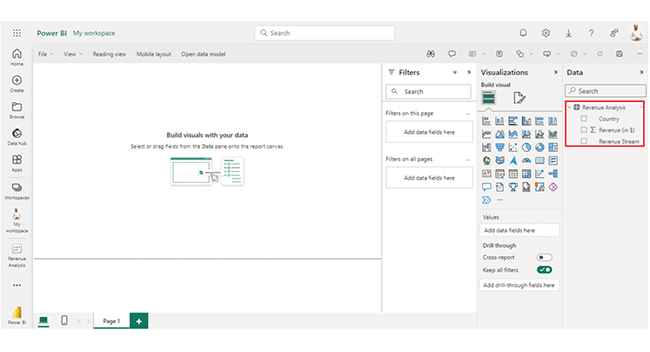
After creating the measure (or calculated column) with the ALLSELECTED function, you can proceed to use it in the data visualizations. Drag the column (or measure) into the visualization to evaluate data based on the specified filters (or context).
The ALLSELECTED function ascertains that the evaluation of data puts the current filter context into consideration, and it also provides dynamic insights into the underlying data.
Example:
EVALUATE
CALCULATEABLE (
ADDCOLUMNS (
ALL ( ‘Product’[Category] ),
“Sales Amount,” [Sales Amount],
“Sales Sel,”
CALCULATE (
[Sales Amount],
ALLSELECTED ( Product[Category] )
)
),
Product[Category] IN { “Audio,” “Computer” }
| Product [Category] | Sales Amount | Sales Sel |
| Audio | 384,518.16 | 30,591,343.98 |
| TV and Video | 4,392,768.29 | 30,591,343.98 |
| Computers | 6,741,548.73 | 30,591,343.98 |
| Cameras and Camcorders | 7,192,581.95 | 30,591,343.98 |
| Cell Phones | 1,604,610.26 | 30,591,343.98 |
| Music, Movies, and Audio Books | 314,206.74 | 30,591,343.98 |
| Games and Toys | 360,652.81 | 30,591,343.98 |
| Home Appliances | 9,600,457.04 | 30,591,343.98 |


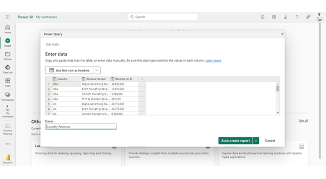
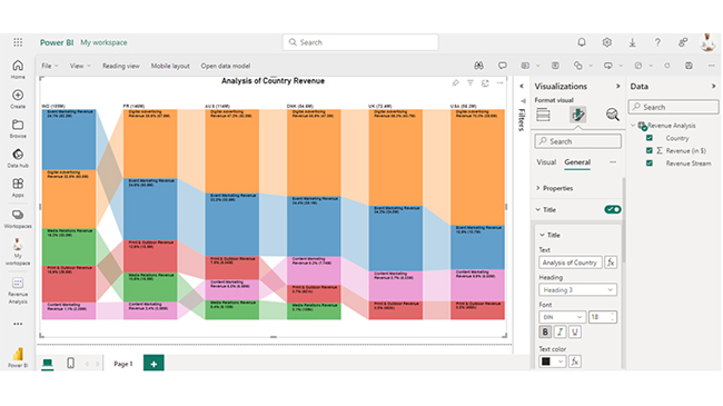
| Country | Revenue Stream | Revenue (in $) |
| USA | Digital Advertising Revenue | 39,620,000 |
| USA | Event Marketing Revenue | 10,670,000 |
| USA | Content Marketing Revenue | 5,580,000 |
| USA | Print & Outdoor Revenue | 455,270 |
| UK | Digital Advertising Revenue | 40,710,000 |
| UK | Event Marketing Revenue | 24,770,000 |
| UK | Content Marketing Revenue | 6,330,000 |
| UK | Print & Outdoor Revenue | 552,190 |
| DNK | Digital Advertising Revenue | 47,040,000 |
| DNK | Event Marketing Revenue | 29,070,000 |
| DNK | Content Marketing Revenue | 7,740,000 |
| DNK | Print & Outdoor Revenue | 600,690 |
| DNK | Media Relations Revenue | 106,430 |
| AUS | Digital Advertising Revenue | 53,790,000 |
| AUS | Event Marketing Revenue | 38,530,000 |
| AUS | Content Marketing Revenue | 6,590,000 |
| AUS | Print & Outdoor Revenue | 9,040,000 |
| AUS | Media Relations Revenue | 6,130,000 |
| FR | Digital Advertising Revenue | 57,860,000 |
| FR | Event Marketing Revenue | 50,450,000 |
| FR | Content Marketing Revenue | 3,560,000 |
| FR | Print & Outdoor Revenue | 18,790,000 |
| FR | Media Relations Revenue | 15,460,000 |
| IND | Digital Advertising Revenue | 60,470,000 |
| IND | Event Marketing Revenue | 63,200,000 |
| IND | Content Marketing Revenue | 2,080,000 |
| IND | Print & Outdoor Revenue | 29,500,000 |
| IND | Media Relations Revenue | 30,020,000 |
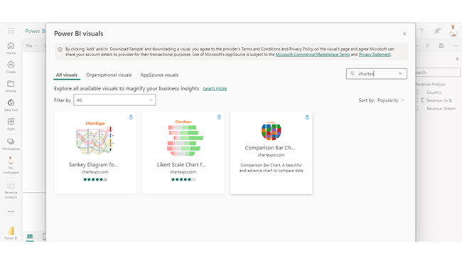
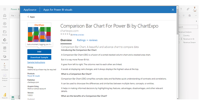
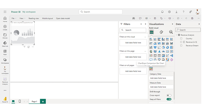
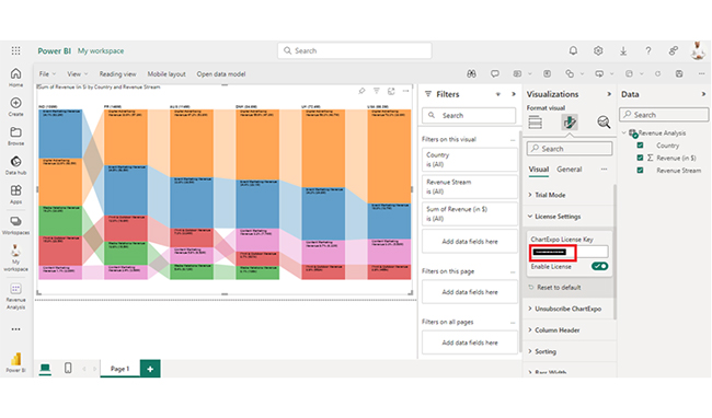
The following video will help you create a Comparison Bar Chart in Microsoft Power BI.
The DAX ALLSELECTED function in Power BI offers several benefits, particularly for dynamic and flexible data analysis. Here are some key advantages:
The ALL function in DAX returns all values from a table or column. The ALLSELECTED function, on the other hand, returns all values while considering current filters except those explicitly removed.
The ALLSELECTED function in DAX is used in Power BI to create dynamic calculations. It provides context-aware insights and facilitates comparative analysis.
The DAX ALLSELECTED function helps in retrieving all values. It also considers the current filter context in Power BI. The function plays a major role in the creation of dynamic calculations and comparative analysis. It also ensures accurate insights by accounting for applied filters.
The function enables the creation of dynamic calculations that respond to user interactions and slicer selections. This is accomplished by disregarding certain applied filters while retaining others.
By incorporating ALLSELECTED into calculations, analysts will gain deeper insights into the underlying data, and calculations will accurately reflect the current state of the data. This will, in turn, empower the user to explore and analyze data in an interactive way.
Now that you’ve figured out the DAX ALLSELECTED function, how will you incorporate it into your data visualization and analysis process?
How much did you enjoy this article?


Discover diverse and high-quality Power BI report examples for inspiration and insights. Elevate your reporting with strategic visualization techniques.

A Customer Relationship Management Dashboard centralizes data, tracks key metrics, and drives smarter business decisions. Discover now!

Explore Healthcare Dashboard Examples and learn how to turn complex healthcare data into clear, actionable insights for better decision-making.


