• Home
  • Tools dropdown img
    • Spreadsheet Charts

      • ChartExpo for Google Sheets
      • ChartExpo for Microsoft Excel
    • Power BI Charts

      • Power BI Custom Visuals by ChartExpo
    • Word Cloud

  • Charts dropdown img
    • Chart Category

      • Bar Charts
      • Circle Graphs
      • Column Charts
      • Combo Charts
      • Comparison Charts
      • Line Graphs
      • PPC Charts
      • Sentiment Analysis Charts
      • Survey Charts
    • Chart Type

      • Box and Whisker Plot
      • Clustered Bar Chart
      • Clustered Column Chart
      • Comparison Bar Chart
      • Control Chart
      • CSAT Survey Bar Chart
      • CSAT Survey Chart
      • Dot Plot Chart
      • Double Bar Graph
      • Funnel Chart
      • Gauge Chart
      • Likert Scale Chart
      • Matrix Chart
      • Multi Axis Line Chart
      • Overlapping Bar Chart
      • Pareto Chart
      • Radar Chart
      • Radial Bar Chart
      • Sankey Diagram
      • Scatter Plot Chart
      • Slope Chart
      • Sunburst Chart
      • Tornado Chart
      • Waterfall Chart
      • Word Cloud
    • Google Sheets
      Microsoft Excel
  • Services
  • Pricing
  • Contact us
  • Blog
  • Support dropdown img
      • Gallery
      • Videos
      • Contact us
      • FAQs
      • Resources
    • Please feel free to contact us

      atsupport@chartexpo.com

Categories
All Data Visualizations Data Analytics Surveys
Add-ons/
  • Google Sheets
  • Microsoft Excel
  • Power BI
All Data Visualizations Data Analytics Surveys
Add-ons
  • Google Sheets
  • Microsoft Excel
  • Power BI

We use cookies

This website uses cookies to provide better user experience and user's session management.
By continuing visiting this website you consent the use of these cookies.

Ok

ChartExpo Survey


Home > Blog > Microsoft Excel

Budget vs. Actual Excel Template: Insights Made Simple

What is a budget vs. actual Excel template, and why does every brilliant planner use one?

Budget vs. Actual Excel Template

Take budgeting beyond guesswork. Pair it with a monthly cash flow template in Excel and track your income and expenses. Missed a target? Overspent in a category? You’ll know instantly. Every number has a story, and the right template helps you read it.

Do you think it’s only for accountants? Not even close. Freelancers, small businesses, and project teams use these tools every day. When tracking department goals, a budget vs. actual Excel template focuses on your numbers.

Many small businesses miss the opportunity to compare budgets against actuals. This is where problems hide. An apparent gap between projection and performance can impact everything from payroll to profits.

Layer in tools like an expense report template in Excel, and you get even more control. These templates help you drill down into spending, catch issues early, and stay on track.

Budgeting isn’t about restriction. It’s about information, awareness, and proactiveness. If your goal is financial clarity, start with the right tools. The budget vs. actual Excel template is one of the most effective ones you can use.

Let me show you how to use this tool.

First…

Table of Contents:

  1. What is the Budget vs. Actual Excel Template?
  2. Why Use a Budget vs. Actual Spreadsheet?
  3. Key Features of a Budget vs. Actual Excel Template
  4. How to Create a Monthly Budget vs. Actual Excel Template?
  5. How to Analyze Budget vs. Actual in Excel?
  6. How to Use a Budget vs. Actual Template in Excel?
  7. Best Practices for Using Excel Budget vs. Actual Templates
  8. FAQs
  9. Wrap Up

What is the Budget vs. Actual Excel Template?

Definition: A budget vs. actual Excel template is a tool for comparing planned financial figures to actual results. It highlights variances in income and spending, helping you track performance and see where you overspent or underperformed.

Many professionals pair it with a monthly financial report template in Excel to review results over time. It’s simple but powerful. Construction teams may use it alongside a construction budget spreadsheet to manage project costs accurately. Clear numbers support smarter decisions.

Top Five Charts Budget vs. Actual Excel Template

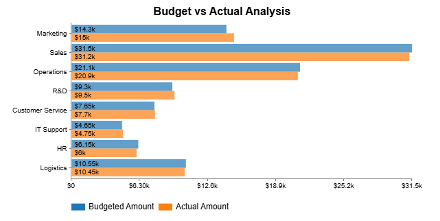
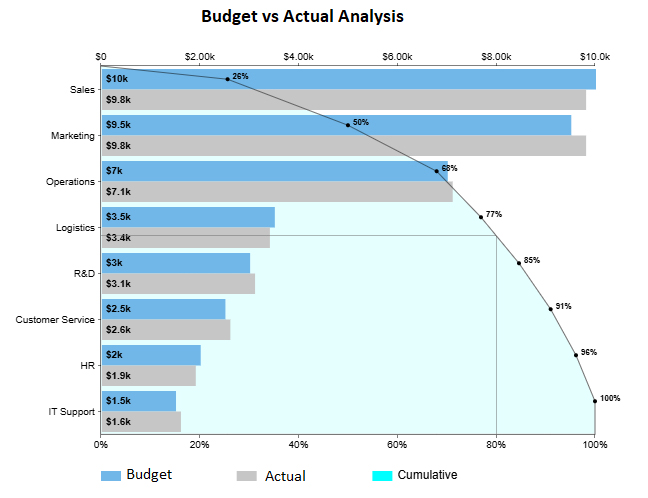
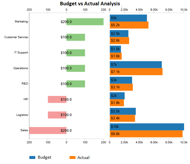
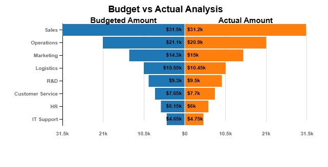
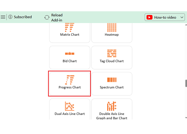
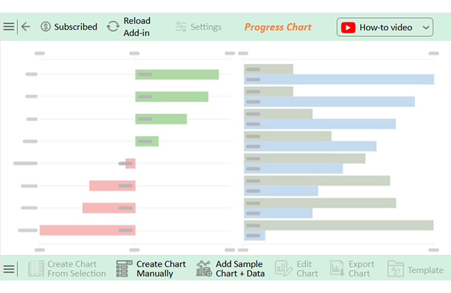
Check out the top 5 charts to analyze your budget vs. the actual Excel template. These charts were created using ChartExpo, a tool that supports decision-making with clear, impactful insights.

Clustered Bar Chart:

Budget vs. Actual Excel Template

Pareto Bar Chart:

Budget vs. Actual Excel Template

Progress Chart:

Budget vs. Actual Excel Template

Overlapping Bar Chart:

Budget vs. Actual Excel Template

Tornado Chart:

Budget vs. Actual Excel Template

Why Use a Budget vs. Actual Spreadsheet?

A budget vs. actual Excel template keeps your finances grounded. It’s not about spreadsheets—it’s about seeing where your money goes. This tool helps you stay honest with the numbers.

Why?

  • Monitor financial performance: This template helps you track how well you meet your financial goals. You can instantly see if you’re hitting targets or falling short.
  • Identify variances: It highlights the difference between what you planned and what happened. This allows you to catch overspending or income drops before they become bigger problems.
  • Improve decision-making: Accurate, real-time numbers lead to better choices. With a built-in view of monthly budget examples, you can easily adjust your strategy.
  • Enhance financial accountability: Everyone sees the exact figures, so there’s no hiding behind estimates. Pairing it with an expense report template in Excel ensures every transaction is tracked and verified.
  • Support financial planning and forecasting: You can build future budgets using historical data, not guesses. This approach increases accuracy and helps you set realistic financial goals.

Key Features of a Budget vs. Actual Excel Template

Have you ever stared at numbers that made no sense? A budget vs. actual Excel template makes them talk. It turns your data into a story you can use. Whether you’re tracking business costs or household spending, the right features make all the difference:

  • Clear budget vs. actual columns with variance insights: See your budgeted numbers next to actuals, side by side. Built-in and percentage variance calculations show you where you’re off track—and by how much.
  • Monthly & annual views in one place: Get the big picture and the day-to-day spending. Whether a year-end review or a month-to-month snapshot, it’s all built in.
  • Smart, predefined categories with custom options: Start fast with categories that make sense—rent, salaries, marketing, and more. Then, tweak the customizable fields to match your needs.
  • Automated totals that save time: Forget manual math. The template adds everything up automatically, from one line item to the full budget.
  • Visual power with charts and graphs: Numbers don’t need to be boring. Data visualizations, like the budget deficit by year graph, turn raw data into clear visuals you can share or present.
  • Clean, printable layout with conditional formatting: The print-friendly design makes sharing results easy. Thanks to conditional formatting, your wins and warning signs stand out at a glance.

How to Create a Monthly Budget vs. Actual Excel Template?

Have you ever felt like your budget disappears the moment the month starts? That’s where a budget vs. actual Excel template saves the day. Building one isn’t hard. And once you do, your finances get a whole lot clearer.

Follow these steps:

  1. Set up the header: Start with a simple title row. Include columns for Category, Budgeted, Actual, Variance, and Percentage.
  2. List categories: Think rent, groceries, marketing, or office supplies. If you’re tracking project costs, use a construction budget spreadsheet.
  3. Enter budgeted figures: Add what you expect to spend or earn in each category. These are your targets for the month.
  4. Input actual data: As the month goes on, fill in real numbers. Keep it updated so the template stays accurate.
  5. Calculate variance: Subtract the actual from the budget to find the difference. This shows where you’re over or under.
  6. Add percentage variance: Divide the variance by the budgeted amount. It helps you see the scale of the change.
  7. Apply conditional formatting: Use color coding to make key differences pop. Red for overspending, green for savings—make it visual.
  8. Create charts (optional): Use graphs for quick insights. A bar chart or budget deficit-by-year graph can highlight monthly trends.

How to Analyze Budget vs. Actual in Excel?

Have you ever tried reading a spreadsheet and felt your brain short-circuit? That’s Excel for you—great with numbers, not so great with visuals. A budget vs. actual Excel template shows where your money went compared to where you thought it would go. But raw numbers alone don’t tell the whole story – you need more.

That’s where data visualization comes in. It makes trends, gaps, and outliers jump off the screen.

Excel tries—but falls short. Clunky charts and limited visuals slow you down. Enter ChartExpo. It plugs into Excel and turns boring spreadsheets into bright, stunning, insightful visuals.

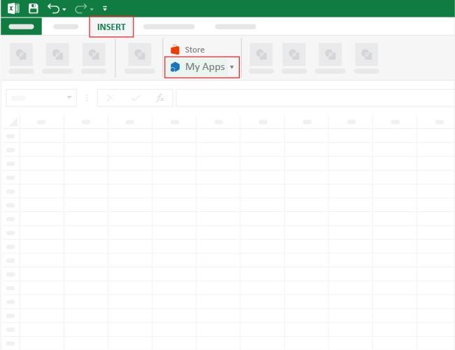
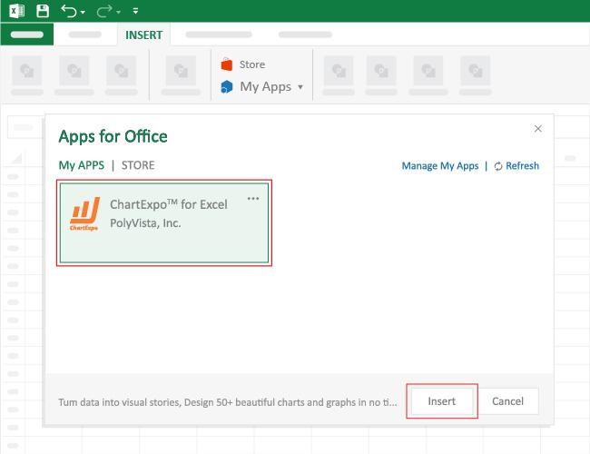
How to Install ChartExpo in Excel?

  1. Open your Excel application.
  2. Open the worksheet and click the “Insert” menu.
  3. You’ll see the “My Apps” option.
  4. In the Office Add-ins window, click “Store” and search for ChartExpo on my Apps Store.
  5. Click the “Add” button to install ChartExpo in your Excel.

ChartExpo charts are available both in Google Sheets and Microsoft Excel. Please use the following CTAs to install the tool of your choice and create beautiful visualizations with a few clicks in your favorite tool.

Example

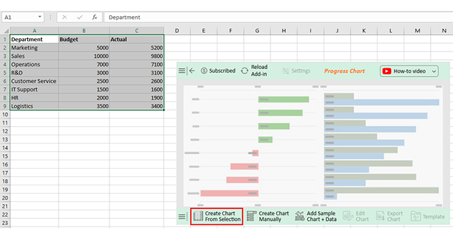
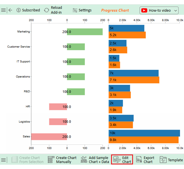
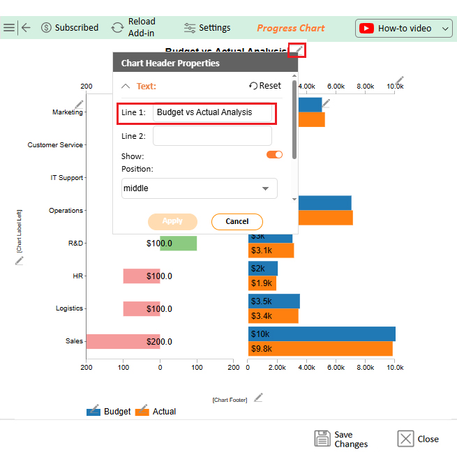
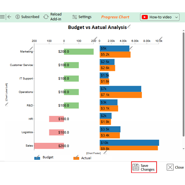
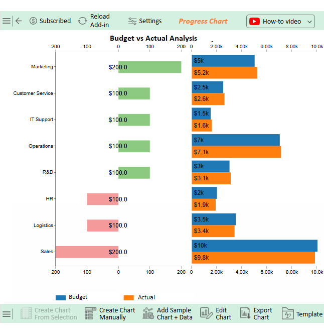
Let’s learn how to create a monthly budget in Excel and analyze it using ChartExpo.
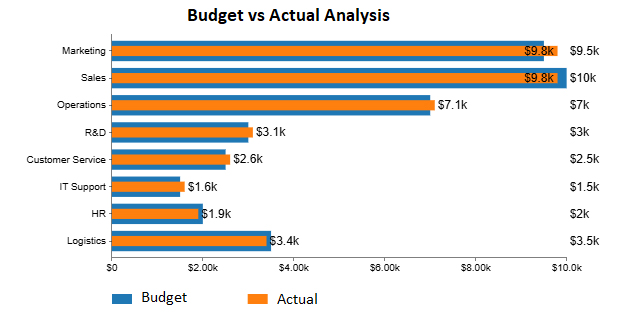
Department Budget Actual
Marketing 5000 5200
Sales 10000 9800
Operations 7000 7100
R&D 3000 3100
Customer Service 2500 2600
IT Support 1500 1600
HR 2000 1900
Logistics 3500 3400
  • To get started with ChartExpo, install ChartExpo in Excel.
  • Now, click on My Apps from the INSERT menu.
Budget vs. Actual Excel Template
  • Choose ChartExpo from My Apps, then click Insert.
Budget vs. Actual Excel Template
  • Once it loads, scroll through the charts list to locate and choose the “Progress Chart”.
Budget vs. Actual Excel Template
  • The Progress Chart will appear as below.
Budget vs. Actual Excel Template
  • Click the “Create Chart From Selection” button after selecting the data from the sheet, as shown.
Budget vs. Actual Excel Template
  • ChartExpo will generate the visualization below for you.
Budget vs. Actual Excel Template
  • If you want to add anything to the chart, click the Edit Chart button:
  • Click the pencil icon next to the Chart Header to change the title.
  • It will open the properties dialog. Under the Text section, you can add a heading in Line 1 and enable Show.
  • Give the appropriate title of your chart and click the Apply button.
Budget vs. Actual Excel Template
  • You can add the dollar sign with axis values as follows:
Budget vs. Actual Excel Template
  • Click the “Save Changes” button to persist the changes made to the chart.
Budget vs. Actual Excel Template
  • Your final Progress Chart will look like the one below.
Budget vs. Actual Excel Template

Insights

  • Sales department: Used the highest budget, spending $200 more than forecasted.
  • Marketing department: Stayed under budget, using $200 less than the $5,000 forecasted amount.

How to Use a Budget vs. Actual Template in Excel?

A budget is only as good as your ability to follow and adjust it. A budget vs. actual Excel template helps turn plans into action and numbers into insight. Here’s how to use it effectively—and get real results:

  1. Download or build your template: You can choose a ready-made template or create one from scratch. Many tools, like a monthly financial report template in Excel, already have this feature.
  2. Enter your budgeted amounts: Start by filling in what you plan to spend or earn. These numbers set the benchmark for tracking your financial performance.
  3. Record actual expenses regularly: Update the template with real figures throughout the month. Accuracy here gives you a clear view of your progress.
  4. Review variance automatically: The template calculates the difference between your budget and actuals. This helps you quickly spot overspending or missed targets.
  5. Analyze monthly trends and adjust accordingly: Look at patterns over time to see where you consistently go off track. Use that insight to refine your future budgets for better accuracy.
  6. Use percentage variance to understand impact: This shows the gap size in context, not just in dollars but as a percentage of your original plan. It highlights what needs your attention.

Best Practices for Using Excel Budget vs. Actual Templates

A budget that sits untouched is as helpful as a blank sheet. A budget vs. actual Excel template only works if you work with it. The proper habits turn it from a static file into a financial game-changer.

Here are some of the best practices to get the most out of your template.

  • Stick to consistent categories: Label the same categories each month—rent, supplies, travel, etc. This makes tracking and comparing easier and keeps your monthly budget examples clean and organized.
  • Keep the data fresh: Update the sheet regularly, not once a month. Real-time numbers give you better control and faster decisions.
  • Let Excel do the math: Use formulas to calculate totals, variances, and percentages. Automating these steps reduces errors and saves time.
  • Use visuals that speak: Apply conditional formatting to highlight key changes. Add charts to turn raw data into a story you can understand at a glance.
  • Organize with tabs: Create separate monthly, department, or project sheets. This keeps your file clean and easy to navigate, especially for larger budgets like a construction budget spreadsheet.
  • Plan realistically, review often: Set budgets based on actual data, not hope. Then, review performance monthly and adjust using tools like a monthly cash flow template in Excel.

FAQs

How to compare actual vs. budget in Excel?

  • Enter budgeted and actual values in separate columns.
  • Use formulas to calculate the variance (Actual – Budget).
  • Add a column for percentage variance.
  • Apply conditional formatting to highlight over-/under-spending.
  • Review regularly to track financial accuracy.

What is the budget vs. actual dashboard template in Excel?

It’s a pre-built Excel file that compares planned and actual figures. It includes charts, totals, and variance metrics. This tool is useful for tracking goals and expenses. It combines numbers and visuals in one view for faster, clearer financial decisions.

How to show budget vs. actual in an Excel graph?

  • Highlight the budget and actual data.
  • Insert a clustered column or bar chart.
  • Use different colors for budget vs. actual columns.
  • Add labels and titles for clarity.
  • Optional: Include a budget deficit by year graph for trend analysis.

Wrap Up

A budget vs. actual Excel template is more than just numbers. It shows the difference between your plans and reality, helping you stay in control of your finances.

This template is simple to build. Add your budgeted and actual figures side by side. Then, use formulas to calculate variance and percentage. You can pair it with profit and loss templates in Excel. This gives you a complete view of your income, expenses, and performance, helping you make smarter financial decisions.

Use monthly budget examples to get started fast. These examples save time and guide your structure. They’re perfect for both personal and business use.

Learning how to create a monthly budget in Excel is a skill that pays off. It keeps your spending in check. And it helps you spot patterns before they become problems.

Install ChartExpo to see it all clearly. This tool transforms raw data into smart, simple visuals, making your budget not only accurate but also easy to understand.

How much did you enjoy this article?

ExcelAd2
Start Free Trial!
154176

Related articles

next previous
Microsoft Excel10 min read

How to Convert XML to Excel: Step-by-Step Walkthrough

Learn how to convert XML to Excel. This blog post has the tips, tools, and charting options to make your data easier to analyze and present.

Microsoft Excel13 min read

How to Calculate Payback Period in Excel? Like a Pro

Dive into importance of calculating payback period! Our guide provides expert insights and step-by-step instructions to help you get informed financial decisions.

Microsoft Excel9 min read

Data Formatting in Excel for Quick and Effective Insights

Discover data formatting in Excel for clear, organized spreadsheets. You’ll learn simple steps to format, clean, and analyze data with top tools and charts.

Microsoft Excel9 min read

Flat Files: Turning Raw Data into Actionable Reports

Flat files are easy-to-use text-based data formats perfect for Excel, analytics, and fast visualization workflows.

Microsoft Excel8 min read

Comma Delimited File: Insights in Excel Made Easy

Comma-delimited file use in Excel lets you move, analyze, and visualize structured data with speed and clarity.

ChartExpo logo

Turn Data into Visual
Stories

CHARTEXPO

  • Home
  • Gallery
  • Videos
  • Services
  • Pricing
  • Contact us
  • FAQs
  • Privacy policy
  • Terms of Service
  • Sitemap

TOOLS

  • ChartExpo for Google Sheets
  • ChartExpo for Microsoft Excel
  • Power BI Custom Visuals by ChartExpo
  • Word Cloud

CATEGORIES

  • Bar Charts
  • Circle Graphs
  • Column Charts
  • Combo Charts
  • Comparison Charts
  • Line Graphs
  • PPC Charts
  • Sentiment Analysis Charts
  • Survey Charts

TOP CHARTS

  • Sankey Diagram
  • Likert Scale Chart
  • Comparison Bar Chart
  • Pareto Chart
  • Funnel Chart
  • Gauge Chart
  • Radar Chart
  • Radial Bar Chart
  • Sunburst Chart
  • see more
  • Scatter Plot Chart
  • CSAT Survey Bar Chart
  • CSAT Survey Chart
  • Dot Plot Chart
  • Double Bar Graph
  • Matrix Chart
  • Multi Axis Line Chart
  • Overlapping Bar Chart
  • Control Chart
  • Slope Chart
  • Clustered Bar Chart
  • Clustered Column Chart
  • Box and Whisker Plot
  • Tornado Chart
  • Waterfall Chart
  • Word Cloud
  • see less

RESOURCES

  • Blog
  • Resources
  • YouTube
SIGN UP FOR UPDATES

We wouldn't dream of spamming you or selling your info.

© 2025 ChartExpo, all rights reserved.