• Home
  • Tools dropdown img
    • Spreadsheet Charts

      • ChartExpo for Google Sheets
      • ChartExpo for Microsoft Excel
    • Power BI Charts

      • Power BI Custom Visuals by ChartExpo
    • Word Cloud

  • Charts dropdown img
    • Chart Category

      • Bar Charts
      • Circle Graphs
      • Column Charts
      • Combo Charts
      • Comparison Charts
      • Line Graphs
      • PPC Charts
      • Sentiment Analysis Charts
      • Survey Charts
    • Chart Type

      • Box and Whisker Plot
      • Clustered Bar Chart
      • Clustered Column Chart
      • Comparison Bar Chart
      • Control Chart
      • CSAT Survey Bar Chart
      • CSAT Survey Chart
      • Dot Plot Chart
      • Double Bar Graph
      • Funnel Chart
      • Gauge Chart
      • Likert Scale Chart
      • Matrix Chart
      • Multi Axis Line Chart
      • Overlapping Bar Chart
      • Pareto Chart
      • Radar Chart
      • Radial Bar Chart
      • Sankey Diagram
      • Scatter Plot Chart
      • Slope Chart
      • Sunburst Chart
      • Tornado Chart
      • Waterfall Chart
      • Word Cloud
    • Google Sheets
      Microsoft Excel
  • Services
  • Pricing
  • Contact us
  • Blog
  • Support dropdown img
      • Gallery
      • Videos
      • Contact us
      • FAQs
      • Resources
    • Please feel free to contact us

      atsupport@chartexpo.com

Categories
All Data Visualizations Data Analytics Surveys
Add-ons/
  • Google Sheets
  • Microsoft Excel
  • Power BI
All Data Visualizations Data Analytics Surveys
Add-ons
  • Google Sheets
  • Microsoft Excel
  • Power BI

We use cookies

This website uses cookies to provide better user experience and user's session management.
By continuing visiting this website you consent the use of these cookies.

Ok

ChartExpo Survey


Home > Blog > Microsoft Excel

Percentage Change Formula in Excel to Visualize Changes

Raw numbers rarely tell the full story. Two companies both report a $50,000 revenue gain, yet one grew 2% while the other jumped 40%. That gap defines the entire meaning of the result.

Percentage Change Formula in Excel

The percentage change formula in Excel converts those raw figures into a proportional context, giving analysts the comparative footing needed to evaluate performance, spot trends, and communicate results with precision.

This guide walks through the core concepts of proportional measurement in spreadsheets, covers multiple calculation methods, and shows how to apply the formula accurately across real data sets. Whether you track sales figures, quarterly budgets, or operational metrics, mastering this skill translates directly into faster, more reliable analysis at every stage of reporting.

Table of Contents:

  1. What is a Percentage Change in Excel?
  2. Why is the Percentage Change in Excel Important?
  3. Calculate Percentage Change in Excel: 2 Easy Methods
  4. Percentage Change Formula in Excel Explained
  5. How to Calculate Percentage Change in Excel?
  6. Percentage Change Examples in Excel
  7. How to Analyze Percentage Change in Excel?
  8. Benefits of Calculating Percentage Change in Excel
  9. Common Errors When Calculating Percentage Change in Excel
  10. Tips for Working with Percentage Change in Excel
  11. FAQs
  12. Wrap Up

What is a Percentage Change in Excel?

Definition: The percentage change formula in Excel quantifies how much a value shifts relative to its starting point, expressing that movement as a proportion rather than a flat number.

Two figures can differ by the same dollar amount yet carry completely different meanings once proportional context enters the picture. That contrast is what makes this calculation so fundamental to spreadsheet analysis.

Applying the percentage change formula in Excel shifts the focus to the relative size of a movement rather than just its direction. A revenue gain of 500 units signals modest progress at 2% but represents a major breakthrough at 40%, and that distinction drives better reporting cycles.

Why is the Percentage Change in Excel Important?

Numbers in isolation answer what happened, but not how much it mattered. The percentage change formula in Excel fills that gap, turning a raw figure into a verdict on both scale and direction.

Using the percentage change formula offers several advantages:

  • Tracks growth and decline over time: Shows whether key metrics are moving forward, plateauing, or deteriorating across periods, particularly when displayed as a year-over-year comparison chart for visual context.
  • Compares performance between periods: Normalizes differences across timeframes so results from one quarter can be measured fairly against the next.
  • Supports financial and sales analysis: Puts revenue shifts, cost changes, and profitability movements into proportional terms that go beyond simple dollar figures.
  • Highlights trends in business data: Surfaces consistent directional movement that raw values can obscure, especially when displayed alongside a percentage bar graph.
  • Improves decision-making accuracy: Grounds strategic choices in relative scale rather than nominal figures, reducing the risk of overreacting to large numbers with small proportional impact.
  • Simplifies reporting and forecasting: Compresses complex datasets into clear percentage signals that are easier to present, summarize, and project using Excel chart templates.
  • Works across multiple industries: Applies equally in marketing, healthcare, operations, education, and finance, making it one of the most transferable analytical tools available.

Calculate Percentage Change in Excel: 2 Easy Methods

Excel offers more than one path to the same answer when computing proportional change. The right approach depends on your data structure, reporting context, and the level of formula complexity the task requires.

Two widely used approaches for computing this metric are:

Formula-based calculation:

  • Uses the percentage change formula in Excel to dynamically compute results that automatically update when values change, which is especially useful when applying Excel automation.

Excel built-in formatting methods:

  • Relies on preconfigured display options to show proportional differences without constructing a formula from scratch.

Percentage Change Formula in Excel Explained

Before building any calculation, it helps to understand what the percentage change formula in Excel is actually doing. Each variation serves a slightly different analytical purpose, and selecting the right one shapes the quality of the output.

The main formula variations are as follows:

  • Standard Method: Calculates change using (New Value – Original Value) / Original Value, which directly measures proportional increase or decrease.
  • Alternative Method: Computes change with (New Value / Original Value) – 1, a structure commonly used in financial models and Excel add-ins for data analysis.
  • With Percentage Points: Finds the difference between two percentages using (New Percentage – Original Percentage), focusing on absolute gaps rather than relative change.

How to Calculate Percentage Change in Excel?

Calculating the percentage change in Excel follows a consistent sequence. Once learned, the process becomes second nature.

Key steps include:

  • Identify original and new values

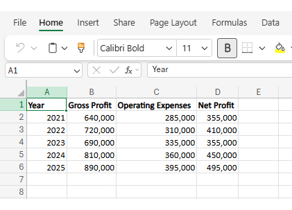
Select the starting value and the updated value that will be compared. For example, when evaluating Net Profit for 2022, we compare:

Original → 355,000 (2021)
New → 410,000 (2022)

Percentage Change Formula in Excel
  • Subtract the original from the new value

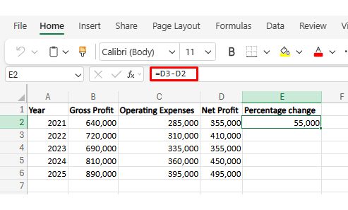
Calculate the raw difference to determine how much the value changed.

Percentage Change Formula in Excel
  • Divide the result by the original value

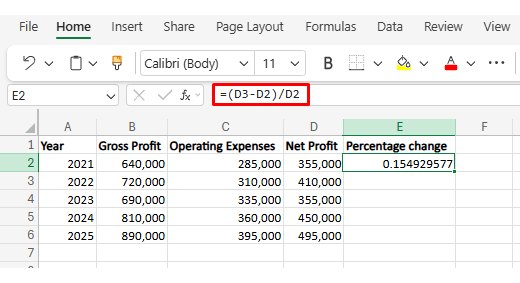
Convert the difference into a proportional change relative to the baseline.

Percentage Change Formula in Excel
  • Apply percentage format

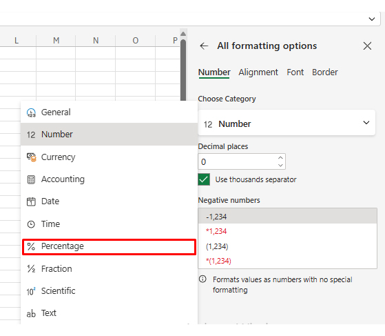
Display the result as a percentage for clearer interpretation using proper data formatting in Excel.

Percentage Change Formula in Excel
  • Select Percentage

Percentage Change Formula in Excel
  • Copy formula across rows

Extend the calculation to other data points for efficiency and consistency.

Percentage Change Formula in Excel
  • Handle negative values correctly

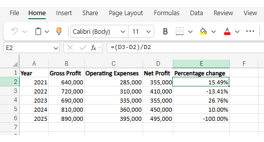
Interpret decreases properly to avoid misreading declines as errors.

Negative = decline (not an error)

  • Validate results with examples

Double-check calculations using known values to ensure accuracy.

For 2025:

Original = 450,000 (2024)
New = 495,000 (2025)

Difference = 45,000

45,000 / 450,000 = 0.10 → 10%

Reasonable and consistent.

Percentage Change Examples in Excel

Real examples clarify how the percentage change formula works in practical scenarios. Consider the following cases:

  • Quarterly Budget Changes and Cost Reduction Analysis

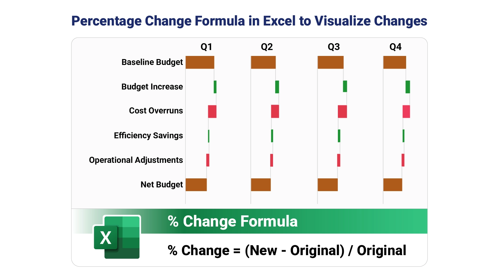
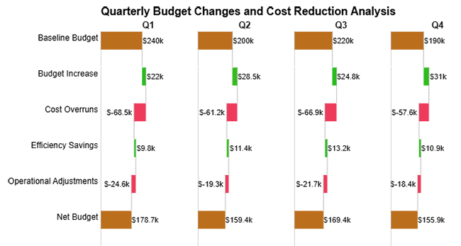
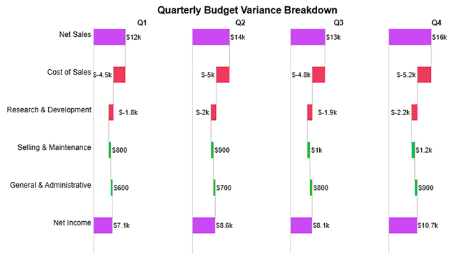
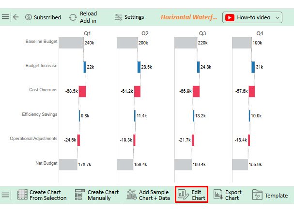
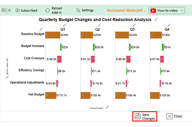
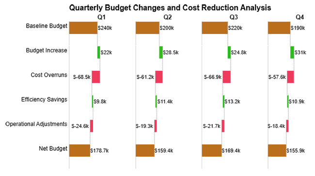
The quarterly budget changes and cost reduction analysis clearly shows that recurring cost overruns consistently reduce gains from budget increases, leading to fluctuating net balances across quarters.

Percentage Change Formula in Excel
  • Quarterly Financial Components Driving Net Profit

The quarterly financial components driving net profit example illustrates how revenue growth and expense fluctuations collectively influence net profit variations across quarters.

Percentage Change Formula in Excel
  • Quarterly Budget Variance Breakdown

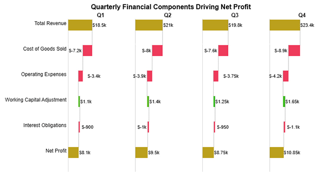
This breakdown demonstrates how changes in sales performance, cost drivers, and operating components each carry distinct proportional weight when shaping net income period over period.

Percentage Change Formula in Excel

How to Analyze Percentage Change in Excel?

Running the numbers with the percentage change formula in Excel is only the first step. Converting those figures into decisions requires a structured approach to reading what the data is actually communicating.

  • Identify patterns: Look for consistent growth, decline, or volatility.
  • Compare time periods: Evaluate whether changes are seasonal or structural.
  • Segment the data: Break down results by categories or regions using techniques like custom sorting in Excel.
  • Visualize movements: Charts simplify recognition of trends, especially when supported by clear chart formatting in Excel.
  • Validate assumptions: Confirm that base values are correct.

Pairing the percentage change formula in Excel with disciplined analytical habits and the right visualization tools amplifies every insight the data contains. A chart communicates in seconds what a column of percentages takes minutes to decode.

Why use ChartExpo?

  • Renders proportional data in formats that any audience can read without additional explanation.
  • Surfaces directional movements buried inside dense numerical tables that would otherwise require careful reading.
  • Cuts the effort required to build presentation-ready visuals from your spreadsheet data.
  • Available on a 7-day free trial with a $10 per month subscription after the trial period ends.

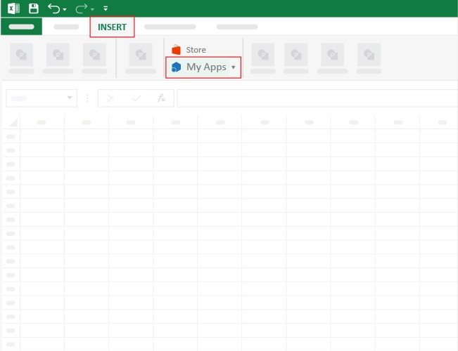
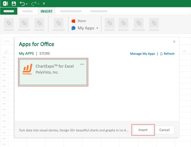
How to install ChartExpo in Excel?

  1. Open your Microsoft Excel.
  2. Start a worksheet and go to the ribbon tab named Insert.
  3. To open the window on Office Add-ins, click on My Apps.
  4. Go to the Add-ins window, and in the “/Store tab,” search ChartExpo.
  5. After finding it, click the Add button to install it.

Example:

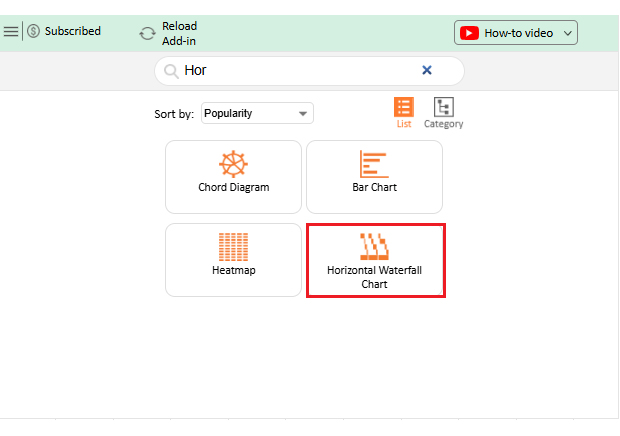
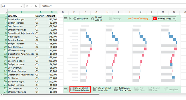
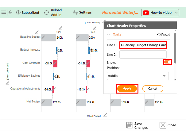
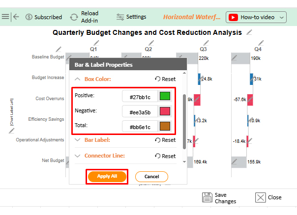
Consider we have the following data for the Horizontal Waterfall Chart.

Category

Quarter

Amount

Baseline Budget Q1 240,000
Budget Increase Q1 22,000
Cost Overruns Q1 -68,500
Efficiency Savings Q1 9,800
Operational Adjustments Q1 -24,600
Net Budget Q1 178,700
Baseline Budget Q2 200,000
Budget Increase Q2 28,500
Cost Overruns Q2 -61,200
Efficiency Savings Q2 11,400
Operational Adjustments Q2 -19,300
Net Budget Q2 159,400
Baseline Budget Q3 220,000
Budget Increase Q3 24,800
Cost Overruns Q3 -66,900
Efficiency Savings Q3 13,200
Operational Adjustments Q3 -21,700
Net Budget Q3 169,400
Baseline Budget Q4 190,000
Budget Increase Q4 31,000
Cost Overruns Q4 -57,600
Efficiency Savings Q4 10,900
Operational Adjustments Q4 -18,400
Net Budget Q4 155,900
  • Once ChartExpo is installed, please click on the “INSERT” menu and then click on the “My Apps” submenu.
Percentage Change Formula in Excel
  • This will open the Apps for Office window. Find ChartExpo in the list and press the Insert button to make it appear in your Excel workbook.
Percentage Change Formula in Excel
  • Once ChartExpo is loaded into your sheet, you can search or select “Horizontal Waterfall Chart” from the list.
Percentage Change Formula in Excel
  • Next, select your data and click the “Create Chart from Selection” button.
Percentage Change Formula in Excel
  • To customize your chart, just click on the “Edit Chart” option to make adjustments effortlessly.
Percentage Change Formula in Excel
  • To change the chart’s title, select the pencil icon on the header. Then, enter the text you want and press Apply.
Percentage Change Formula in Excel
  • You can change box colors as well.
Percentage Change Formula in Excel
  • You can add a prefix sign.
Percentage Change Formula in Excel
  • Next, you can increase the font size for better readability.
Percentage Change Formula in Excel
  • When you are done with all the changes, click the “Save” button to save them.
Percentage Change Formula in Excel
  • The final look of the Horizontal Waterfall Chart is shown below.
Percentage Change Formula in Excel

Key Insights

  • Across every quarter, cost overruns rank as the single largest drag on the net budget result.
  • Between the first and final quarter, the net budget peaks at the opening period, while Q4 posts the lowest result despite carrying the highest budget increases of any quarter.
  • Even as budget allocations grow each period, the recurring expense load prevents those gains from producing proportional improvements in the net result.

Benefits of Calculating Percentage Change in Excel

Proportional analysis, powered by the percentage change formula in Excel, converts data complexity into clarity. Applying it consistently across datasets raises the quality and credibility of every performance report.

Key advantages include:

  • Clear performance measurement: Quantifies increases or decreases in a standardized, easy-to-understand format.
  • Easy comparison across datasets: Allows proportional evaluation even when values differ greatly in scale.
  • Better trend identification: Helps reveal consistent patterns and directional movement over time.
  • Improved business insights: Converts raw figures into actionable information for strategic decisions.
  • Faster data interpretation: Makes it easier to assess changes without manually analyzing numeric differences.
  • Scalable for large spreadsheets: Works efficiently across extensive datasets, particularly when using an Excel online worksheet for collaboration.
  • Data consistency and accuracy: Ensures reliable calculations when supported by data validation in Excel.

Common Errors When Calculating Percentage Change in Excel

Even a straightforward formula like the percentage change formula in Excel produces errors more often than expected. Most missteps trace back to a small set of repeated habits that quietly distort analysis.

Frequent issues include:

  • Dividing by incorrect base value: Using the wrong starting value changes the entire result and produces misleading percentages.
  • Forgetting percentage formatting: Displaying decimals instead of percentages can cause misinterpretation of the outcome.
  • Using wrong cell references: Pulling values from unintended cells injects false data into the formula, a risk that careful formula auditing helps catch before errors propagate through the analysis.
  • Ignoring negative values: Overlooking decreases leads to flawed conclusions about performance or trends.
  • Mixing absolute and relative references: Inconsistent references create errors when formulas are copied across cells.
  • Misinterpreting zero values: Calculations involving zero can generate errors or undefined results if not handled properly.

Tips for Working with Percentage Change in Excel

A few consistent habits eliminate most percentage change formula errors in Excel before they ever reach a finished report, saving time on corrections and boosting confidence in every output.

Useful recommendations:

  • Always verify base value: Ensure calculations reference the correct original value to avoid distorted percentages.
  • Use consistent data ranges: Maintain uniform selection of cells so formulas behave predictably across datasets.
  • Apply conditional formatting: Highlight increases or decreases visually to improve data interpretation speed.
  • Label columns clearly: Prevent confusion by explicitly identifying original values, new values, and results.
  • Check results with sample data: Validate formulas using known inputs to confirm calculation accuracy.
  • Combine with charts for clarity: Visual representations make percentage movements easier to understand and communicate.

FAQs

What is the percentage change when 25 is increased to 45?

Subtract 25 from 45 to get 20, then divide 20 by 25. The result is 0.8, or 80%.

What is the percentage change in statistics?

It quantifies how a value shifts in relation to a reference point by expressing that gap as a proportion of the original.

How do I calculate the percentage difference between two numbers?

Percentage difference uses the average of both values as the reference, while percentage change uses the original value as the base denominator.

Wrap Up

Adopting the percentage change formula in Excel as a core part of your workflow changes how you read data from the ground up. Proportional context replaces the noise of raw figures with clear signals about the magnitude and direction of every shift, making each report more actionable at first glance and easier to defend under scrutiny.

Combine that formula discipline with rigorous validation habits, clean column labeling, and well-chosen visual formats, and the result is analysis that stakeholders can interpret and act on without further explanation. These are transferable skills that hold value across every industry, every data type, and every reporting cycle you face.

How much did you enjoy this article?

ExcelAd1
Start Free Trial!
159997

Related articles

next previous
Microsoft Excel7 min read

How to Create Sankey Diagram in Excel? Easy Steps

Create your own Sankey diagram in Excel with simple steps. This guide shows you how to build, format, and customize a professional flow chart without coding.

Microsoft Excel10 min read

How to Build a Finance Dashboard in Excel Step by Step

Learn how to create a finance dashboard in Excel and track key metrics, visualize data, and gain actionable insights to make smarter financial decisions.

Microsoft Excel8 min read

How to Create a Heatmap in Excel: A Practical Guide

Transform spreadsheet data into color-coded visuals with a Heatmap in Excel. Learn two methods and see when color intensity beats numbers. Discover now!

Microsoft Excel12 min read

15 Financial Charts Every Business Should Use

Explore 15 best financial charts to track revenue, costs, and profits, simplifying analysis and helping businesses make smarter financial decisions.

Microsoft Excel8 min read

Treemap in Excel: From Data to Clear Insights

Build nested rectangle charts that expose hidden patterns in layered datasets. Discover techniques for hierarchical analysis. Learn more!

ChartExpo logo

Turn Data into Visual
Stories

CHARTEXPO

  • Home
  • Gallery
  • Videos
  • Services
  • Pricing
  • Contact us
  • FAQs
  • Privacy policy
  • Terms of Service
  • Sitemap

TOOLS

  • ChartExpo for Google Sheets
  • ChartExpo for Microsoft Excel
  • Power BI Custom Visuals by ChartExpo
  • Word Cloud

CATEGORIES

  • Bar Charts
  • Circle Graphs
  • Column Charts
  • Combo Charts
  • Comparison Charts
  • Line Graphs
  • PPC Charts
  • Sentiment Analysis Charts
  • Survey Charts

TOP CHARTS

  • Sankey Diagram
  • Likert Scale Chart
  • Comparison Bar Chart
  • Pareto Chart
  • Funnel Chart
  • Gauge Chart
  • Radar Chart
  • Radial Bar Chart
  • Sunburst Chart
  • see more
  • Scatter Plot Chart
  • CSAT Survey Bar Chart
  • CSAT Survey Chart
  • Dot Plot Chart
  • Double Bar Graph
  • Matrix Chart
  • Multi Axis Line Chart
  • Overlapping Bar Chart
  • Control Chart
  • Slope Chart
  • Clustered Bar Chart
  • Clustered Column Chart
  • Box and Whisker Plot
  • Tornado Chart
  • Waterfall Chart
  • Word Cloud
  • see less

RESOURCES

  • Blog
  • Resources
  • YouTube
SIGN UP FOR UPDATES

We wouldn't dream of spamming you or selling your info.

© 2026 ChartExpo, all rights reserved.