• Home
  • Tools dropdown img
    • Spreadsheet Charts

      • ChartExpo for Google Sheets
      • ChartExpo for Microsoft Excel
    • Power BI Charts

      • Power BI Custom Visuals by ChartExpo
    • Word Cloud

  • Charts dropdown img
    • Chart Category

      • Bar Charts
      • Circle Graphs
      • Column Charts
      • Combo Charts
      • Comparison Charts
      • Line Graphs
      • PPC Charts
      • Sentiment Analysis Charts
      • Survey Charts
    • Chart Type

      • Box and Whisker Plot
      • Clustered Bar Chart
      • Clustered Column Chart
      • Comparison Bar Chart
      • Control Chart
      • CSAT Survey Bar Chart
      • CSAT Survey Chart
      • Dot Plot Chart
      • Double Bar Graph
      • Funnel Chart
      • Gauge Chart
      • Likert Scale Chart
      • Matrix Chart
      • Multi Axis Line Chart
      • Overlapping Bar Chart
      • Pareto Chart
      • Radar Chart
      • Radial Bar Chart
      • Sankey Diagram
      • Scatter Plot Chart
      • Slope Chart
      • Sunburst Chart
      • Tornado Chart
      • Waterfall Chart
      • Word Cloud
    • Google Sheets
      Microsoft Excel
  • Services
  • Pricing
  • Contact us
  • Blog
  • Support dropdown img
      • Gallery
      • Videos
      • Contact us
      • FAQs
      • Resources
    • Please feel free to contact us

      atsupport@chartexpo.com

Categories
All Data Visualizations Data Analytics Surveys
Add-ons/
  • Google Sheets
  • Microsoft Excel
  • Power BI
All Data Visualizations Data Analytics Surveys
Add-ons
  • Google Sheets
  • Microsoft Excel
  • Power BI

We use cookies

This website uses cookies to provide better user experience and user's session management.
By continuing visiting this website you consent the use of these cookies.

Ok

ChartExpo Survey


Home > Blog > Data Visualization

Percentage Bar Graph: A Step-by-Step Guide

Understanding how data is distributed across categories becomes much easier when you view it as a percentage.

A percentage bar graph converts raw values into proportions, helping you compare how each segment contributes to the whole.

Instead of focusing on absolute numbers, this type of chart highlights relative differences.

This makes it especially useful when comparing categories across groups, such as survey responses, market share, or performance breakdowns.

Percentage Bar Graph

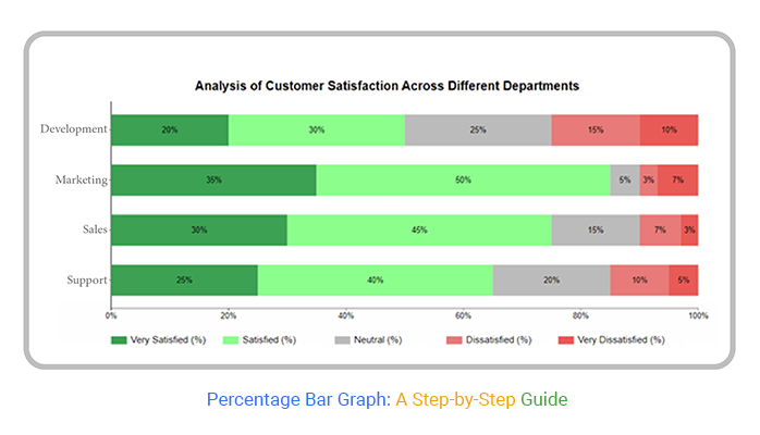
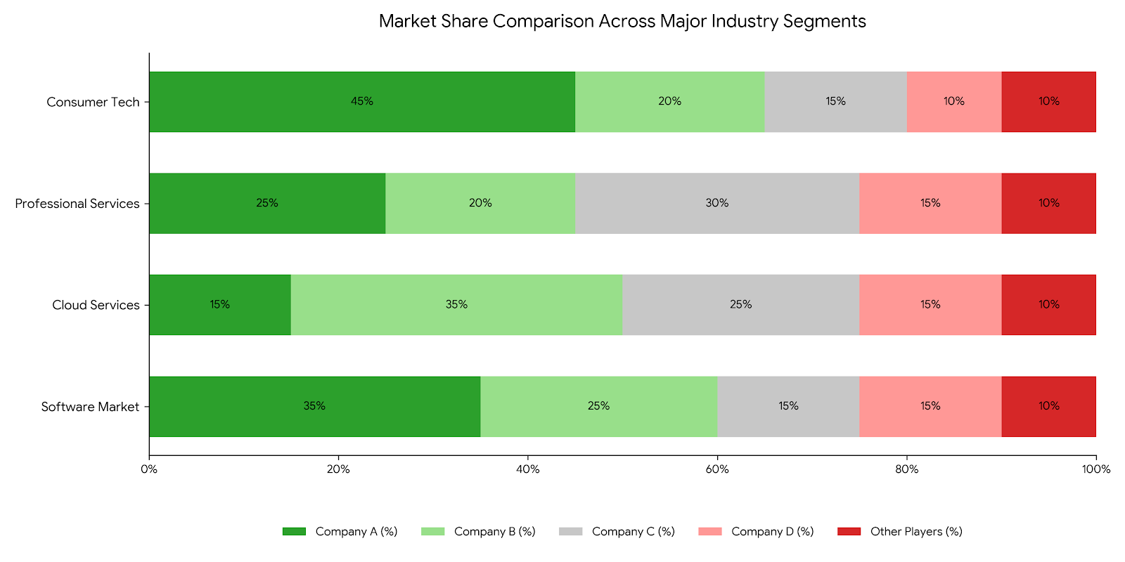
For example, in a market share analysis, a percentage bar graph clearly shows how each company contributes to the total.

You can quickly identify dominant segments, balanced distributions, or gaps between competitors without scanning detailed tables.

This is what makes percentage bar charts valuable.

They simplify comparison, reveal patterns, and make insights easier to interpret across Excel, Power BI, or Google Sheets.

What is a Percentage Bar Graph?

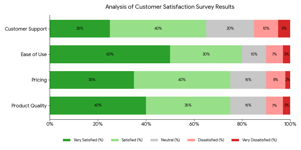
Definition: A percentage bar graph is a chart that displays data as proportions of a whole, where each bar represents 100%.

The bar is divided into segments, with each segment showing the percentage contribution of a category.

Instead of focusing on raw values, this graph emphasizes relative distribution.

It allows you to compare how different categories contribute to the total across one or multiple groups.

Because each bar is standardized to 100%, percentage bar charts make it easy to identify dominant segments, balanced distributions, and variations between datasets.

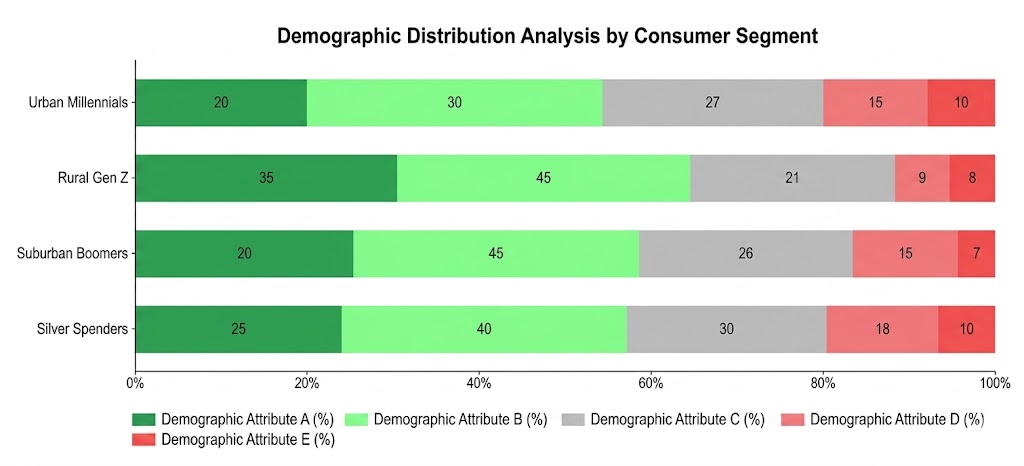
These graphs are widely used in surveys, market analysis, and performance reporting, where understanding proportion and comparison is more important than absolute numbers.

Key Features of the Percentage Bar Diagram

A percentage bar diagram is designed to simplify comparison by focusing on proportions rather than raw values.

Its structure makes it easy to analyze how different categories contribute to a whole.

  • Each Bar Represents 100%: Every bar in the diagram is standardized to 100%. This allows consistent comparison across different groups, regardless of their actual totals.
  • Segmented Distribution: Each bar is divided into segments, with each segment representing a category’s percentage share, much like a Segmented bar graph. This makes it easy to see how the total is distributed within each group.
  • Focus on Relative Comparison: Instead of absolute numbers, the diagram emphasizes proportions. This helps identify dominant categories, balanced distributions, or gaps between segments.
  • Consistent Scale Across Categories: Since all bars use the same percentage scale, you can compare multiple groups side by side without distortion or scale mismatch.
  • Ideal for Multi-Category Analysis: Percentage bar diagrams work well when comparing multiple categories across different groups, such as survey responses, market segments, or performance breakdowns.

Why Use a Percentage Bar Graph?

A percentage bar graph is useful when you want to compare how different categories contribute to the whole.

It focuses on proportions, making patterns easier to interpret than raw numbers.

  • Clear Proportional Comparison: It shows how each category contributes to 100%, allowing quick comparison of relative sizes across groups.
  • Instant Composition Breakdown: You can see how a dataset is structured within a single bar, making it easy to understand the distribution of segments.
  • Easy Cross-Category Comparison: Multiple bars allow you to compare distributions across different groups, helping identify similarities and differences in composition.
  • Simplifies Complex Data: By converting values to percentages, the graph removes scale differences, making the data easier to read and interpret.
  • Highlights Distribution Changes: It helps track how proportions shift across categories, making it useful for comparing changes between groups rather than over time.

When to Use a Percentage Bar Graph

A percentage bar graph is most effective when your goal is to compare how different categories contribute to a whole across one or more groups.

  • Comparing Proportions Across Groups: Use it when you want to compare how distributions differ between categories, such as survey responses across regions or customer segments.
  • Analyzing Part-to-Whole Relationships: It works best when the total for each group equals 100%, and you need to understand how each segment contributes to that total.
  • Working with Survey or Poll Data: Percentage bar graphs are ideal for visualizing survey results where responses are distributed across multiple options.
  • Comparing Composition Instead of Absolute Values: Use this graph when the focus is on relative contribution rather than raw numbers, especially when totals vary between groups.
  • Identifying Dominant or Balanced Segments: It helps quickly highlight which categories dominate and whether the distribution is balanced or skewed.

How to Calculate Percentages

Calculating percentages for a graph is simple when you follow a consistent approach.

The goal is to convert raw values into proportions so each category can be compared within a total.

Step 1: Determine the Total Value

  • Start by calculating the sum of all data points. This total acts as the reference (100%) for all percentage calculations.

Step 2: Apply the Percentage Formula

  • For each category, divide its value by the total and multiply by 100.
  • This converts raw data into a percentage share of the whole, as shown in the formula above.
Calculate Percentage for Making Percentage Bar Graph

Step 3: Convert All Data Points

  • Repeat the same calculation for each category to ensure consistency across your dataset. Every value should now represent its proportional contribution.

Step 4: Use Percentages in the Graph

  • Plot the calculated percentages in your graph. Each segment will represent a portion of 100%, making comparisons clear and standardized.

How to Create a Percentage Bar Graph in Excel?

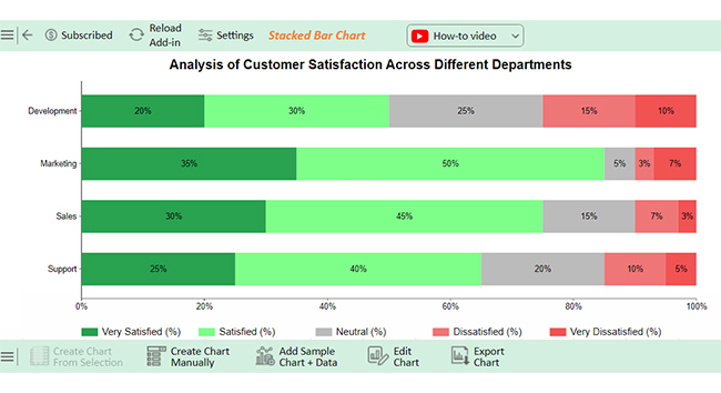
Creating a percentage bar graph in Excel involves converting your data into proportions and visualizing it using a stacked bar chart.

Step 1: Prepare Your Data

Organize your data in a table format:

  • Column A: Categories (e.g., Product, Region, Survey Group)
  • Columns B–D: Sub-categories or segments

Each row should represent one group you want to compare.

Step 2: Calculate Percentages

Convert raw values into percentages so each row totals 100%:

  • Divide each value by the row total
  • Multiply by 100

This ensures your chart reflects proportional distribution instead of absolute values.

Step 3: Select the Data Range

  • Highlight the dataset that includes categories and their percentage values.
  • Make sure the data is clean and consistently formatted.
Initial Visuals for Making Percentage Bar Graph

Step 4: Insert a Stacked Bar Chart

  • Go to the Insert tab in Excel
  • Select Bar Chart → 100% Stacked Bar Chart
Initial Visuals for Making Percentage Bar Graph

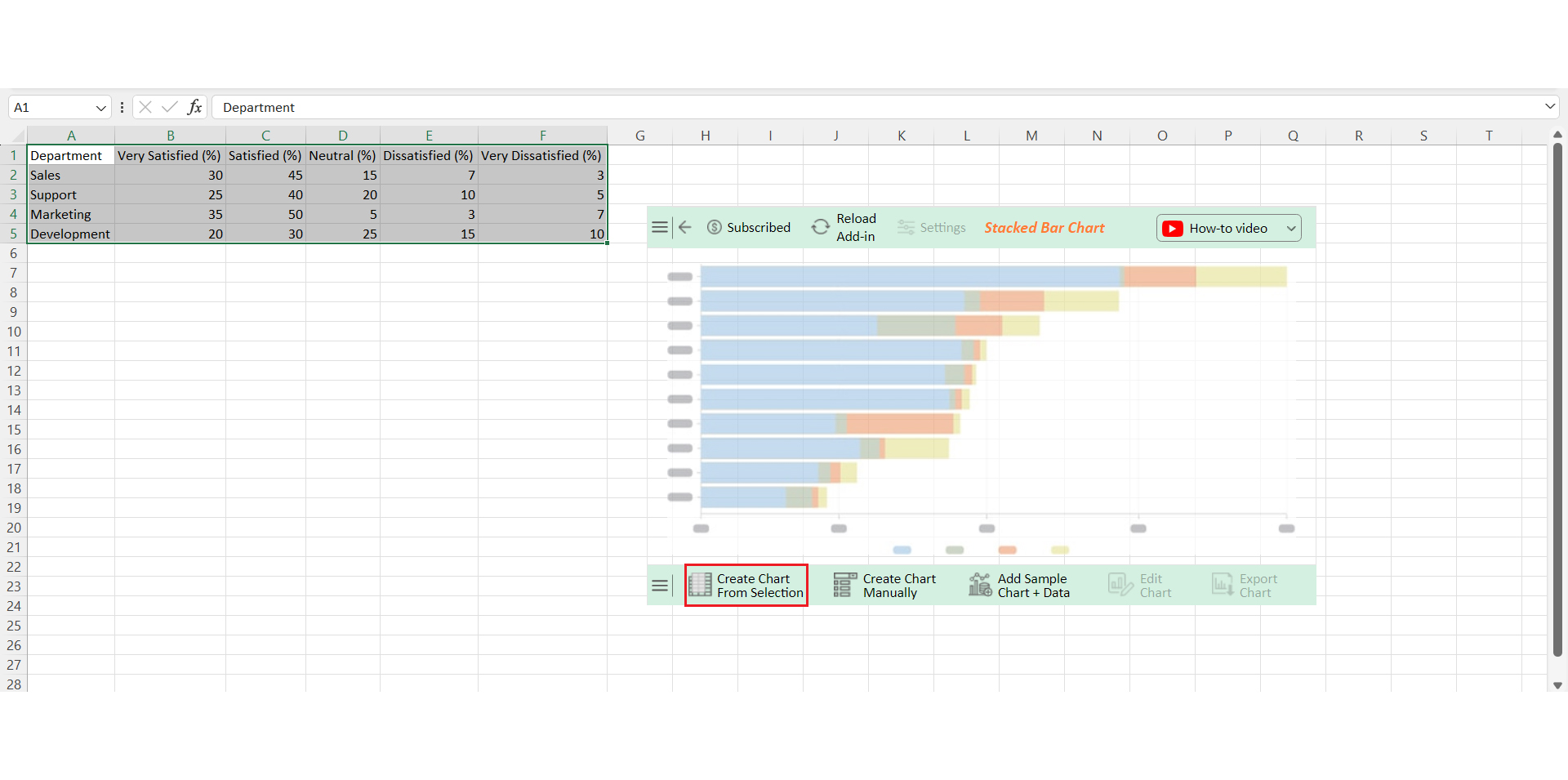
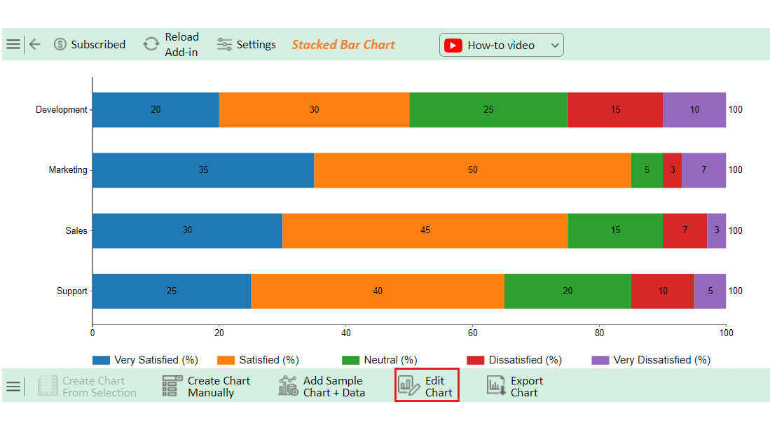
This chart type automatically displays each category as a percentage of the whole.

Step 5: Adjust Chart Layout

Improve readability by:

  • Adding axis titles and a clear chart title
  • Formatting values as percentages
  • Ensuring consistent colors for each segment
Click Save Changes for Making Percentage Bar Graph

Step 6: Enhance Visualization for Better Insights

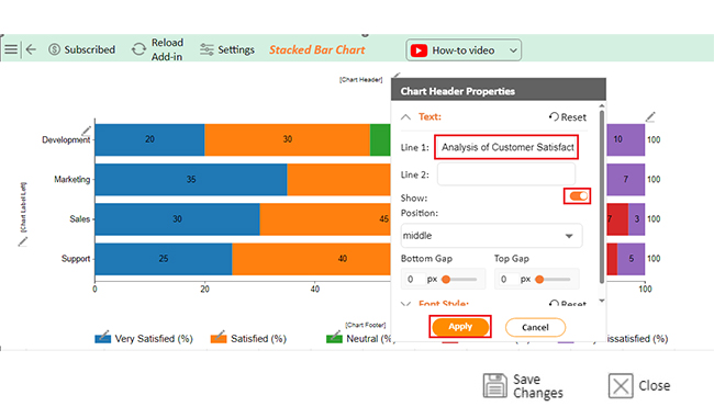
Default Excel charts can be limited in highlighting patterns. For deeper analysis and clearer presentation, you can use Chartexpo to create more advanced and interactive percentage bar charts directly within Excel.

Click Save Changes for Making Percentage Bar Graph

Step 7: Interpret the Graph

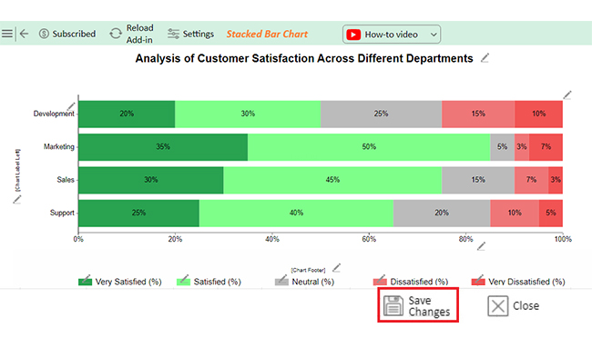
Once your chart is ready, focus on insights:

  • Identify dominant segments within each bar
  • Compare distributions across categories
  • Spot balanced vs. skewed compositions
Final Percentage Bar Graph

Real-World Use Cases of Percentage Bar Diagram

1. Customer Satisfaction Survey Analysis

  • Businesses use percentage bar diagrams to visualize survey responses across categories like “Satisfied,” “Neutral,” and “Dissatisfied.”
  • This helps quickly compare how customer sentiment varies across regions, products, or time periods.
Customer Satisfaction Survey

2. Market Share Comparison

  • Companies use percentage bar diagrams to compare market share distribution across competitors.
  • Each bar represents a market (or year), showing how each company contributes to the total.
Market Share Comparison

3. Demographic Distribution Analysis

  • In research and reporting, percentage bar diagrams are used to show how populations are distributed across categories like age groups, income levels, or education.
Demographic Distribution Analysis

Common Mistakes to Avoid When Creating a Percentage Bar Chart

1. Using Raw Values Instead of Percentages

  • A percentage bar diagram must represent proportions. Plotting raw numbers instead of converting them into percentages breaks the core purpose of the chart and leads to misleading comparisons.

2. Totals Not Equal to 100%

  • Each bar should represent 100%. If your segments don’t add up to 100%, the distribution becomes inaccurate and difficult to interpret.

3. Choosing the Wrong Chart Type

  • Using a standard bar chart instead of a 100% stacked bar chart removes the proportional context. This makes it harder to compare how each category contributes to the whole.

4. Overloading with Too Many Categories

  • Adding too many segments in a single bar makes the chart cluttered and hard to read. Keep categories limited so patterns and differences remain clear.

5. Inconsistent Category Order

  • Changing the order of segments across bars creates confusion. Keeping a consistent sequence helps users compare distributions quickly.

Best Practices for Designing a Percentage Bar Graph

1. Use a Consistent 100% Scale

  • Every bar should represent 100% to maintain an accurate proportional comparison. Any variation in scale can distort interpretation and mislead analysis.

2. Keep Labels Clear and Readable

  • Clearly label each segment and axis so users can instantly understand what each portion represents. Avoid ambiguity by using concise, descriptive category names.

3. Choose Colors That Improve Clarity

  • Use distinct and consistent colors for each category across all bars. Avoid overly bright or similar shades that make segments difficult to differentiate.

4. Display Exact Percentage Values

  • Adding data labels with exact percentages improves precision and reduces the need for guesswork. This is especially useful in reports and dashboards.

5. Keep the Design Simple and Focused

  • Avoid clutter by limiting the number of categories and visual elements. A clean design makes it easier to identify patterns, dominant segments, and comparisons.

FAQs

What are the key differences between a percentage bar graph and a regular bar graph?

  • Data Representation
    • The percentage bar graph shows proportions (each bar = 100%)
    • A regular bar graph shows actual values (counts, totals)
  • Purpose
    • A percentage bar graph focuses on the distribution within a whole
    • A regular bar graph focuses on magnitude comparison
  • Comparison Type
    • The percentage bar graph compares relative contributions across categories
    • A regular bar graph compares absolute differences between values
  • Use Case
    • Percentage: surveys, market share, composition analysis
    • Regular: sales figures, revenue, quantities

How do I add percentage labels to a percentage bar graph in Excel or Google Sheets?

  • In Excel:
    • Select your chart
    • Click on Chart Elements (+ icon)
    • Enable Data Labels
    • Right-click labels → Format Data Labels
    • Choose Percentage and adjust position
  • In Google Sheets:
    • Select the chart → Open Chart Editor
    • Go to Customize → Series
    • Enable Data Labels
    • Set label type to Percentage
  • Best Practice:
    • Keep labels readable and avoid overlap
    • Use consistent formatting (e.g., 0% or 0.0%)

How does a percentage bar graph handle overlapping data points?

  • No Overlapping Values
    • Data is stacked within each bar, so segments don’t overlap
  • Stacked Structure
    • Each category is placed on top of another within the same bar
    • Ensures total always equals 100%
  • Clear Separation of Segments
    • Different colors or patterns distinguish each segment
    • Prevents confusion between categories
  • Improved Readability
    • Eliminates visual clutter compared to overlapping charts
    • Makes distribution easier to interpret

Wrap Up

A percentage bar graph is a simple but effective way to show proportions clearly.

Since every bar represents 100%, they make it easy to compare how different categories contribute to a whole without digging through raw numbers.

They also help turn complex datasets into something instantly readable.

Instead of scanning spreadsheets or long tables, you can quickly see the overall distribution and make faster, more confident decisions based on visual patterns.

Another strength is flexibility.

In Excel, Power BI, and Google Sheets, percentage bar charts are commonly used for survey results, sales breakdowns, budget allocation, and performance comparisons where relative contribution matters more than absolute values.

Design consistency plays a big role in clarity. Clear labels, consistent color coding, and proper scaling ensure the message is not lost in the visuals.

Poor design can distort interpretation, even if the data is correct.

Over time, these graphs also make trend detection easier.

You can track how proportions shift across months, quarters, or groups and quickly identify changes that may need attention or further analysis.

How much did you enjoy this article?

PBIAd1
Start Free Trial!
141214

Related articles

next previous
Data Visualization11 min read

Segmented Bar Graph: Make Layered Data Understandable

Unlock the power of data with this guide to Segmented Bar Graphs. Learn its types, pros and cons, and when to use it for clear data visualization in Excel.

Data Visualization10 min read

How to Visualize Data Using Exponential Growth Chart?

Explore exponential growth, its real-world applications, and how to visualize it in Excel. Includes examples, chart types, and key limitations for better data insights.

Data Analytics11 min read

Measuring Workforce Productivity for Insightful Analysis

Measuring Workforce Productivity helps businesses track performance and boost efficiency. Explore key methods, formulas, and metrics. Read on!

Data Analytics10 min read

Software Testing Metrics: A Modern Approach

Software testing metrics measure quality, track defects, and guide release decisions. Explore formulas, KPIs, and examples. Read on!

Data Analytics8 min read

Economic Indicators Examples: A Complete Guide

Economic indicators examples reveal how economies grow, contract, and shift. Learn types, top indicators, and how to visualize data. Read on!

ChartExpo logo

Turn Data into Visual
Stories

CHARTEXPO

  • Home
  • Gallery
  • Videos
  • Services
  • Pricing
  • Contact us
  • FAQs
  • Privacy policy
  • Terms of Service
  • Sitemap

TOOLS

  • ChartExpo for Google Sheets
  • ChartExpo for Microsoft Excel
  • Power BI Custom Visuals by ChartExpo
  • Word Cloud

CATEGORIES

  • Bar Charts
  • Circle Graphs
  • Column Charts
  • Combo Charts
  • Comparison Charts
  • Line Graphs
  • PPC Charts
  • Sentiment Analysis Charts
  • Survey Charts

TOP CHARTS

  • Sankey Diagram
  • Likert Scale Chart
  • Comparison Bar Chart
  • Pareto Chart
  • Funnel Chart
  • Gauge Chart
  • Radar Chart
  • Radial Bar Chart
  • Sunburst Chart
  • see more
  • Scatter Plot Chart
  • CSAT Survey Bar Chart
  • CSAT Survey Chart
  • Dot Plot Chart
  • Double Bar Graph
  • Matrix Chart
  • Multi Axis Line Chart
  • Overlapping Bar Chart
  • Control Chart
  • Slope Chart
  • Clustered Bar Chart
  • Clustered Column Chart
  • Box and Whisker Plot
  • Tornado Chart
  • Waterfall Chart
  • Word Cloud
  • see less

RESOURCES

  • Blog
  • Resources
  • YouTube
SIGN UP FOR UPDATES

We wouldn't dream of spamming you or selling your info.

© 2026 ChartExpo, all rights reserved.