Categories
Data formatting in Excel — what exactly does that mean? Many users struggle with raw spreadsheets full of numbers that don’t tell a clear story.


This is hectic because it is where data analysis in Excel begins. When data is formatted correctly, it becomes easier to read, interpret, and present.
One significant benefit of data formatting in Excel is improving data presentation. Well-formatted data stands out clearly in reports or dashboards, making it simple for others to understand.
For example, transforming Excel data to graph formats can bring numbers to life visually, allowing trends and patterns to emerge instantly.
Research shows that visual aids in reporting improve comprehension by 40%, proving the value of good presentation.
Effective formatting also sets the stage for data reporting examples that professionals use daily. Whether you’re summarizing sales, analyzing customer feedback, or tracking expenses, clean data makes all the difference.
This blog will explore how mastering data formatting in Excel helps with these tasks. We’ll get through everything from cleaning data to grouping and sorting it for meaningful insights.
By the end, you’ll see how these skills boost your confidence and efficiency in handling data.
Are you ready for the rollercoaster? Let’s get rolling.
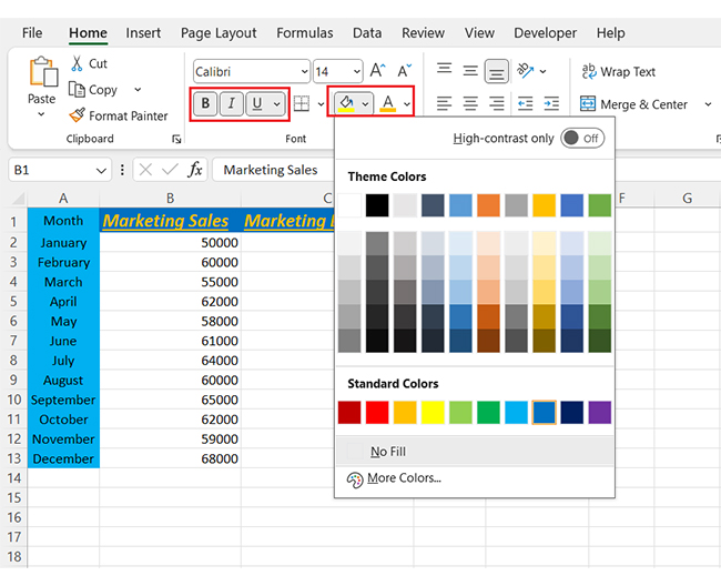
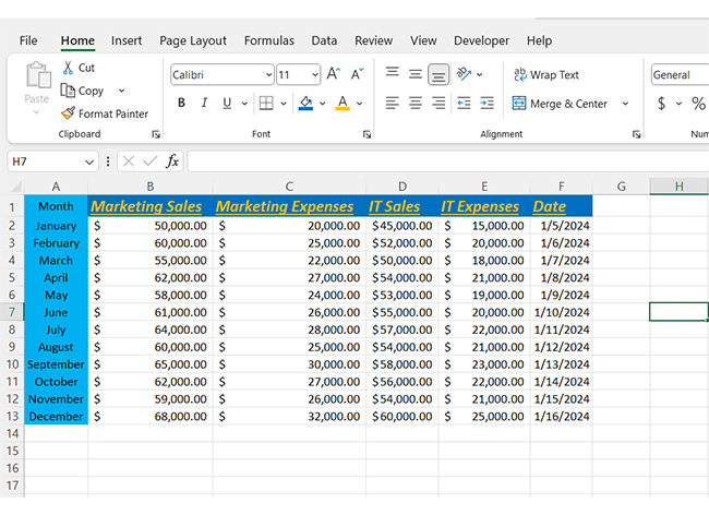
Definition: Data formatting in Excel means changing how data looks to make it easier to read and understand. It includes adjusting fonts, number styles, colors, and alignment. You can apply custom sorting in Excel to organize information quickly.
Formatting also helps when grouping data in Excel to collapse or expand sections. Clean formatting improves accuracy and saves time. It’s a key step before sharing reports or running analysis. Even simple changes can make data more useful and clear.
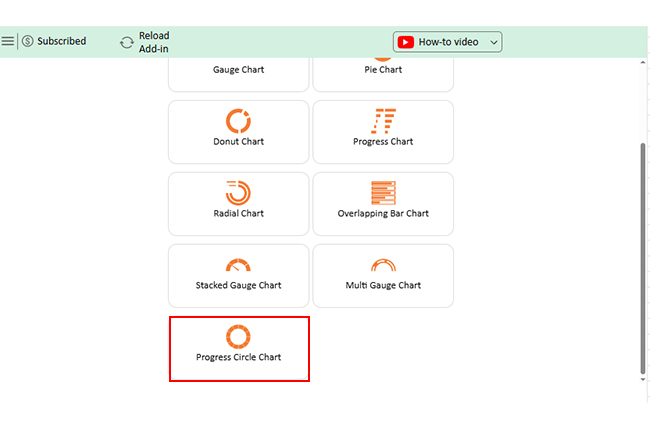
Explore the top 5 charts for analyzing data formatting in Excel. These charts were made with ChartExpo, a tool that helps simplify your data insights:
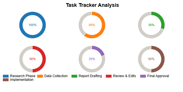
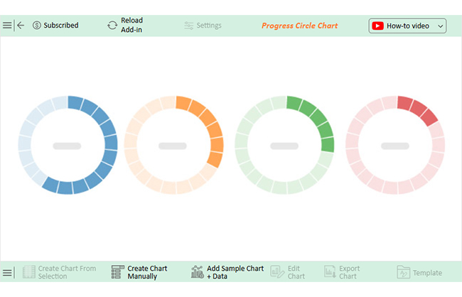
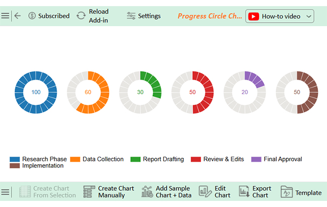
Progress Circle Chart:
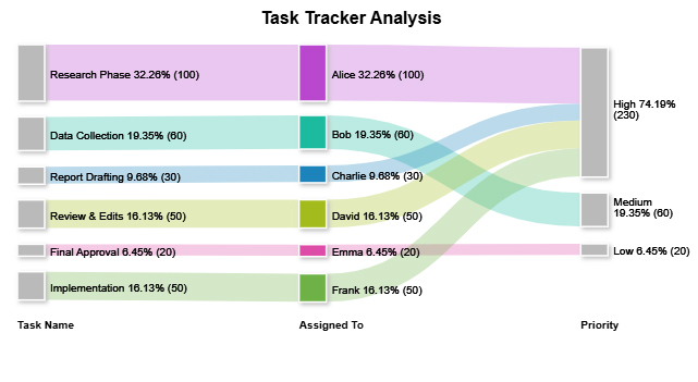
Sankey Chart:
Slope Chart:
Funnel Chart (aka Pyramid Chart):
Progress Chart:
Have you ever noticed how some Excel sheets make sense instantly while others leave you guessing? That’s the power of data formatting in Excel. When your spreadsheet is well-formatted, it’s faster to read, easier to analyze, and ready for action. Whether you’re doing quick checks or preparing data reporting examples, formatting sets the stage for everything else.
How?
Excel can be more than a grid of numbers—it can tell a clear, organized story. The secret? Knowing the correct type of formatting to use. Whether you’re preparing a budget, cleaning survey results, or creating data modeling in Excel, the format you use matters.
Let’s explore the different types of Excel data formatting and how each improves your work.
Have you ever tried making sense of a jungle of numbers in Excel? It’s not fun. Excel’s data formatting helps clean things up, but visuals still fall short. You can bold, color, and align all you want, but only a Scatter plot or other advanced chart can reveal the insights hidden behind the clutter.
That’s where data visualization comes in. It turns dry rows into sharp, clear stories.
And here’s the kicker: Excel’s native charts don’t consistently deliver. Limited options, clunky edits, and dull visuals can slow you down.
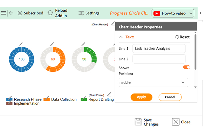
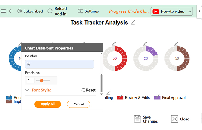
Enter ChartExpo—a more innovative way to visualize data inside Excel. Clean data meets sharp charts, especially the Progress Circle chart and the Sankey diagram in Excel, and your analysis gets the spotlight it deserves.
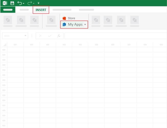
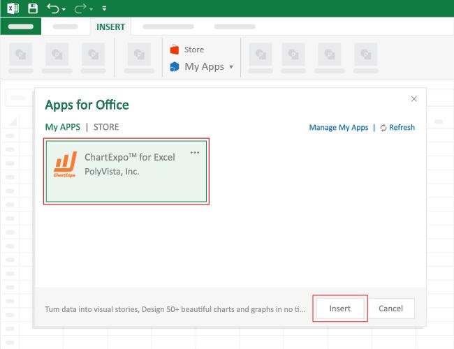
How to Install ChartExpo in Excel?
ChartExpo charts are available both in Google Sheets and Microsoft Excel. Please use the following CTAs to install the tool of your choice and create beautiful visualizations with a few clicks in your favorite tool.
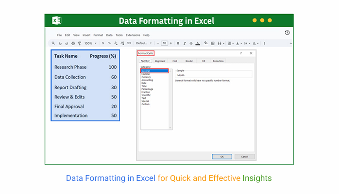
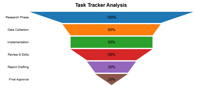
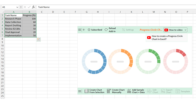
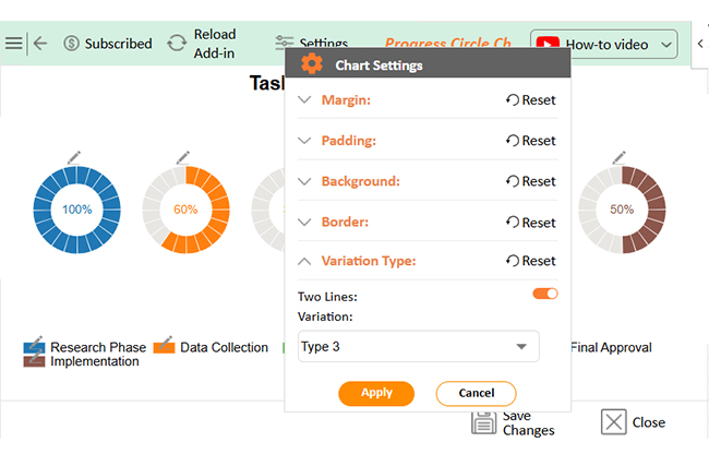
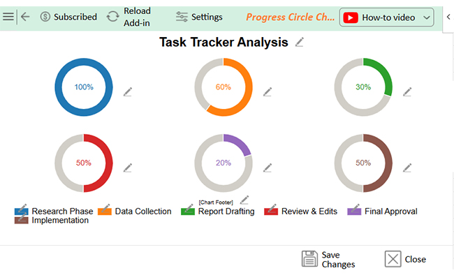
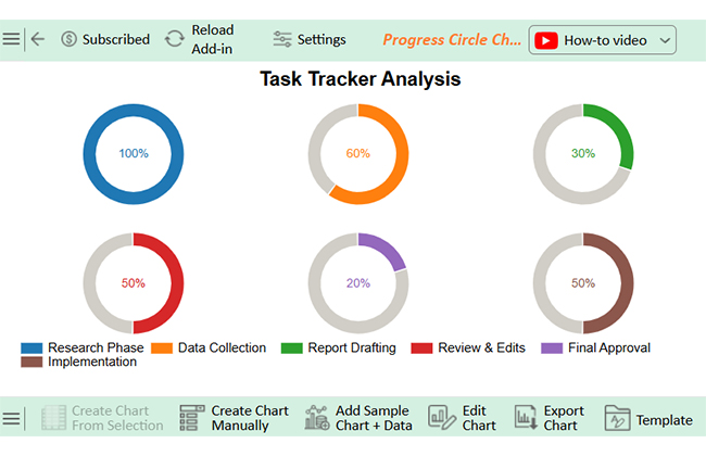
Let’s analyze this sample data in Excel using ChartExpo.
| Task Name | Progress (%) |
| Research Phase | 100 |
| Data Collection | 60 |
| Report Drafting | 30 |
| Review & Edits | 50 |
| Final Approval | 20 |
| Implementation | 50 |


Have you ever had a messy spreadsheet with too many fonts, colors, and styles? Sometimes formatting helps, but too much can make things worse. Clearing excess formatting is a smart first step. Whether you’re updating old files or prepping for custom sorting in Excel, it gives you a clean slate to work with.
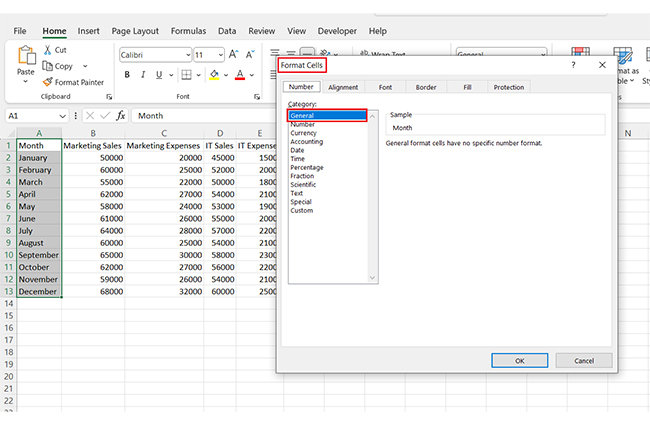
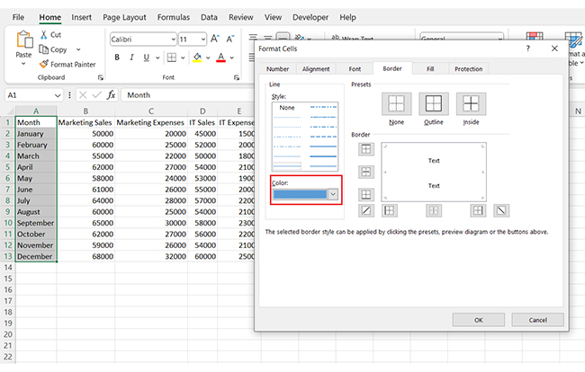
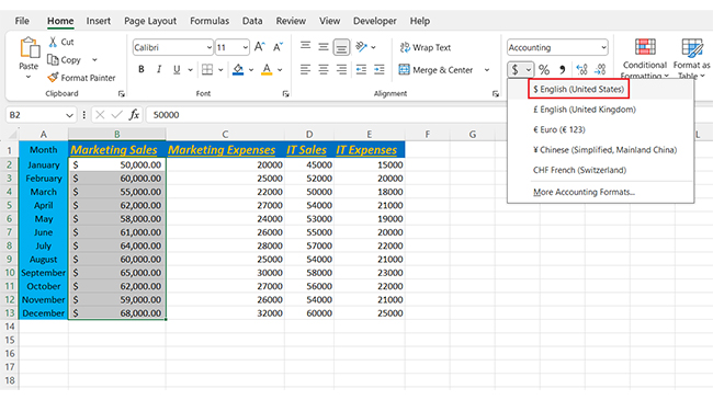
Excel offers around 11 main data formats. These include General, Number, Currency, Accounting, Date, Time, Percentage, Fraction, Scientific, Text, and Special. Each helps display data correctly, and you can access them under the “Format Cells” dialog.
Excel formatting is about making your data clear and easy to read. It organizes raw numbers and text into a structured, understandable form. Without formatting, spreadsheets can look messy and confusing. Proper formatting helps highlight essential details and supports better analysis.
Learning how to clean data in Excel is a key part of formatting. Cleaning removes errors, duplicates, and inconsistencies. Clean data ensures accurate results and saves time when creating reports or charts. It’s the foundation of reliable analysis.
Another useful skill is how to transpose data in Excel. This means switching rows to columns or vice versa. Transposing helps reorganize data to fit your analysis needs. It makes your data easier to compare and visualize.
The best Excel add-ins for data analysis can boost your formatting and analysis power. Add-ins offer advanced tools that automate formatting, cleaning, and visualization. They save time and improve accuracy.
Data formatting isn’t just about looks. It’s about making your work efficient and insightful. So, make it a goal to master these skills to turn your Excel sheets into powerful decision tools. For advanced visuals, install ChartExpo.
How much did you enjoy this article?


Learn how to use sparklines in Excel to quickly visualize trends inside cells. Discover types, creation steps, customization, use cases, benefits, and best practices.

Learn what a confidence interval graph is, how to create it in Excel, and how to interpret results to make more reliable, data-driven decisions.

A correlation matrix in Excel helps identify relationships between variables. Learn how to create, read, and use it for effective data analysis.


