• Home
  • Tools dropdown img
    • Spreadsheet Charts

      • ChartExpo for Google Sheets
      • ChartExpo for Microsoft Excel
    • Power BI Charts

      • Power BI Custom Visuals by ChartExpo
    • Word Cloud

  • Charts dropdown img
    • Chart Category

      • Bar Charts
      • Circle Graphs
      • Column Charts
      • Combo Charts
      • Comparison Charts
      • Line Graphs
      • PPC Charts
      • Sentiment Analysis Charts
      • Survey Charts
    • Chart Type

      • Box and Whisker Plot
      • Clustered Bar Chart
      • Clustered Column Chart
      • Comparison Bar Chart
      • Control Chart
      • CSAT Survey Bar Chart
      • CSAT Survey Chart
      • Dot Plot Chart
      • Double Bar Graph
      • Funnel Chart
      • Gauge Chart
      • Likert Scale Chart
      • Matrix Chart
      • Multi Axis Line Chart
      • Overlapping Bar Chart
      • Pareto Chart
      • Radar Chart
      • Radial Bar Chart
      • Sankey Diagram
      • Scatter Plot Chart
      • Slope Chart
      • Sunburst Chart
      • Tornado Chart
      • Waterfall Chart
      • Word Cloud
    • Google Sheets
      Microsoft Excel
  • Services
  • Pricing
  • Contact us
  • Blog
  • Support dropdown img
      • Gallery
      • Videos
      • Contact us
      • FAQs
      • Resources
    • Please feel free to contact us

      atsupport@chartexpo.com

Categories
All Data Visualizations Data Analytics Surveys
Add-ons/
  • Google Sheets
  • Microsoft Excel
  • Power BI
All Data Visualizations Data Analytics Surveys
Add-ons
  • Google Sheets
  • Microsoft Excel
  • Power BI

We use cookies

This website uses cookies to provide better user experience and user's session management.
By continuing visiting this website you consent the use of these cookies.

Ok

ChartExpo Survey


Home > Blog > Microsoft Excel

Grouping Data in Excel for Clear and Precise Visuals

Why is grouping data in Excel so helpful? This powerful feature makes large datasets easier to manage and understand. It organizes data into clear sections, saving time and improving efficiency.

Imagine a massive spreadsheet filled with sales, expenses, or project timelines. Scrolling endlessly to find relevant details can be frustrating. Grouping data in Excel solves this by allowing you to collapse or expand sections as needed. It helps you focus on what’s important without distractions.

Grouping Data in Excel

Time-saving tools are invaluable in today’s fast-paced work environments. Research shows that professionals spend nearly 20% of their work hours searching for information. Grouping minimizes this effort, enabling you to access specific data sections quickly.

Another key benefit is clarity. Grouped data reduces visual clutter, making spreadsheets easier to read and interpret. It is particularly useful for presentations or when sharing files with a team. It enhances collaboration by ensuring everyone can find what they need efficiently.

Mastering grouping data in Excel gives you more control over your spreadsheets. It transforms overwhelming datasets into structured and actionable insights. Whether you’re managing budgets or tracking performance, grouping makes it simpler.

Table of Contents:

  1. Why is It Helpful to Group Data in Excel?
  2. How to Group Rows in Excel?
  3. How to Group Columns in Excel?
  4. How to Analyze Grouped Data in Excel?
  5. What are the Tips for Grouping Data in Excel?
  6. Wrap Up

First…

Why is It Helpful to Group Data in Excel?

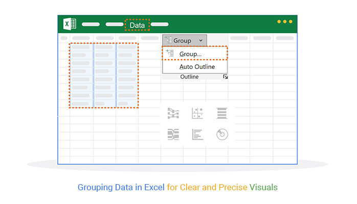
Grouping data in Excel is a game-changer for managing spreadsheets. It transforms scattered information into a clear and structured format. Whether working with large datasets or detailed reports, grouping makes everything more manageable.

  • Enhanced organization: Grouping organizes data into logical sections. It helps you create a clean and structured layout for better understanding.
  • Improved readability: Collapsed groups reduce visual clutter. It makes spreadsheets easier to navigate and interpret at a glance.
  • Streamlined analysis: Focusing on grouped data simplifies analysis. You can quickly compare sections or highlight key trends.
  • Efficient data management: Grouping allows you to collapse irrelevant details and focus on important sections. This makes handling large datasets less overwhelming.
  • Time-saving feature: Grouped data lets you skip unnecessary scrolling. Finding specific sections becomes faster and more efficient.
  • Professional presentation: Well-grouped data looks polished and professional, making it ideal for reports, client presentations, or team discussions.
  • Collaborative benefits: Grouped spreadsheets make teamwork smoother. Colleagues can quickly locate and understand relevant sections.

How to Group Rows in Excel?

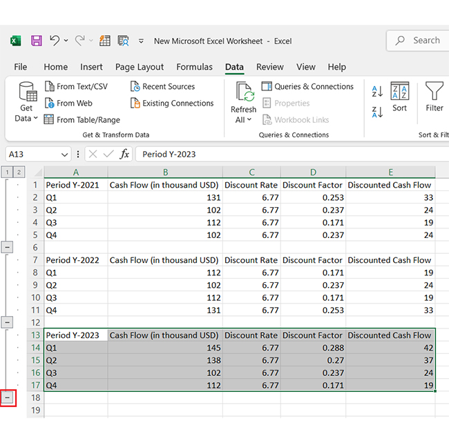
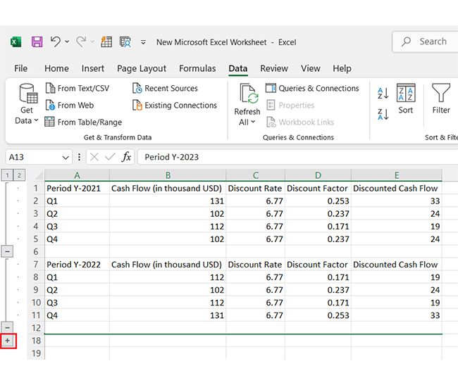
Grouping rows in Excel is a smart way to manage and organize large datasets. It helps you focus on specific data sections while keeping everything tidy. Whether you’re analyzing yearly reports or project timelines, grouping rows can make your work faster and clearer.

How?

  1. Start by adding your data to an Excel sheet. Ensure your data is well-organized for easy grouping.
Add Data to Excel for Doing Grouping Data in Excel
  1. Select the rows you want to group (e.g., Period Y-2021). Highlight them by clicking and dragging over the row numbers.
Select Rows You Want to Group for Doing Grouping Data in Excel
  1. Go to the Data tab in the toolbar. Click on Group, select Rows, and click OK. Your selected rows are now grouped.
Click Group, Select Rows and Click Ok for Doing Grouping Data in Excel
  1. Repeat the process for additional periods or categories (e.g., Period Y-2022 and Period Y-2023). Select the rows, group them, and confirm your selection.
Repear Process of Additional Periods for Doing Grouping Data in Excel
  1. Click the “-” sign next to the Group to hide grouped data. It collapses the rows, making your sheet cleaner and more focused.
Click
  1. You can expand the data again. Click the “+” sign, and your grouped rows will reappear as they were.
Expand Data Again for Doing Grouping Data in Excel

How to Group Columns in Excel?

Does your spreadsheet look like a tangled web of data? Grouping columns is the secret weapon to tame the chaos. It keeps things clean and helps you focus on what matters. Let’s dive in!

  1. Select the columns: Click and drag across the column headers you want to group. For example, to group columns B through D, just highlight them. Easy.
  2. Open the grouping tool: Go to the Data tab on the ribbon. Look for the Outline group and click Group. Excel will ask, “Rows or Columns?” Choose Columns, of course!
  3. Confirm the grouping: You’ll see a line (or a bracket) above the selected columns.
  4. Collapse or expand the group: Here’s the fun part! Notice the tiny plus (+) or minus (-) button near your bracket. Click it to collapse or expand the Group. Collapse to declutter, expand to dive back in.

How to Analyze Grouped Data in Excel?

Ever stared at a cluttered Excel sheet and thought, “There has to be a better way”? Grouping data in Excel and analyzing it is a lifesaver for keeping things organized. However, Excel has its limits in data visualization. Sure, it can handle the basics, but translating raw numbers into stunning, insightful visuals? Not so much.

That’s where ChartExpo steps in. It’s a powerful tool that transforms your data into eye-catching, interactive charts—making data analysis faster, smarter, and more impactful.

Let’s see why grouping data matters and how ChartExpo can improve your Excel game!

But first…

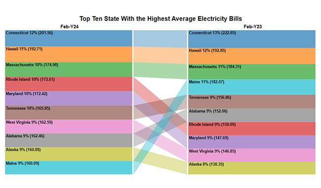
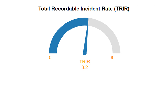
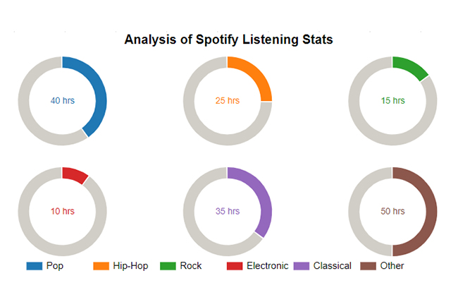
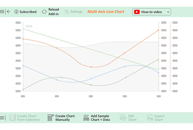
Here are some top charts and graphs created in Excel using ChartExpo:

Sankey Chart

Sankey Chart After Doing Grouping Data in Excel

Comparison Bar Chart

Comparison Bar Chart After Doing Grouping Data in Excel

Gauge Chart

Gauge Chart After Doing Grouping Data in Excel

Progress Circle Chart

Progress Circle Chart After Doing Grouping Data in Excel

Multi Axis Line Chart

Multi Axis Line Chart After Doing Grouping Data in Excel

Let’s learn how to install ChartExpo in Excel.

  1. Open your Excel application.
  2. Open the worksheet and click the “Insert” menu.
  3. You’ll see the “My Apps” option.
  4. In the Office Add-ins window, click “Store” and search for ChartExpo on my Apps Store.
  5. Click the “Add” button to install ChartExpo in your Excel.

ChartExpo charts are available both in Google Sheets and Microsoft Excel. Please use the following CTAs to install the tool of your choice and create beautiful visualizations with a few clicks in your favorite tool.

Example

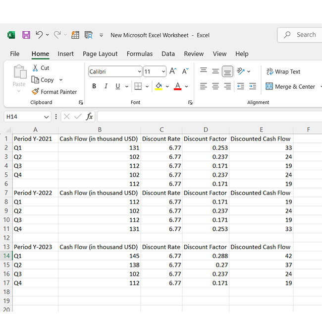
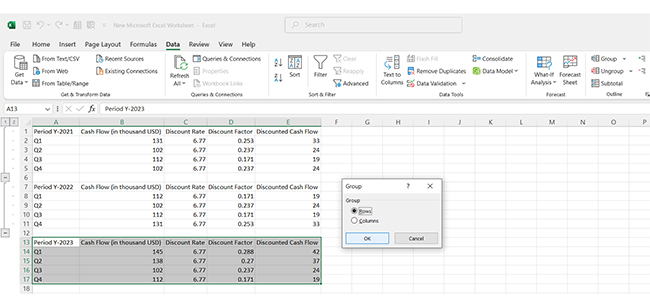
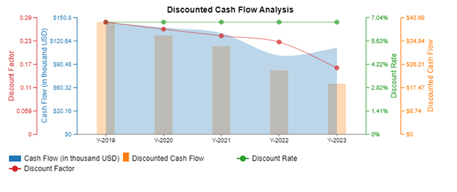
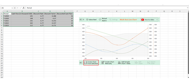
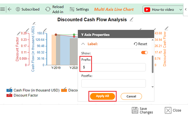
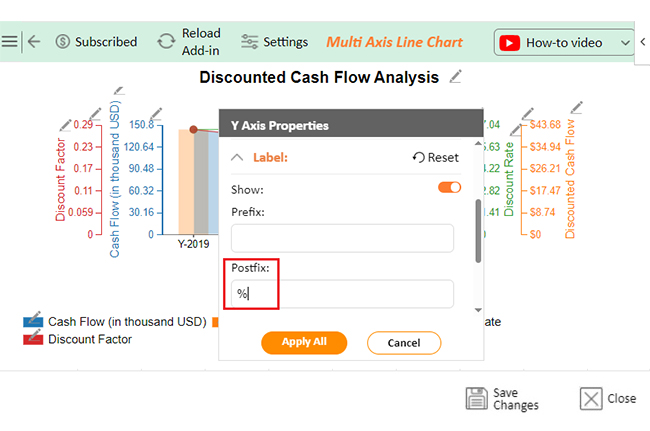
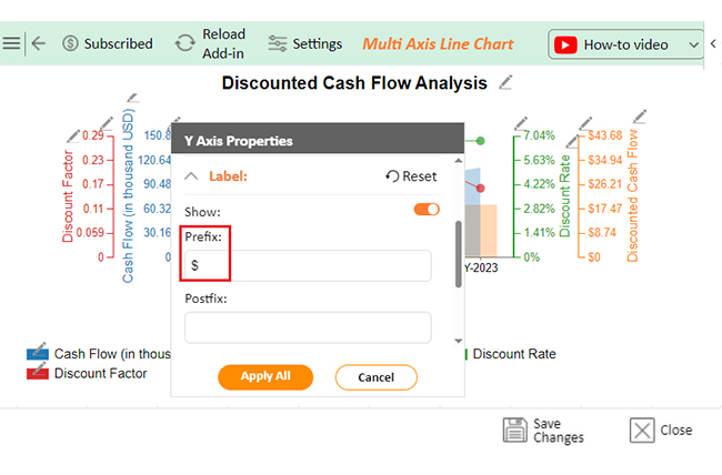
Let’s analyze and interpret this sample data in Excel using ChartExpo, making analyzing and interpreting data easier and more insightful.

Period Cash Flow (in thousand USD) Discount Rate Discount Factor Discounted Cash Flow
Y-2019 145 6.77 0.288 42
Y-2020 138 6.77 0.27 37
Y-2021 131 6.77 0.253 33
Y-2022 102 6.77 0.237 24
Y-2023 112 6.77 0.171 19
  • To get started with ChartExpo, install ChartExpo in Excel.
  • Now Click on My Apps from the INSERT menu.
insert chartexpo in excel
  • Choose ChartExpo from My Apps, then click Insert.
open chartexpo in excel
  • Once it loads, scroll through the charts list to locate and choose the “Multi Axis Line Chart”.
search multi axis line chart in excel
  • You will see a Multi Axis Line Chart on the screen.
See Multi Axis Line Chart After Doing Grouping Data in Excel
  • Click the “Create Chart From Selection” button after selecting the data from the sheet, as shown.
Click Create Chart From Selection After Doing Grouping Data in Excel
  • ChartExpo will generate the visualization below for you.
Initial Visual After Doing Grouping Data in Excel
  • Click on Settings and change the “Data Representation” as follows.
Change Data Representation After Doing Grouping Data in Excel
  • If you want to add anything to the chart, click the Edit Chart button:
Click Edit Chart After Doing Grouping Data in Excel
  • Click the pencil icon next to the Chart Header to change the title.
  • It will open the properties dialog. Under the Text section, you can add a heading in Line 1 and enable Show.
  • Give the appropriate title of your chart and click the Apply button.
Add Chart Header After Doing Grouping Data in Excel
  • You can add the dollar sign with discounted cash flow value as follows:
Add Prefix With Discounted Cash Flow After Doing Grouping Data in Excel
  • You can add the percentage sign with “Discounted Rate” values as follows:
Add Postfix After Doing Grouping Data in Excel
  • You can add the dollar sign with “Cash Flow” values as follows:
Add Prefix With Cash Flow After Doing Grouping Data in Excel
  • You can enable the Legend show button as follows:
Enable Legend Show Button After Doing Grouping Data in Excel
  • Change the Legend shape of “Discounted Cash Flow” to Column and click the “Apply” button.
Change Legend Shape of Discounted Cash Flow After Doing Grouping Data in Excel
  • Change the Legend shape of “Discount Rate” into a Line and Circle and click the “Apply” button.
Change Legend Shape of Discount Rate After Doing Grouping Data in Excel
  • Change the Legend shape of “Discount Factor” into a Line and Circle and click the “Apply” button.
Change Legend Shape of Discount Factor After Doing Grouping Data in Excel
  • Click the “Save Changes” button to persist the changes made to the chart.
Click Save Changes After Doing Grouping Data in Excel
  • Your final Multi Axis Line Chart will look like the one below.
Final Grouping Data in Excel

Insights

  • Cash flows declined from 2019 to 2021.
  • A slight recovery occurred in 2022-2023.
  • Discounted cash flows decreased steadily, driven by a 6.77% discount rate.
  • The decline reflects the erosion of value over time.

Leveraging Grouping Data in Microsoft Excel to Create Insightful Charts:

  1. Open your Excel Application.
  2. Install ChartExpo Add-in for Excel from Microsoft AppSource to create interactive visualizations.
  3. Select the Multi Axis Line Chart from the list of charts.
  4. Select your data
  5. Click on the “Create Chart from Selection” button.
  6. Customize your chart properties to add header, axis, legends, and other required information.

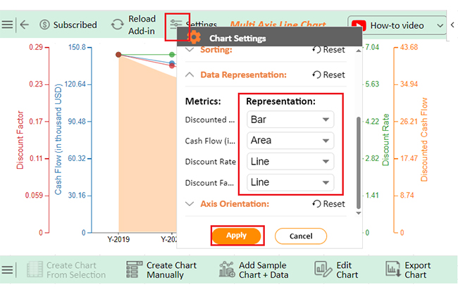
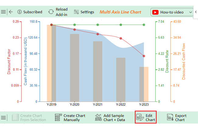
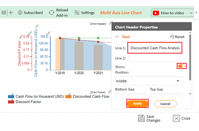
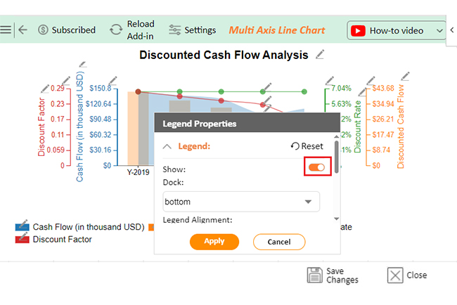
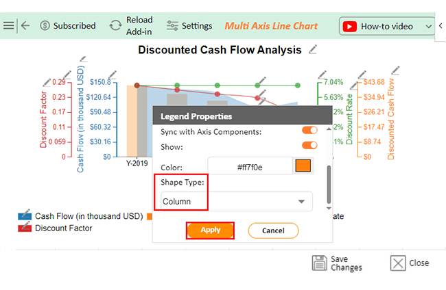
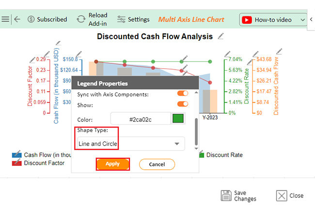
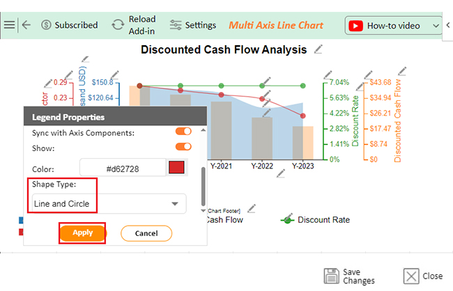
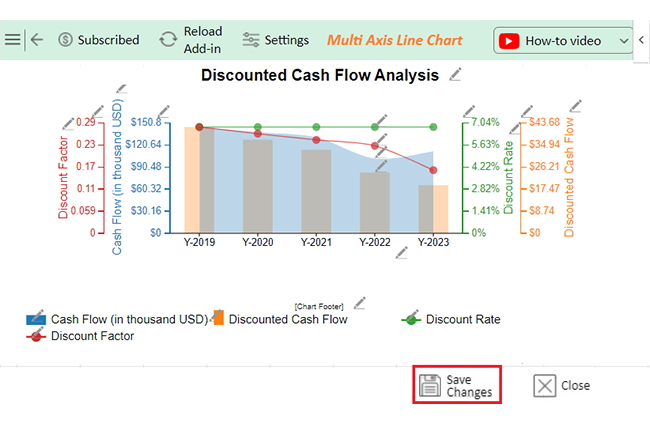
The following video will help you to create a Multi Axis Line Chart in Microsoft Excel.

What are the Tips for Grouping Data in Excel?

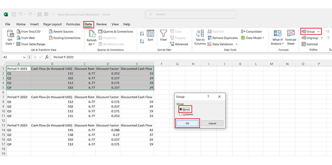
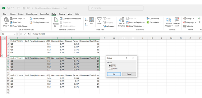
Grouping data in Excel is like tidying up a cluttered room—smart planning makes it easier. Here’s how to organize efficiently:

  • Start with a clear plan: Decide what to group and why. Planning ensures your data structure makes sense from the start.
  • Summarize for insights: Pair groups with subtotals or summaries to highlight key points. It makes it easy to spot trends without sifting through rows of data.
  • Leverage quick shortcuts: Use Excel’s shortcuts like Alt + Shift + → to group fast. Or try Auto Outline for a one-click organization boost.
  • Think layers with nested groups: Dive deep into details using nested levels (e.g., months within quarters). Collapse or expand as needed to switch between big-picture and granular views.
  • Label clearly for tidy sheets: Add meaningful headings to avoid confusion. A well-labelled group saves time when revisiting or sharing your data.

FAQs

How do I group data in Excel based on range?

To group data by range in Excel:

  1. Sort your data.
  2. Select it and click PivotTable (Insert tab).
  3. Drag the data to Rows and values to Columns/Values.
  4. Use “Group Selection” for ranges.

What is the purpose of grouping data in Excel?

D organizes information for better analysis. It simplifies large datasets by categorizing values into ranges or intervals. It aids in spotting trends, summarizing data, creating reports, and improving readability, especially in pivot tables or charts.

Wrap Up

Grouping data in Excel is a simple yet powerful feature. It organizes information into manageable sections, making it easier to handle. It boosts efficiency and reduces frustration when working with large spreadsheets.

One of the biggest advantages is better readability. Collapsing groups removes clutter and allows you to focus on what’s important. This makes it faster to find and analyze specific data.

Grouping also saves time. It eliminates unnecessary scrolling by letting you access key details in seconds. It’s useful, especially for time-sensitive tasks.

Grouping data enhances collaboration, too. Grouped data makes spreadsheets clearer for teams. Everyone can easily navigate and understand the content, improving teamwork.

For presentations, grouping adds a professional touch. It ensures your data looks organized and polished, leaving a strong impression.

In summary, grouping is a valuable tool for anyone using Excel. It streamlines workflows, simplifies analysis, and supports better decision-making.

Do not hesitate.

Start grouping data in Excel and install ChartExpo to make your work smarter and more effective.

How much did you enjoy this article?

ExcelAd2
Start Free Trial!
146528

Related articles

next previous
Microsoft Excel12 min read

Key Performance Indicators in Healthcare for Better Insights

Key Performance Indicators in healthcare track patient care and efficiency. Learn about these KPIs, top examples, and how to use them to improve outcomes.

Microsoft Excel10 min read

BMI Calculation Formula in Excel for Better Fitness Insights

The BMI calculation formula in Excel helps track and analyze body mass index. Explore step-by-step instructions and tips to simplify BMI tracking in Excel.

Microsoft Excel29 min read

How to Create a Tornado Chart in Excel? A Complete Guide

Click to learn how to plot a Tornado Chart in Excel using easy-to-follow steps. Also, we’ll address the following question: what is a Tornado Diagram?

Microsoft Excel14 min read

How to Create a Scatter Plot in Excel with 3 Variables?

Click to discover how to create a Scatter Plot in Excel with 3 variables. We’ll also address the following question: why do we use Scatter Plot Graph?

Microsoft Excel12 min read

Construction Budget Spreadsheet for Better Planning

A construction budget spreadsheet helps track expenses and control costs. This blog explores benefits, top templates, and tips for better budgeting in Excel.

ChartExpo logo

Turn Data into Visual
Stories

CHARTEXPO

  • Home
  • Gallery
  • Videos
  • Services
  • Pricing
  • Contact us
  • FAQs
  • Privacy policy
  • Terms of Service
  • Sitemap

TOOLS

  • ChartExpo for Google Sheets
  • ChartExpo for Microsoft Excel
  • Power BI Custom Visuals by ChartExpo
  • Word Cloud

CATEGORIES

  • Bar Charts
  • Circle Graphs
  • Column Charts
  • Combo Charts
  • Comparison Charts
  • Line Graphs
  • PPC Charts
  • Sentiment Analysis Charts
  • Survey Charts

TOP CHARTS

  • Sankey Diagram
  • Likert Scale Chart
  • Comparison Bar Chart
  • Pareto Chart
  • Funnel Chart
  • Gauge Chart
  • Radar Chart
  • Radial Bar Chart
  • Sunburst Chart
  • see more
  • Scatter Plot Chart
  • CSAT Survey Bar Chart
  • CSAT Survey Chart
  • Dot Plot Chart
  • Double Bar Graph
  • Matrix Chart
  • Multi Axis Line Chart
  • Overlapping Bar Chart
  • Control Chart
  • Slope Chart
  • Clustered Bar Chart
  • Clustered Column Chart
  • Box and Whisker Plot
  • Tornado Chart
  • Waterfall Chart
  • Word Cloud
  • see less

RESOURCES

  • Blog
  • Resources
  • YouTube
SIGN UP FOR UPDATES

We wouldn't dream of spamming you or selling your info.

© 2025 ChartExpo, all rights reserved.