• Home
  • Tools dropdown img
    • Spreadsheet Charts

      • ChartExpo for Google Sheets
      • ChartExpo for Microsoft Excel
    • Power BI Charts

      • Power BI Custom Visuals by ChartExpo
    • Word Cloud

  • Charts dropdown img
    • Chart Category

      • Bar Charts
      • Circle Graphs
      • Column Charts
      • Combo Charts
      • Comparison Charts
      • Line Graphs
      • PPC Charts
      • Sentiment Analysis Charts
      • Survey Charts
    • Chart Type

      • Box and Whisker Plot
      • Clustered Bar Chart
      • Clustered Column Chart
      • Comparison Bar Chart
      • Control Chart
      • CSAT Survey Bar Chart
      • CSAT Survey Chart
      • Dot Plot Chart
      • Double Bar Graph
      • Funnel Chart
      • Gauge Chart
      • Likert Scale Chart
      • Matrix Chart
      • Multi Axis Line Chart
      • Overlapping Bar Chart
      • Pareto Chart
      • Radar Chart
      • Radial Bar Chart
      • Sankey Diagram
      • Scatter Plot Chart
      • Slope Chart
      • Sunburst Chart
      • Tornado Chart
      • Waterfall Chart
      • Word Cloud
    • Google Sheets
      Microsoft Excel
  • Services
  • Pricing
  • Contact us
  • Blog
  • Support dropdown img
      • Gallery
      • Videos
      • Contact us
      • FAQs
      • Resources
    • Please feel free to contact us

      atsupport@chartexpo.com

Categories
All Data Visualizations Data Analytics Surveys
Add-ons/
  • Google Sheets
  • Microsoft Excel
  • Power BI
All Data Visualizations Data Analytics Surveys
Add-ons
  • Google Sheets
  • Microsoft Excel
  • Power BI

We use cookies

This website uses cookies to provide better user experience and user's session management.
By continuing visiting this website you consent the use of these cookies.

Ok

ChartExpo Survey


Home > Blog > Data Analytics

Fleet Management Dashboard: Features, Metrics, and Tips

Managing a commercial fleet without unified visibility is like flying blind. A Fleet Management Dashboard consolidates vehicle tracking, driver metrics, fuel consumption, and service records into one comprehensive interface.

Fleet Management Dashboard

It transforms scattered operational data into actionable intelligence that keeps fleets running smoothly and cost-effectively. This centralization reduces manual effort and improves response times across operations.

Organizations leverage these digital dashboards to spot inefficiencies, reduce downtime, and make better resource allocation decisions. Real-time data access eliminates guessing and enables managers to respond quickly when issues arise.

The dashboard becomes the central nervous system for fleet operations, connecting all moving parts and driving smarter choices.

Table of Contents:

  1. What is a Fleet Management Dashboard?
  2. Why is a Fleet Management Dashboard Important?
  3. Key Features of Fleet Management Dashboards
  4. Types of a Fleet Management Dashboard
  5. Key KPIs to Track in Your Fleet Management KPIs Dashboard
  6. Fleet Management Dashboard Examples
  7. Tools and Methods for Building a Fleet Management Dashboard
  8. How to Create a Fleet Management KPIs Dashboard in Power BI?
  9. Benefits of a Fleet Management Dashboard
  10. Best Practices for Fleet Management System Dashboard
  11. FAQs
  12. Wrap Up

What is a Fleet Management Dashboard?

Definition: A Fleet Management Dashboard is a visual analytics platform that centralizes vehicle, driver, and operational tracking in a single location. Raw fleet data gets converted into structured visualizations like charts, KPIs, and summary tables.

Fleet managers turn to dashboards to track vehicle whereabouts, evaluate driver conduct, and gauge operational effectiveness in real time. The interface surfaces patterns related to fuel usage, service intervals, and routing efficiency.

Complex information becomes digestible through clear visual formatting, supporting smarter decision-making, cutting operational expenses, and boosting fleet productivity, along with reliability.

Why is a Fleet Management Dashboard Important?

It’s critical for sustaining control and transparency across expanding fleet operations. Organizations can shift from manual monitoring to data-powered fleet enhancement.

Key reasons include:

  • Delivers real-time fleet visibility.
  • Optimizes routes and planning workflows.
  • Cuts fuel and servicing costs.
  • Strengthens driver safety and regulatory adherence.
  • Tracks KPIs via a Fleet Management KPIs Dashboard.
  • Enables strategic and day-to-day decisions.
  • Boosts overall fleet performance.

Key Features of Fleet Management Dashboards

A properly designed Fleet Management Dashboard merges operational data with intuitive visual elements to produce actionable insights.

Key features include:

  • Real-time GPS vehicle tracking.
  • Automated servicing and inspection alerts.
  • Driver conduct and safety oversight.
  • Fuel usage and cost breakdowns.
  • Route planning and delivery monitoring.
  • Customizable charts and performance graphics.
  • Seamless integration with fleet and telematics systems.

A unified digital dashboard keeps all fleet information accessible from one interface without toggling between tools.

Types of a Fleet Management Dashboard

Different operational needs demand different dashboard structures. Fleet dashboards can be organized by management tier and reporting goals.

Common types include:

  • Operational dashboards for day-to-day tasks.
  • Strategic dashboards for future planning.
  • Tactical dashboards for mid-tier performance.
  • Real-time monitoring dashboards.
  • Vehicle performance dashboards.
  • Maintenance and compliance dashboards.

Some companies match fleet reporting styles with wider analytics frameworks used in a marketing dashboard, guaranteeing uniform visualization standards.

Key KPIs to Track in Your Fleet Management KPIs Dashboard

Monitoring the right metrics guarantees that a Fleet Management Dashboard produces measurable value instead of surface-level reporting.

Important KPIs to monitor include:

  • Vehicle utilization rate.
  • Fuel efficiency per vehicle.
  • On-time delivery percentage.
  • Maintenance frequency and downtime.
  • Driver performance scorecards.

These indicators help organizations link fleet performance with financial reporting structures often seen in an accounts dashboard.

Fleet Management Dashboard Examples

Practical examples demonstrate how a Fleet Management Dashboard supports real-world decision-making.

GPS Tracking Dashboard

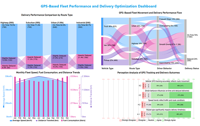
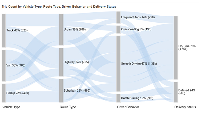
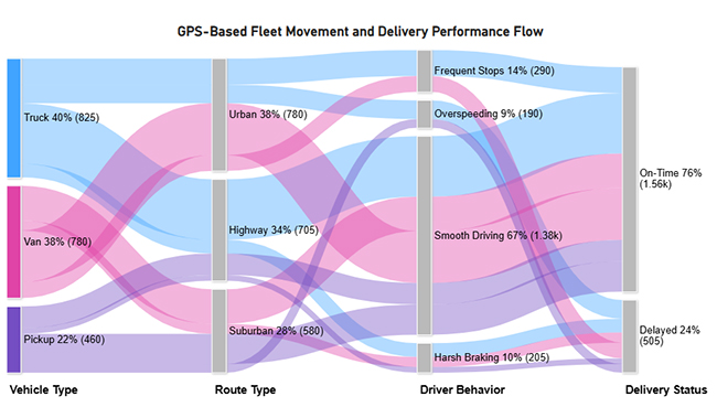
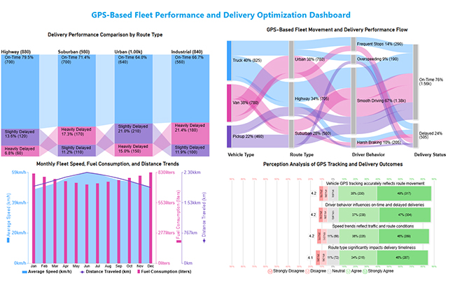
This dashboard provides a comprehensive view of GPS-based fleet operations by linking vehicle movement, route performance, driving behavior, and delivery outcomes to support data-driven fleet optimization.

Fleet Management Dashboard

Maintenance Schedule Dashboard

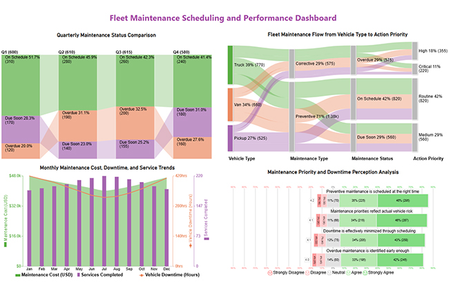
This dashboard summarizes fleet maintenance performance by combining scheduling status, downtime, costs, and feedback to support timely and prioritized maintenance decisions.

Fleet Management Dashboard

Route Optimization and KPI Dashboard

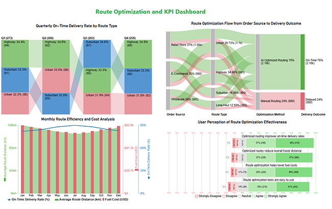
This dashboard highlights route optimization performance by tracking delivery reliability, cost efficiency, and key fleet KPIs in one view.

Fleet Management Dashboard

Many of these layouts align with visual patterns seen in business dashboards used across operations teams.

Tools and Methods for Building a Fleet Management Dashboard

Building a reliable dashboard requires the right mix of tools, data sources, and visualization methods.

Common approaches include:

  • Excel and Google Sheets for basic reporting.
  • Power BI for advanced fleet analytics.
  • Tableau for interactive dashboards.
  • Fleet software integrations.
  • API-based telematics data collection.
  • Custom chart templates.

Fuel cost insights from fleet data often support analysis models used in a finance dashboard in Power BI.

How to Create a Fleet Management KPIs Dashboard in Power BI?

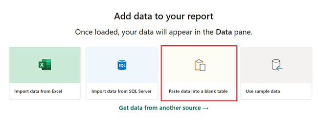
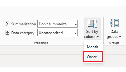
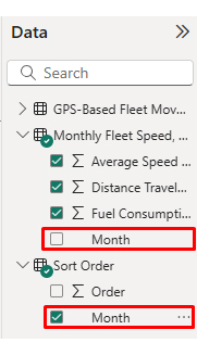
Creating a Fleet Management Dashboard in Power BI involves structured data modeling and thoughtful visual design.

  1. Collect data from GPS systems, fuel logs, and maintenance records.
  2. Clean and transform data using Power Query.
  3. Define KPIs aligned with a Fleet Management KPIs Dashboard.
  4. Build visuals such as maps, trend charts, and KPI cards.
  5. Use ChartExpo to unlock advanced and highly customizable charts that enhance pattern detection, distribution analysis, and performance comparison beyond native visuals.
  6. Publish and share the dashboard securely.

This structured workflow follows principles similar to guides that explain how to create a dashboard in Power BI.

Why use ChartExpo?

  • Adds advanced visuals to Power BI that uncover insights beyond standard charts.
  • Makes complex data easier to understand with clear, decision-ready visuals.

Offers a 7-day free trial and costs $10/month.

Example:

  • Log in to Power BI.
  • Enter your email. Click the “Submit” button.
Fleet Management Dashboard
  • You are redirected to your Microsoft account.
  • Enter your password and click “Sign in”.
Fleet Management Dashboard
  • Choose whether to stay signed in.
Fleet Management Dashboard
  • Once done, the Power BI home screen will open.

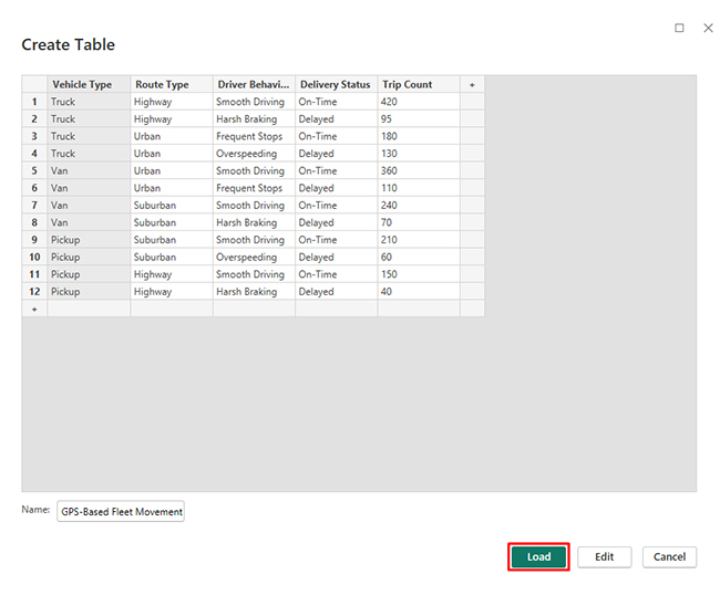
Now, consider we have the following data for a Sankey Chart.

Vehicle Type Route Type Driver Behavior Delivery Status Trip Count
Truck Highway Smooth Driving On-Time 420
Truck Highway Harsh Braking Delayed 95
Truck Urban Frequent Stops On-Time 180
Truck Urban Overspeeding Delayed 130
Van Urban Smooth Driving On-Time 360
Van Urban Frequent Stops Delayed 110
Van Suburban Smooth Driving On-Time 240
Van Suburban Harsh Braking Delayed 70
Pickup Suburban Smooth Driving On-Time 210
Pickup Suburban Overspeeding Delayed 60
Pickup Highway Smooth Driving On-Time 150
Pickup Highway Harsh Braking Delayed 40
  • First, you need to add data to your report and click on the “Paste data into a blank report”.
Fleet Management Dashboard
  • Paste the data table above into a blank table, name it, and click on the “Load” button.
Fleet Management Dashboard
  • To build a Sankey Chart, import the visual from App Source by opening the Visualizations panel in Power BI.
  • Select “Get more Visuals”.
Fleet Management Dashboard
  • Search ChartExpo and select the Sankey Diagram. It’s also recommended to add the Multi Axis Line Chart, Comparison Bar Chart, and Likert Chart to support different insights.
Fleet Management Dashboard
  • Click on the “ADD” button.
Fleet Management Dashboard
  • Once you have added all four charts to your visuals, you’ll see the chart icons in your visuals list.
Fleet Management Dashboard
  • To add a Sankey Chart visual, click on the chart icon and choose the dimension and measures.
Fleet Management Dashboard
  • In Visualization’s properties, click on License Settings and add the key. So that you’ll see the Sankey Chart without a watermark.
Fleet Management Dashboard
  • Now, after applying the key, the watermark is removed from the chart.
Fleet Management Dashboard
  • Now, we will enhance the chart’s appearance and modify the title to better align with the visualized data.
Fleet Management Dashboard
  • You can set bar colors from “Visual”.
Fleet Management Dashboard
  • The final look of the Sankey Chart is given below.
Fleet Management Dashboard

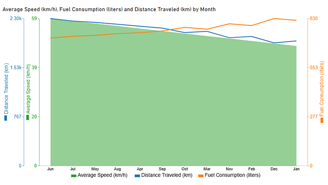
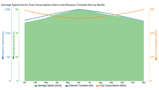
Now discuss the second chart. Consider we have the following data for a Multi-Axis Line Chart.
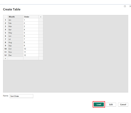
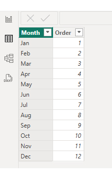
Month Average Speed (km/h) Fuel Consumption (liters) Distance Traveled (km)
Jan 48 820 1,950
Feb 50 790 2,020
Mar 52 770 2,100
Apr 55 750 2,180
May 57 735 2,240
Jun 59 720 2,300
Jul 58 730 2,260
Aug 56 745 2,210
Sep 54 760 2,150
Oct 53 780 2,080
Nov 51 800 2,000
Dec 49 830 1,920
  • Once data is manually pasted in Power BI or exported from Excel, choose the dimension and measures.
Fleet Management Dashboard
  • Before creating the chart, enter the key to remove the watermark. Once applied, the chart will appear without the watermark.
Fleet Management Dashboard
  • If you notice in the chart, the months in x-axis are not ordered correctly. Create a new table to sort the data from Jan to Dec.
  • Enter data manually, name it, and click on the “Load” button.
Fleet Management Dashboard
  • Open “Table View”, select the “Sort Order” table, select the “Month Column”, and set the sorting order column.
Fleet Management Dashboard
  • Choose sort by order.
Fleet Management Dashboard
  • With the custom sorting set, use the Month column from the Sort Order table instead of the original table’s Month column.
Fleet Management Dashboard
  • The chart should now display with the custom sorting order applied on the X-axis.
Fleet Management Dashboard
  • First, we will change the title of the chart, then we will change the data representation.
Fleet Management Dashboard
  • Next, we will change legend properties to set the shape type.
Fleet Management Dashboard
  • The final look of the Multi Axis Line Chart is given below.
Fleet Management Dashboard

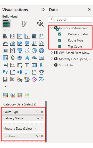
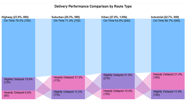
Now discus third chart. Consider we have the following data for a Comparison Bar Chart.

Route Type Delivery Status Trip Count
Urban On-Time 640
Urban Slightly Delayed 210
Urban Heavily Delayed 150
Suburban On-Time 700
Suburban Slightly Delayed 110
Suburban Heavily Delayed 170
Highway On-Time 700
Highway Slightly Delayed 120
Highway Heavily Delayed 60
Industrial On-Time 560
Industrial Slightly Delayed 100
Industrial Heavily Delayed 180
  • Once data is manually pasted in Power BI or exported from Excel, choose the dimension and measures.
Fleet Management Dashboard
  • Enter the key to remove the watermark, then update the chart title and change the bar color.
Fleet Management Dashboard
  • The final look of the Comparison Bar Chart is given below.
Fleet Management Dashboard

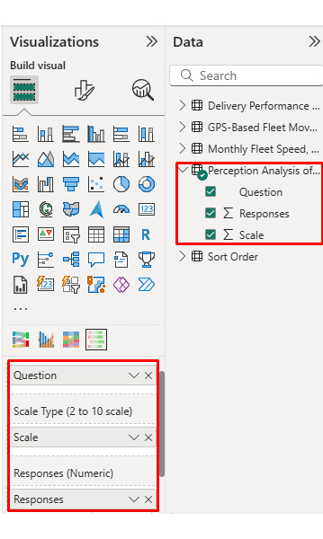
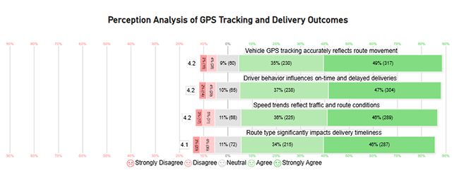
Now discuss the fourth chart. Consider we have the following data for a Likert Chart.

Question

Scale

Responses

Vehicle GPS tracking accurately reflects route movement 1 15
Vehicle GPS tracking accurately reflects route movement 2 28
Vehicle GPS tracking accurately reflects route movement 3 60
Vehicle GPS tracking accurately reflects route movement 4 230
Vehicle GPS tracking accurately reflects route movement 5 317
Route type significantly impacts delivery timeliness 1 20
Route type significantly impacts delivery timeliness 2 36
Route type significantly impacts delivery timeliness 3 72
Route type significantly impacts delivery timeliness 4 215
Route type significantly impacts delivery timeliness 5 287
Driver behavior influences on-time and delayed deliveries 1 14
Driver behavior influences on-time and delayed deliveries 2 29
Driver behavior influences on-time and delayed deliveries 3 65
Driver behavior influences on-time and delayed deliveries 4 238
Driver behavior influences on-time and delayed deliveries 5 304
Speed trends reflect traffic and route conditions 1 17
Speed trends reflect traffic and route conditions 2 31
Speed trends reflect traffic and route conditions 3 68
Speed trends reflect traffic and route conditions 4 225
Speed trends reflect traffic and route conditions 5 289
  • Once data is manually pasted in Power BI or exported from Excel, choose the dimension and measures.
Fleet Management Dashboard
  • Enter the key to remove the watermark, update the title, and adjust rating colors and labels.
Fleet Management Dashboard
  • You can legend text as well.
Fleet Management Dashboard
  • The final look of the Likert Chart is shown below.
Fleet Management Dashboard

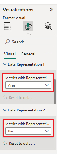
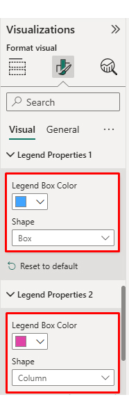
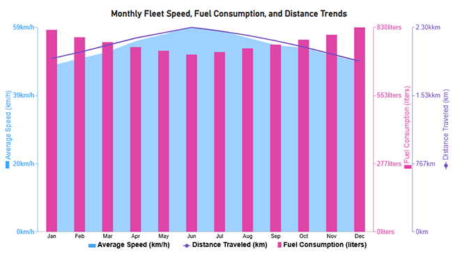
Arrange the charts efficiently and add interactivity to create a clear, engaging dashboard. After placement, the dashboard should appear as shown below.

Fleet Management Dashboard

Key Insights

  • In the Sankey Chart, fleet movement is primarily driven by trucks and vans operating on urban and highway routes, where smooth driving correlates with more on-time deliveries while risky behaviors increase delays.
  • In the Comparison Bar Chart, highway routes deliver the best on-time performance, while urban and industrial routes face more delivery delays.
  • In the Multi Axis Line Chart, higher average speeds correspond with lower fuel consumption and greater distance traveled, indicating better fleet efficiency.
  • In the Likert Chart, drivers largely agree that GPS accuracy, route type, speed patterns, and driving behavior directly impact delivery timeliness.

Benefits of a Fleet Management Dashboard

It delivers both operational and strategic benefits by improving visibility and accountability.

Key benefits include:

  • Improved operational efficiency.
  • Reduced fuel and maintenance costs.
  • Enhanced safety and compliance.
  • Faster, data-driven decision-making.
  • Streamlined performance monitoring.
  • Increased productivity.

These operational insights often complement service metrics tracked in a customer experience dashboard.

Best Practices for Fleet Management System Dashboard

A Fleet Management System Dashboard should remain clear, relevant, and actionable as fleet operations evolve.

Best practices include:

  • Keep the design simple and uncluttered.
  • Focus on actionable KPIs.
  • Use real-time data where possible.
  • Ensure mobile accessibility.
  • Integrate with existing fleet tools.
  • Update visuals and metrics regularly.

Workforce efficiency metrics used alongside fleet data often reflect patterns found in the human resource dashboard. Performance comparisons across fleets can also be strengthened using a benchmarking dashboard.

FAQs

What tools are best for building a Fleet Management Dashboard?

Power BI, Tableau, and fleet management platforms are widely used. Tool selection depends on data complexity and integration needs.

How can a Fleet Management Dashboard improve fleet efficiency?

It improves efficiency by identifying route delays, fuel waste, maintenance risks, and unsafe driving patterns early.

What are common mistakes to avoid in Fleet Management Dashboards?

Common mistakes include tracking too many metrics, poor visual hierarchy, outdated data, and a lack of user-focused design.

Wrap Up

A Fleet Management Dashboard empowers organizations to monitor performance, control costs, and improve operational efficiency through data-driven insights.

When built in Power BI and enhanced with advanced visuals from ChartExpo, fleet dashboards become more intuitive, insightful, and effective for smarter decision-making at every operational level. The combination delivers measurable business impact across your entire operation.

These dashboards don’t just track numbers passively. They turn raw fleet data into actionable strategies that protect budgets, reduce risks, and keep operations moving forward efficiently and profitably.

Fleet visibility translates directly into competitive advantage and bottom-line savings. Start building smarter, more effective dashboards today.

How much did you enjoy this article?

ExcelAd1
Start Free Trial!
159566

Related articles

next previous
Data Analytics10 min read

Board Report Template: A Complete Walkthrough

Board Report Templates streamline governance with decision-ready insights. Build effective formats that strengthen oversight. Discover how!

Data Analytics10 min read

Online Retailer Demand Forecasting and Price Optimization

Analytics for an Online Retailer Demand Forecasting and Price Optimization: build forecasts, set prices, avoid stockouts, and see trends. Read on!

Data Analytics7 min read

Brand Awareness Metrics for Better Brand Insights

Brand Awareness Metrics show what people notice, remember, and repeat. Track search, reach, share of voice, and surveys. Read on, then act!

Data Analytics10 min read

Charts Templates for PowerPoint for Improved Presentations

Charts Templates for PowerPoint set chart layout, labels, and colors in slides, and reuse charts across decks and reports. Read on!

Data Analytics7 min read

How to Measure Energy Use: Simple Visual Guide

Track energy consumption with precision. Learn practical methods to measure energy use, calculate costs, and optimize efficiency. Read on!

ChartExpo logo

Turn Data into Visual
Stories

CHARTEXPO

  • Home
  • Gallery
  • Videos
  • Services
  • Pricing
  • Contact us
  • FAQs
  • Privacy policy
  • Terms of Service
  • Sitemap

TOOLS

  • ChartExpo for Google Sheets
  • ChartExpo for Microsoft Excel
  • Power BI Custom Visuals by ChartExpo
  • Word Cloud

CATEGORIES

  • Bar Charts
  • Circle Graphs
  • Column Charts
  • Combo Charts
  • Comparison Charts
  • Line Graphs
  • PPC Charts
  • Sentiment Analysis Charts
  • Survey Charts

TOP CHARTS

  • Sankey Diagram
  • Likert Scale Chart
  • Comparison Bar Chart
  • Pareto Chart
  • Funnel Chart
  • Gauge Chart
  • Radar Chart
  • Radial Bar Chart
  • Sunburst Chart
  • see more
  • Scatter Plot Chart
  • CSAT Survey Bar Chart
  • CSAT Survey Chart
  • Dot Plot Chart
  • Double Bar Graph
  • Matrix Chart
  • Multi Axis Line Chart
  • Overlapping Bar Chart
  • Control Chart
  • Slope Chart
  • Clustered Bar Chart
  • Clustered Column Chart
  • Box and Whisker Plot
  • Tornado Chart
  • Waterfall Chart
  • Word Cloud
  • see less

RESOURCES

  • Blog
  • Resources
  • YouTube
SIGN UP FOR UPDATES

We wouldn't dream of spamming you or selling your info.

© 2026 ChartExpo, all rights reserved.