Categories
A Human Resource (HR) dashboard is a key workforce metric that helps in effective monitoring and decision-making in organizations.


In this guide, you’ll get to know what the human resource dashboard is, the benefits of the human resource dashboard, the types of HR dashboards, the elements of the HR dashboard, and the key capabilities of an HR dashboard.
First…
A Human Resource dashboard is a visual representation of metrics and KPIs related to an organization’s workforce. It provides a comprehensive and easily interpretable view of HR data, enabling HR professionals and decision-makers to analyze and monitor various aspects of human capital management.
The HR dashboards typically include data visualizations for key metrics such as recruitment effectiveness, employee turnover, workforce demographics, employee satisfaction, training and development progress, and other vital HR-related data.
Here are the major types of HR dashboards.
It focuses on metrics like applicant tracking, cost per hire, and time-to-fill to optimize the recruitment process.
It helps in tracking key performance indicators (KPIs) that relate to team and individual performance, including recruitment key performance indicators. This allows for monitoring development and achievement progress effectively.
It evaluates training program effectiveness, employee learning paths, and skill development.
It monitors factors like feedback, sentiment analysis, and employee satisfaction to gauge overall well-being and engagement.
Here are the elements of the human resource dashboard:
Clearly outline the objectives and goals of your recruitment dashboard to figure out specific functionalities and features needed.
Choose a platform with a user-friendly and intuitive interface to facilitate adoption across stakeholders and HR professionals.
Choose a platform that offers customization capabilities. Also, choose a platform that allows you to tailor the dashboard to meet the unique needs of your organization.
Prioritize platforms that adhere to robust data security measures. This will help you protect sensitive HR information.
Evaluate the level of training and support offered by the platform provider to ascertain a smooth implementation and ongoing use.
You have to ascertain that the platform complies with the relevant industry standards and data privacy regulations.
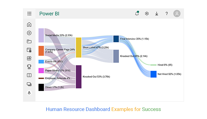
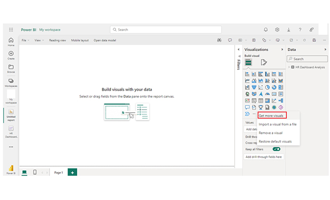
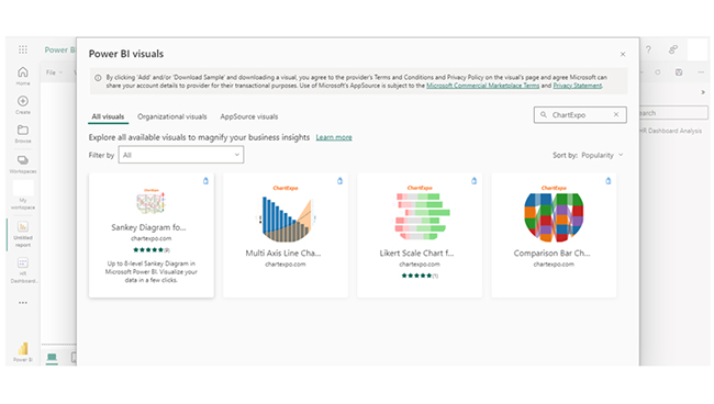
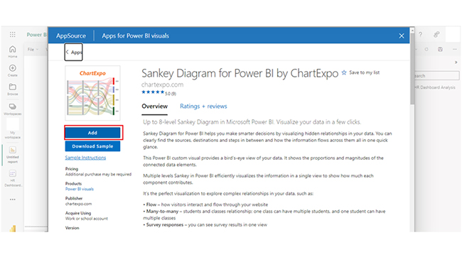
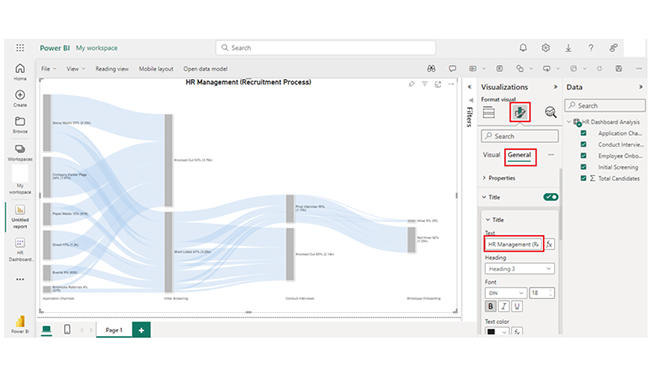
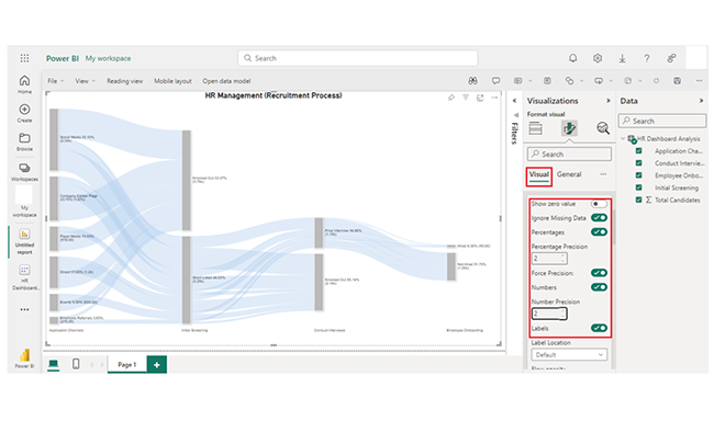
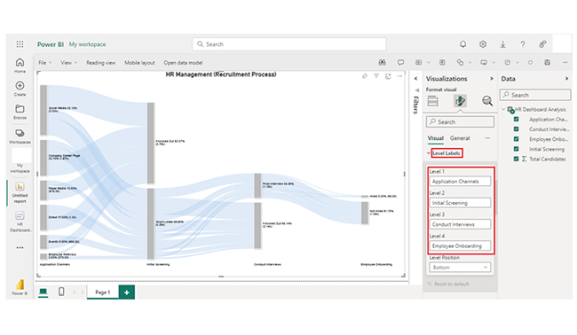
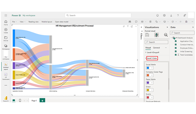
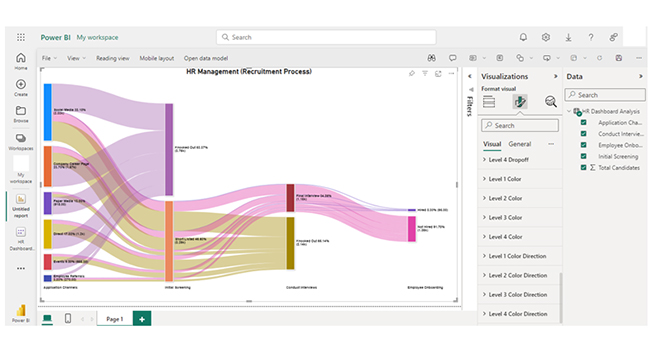
Create an HR dashboard in Power BI with a Sankey Diagram maker to turn workforce data into clear, actionable insights.


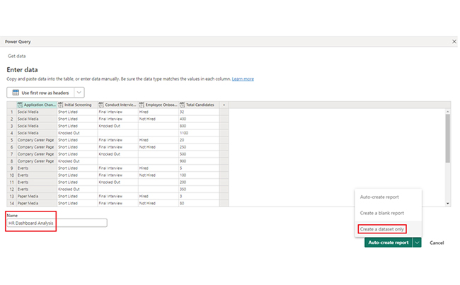
| Application Channels | Initial Screening | Conduct Interviews | Employee Onboarding |
Total Candidates
|
| Social Media | Short Listed | Final Interview | Hired | 32 |
| Social Media | Short Listed | Final Interview | Not Hired | 400 |
| Social Media | Short Listed | Knocked Out | 800 | |
| Social Media | Knocked Out | 1100 | ||
| Company Career Page | Short Listed | Final Interview | Hired | 20 |
| Company Career Page | Short Listed | Final Interview | Not Hired | 250 |
| Company Career Page | Short Listed | Knocked Out | 500 | |
| Company Career Page | Knocked Out | 900 | ||
| Events | Short Listed | Final Interview | Hired | 5 |
| Events | Short Listed | Final Interview | Not Hired | 100 |
| Events | Short Listed | Knocked Out | 200 | |
| Events | Knocked Out | 350 | ||
| Paper Media | Short Listed | Final Interview | Hired | 3 |
| Paper Media | Short Listed | Final Interview | Not Hired | 80 |
| Paper Media | Short Listed | Knocked Out | 135 | |
| Paper Media | Knocked Out | 700 | ||
| Employee Referrals | Short Listed | Final Interview | Hired | 10 |
| Employee Referrals | Short Listed | Final Interview | Not Hired | 70 |
| Employee Referrals | Short Listed | Knocked Out | 80 | |
| Employee Referrals | Knocked Out | 110 | ||
| Direct | Short Listed | Final Interview | Hired | 25 |
| Direct | Short Listed | Final Interview | Not Hired | 150 |
| Direct | Short Listed | Knocked Out | 425 | |
| Direct | Knocked Out | 600 |
Discover the potential of creating a human resource dashboard in Power BI with this interactive guide, where you’ll learn how to visualize key HR metrics using dynamic visuals. This powerful tool enables you to display employee performance, turnover rates, recruitment progress, and more, all in one place. By customizing your HR dashboard, you can quickly analyze trends, compare departments, and uncover insights that help drive better decision-making and improve workforce management. With visually engaging and real-time data, you’ll have a comprehensive view of your organization’s human resources.
A quick look at the human resource dashboard examples shows that it helps HR management and professionals make data-driven decisions based on real-time and historical workforce data.
The human resource dashboard offers a centralized view of the key HR metrics and also facilitates efficient monitoring of performance indicators and workforce trends.
The human resource dashboard enhances transparency by presenting HR data in visually accessible formats, and it also fosters better communication within an organization.
It aids in strategic workforce planning by identifying areas of improvement, aligning HR initiatives with organizational goals, and optimizing talent management.
Streamlining data analysis processes improves overall HR efficiency. Going through the human resource dashboard reduces manual reporting efforts, and promotes proactive management practices.
An HR dashboard provides a visual representation of real-time HR metrics, while the HR scorecard is a strategic tool that aligns HR objectives with the overall organizational goals through key performance indicators (KPIs).
The HR Key Performance Indicator (KPI) is a visual tool that showcases critical metrics and performance indicators related to human resources. It aids in workforce management and decision-making.
An interactive HR dashboard is a dynamic tool that allows users to engage with (and explore) HR data in real time. It helps in customization, interactive data visualization, and exploration.
The Human Resource dashboard is a visual representation of vital metrics. It provides real-time insights into recruitment, performance, and workforce data. It helps HR professionals monitor HR KPIs, and facilitate data-driven decision-making and strategic planning. This enhances the overall organizational performance.
When choosing an HR dashboard, you have to ascertain that the platform can support mobile devices. This way, users can easily access HR insights remotely. The platform should also be scalable. A scalable platform will likely accommodate future growth and evolving HR requirements.
Furthermore, you have to compare the various pricing models and look out for the overall cost of ownership. And that includes licensing, maintenance, and implementation.
By following the steps outlined in this guide, you’ll become proficient in the creation of a Human Resource dashboard in Power BI. You’ll also develop the right skills to help you create visualizations like the Sankey Chart.
How much did you enjoy this article?


Calculate accounts receivable turnover ratio to measure credit collection speed, improve cash flow, and strengthen your financial strategy. Read on!

Change Management KPIs are the key to tracking adoption, performance, and ROI during transitions. Find out which metrics matter. Read on!

Data collection methods and techniques determine the quality of every insight you act on. Explore key approaches for gathering reliable data. Read on!


