Categories
Hiring teams that lack visibility into their own processes often lose top candidates to slower pipelines and poor data. Recruitment dashboards solve this by consolidating every stage of the hiring workflow into one live, visual interface, giving teams the clarity to act fast and hire smart.
This guide covers what these dashboards are, why they matter, the metrics worth tracking, and how to build and analyze them in Power BI. Whether you manage a small HR team or oversee enterprise-wide hiring, the strategies here will help you move from gut-feel recruiting to decisions grounded in data.
Definition: Recruitment dashboards are visual reporting tools that pull hiring data from multiple systems and display it through charts, tables, and KPIs on a single screen. Rather than toggling between platforms or waiting for static spreadsheet exports, hiring teams get a consolidated view of every open role and candidate in real time.
Think of a human resource dashboard setup, where managers can surface workforce trends at a glance. These tools work the same way for talent acquisition, showing candidate flow, job status, time-in-stage, and recruiter output, so that every decision from screening to offer is anchored in current data instead of guesswork.
When hiring processes rely on manual tracking, delays and blind spots are inevitable. A well-configured dashboard transforms scattered recruitment activity into structured, actionable insight.
Key reasons organizations rely on them:
A well-built Power BI recruitment dashboard brings the most critical hiring information together in one structured view. The components below form the foundation of any effective setup:
For any recruitment dashboards setup to produce meaningful output, it must center on KPIs that reflect real hiring performance, not just activity.
Core metrics to track:
The right recruiting dashboard examples vary by team size, hiring volume, and reporting goals. Below are three widely used templates that HR teams adapt for different situations.
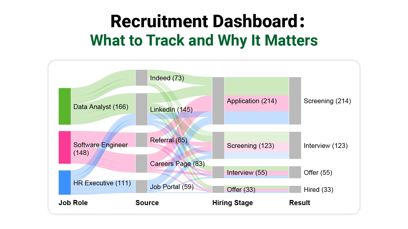
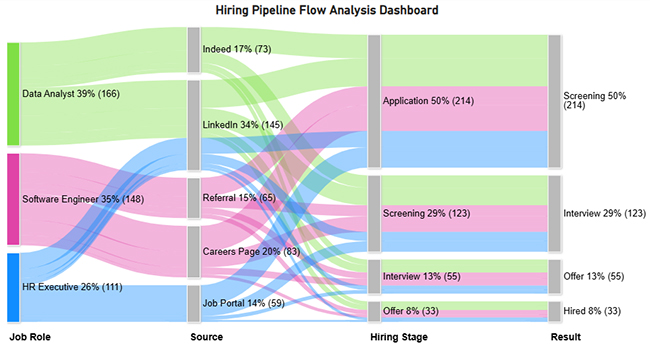
The Hiring Pipeline Dashboard reveals where candidates concentrate and where they exit. In this example, LinkedIn drives the largest share of applicants, yet only a fraction of those candidates advance all the way to the hired stage.
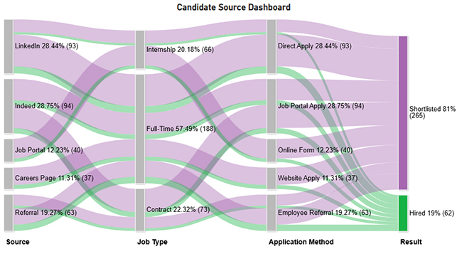
The Candidate Source Dashboard compares how each sourcing channel contributes to hiring volume. The data shows that full-time roles attract the greatest number of applications, while only a small portion of overall candidates progress to a final hiring decision.
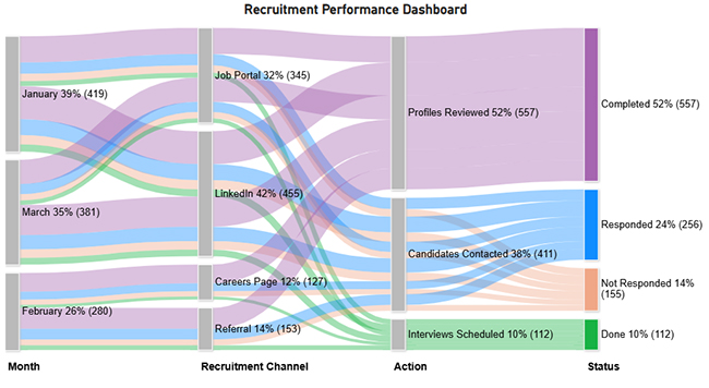
The Recruitment Performance Dashboard breaks hiring activity down by month and channel, revealing that profile reviews make up the bulk of recruiter tasks, while fewer candidates respond and even fewer reach the interview phase.
Building strong recruiting dashboard examples takes more than choosing a tool. It requires a deliberate sequence of planning, data preparation, and design that keeps the output genuinely useful.
Steps to create a dashboard:
Getting value from a Power BI recruitment dashboard means going beyond a surface read of the charts. Each metric you surface tells a story about what is working and what is not in your hiring process.
Begin each review session by scanning headline metrics, including time to hire and cost per hire, to establish a baseline for the rest of the analysis.
Use funnel or Sankey Chart visuals to follow candidates as they move, or fail to move, between each stage of the pipeline.
Apply slicers and filters to isolate individual recruiter output, identifying who is performing above expectations and who may need support.
Determine which sourcing channels consistently deliver candidates who reach the offer stage, and shift budget and effort toward those pathways.
Flag any stage where candidates sit longer than the target window, as these are the bottlenecks that compound into extended time-to-hire figures.
Bring in ChartExpo to produce Sankey Charts and flow diagrams that default Power BI visuals cannot replicate, making complex candidate journeys easier to read.
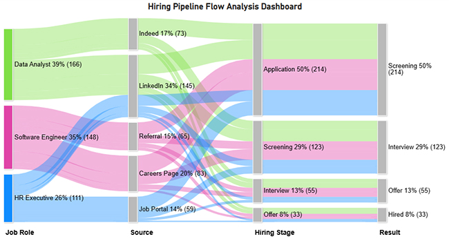
The Sankey diagram shows the hiring pipeline flow from job roles through sources (LinkedIn, Indeed, referrals, etc.) into stages like application, screening, interview, and offer.
It highlights conversion drop-offs at each stage, with only 8% of candidates ultimately hired, revealing bottlenecks in screening and interview phases.
Knowing where dashboards add value and where they fall short helps organizations use them as genuine decision tools rather than reporting formalities.
Setting up a recruitment dashboard in Power BI can be straightforward when the data is clean and the requirements are well defined. In practice, teams regularly encounter the following obstacles:
A KPI dashboard for a recruiter is a visual report that surfaces the hiring metrics that matter most, including time to hire, cost per hire, candidate conversion rate, and offer acceptance rate.
It gives recruiters a structured way to track pipeline health, measure their own output, and identify which areas of the process need attention. Comparing results across roles, teams, and campaigns becomes straightforward when all hiring data is consolidated in a single, real-time view.
Effective recruitment dashboards start with a clear statement of the hiring goals they need to support. Work backward from those goals to select the metrics that best reflect progress, then choose chart types that display candidate flow, role status, and recruiter output without demanding interpretation.
Pick a tool built for live data and easy filtering, keep the layout focused, and revisit it regularly to remove any metrics that no longer serve a clear purpose.
Recruitment dashboards give hiring teams the visibility they need to move from reactive processes to deliberate, data-backed decisions. By surfacing the right metrics in real time, they remove the guesswork from pipeline management and make every stage of hiring accountable to measurable outcomes.
The most effective implementations start with clear goals, stay focused on a small set of high-value KPIs, and are reviewed often enough to stay current. Teams that treat their dashboards as living tools rather than one-time builds will consistently make faster, smarter hiring calls and build recruitment processes that scale with their organization.
How much did you enjoy this article?


Discover diverse and high-quality Power BI report examples for inspiration and insights. Elevate your reporting with strategic visualization techniques.

A Customer Relationship Management Dashboard centralizes data, tracks key metrics, and drives smarter business decisions. Discover now!

Explore Healthcare Dashboard Examples and learn how to turn complex healthcare data into clear, actionable insights for better decision-making.